Nike UK Headquarters redesign by Rosie Lee
Here's a look inside the newly redesigned Nike headquarters in London by Rosie Lee (+ slideshow + movie).
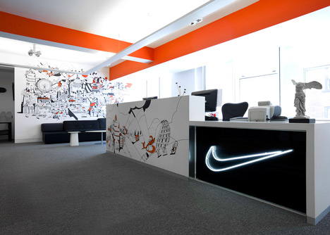
British agency Rosie Lee has created themed zones for sportswear giant Nike's three-floor head office in central London. Each zone has a designated colour, hand-painted illustrations and text graphics referencing milestones from the brand's history.
"Nike wanted to utilise its rich brand and product heritage to bring to life the company's London headquarters," said Stephen Bates of Rosie Lee.
The firm commissioned illustrators and artists to create large graphics and hand-drawn murals for the office walls.
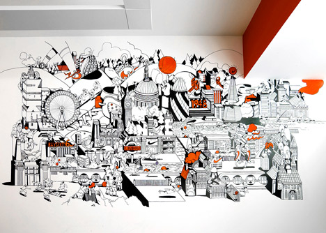
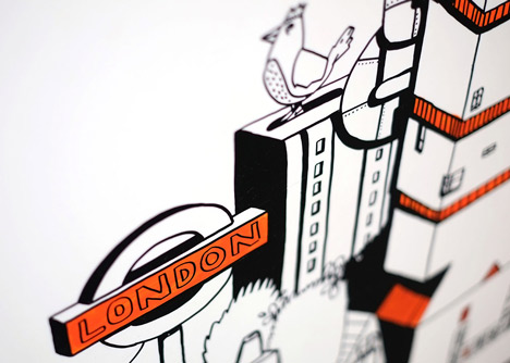
In the reception area illustrator Chris Martin sketched a mural that features Nike trainers and other sportswear products amongst well-known London landmarks including Renzo Piano's Shard skyscraper and St. Paul's Cathedral.
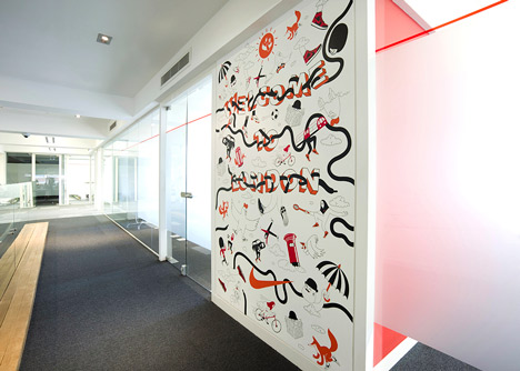
Another wall illustration in the third floor entrance by Rob Flowers features the words "Welcome to London" surrounded by bowler hats, black taxi cabs with legs, skateboarding pigeons, clouds with feet and urban foxes in trainers.
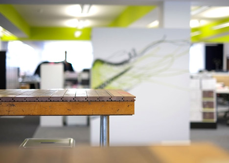
The designers used discarded wood from a basketball court to create a new table for the offices new social area.
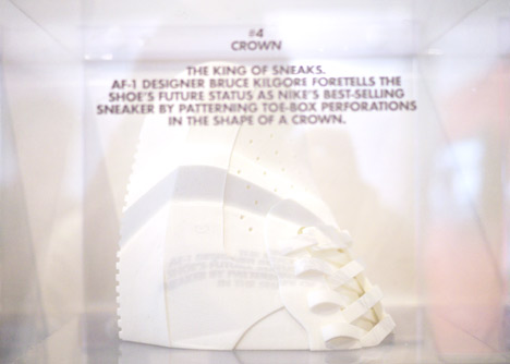
Thirty models of trainers and other accessories have been 3D-printed in nylon and acrylic.
Here's a movie showing the interior:
We recently went behind the scenes at the laboratory where Nike tests new technologies and met a robot that perspires as he runs.
Other features about Nike to appear on Dezeen recently include the new Free Hyperfeel running shoe that is designed to allow athletes to feel the ground beneath them as they would in bare feet. See all our Nike features »
See more offices on Dezeen »
See more interior design »
Here's the full project description:
Nike redesigns UK Headquarters
Nike wanted to utilise its rich brand and product heritage to bring to life the company’s London headquarters. With over a decade of experience in creating and delivering Nike product campaigns and launch spaces, we were perfectly suited to lead the project.
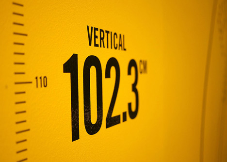
Our concept divided the three floors of the office into distinct product and heritage areas, each with it's own representative colour scheme, imagery and inspirational copy, whilst the reception area overtly referenced the iconic landmarks and symbols of London.
To execute the concept we brought in and art directed a team of London's leading illustrators, artists and interior decorators.
We also made use of campaign props from the Nike archive.
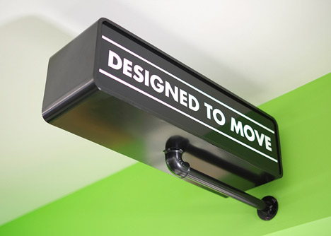
To finish it off, fixtures and furniture crafted from reclaimed wood introduced a softer look and feel to social areas.
The lively, visually rich workspace generated a huge amount of excitement and appreciation amongst staff and helped to further embed the positive, heritage-infused culture that has made the company such a success.
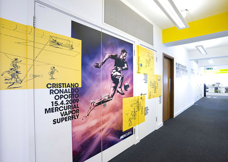
Mercurial zone: features reworked artwork from a 2010 book that documented and celebrated the Mercurial football boot and it's history. The zone includes depictions of players such as Ronaldo scoring famous goals whilst wearing the boots.
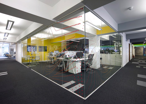
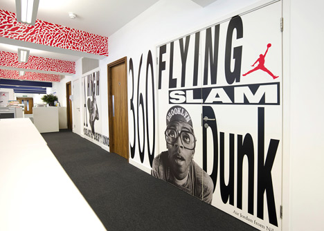
Air Jordan zone: references famous advertising campaigns starring Spike Lee as the basketball-obsessed character Mars Blackmon from the film Do The Right Thing. The Air Jordan 3 elephant print adorns the ceiling beams.
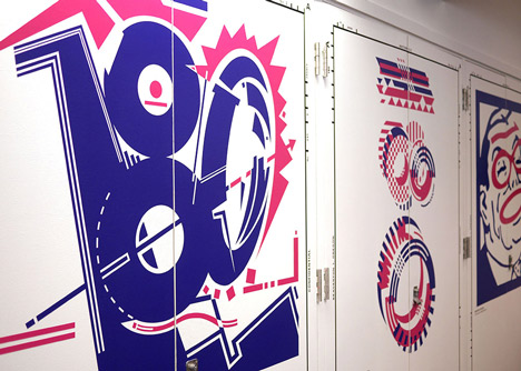
Air Max 180 zone: features a gallery of artworks from the original Air Max 180 launch campaign of 1991, including artists such as Ralph Steadman.
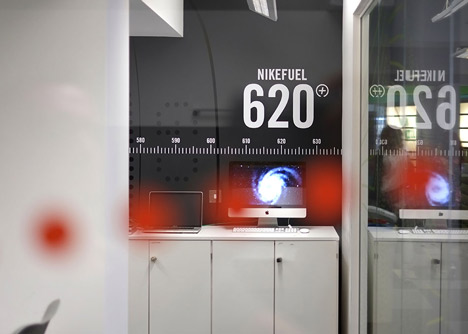
Nike Tech zone: includes high gloss vinyl on matt black wall drawing of the new Nike FuelBand to create subtle but impactful mural. Various dot and number treatments reference LED display of the FuelBand and NikeFuel points.
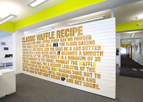
Social area: New area created by us to give Nike staff an area to unwind in. Divided from rest of the office by the ‘Waffle Wall’ that references the pivotal moment when Nike co-founder Bill Bowerman began experimenting with rubber soles by pouring liquid rubber compound into his wife’s waffle iron to create a sole that forever changed the design of running shoes.
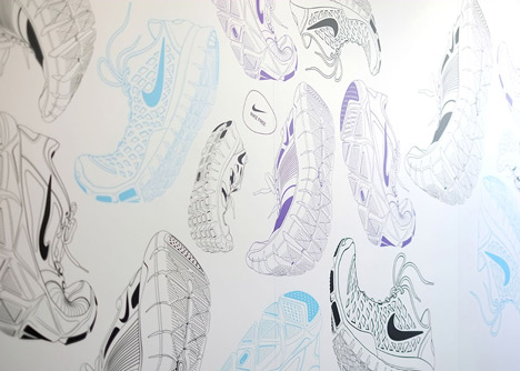
Also utilises tables made of reclaimed wood from UK basketball court floors that we used in the 2008 relaunch of Nike Sportswear campaign plus informal, bar style seating.
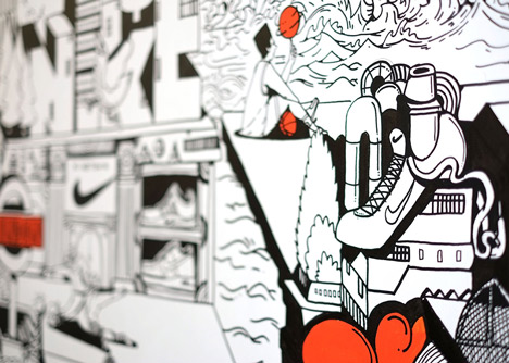
Reception area: there is an illustrated wall mural by Chris Martin that uses Nike's brand orange referencing Nike spaces in London, Nike products, popular UK sporting activities and famous London landmarks.