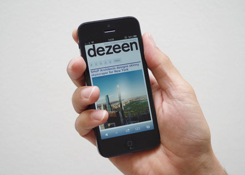
If you've visited Dezeen on a mobile device over the last few weeks you may have noticed some improvements... our mobile-friendly responsive site went live at the end of last month.
The new responsive design detects the device you're using and serves the optimal user experience for that device. So if you're using a mobile phone, you'll see a stylish new interface with simplified navigation. There is just one column of stories, with all other navigation tidied away into drop-down menus.
Dezeen is proud of its logical yet stylish layout and we think we've found a way to bring those same qualities to smaller mobile screens. The mobile experience is designed to be as simple, clean and fast-loading as possible. Features such as slideshows and movies automatically reformat to work seamlessly on iPhones, Android devices and other mobile gadgets.
We've been testing the site extensively since it went live and we think we've ironed out all the bugs, but let us know if you spot any more.
We're still working on ways of sharing stories via social media on mobile, and on offering a way to view the desktop version of the site, in case you'd prefer that experience.
Comment counts will also be added to the homepage soon (and by the way we've also overhauled our comment engine, which is now run by the more elegant and customisable Disqus solution, rather than Intense Debate).
Suggestions for further improvements are most welcome!
Desktop, laptop and tablet users will still see the full, three-column version of Dezeen. Our analytics show that readers feel very comfortable visiting the full version Dezeen on devices such as iPads - the number of users visiting Dezeen on tablets more than doubled over the past year compared to the previous year. Mobile users grew 70% over the year and have grown a further 20% since we introduced the new responsive site.
The site has been designed by our office mates Zerofee. The next steps will be to roll out responsive versions of our Dezeen Jobs recruitment site and our Dezeen Watch Store ecommerce site. Our World Design Guide maps already feature responsive design.

