Ace Hotel Shoreditch by Universal Design Studio
Turntables and Tokyobikes will be available to hire at the latest addition to the Ace Hotel chain, designed by London practice Universal Design Studio and opening later this month in Shoreditch.
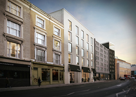
Edward Barber and Jay Osgerby's Universal Design Studio designed the interior and exterior of the 258-room hotel on Shoreditch High Street, behind a new facade designed by the team.
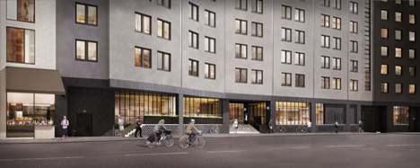
Dark engineering brick will clad the ground floor, with lighter rendering on the upper storeys.
"Both exterior and interior design focus on traditional craftsmanship, embedding the space within the historic context and material heritage of Shoreditch," said Universal Design Studio director Jason Holley.
A large glass-walled event space on top will have panoramic views of London and the basement will feature a bar and performance space. The hotel will also contain a flower shop, brasserie, takeaway juice bar and cafe.
Cork ceilings fitted with custom copper light fixtures and timber parquet flooring are to be installed in communal areas on the ground floor.
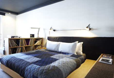
Original work by local artists will adorn walls of the minimal bedrooms, in some of which guests can request to have Martin guitars and Rega RP1 turntables. Guests will also be able to hire bicycles to explore the city from local shop Tokyobike.
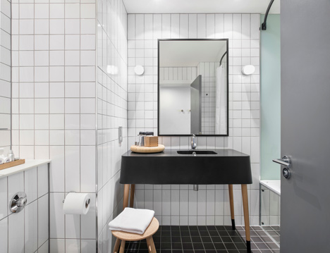
Monochrome tiles will line the bathrooms, which will feature mirror-faced bathtubs and lights designed for outside.
Universal Design Studio was founded by Edward Barber and Jay Osgerby, designers of the London 2012 Olympic torch. The studio has also completed interiors for fashion brand Mulberry's stores in Manchester and New Bond Street, London, plus a pleated facade for an H&M shop in Seoul.
These images show model rooms representing the finished guest facilities at the hotel. Photographs are by Mads Perch, unless otherwise stated.
See more hotel architecture and interiors »
See more interiors by Universal Design Studio »
See more architecture and design in London »
Here's a full project description from the hotel:
Ace Hotel London Shoreditch - Design Narrative
Ace Hotel worked with London-based architecture and interior design firm Universal Design Studio to design exteriors and interiors, including 258 guest rooms, an 1,800 square foot seventh floor event space, a 2,700 square foot restaurant, Hoi Polloi, and a 3,900 square foot lounge and reception area comprised of retail units, a bar, café and art gallery. Our approach was to tune in to the authentic voice of Shoreditch, to engage local artists, craftspersons and builders to foster a sense of place at home with its surroundings, a place that is, according to Ace co-founder Alex Calderwood, "of London and for London."
Known for their distinctive design aesthetic, recognisable for its simplicity and clever use of material details, and a bespoke approach to each client, Universal Design Studio was a natural choice to help translate the Ace ethos into a London vernacular. Both exterior and interior design focus on traditional craftsmanship, embedding the space within the historic context and material heritage of Shoreditch. Material choices are informed by East London's longstanding role as a centre for the performing arts, as well as a historic home to skilled trades like shoemaking, furniture making, rope making, ship building and silk weaving.
Façade & Exterior Details
Immediately facing a conservation area, the area surrounding Ace Hotel London Shoreditch has a rich architectural history, composed of a tightly knit grain of warehouses, shops, residential and industrial buildings. The intent of the façade is to mesh with the urban fabric around us. Contemporary takes on traditional material cues use expressive brickwork, infill and pattern to reanimate the street level of the building, bringing activity to the front and breaking the façade into a number of independent units and uses. Dark 'engineering brick', often found in traditional utilitarian buildings is used to ground the base in local tradition. A rich mixture of textural changes — brick bonds and receded bricks alongside glazed and unglazed patterning — create a series of distinct identities across the span of the façade. In reference to local metalwork traditions, Crittall windows, doors and industrial elements like grids, cast bronze, galvanised steel and waxed finishes add to the authentically local character.
Public Areas
Communal areas at Ace Hotel London Shoreditch include the ground floor lobby, a communal table, café, lobby bar and gallery space. The lobby is envisioned as a hub for interaction for hotel guests as well as the surrounding community, and continues the real-Shoreditch tone set by the exterior, with common local materials like brick, metalwork and Crittall glazing. A series of room-like zones are created through furniture arrangements and a series of full-height Crittall glass and steel screens, inviting the language of articulated shop fronts, that begins with the façade, indoors. A cork ceiling fitted with custom copper light fixtures and timber parquet flooring steeps the setting in the local visual culture.
A rich theatrical history is reflected in moments throughout the communal spaces as well, like a custom theatre-style light grid installed in the external entrance foyer. Ace Hotel London Shoreditch sits on the original site of the Shoreditch Empire, later the London Music Hall. The Empire, designed by prolific theatrical architect Frank Matcham, opened in 1856 and played host to stars like Charlie Chaplin.
In the lobby bar area, a lighter colour of brick, articulated brick patterns, and a skylight that draws natural daylight lend to the uniqueness of the space. Artist Max Lamb was commissioned to design the bar cladding, bar stools and cocktail tables. A long, sixteen-seat communal work table by Benchmark in the lobby is a bespoke piece made of cast iron, oak and copper which can be used as an informal meeting or work space.
The café features a range of rich finishes including handmade tiles and patterned timber floors. The gallery space will rotate artist exhibitions and we're collaborating with local artists on details throughout the lobby.
Restaurant Concept
At Hoi Polloi, Universal and Atelier Ace worked with the Hoi Polloi team to create an English modernist brasserie inspired by mid-twentieth century European bistros. Stepping in from bustling Shoreditch High Street, Hattie Fox's That Flower Shop is a floral interlude before discovering the restaurant. On entering Hoi Polloi, guests encounter an informal bar area made up of a series of banquette booths. The high-ceilinged space accommodates a variety of paces — fast-moving and leisurely. Moving into the main dining space, soft banquette seating creates a range of areas focused around a central seating section. A sense of spontaneity fosters the feeling of 'an occasion,' somewhere for everyday, yet special every time. It's a dynamic space, as ideal for daytimes spent working on a laptop as it is for evening drinks or supper.
Design details include a complex palette of materials like fluted timber-paneled walls with horizontally mirrored panels to create further depth. The bar is wrapped with natural stone while banquettes are finished in leather. Flecked linoleum tabletops contrast with stone surfaces, while Douglas Fir-paneled banquettes standout against warm Iroko timber wall panels. Hexagonal timber flooring in the bar area shifts to encaustic ceramic tiles in the dining room. Polished brass light fixtures sit on low walls behind banquette seating and custom pendant lights by Philippe Malouin light the main dining space. Ercol Love Seats and classic Butterfly chairs echo classic British dining rooms.
Guest Rooms
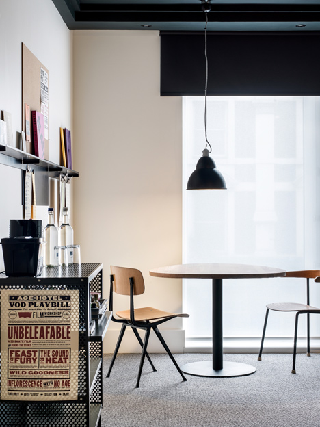
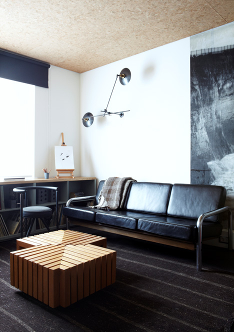
The approach to the guest rooms was to think of them as a friend's Shoreditch apartment, a collection of furniture and objects acquired over time, each with stories and memories attached. Each guest finds a curated shelf with a distinct identity and experience of place — useful crafted elements (maps, sketch pads) from local makers, records, books, a pin-up cork board and found curiosities. This magnetic shelf by T Nevill & Co. can be changed or added to by guests during their visit.
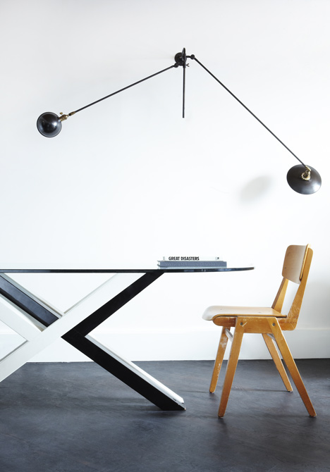
A utilitarian colour palette on the walls of the rooms creates a modest shell, a low-key canvas for simple but considered bespoke elements like folding metal display shelving, matte-finish oak bed platforms and expansive daybeds with reverse-denim upholstery. The full-width daybed encourages social interaction and a round table replaces the standard hotel room desk with something more domestic and multi-functional. The mixture of matte-finish solid white European oak, black powder- coated metal and fabrics add texture in consonance with the cool, pared-back approach throughout, to allow for curated objects to stand out.
Custom tile patterns, mirror-faced bathtubs and 'exterior' light fittings in bathrooms are complementary patterns against a monochrome palette.
Lovage
Lovage is a seasonal farm-to-street elixir and treat stand rooted in the essentials of British folk medicine and based on the idea that wellness comes from nature. The menu content will change seasonally and the interior walls will transition accordingly from white washed spruce to dark, charred cedar panels. The reversible panels are hung from raw breeze block walls with blackened steel barnyard ironmongery, a material gesture inspired by unfussy, rural Japanese kitchens and traditional village apothecaries.
Other notes include cast bronze light fixtures and a Noren curtain made of vintage boro fabric, contrasted with stainless steel work surfaces and a floor made of black hexagonal encaustic tiles. Signage and graphics are screen-printed on plywood. The warm, earthen atmosphere, set against a clean, utilitarian space complements the objective of providing natural, holistic sustenance in the midst of travel and work.