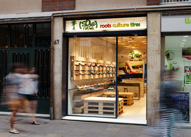
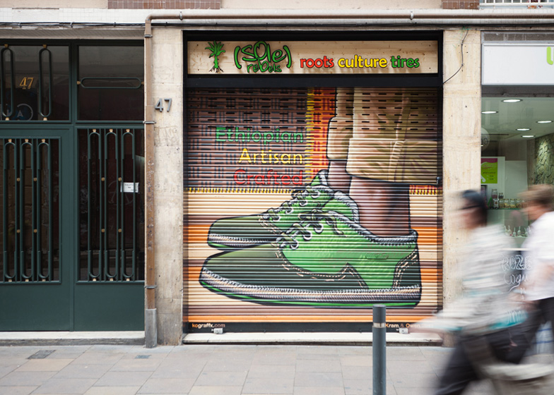
This former butchers shop in Barcelona has been converted into a shoe shop furnished with wooden pallets, ropes and tyres (+ slideshow).
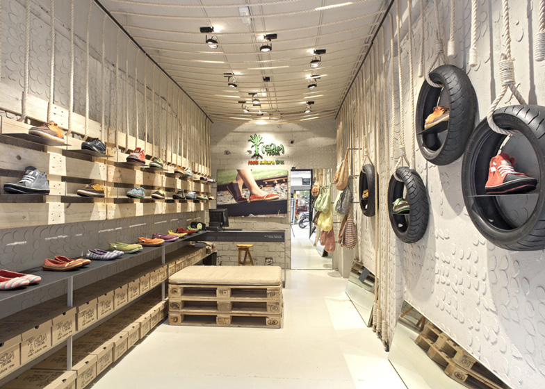
Spanish firm Dom Arquitectura and Rwanda-based Asa Studio renovated the narrow interior by stripping away the tiles that used to line the walls then painting over the rough plastered surface and blobs of leftover adhesive with a grey glaze.
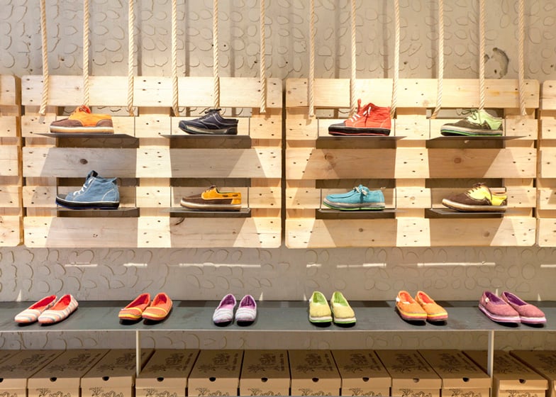
Display units made of pallets slung from the ceiling on ropes are used to showcase the Ethiopian brand's range of shoes.
Tyres are hung from the ceiling by thick lengths of rope as decoration, while the ceiling is strung with extra lengths of rope and spotlights.
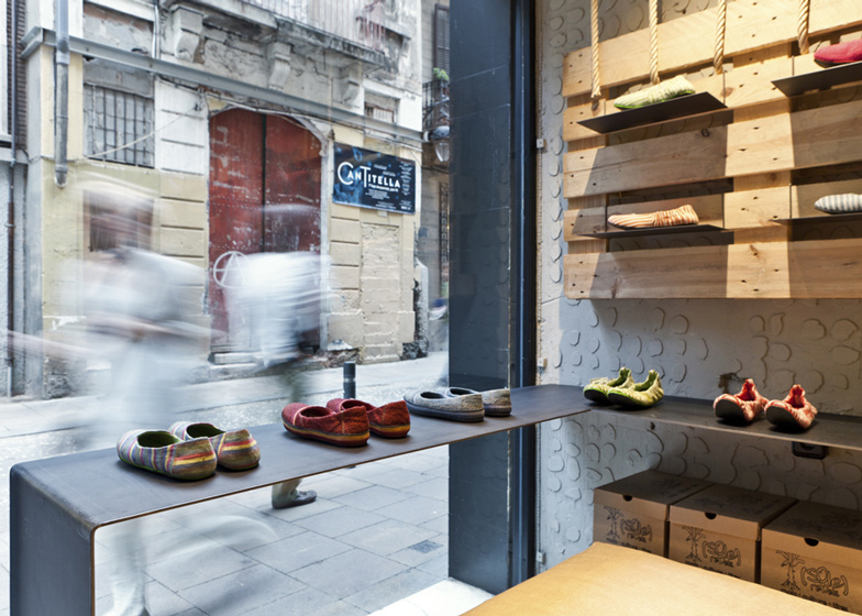
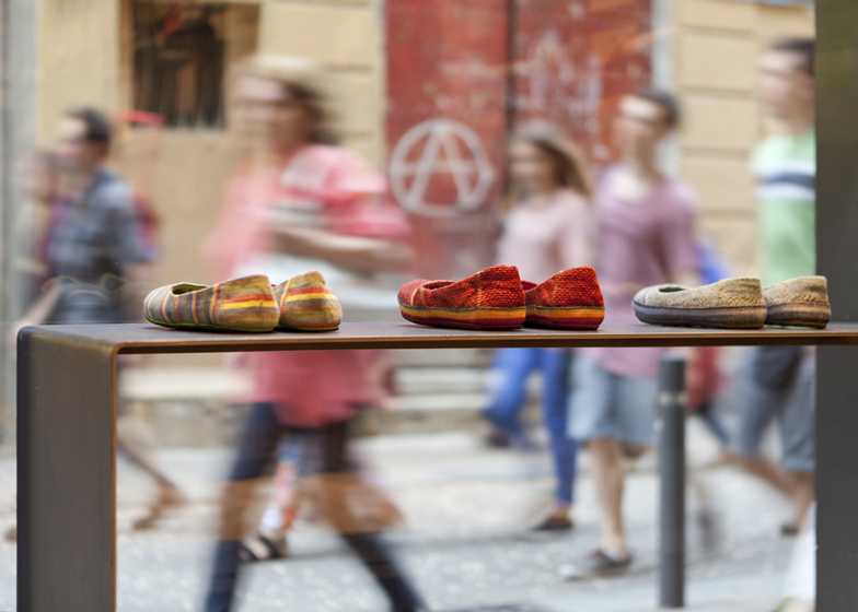
Metal work benches stretch down one side of the store with space to hold shoe boxes underneath, steel plates protrude from gaps in the pallets on the wall to form individual platforms for the shoes and a folded steel plate stretches in front of the window to display footwear to passersby.
"We had a very small place and a very limited budget," the studio said. "We decided to use natural materials and neutral colours to highlight the product. The colourful shoes should be the element that attracts and stands out to the street walker and the future client."
Other shop interiors we've recently featured include a Belgian fashion boutique with cacti, gravel and a wooden bridge, a shop and cafe in Vienna with a grid of white ceramic tiles and a fashion boutique in London lined with dominoes and a patterned iron facade.
Photography is by Jordi Anguera.
Here's a description from the architects:
SoleRebels Shoe Store, Gracia, Barcelona
SoleRebels is an Ethiopian brand of shoes from Africa. They surprise us with recycled materials, colourful shoes and originality. Its purpose was implant the brand in Barcelona for the first time.
Located in Gracia, we had a very small place and a very limited budget. The place was an old butcher with white and bright tiled walls.
The coating did not fit with the brand and with the image that we wanted for the store. So we took out the tiles, but decided to leave the plaster gobs that held them, and paint in that textured walls with a stone grey with a grey glaze, so we keep alive part of the place history.
Ahead the walls, as a new layer, we proposed a number of recycled items, such as pallets, ropes and wheels that fit with the brand image and the idea that we wanted to convey. With minimal resources we bet for a sustainable and original design.
We decided to use natural materials and neutral colours to highlight the product. The colourful shoes should be the element that attract and stand out the street walker and future client. One iron piece in "U" form wrap the space and allows us to exhibit the most outstanding shoes. One store side is lined with pallets, which helps to increase exposure while gives warmth to the space.
Some ropes tied to the pallets go up by the ceiling to come down to the other store side, where they also hold several wheels, reused to promote featured shoes. Everything is held between both sides and generates a sustainable tension.
Recycle step by step project: Dom Arquitectura + Asa Studio
Surface: 26 metres squared

