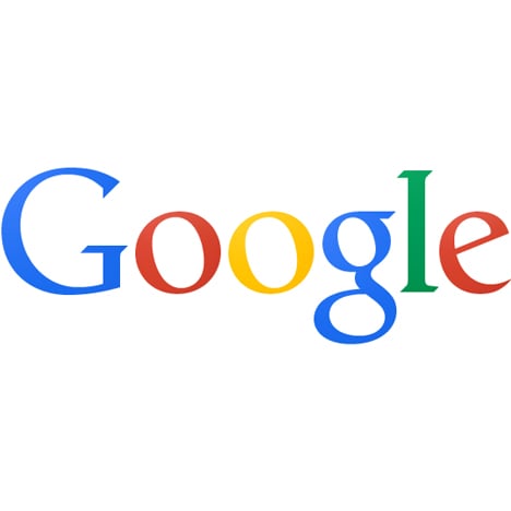
News: internet giant Google has unveiled a simplified logo that flattens its colours and ditches the drop shadow.
Following days of speculation, Google revealed the news in a blog post yesterday. The new logo will appear within a redesigned version of the search engine's homepage - the most visited website in the world.
"As part of this design, we’ve also refined the colour palette and letter shapes of the Google logo," wrote Eddie Kessler.
The new homepage will be rolled out to users in upcoming weeks and will feature a revised menu bar that groups links into an "app launcher" on the right-hand side of the page, rather than within the existing black menu bar.
Rumours first circulated earlier this month that Google was planning to update its logo, after the flatter version showed up in a beta version of Chrome for Android.
The new logo is more in line with the cleaner graphics and uncluttered interfaces of Apple's iOS 7 operating system, which was launched worldwide this week.
Other brands to relaunch logos in the last year include the Whitney Museum of American Art in New York and American Airlines.
See more logo design »
See more graphic design »

