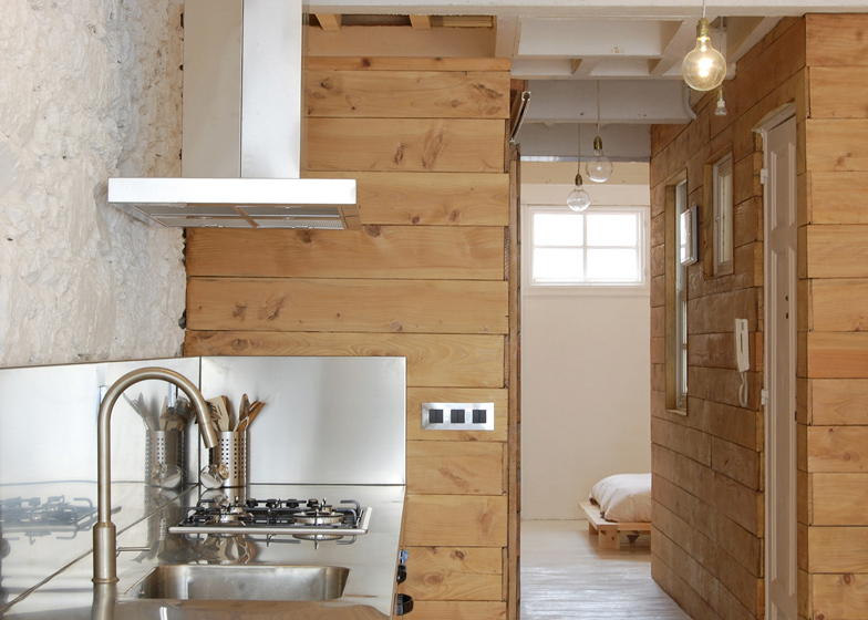
Long wooden panels give a shed-like aesthetic to the walls and cabinets of this apartment in A Coruña, Spain, by Sinaldaba Estudio de Arquitectura.
Spanish studio Sinaldaba Estudio de Arquitectura adapted the narrow, confined layout of the apartment to create a single, open-plan living space at one end and a bedroom at the other.
Working with a limited budget, the architects used recycled materials to construct partitions between rooms, as well as to build worktops and cabinets for the kitchen.
White tiles were stripped from the kitchen worktop and replaced with a stainless steel surface and sink.
Rugged stone walls were painted white, as were the timber floorboards and ceiling beams. Architect Ignacio Reigada describes this as a "necessary luminosity" that results in "a neutral volume - white, bright [and] airy".
An entrance corridor, bathroom and small study space separate the bedroom from the living and dining area.
Bare lightbulbs and recycled furniture complete the interior. "The furniture is all recycled. We saw it in other apartments of this building, that still aren't restored, so we decided to include it in the project," added Reigada.
Other Spanish apartments we've featured include a seaside home with an all-white interior and an apartment with mosaic floors and a decorative ceiling. See more Spanish architecture and design »
Photography is by Abraham Viqueira.
Here's a project description from the architects:
A Coruña
A top floor in a late nineteenth century building, located one of the central streets of A Coruña, in conditions very unfavourable maintenance, on a shoestring budget but with total freedom and trust from the client to choose the solutions, have us believe appropriate.
The house has the classic spatial configuration of a Gothic story plot: elongated, narrow, narrow, multi confined spaces? Is that what we all wanted? Quite the opposite. We proposed to completely empty the floor early on, keeping only the main stairwell. We got a single space, open, broad, bounded by a strip that houses furniture-kitchen-toilet-cabinet-study, i.e. a longitudinal continuous section running along the floor and containing all needs, freeing the volume and providing a spatial and visual continuity to housing.
The solutions adopted for the realisation of the idea happen to be fully reversible. We basically reinforced all beams that needed it with metallic elements, fir wood is used for the longitudinal strip and to repair the core of stairs. Both the stone walls and floors and ceilings are painted white, providing a necessary luminosity, as it is also the cheapest option. The result is a neutral volume, white, bright, airy, acting as a container for a small wooden box for communications and other longitudinal collecting the necessary elements to inhabit.

