Dear Ginza Building by Amano Design Office
This towering commercial block in Ginza, Tokyo, by Amano Design Office features a faceted aluminium facade reminiscent of a crumpled-up sweet wrapper (+ slideshow).
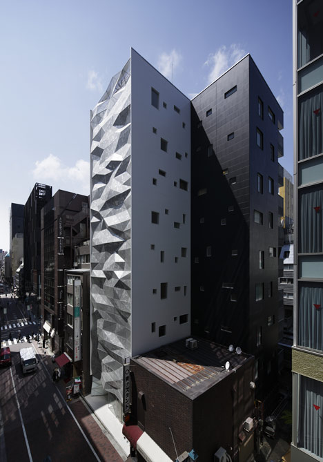
Tokyo-based Amano Design Office was asked to design an eye-catching building that would entice shoppers from Ginza's Central Street to a second shopping street just beyond.
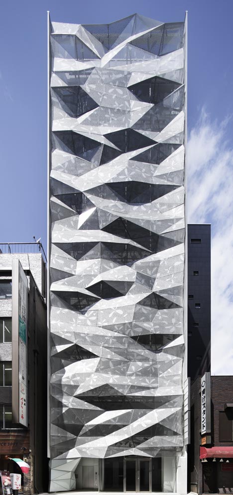
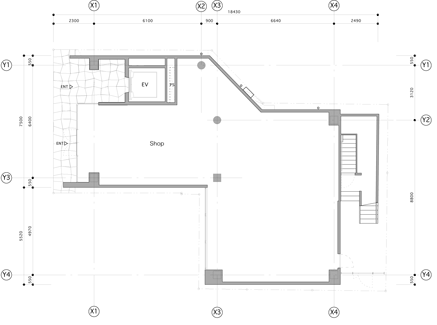
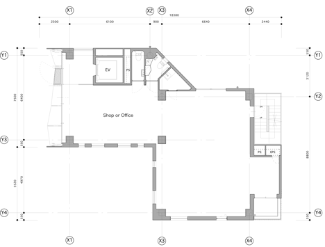
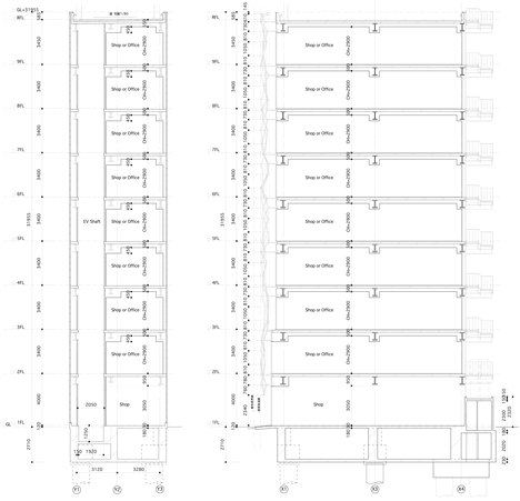
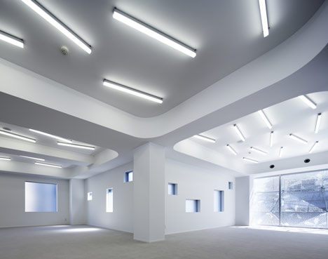
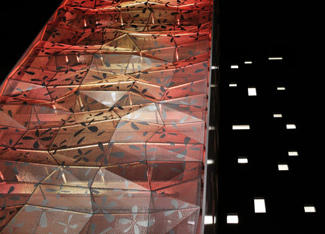
The nine-storey tower accommodates small units that can be used as either offices or shops. Apart from the glazed ground floor, each storey is concealed behind a double-layer facade that comprises a perforated metal exterior and a clear glass interior.
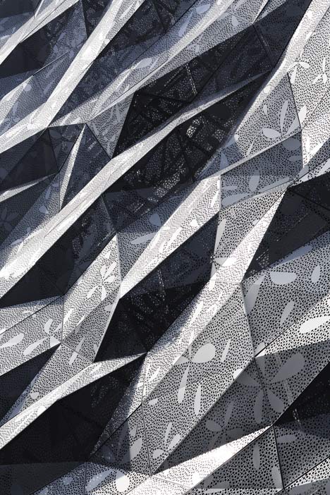
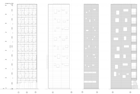
The architects used computers to generate the faceted aluminium form, then added a floral pattern to soften the appearance.
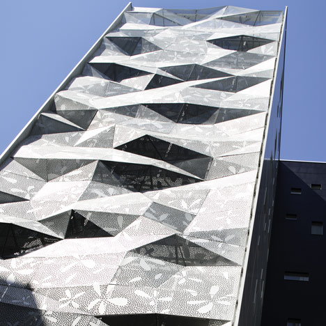
"In the neighbourhood of mostly modernist architecture with horizontal and vertical or geometric shapes, the building has a proper feeling of strangeness, attracts special attention and has an appeal as a commercial building," they explained.
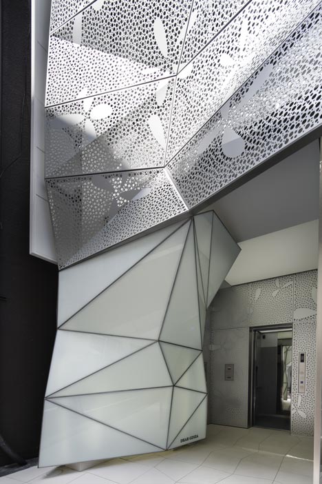
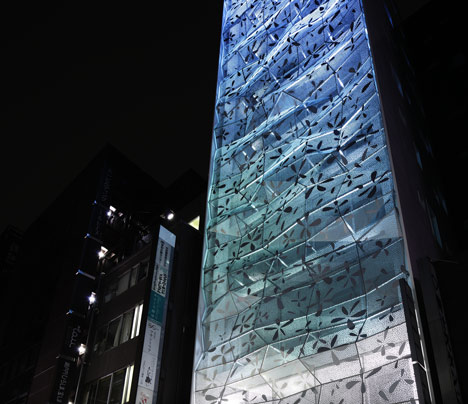
Lighting installed behind the metal panels is programmed to change colour depending on the season, switching between shades of red, blue and green.
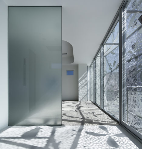
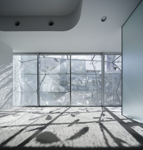
"The facade becomes a part of the interior decoration and obviates the need for window treatments such as blinds or curtains," added the architects.
Other commercial buildings from Japan with unusual facades include a herringbone-patterned boutique designed by OMA and a Tokyo bookstore covered in hundreds of interlocking T-shapes. See more architecture in Tokyo »
Photography is by Nacasa & Partners.
Here's the project description from the architects:
Dear Ginza Building
The client is a developer company. It purchased a long-sought after lot in Ginza, and planned to build a commercial/office building. The building site is on the Ginza 1-chome Gaslight Street, which is one street behind the Ginza Central Street. It is on the back side of the Mizuho Bank and Pola Ginza buildings on the Central Street. The atmosphere is quite different from the gorgeous Central Street, and the site is on an empty street which is often seen behind the street with large-sized buildings. Attracting as many people as possible into such a street is our task. The client desired the building to be a gorgeous existence. In addition, the designer desired to provide a "slight feeling of strangeness" to the passersby that would attract them to the building.
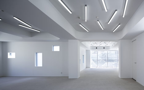
Considering the views from the inside, simply obtaining openness with glass seems futile, since the outside scenery is hopeless. Therefore, a double skin structure is employed, which consists of glass curtain walls and graphically treated aluminium punched metal. The facade becomes a part of the interior decoration and obviates the need for window treatments such as blinds or curtains. By using a double skin, reduction of the air conditioning load and the glass cleaning burden was also intended.
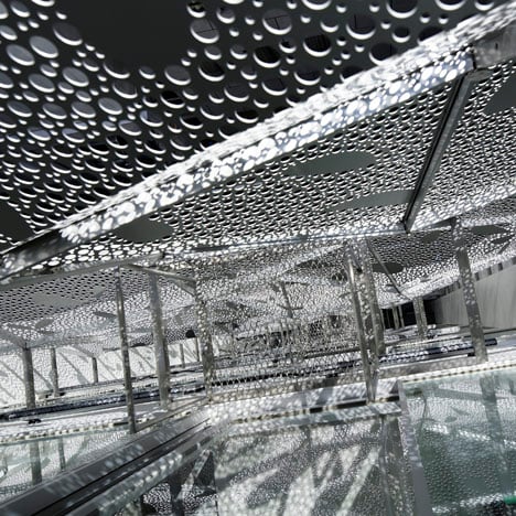
The irregular facade design was determined by computing a design to avoid arbitrary forms and to approximate forms in nature. We thought that a well-made incidental form would likely be a less-disagreeable design. In the neighbourhood of mostly modernist architecture with horizontal and vertical or geometric shapes, the building has a proper feeling of strangeness, attracts special attention, and has an appeal as a commercial building. The abstract flower graphic is used to balance the impression of the facade, i.e., to free it up from becoming too edgy.
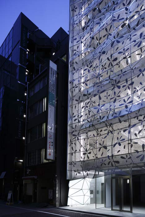
By computing the design, individual aluminium punched panels are irregular with different angles and shapes, yet all fit into a standard size, resulting in excellent material yield. To avoid being clunky, an extremely lightweight structure is required. Therefore, much caution was taken in its details. The coloured LED upper lighting, which is installed inside the double skin, entertains the passersby with different programs depending on the season. Expected tenants included a beauty salon and aesthetic salon, and the expectations are materialising.
Building location: Ginza-1-chome, Chuo-ku, Tokyo, Japan
Completion year: March 2013
Designer: amano design office
Collaborators: Atorie Oica, Azzurro Architects
Construction firm: Kumagai Gumi Co.,Ltd.
Main use: store building and office building
Lot size: 187.20 sqm
Building area: 155.55 sqm
Total floor space: 1300.02 sqm
Maximum height above rail level: 31.955 m
Structure: steel frame
Number of stairs or stories: nine storeys above ground and one underground story
Main material: aluminium graphic punching metal, extruded cement panel
