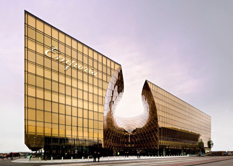
A gigantic golden chasm welcomes visitors to this shopping centre in Malmö by Swedish architects Wingårdhs (+ slideshow).
Located to the south of the city in Hyllie, the Emporia shopping centre is Wingårdhs' first realised building from a competition-winning masterplan of proposed housing and office blocks. Once all the buildings have been completed, the "amber entrance" will be the only section of the shopping centre visible from the surrounding new streets.
"The main idea of our winning competition entry was to hide inward-looking retail behind a wreath of residential and commercial buildings," said the architects.
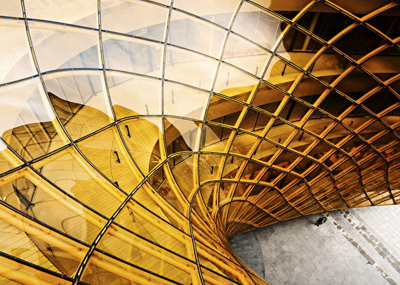
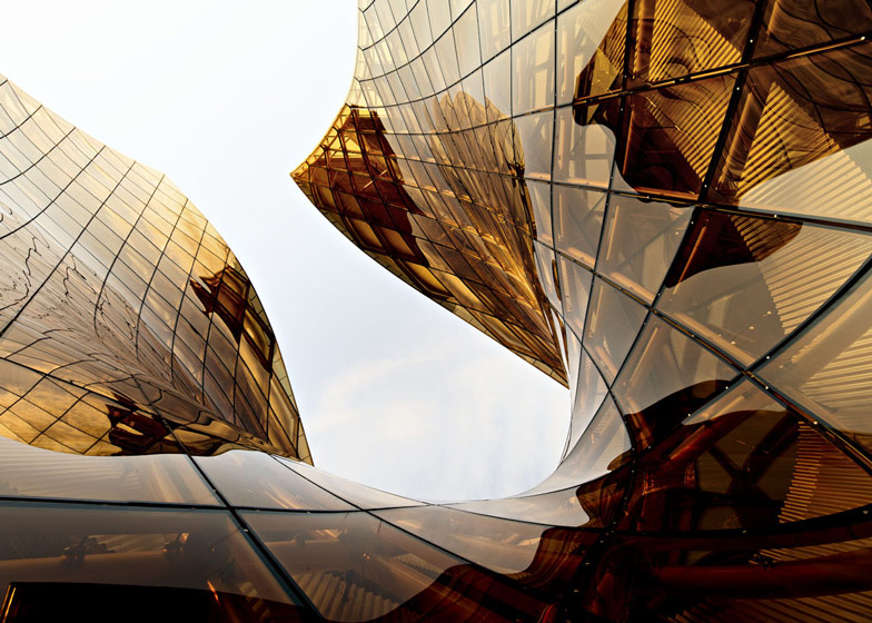
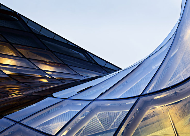
The curving golden glass stretches across a gridshell structure, which curves up and back to allow daylight to penetrate the entrance courtyard. From here, shoppers are led towards three storeys of retail arranged around a figure-of-eight plan.
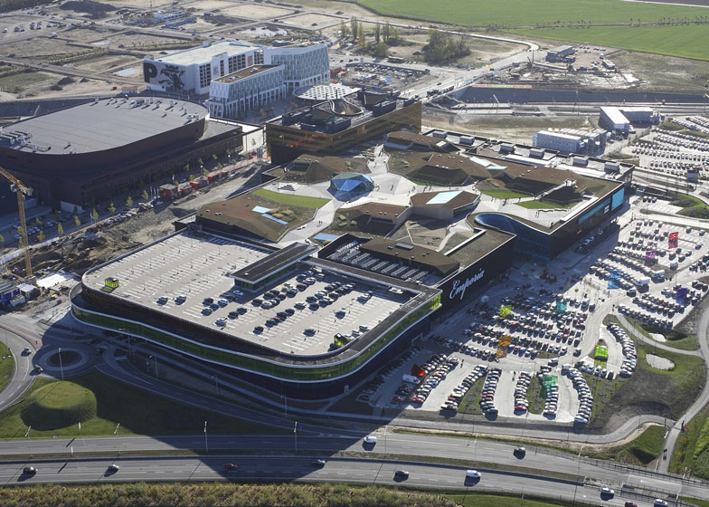
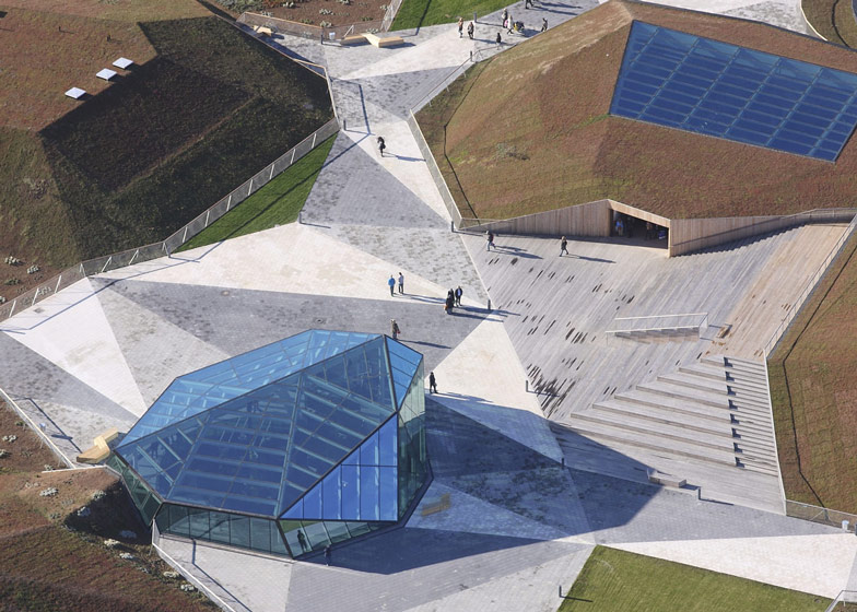
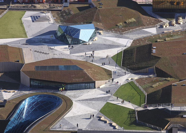
The roof of the structure accommodates a large park with a faceted landscape made up of lawns, terraces and pavilions.
"In the future the roof will be developed with outdoor dining and a spa facility," added the architects. "Like amusement parks, shopping centres need to offer new attractions at regular intervals."
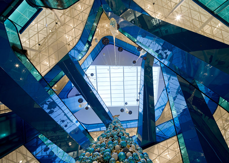
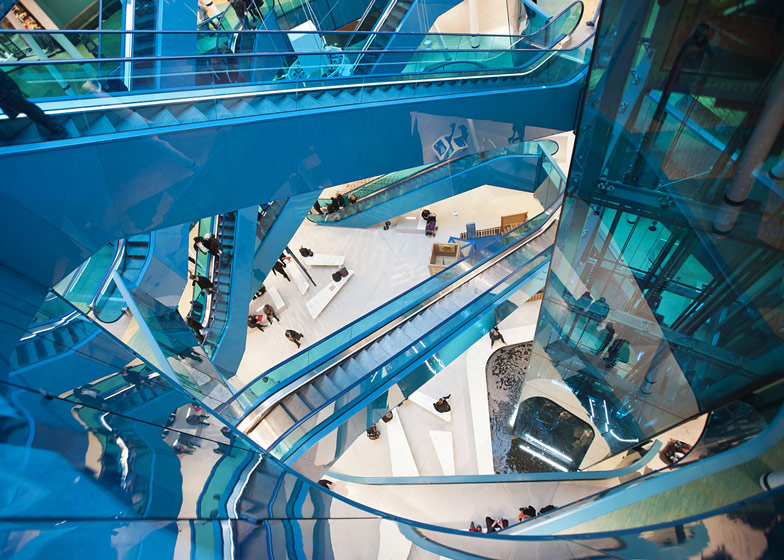
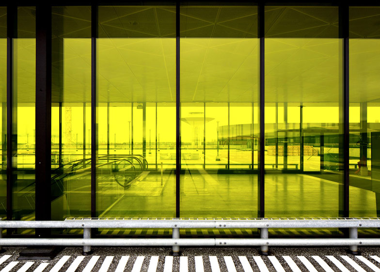
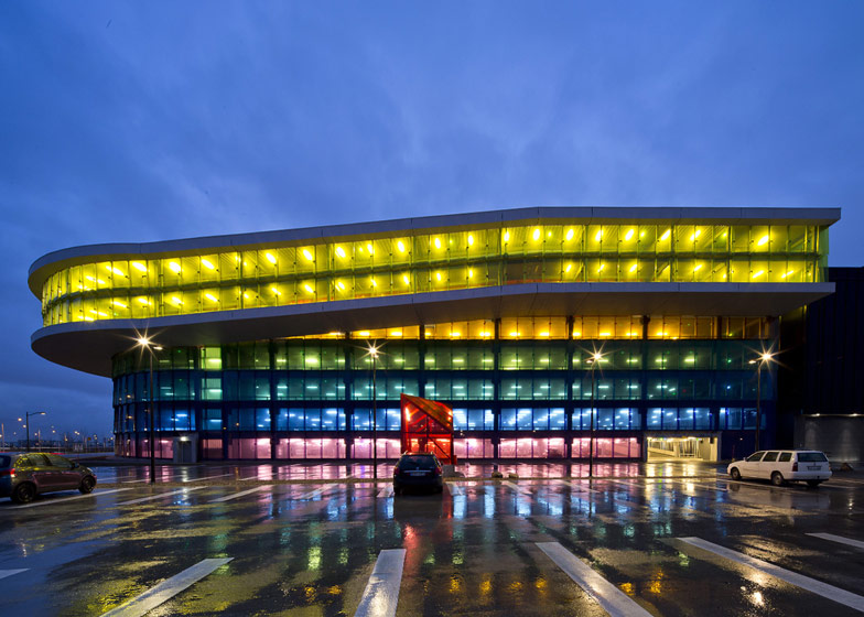
Atriums in bold shades of blue, green and red help shoppers to navigate the building, while the adjoining car park can be identified by an assortment of coloured panels.
Wingårdhs is led by architect Gert Wingårdh. Past projects by the studio include a thatched visitor centre at Sweden's Lake Tåkern and a high-rise hotel in Stockholm. See more architecture by Wingårdhs »
Other shopping centres on Dezeen include a former bullring in Barcelona and a rippled concrete building in Hong Kong. See more shopping centres »
Photography is by Tord-Rikard Söderström, apart from where otherwise indicated.
Here's a project description from Wingårdhs:
Emporia
Emporia is first and foremost an urban planning project in which offices, housing, and retail come together in a mixed-use development along Boulevarden and Stationsgatan in Hyllie, on the south side of Malmö. The main idea of our winning competition entry was to hide inward-looking retail behind a wreath of residential and commercial buildings. The whole shopping complex would thereby eventually become integrated into the fabric of the city.
It is a huge development, of which only the corner building with the Amber Entrance has yet been completed. This entrance will be the only part of the Emporia shopping centre that remains visible when the development is completely built out. The idea of lining the streets with mixed-use buildings demanded a strong form that could attract visitors from Station Square to come in and shop. A sequence of vaults from a previous competition proposal, along with a memory from the Pantheon, reemerged in a bronze-ochre tone. Double-bent glass encloses the diagonal slit that cuts through the building. Here the weather of the Öresund Strait, its fast-moving clouds chasing glimpses of sun, becomes present and tangible.
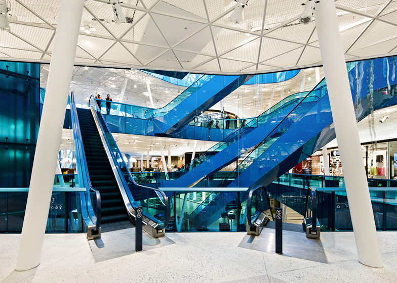
The diagonal entrance from Hyllie Station Square leads deep into the block. Inside, retail is organised around a three-storey figure eight. Shops are grouped together around boldly coloured atriums, each with a different theme. On the north side of the complex, a ramp leads into a rainbow-coloured parking garage (for 2500 cars) with direct access to the figure eight. To the east is a surface parking lot (for 500) right outside the supermarket.
The rooftop park is designed as a bit of cultivated nature. Its vegetation (sedum, prairie grass, and trees) and its sun-facing, wind-sheltered patios are accessible from both inside and outside the building. The hills that provide protection from the wind are actually hiding mechanical rooms. In the future the roof will be developed with outdoor dining and a spa facility—like amusement parks, shopping centres need to offer new attractions at regular intervals.
Emporia can expand upward and to the west, but not in any of the other directions. The freestanding residential buildings facing Boulevarden have yet to be built, as do those that will stand atop the podium along Stationsgatan on the south side.
Emporia's interior challenges established shopping centre conventions. Its bold colours and bent sight lines break with the norm, as do the project's size and ambition—which have made it possible to do custom designs for everything from ceilings, floors, and storefronts to signage, ropes of hanging plants, furniture, and cast glass door handles.
Our motto has been "no intermediate scale" — because that is the realm of the products on display. Large-scale patterns and intricate details characterise the interior. The terrazzo floor is typical of this approach, with its oversized triangular joint pattern, its gradual shift from white to graphite in seven steps, and its flashing inclusions of coloured mirror glass. The design has been wrought with extraordinary attention to detail, down to the leather-wrapped handrails and the colour of the stitching on the built-in seating.
Emporia also includes a quantity of art seldom seen in a commercial environment. A lighting installation (ninety-nine bollards) by Petteri Nisunen and Tommi Grönlund lifts the Amber Entrance, bronze sculptures by Joep van Lieshout and a glass art piece (4 x 81 m) by Silja Rantanen adorn the Sea Entrance, and a line painting on film at an extremely outsized format (20 x 114 m) by Per Mårtensson clads the façade of the parking garage. On the interior is a series of photos by Signe Maria Andersen.
Architect: Wingårdhs through, Gert Wingårdh, Johan Eklind and Joakim Lyth
Interior architect: Wingårdhs through, Helena Toresson
Graphic design: Wingårdhs through, Jennie Stolpe
Landscape design: Thyréns AB (Anders Dahl, Pamela Sjöstrand)
Landscape design (roof park): Wingårdhs, Landskapsgruppen Öresund AB
Client: Steen & Ström Sverige AB

