Daaf Geluk School by KoningEllis Architects
Dutch studio KoningEllis Architects used a combination of grey slate, warm timber and shimmering aluminium for the walls of a new building at this school for children with learning disabilities in Haarlem, the Netherlands (+ slideshow).
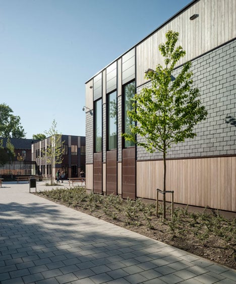
Daaf Geluk secondary school had previously been located on two sites, but the construction of new housing had created the opportunity to bring the entire school together on one campus. KoningEllis Architects was tasked with renovating one of the old buildings - a brick structure from the 1940s - and adding an additional block of classrooms and sports facilities.
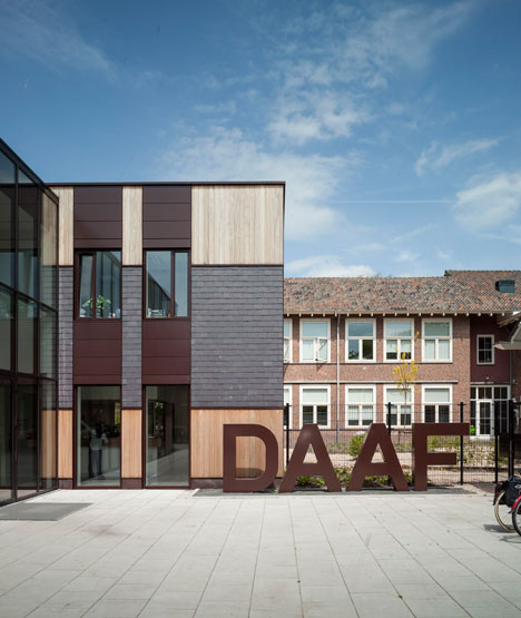
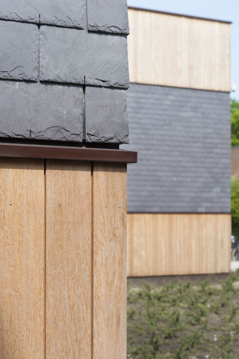
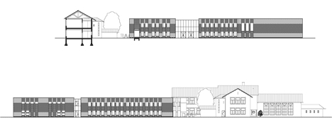
To complement the red and brown tones of the existing brickwork, architects Suzanne Ellis and Ieke Koning designed a two-storey extension with a timber facade, then added a ribbon of grey slate around its middle.
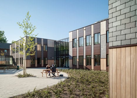
"The two buildings are in agreement with each other not only in form, but also in appearance, without being copies," said the architects.
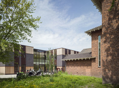
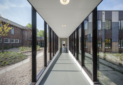
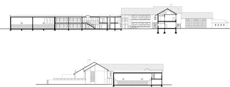
A glass tunnel leads from the renovated building to the new structure, which accommodates 12 classrooms, offices and a pair of sports halls.
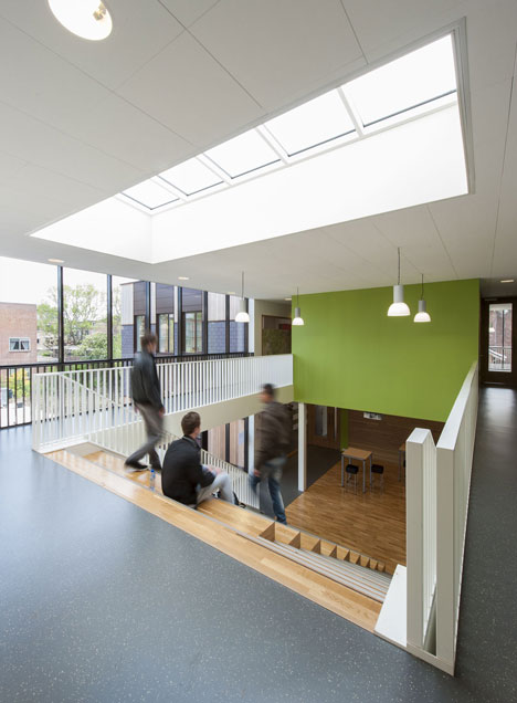
Rooms are arranged around a double-height atrium with a generous skylight. A wide staircase extends up through the centre and doubles up as seating, allowing the space to function as an informal auditorium.
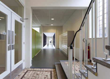
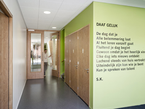
To create a "quiet, homely atmosphere", the architects used a simple colour palette of white, grey and lime green. They also added windows at the end of every corridor so that natural light floods through the building.
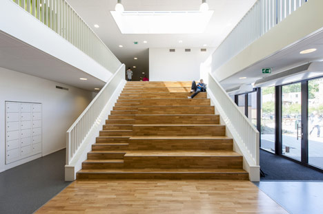
"White walls and ceilings combined with grey melange floors form a peaceful basis," explained Ellis. "For the frames, the staircase, floor and ceiling of the auditorium white oak was used, to add a neutral, natural and warm-looking material."
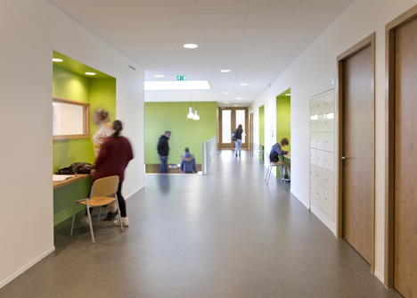
She added: "We only added one distinct colour - grass green. This fresh colour forms a stylish, modern combination with the oak."
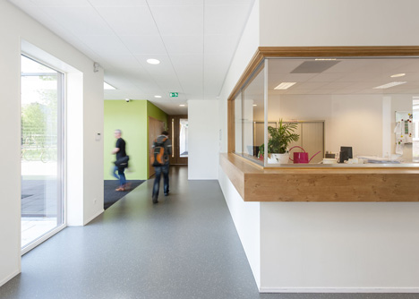
Each of the classrooms feature thick partitions walls, creating built-in storage closets on the inside and private workspaces in the corridors.
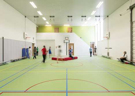
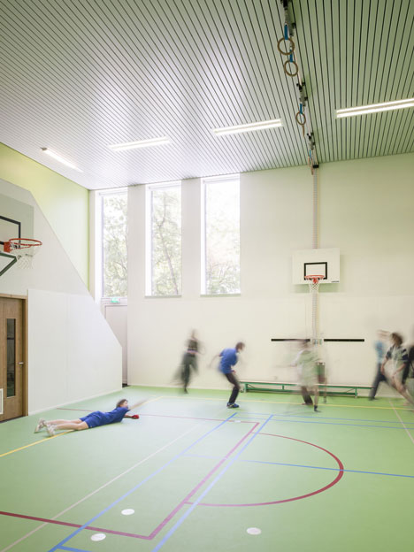
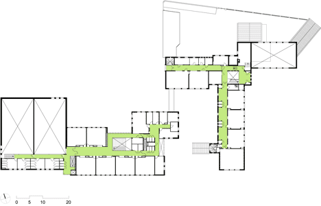
The two sports halls are housed at the western end of the building and feature first-floor viewing platforms for spectators.
Other recently completed school buildings in Europe include a timber-clad extension to a school near The Hague and a French nursery and elementary school with hilly rooftops that pupils can explore. See more school design »
Photography is by Maarten Noordijk.
Here's a more detailed project description from KoningEllis Architects:
Secondary School Haarlem
The Daaf Geluk School is a special-needs school, which means that it provides education for secondary school pupils who need more attention, guidance and help. The school offers tailored-made education and provides lessons in small classes of up to sixteen pupils.
Renovation and Expansion
Formerly, the 350 pupils of the ‘Daaf’ were spread over two locations in Haarlem. When the annex had to give way to housing, the school got the chance to come together on one site. The choice was made for renovation and expansion of the existing building at the current location. The expansion consists of offices, a communal space, twelve classrooms and two sports halls.
Design
For the type of pupils of ‘the Daaf’ it is important that the school has a quiet, homely atmosphere. Structure, clarity, peacefulness and security were therefore important conditions for the design. The layout ensures that there is always light at the end of the spacious corridors. The interior design has been kept basic and light, to avoid too much stimulation.
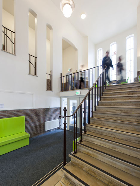
The heart of the school is the auditorium, where the broad wooden staircase, also functioning as seating for the stage, immediately catches the eye. The wood extends as a carpet in front of the staircase and at the end curls up into natural casing of the stage. A large skylight above the stairs makes the auditorium light and pleasant.
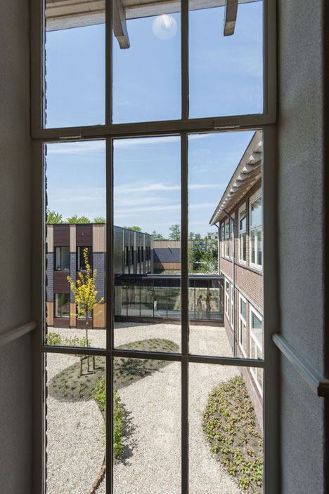
The building has been logically and cleverly planned. For example, the common areas are situated at the nodes and there is no wasted space. In the corridors smart double walls have been constructed. On the classroom side, there are built-in cupboards and on the corridor side there are recessed lockers and workplaces where pupils can sit and work quietly. Through the window the teacher can monitor them as well.
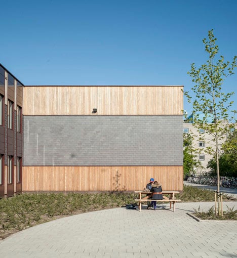
At the far end of the extension is a double gymnasium. The height in this part of the building is used for changing-rooms on the first floor and to provide a balcony where spectators can follow the activities in the gym. By providing the gyms with their own entrance they can also be used outside school hours.
Renovation
On the site they found a beautiful brick school building from the forties, but it didn’t meet the current requirements any longer and the original structure was not visible anymore. By removing the superficial interior additions and careful renovation of the primary structures, the architects were able to bring back the beauty of the original building. Constructive interventions strengthened the improvement of the routing and lines of visibility.
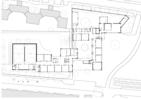
Sight lines are important to our design. From the new entrance square you look through the connecting corridor into the old building. The orientation of the buildings creates several outdoor areas: an entrance square, two playgrounds, and a secluded courtyard between the old and the new buildings. The old and the new are connected by a glazed corridor.
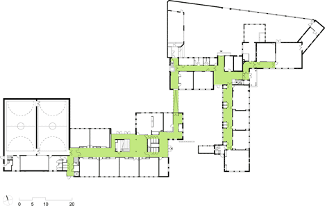
The new interventions were accentuated by using the colour green, which continues into the new building. To leave the historic appearance as much intact as possible, the iconic iron window frames were retained and renovated. Finally, a modern ventilation/air handling system was put in to improve the climate in the building. In this way the historic characteristics of the existing building have been preserved and the quality of the building environment has been optimised.
Exterior
The two buildings are in agreement with each other not only in form, but also in appearance, without being copies. The colour palette of the façade and the roof of the old building; brown and purple-grey, returns in the new building in contemporary materials such as preserved wood, aluminium and slate, all maintenance free materials. Hence the new building gets a warm feel to it, in tune with the old one, but still with its own character.
Around the school they put a ‘ribbon’; a horizontal stripe of purple-grey slate. In front of the entrance are the large steel letters ’DAAF’. The sign fits well with the modest building. No loud signs, just a stylish touch.
Detail
An aluminium strip ensures a tight transition between the different materials and gives the outline of the horizontal and vertical surfaces in the facade extra sharpness. The sun-blinds are hidden behind a removable panel. The technical drawings for the construction were not outsourced to ensure the quality of the design and to have maximum control during the building process.
Surroundings
With the same attention to detail the building was integrated into the environment. Also, the neighbourhood, welfare and preservation organisations were consulted. It was a puzzle to get the new building onto the plot. The new building doubled the volume of the existing school, and residential homes are close. That is why the appearance of the school has been kept modest. By using a light colour wood at the top and the bottom, the building looks friendly and inviting.