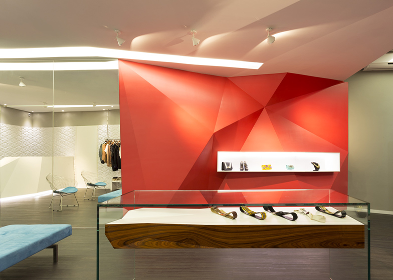
This boutique interior by Brazilian architect Guilherme de Vasconcelos features a red faceted wall that references the angular qualities of polished gems (+ slideshow).
Vasconcelos of GUIV Arquitetura designed the interior of the Las Chicas womenswear boutique that stocks Brazilian brands in Belo Horizonte.
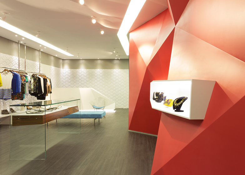
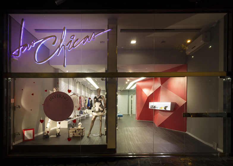
The faceted wall houses a small illuminated shelf for products. Made of triangular MDF polygons, it is finished in a red lacquer. "The project strategy is inspired by the process of lapping and polishing gems, which transforms raw elements of nature in precious jewellery with angular faces and bright colours," said the architect.
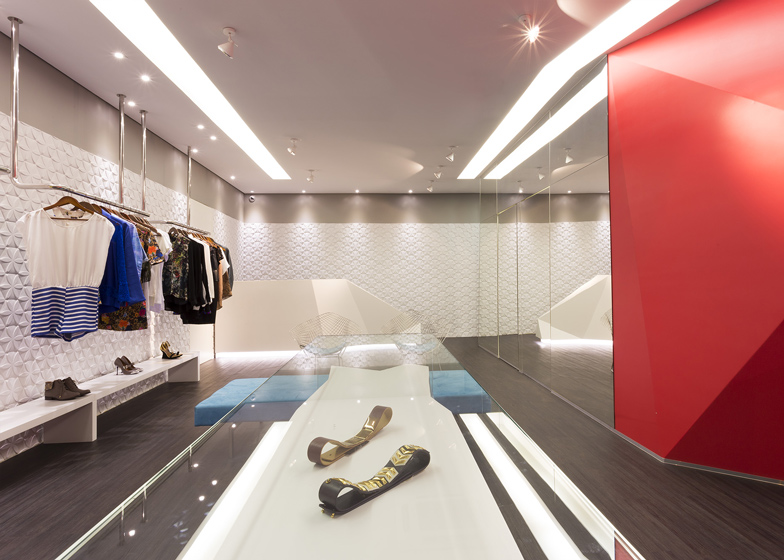
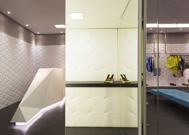
Large full-height mirrored doors hide two dressing rooms.
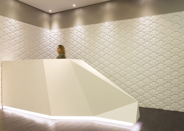
The white counter follows a similar triangular shape to the faceted wall and sits in front of a wall patterned with hexagons.
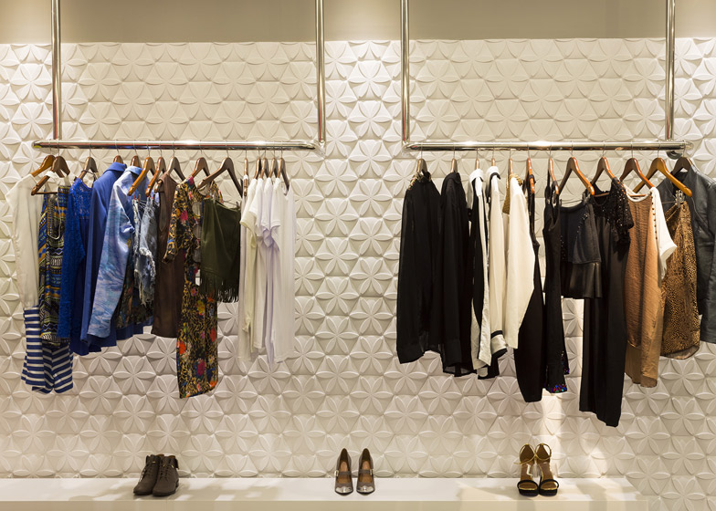
Women's garments are hung from tubular stainless steel supports.
Other retail interiors that have featured on Dezeen include a Stuttgart boutique featuring a textured wall of 22,000 wooden sticks and an extension of Paul Smith's London boutique with a cast-iron facade.
See more architecture and design in Brazil »
See more boutique designs »
See more information from the architect:
Las Chicas Boutique intends to be a reference space for fashion in Belo Horizonte and seeks to enhance the Brazilian design offering clothing and accessories of consecrated national brands to the female audience. Located at the traditional neighborhood of Lourdes, in a street with high pedestrian flow and moderated commerce, the Las Chicas Boutique also promotes periodically vernissages and meetings for professionals and connoisseurs of the fashion world.
The project strategy is inspired by the process of lapping and polishing gems which transforms raw elements of nature in precious jewellery with angular faces and bright colours. The objective was to integrate a large ambient, clear and enlightened and impactful elements with angular faces and well-defined lines, to capture the attention of pedestrians passing through the region.
In that sense, the faceted panel is the key piece of the store, not only for its scale, but also due to the function it takes as space articulator. Made by triangular polygons in MDF, each one different from another, and finishing in pink matte lacquer, the panel continues to the back of the store and hides two dressing rooms behind the mirrors.The counter uses the same language, with faceted geometry and offers space for two people to work comfortably.
The clothing exhibition is made by four tubular stainless steel supports. Accessories are exposed on the bench just below the plow, at the sideboard and in panel niche. The layout adopted allows the non-linear flow of customers, which can freely explore the space of the store, and on events days enables the rapid reconfiguration of the environment.
Architect: Guilherme de Vasconcelos (GUIV Arquitetura)
Photos: Gabriel Castro
Start of project: September 2012
Building Completion: March 2013
Built area: 130m²
Building Company: Gilberto Lacerda & Cia.
Woodworking: Marcenaria Monte Santo


