D&V Multibrand Store by Guise
Scandinavian architects Guise designed this retail space in Stockholm as a blank canvas for any fashion brand to display their garments against (+ slideshow).
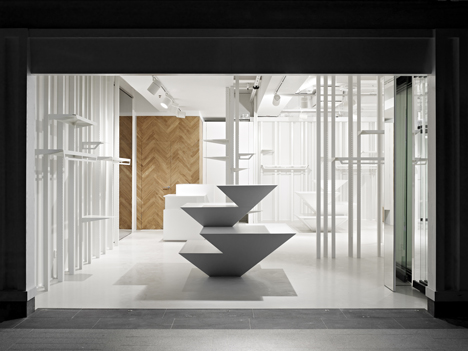
Guise designed the white interior of the D&V Multibrand Store to provide a neutral background for different retailers.
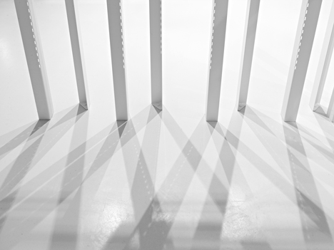
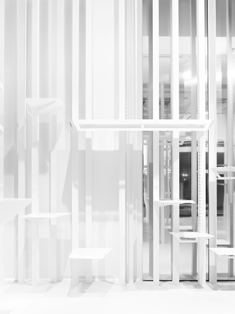
Powder-coated steel pillars have perforated corners to accommodate a flexible steel shelving system and also allow clothes to be hung directly from the holes.
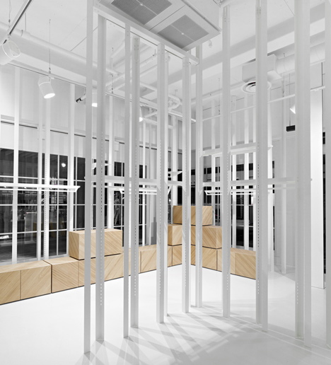
The pillars are arranged in staggered lines and spread throughout the store, grouped for garments designed by different clothing labels.
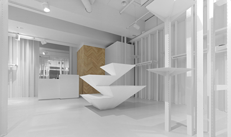
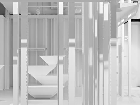
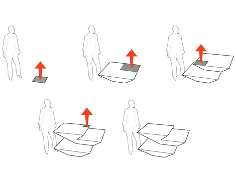
Central display units are made of asymmetrical stacks of angled boxes, which each flare outward from their bases to create more surface area on top for folded items.
"We used a floor area of 40 by 40 centimetres, equivalent to one folded shirt," said the designers. "This area was designed to grow into a table with a surface for seven shirts. This was repeated until the table offered an area for 20 shirts."
Oak-clad storage boxes line the edges of the shop and the cash register covered with toughened glass. All pieces of furniture were custom made for the store.

Guise have also designed custom-made furniture for this Stockholm shoe retailer.

Photography is by Brendan Austin.
Here is some more information from the architects:
We used a floor area of 40x40 cm, equivalent to one folded shirt, this area were designed to grow to a table for 7 shirts. This logical course of action was repeated until the table offered an area for 20 shirts. The final shape is a result of this commercial rationality, making a 20 times profit in display area.
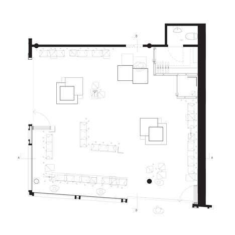
Being asked not to have any specific garments or brand in mind the space was designed as a neutral space similar to a warehouse. White and with no branded features, hence the empty photos.
We designed a L-shaped beam with a perforation along the corner. Shelves were custom designed to fit the perforated pillars. The beams were distributed asymmetrical around the store, like a forest of pillars where clothes can hung or be placed according to every new items needs.