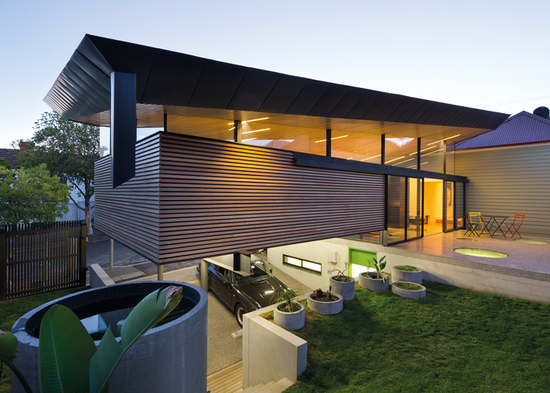
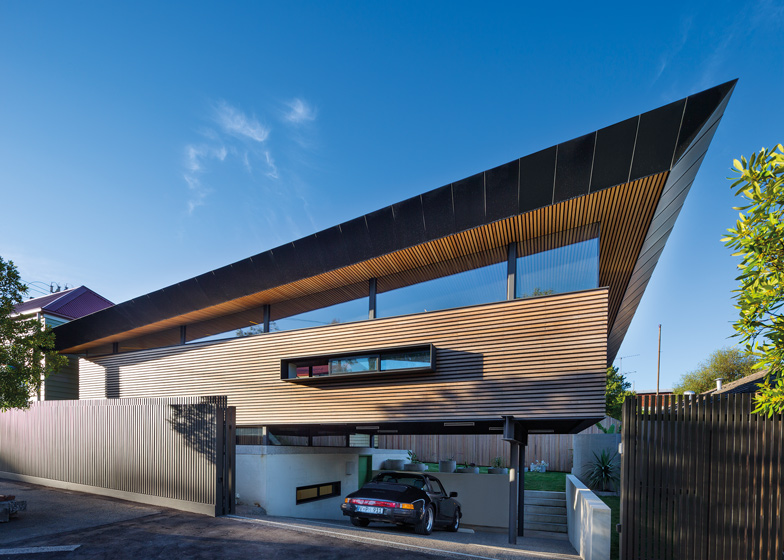
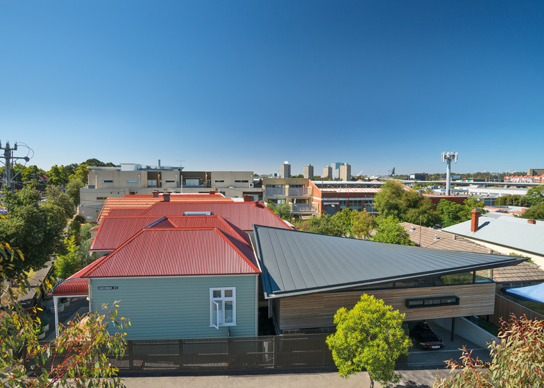
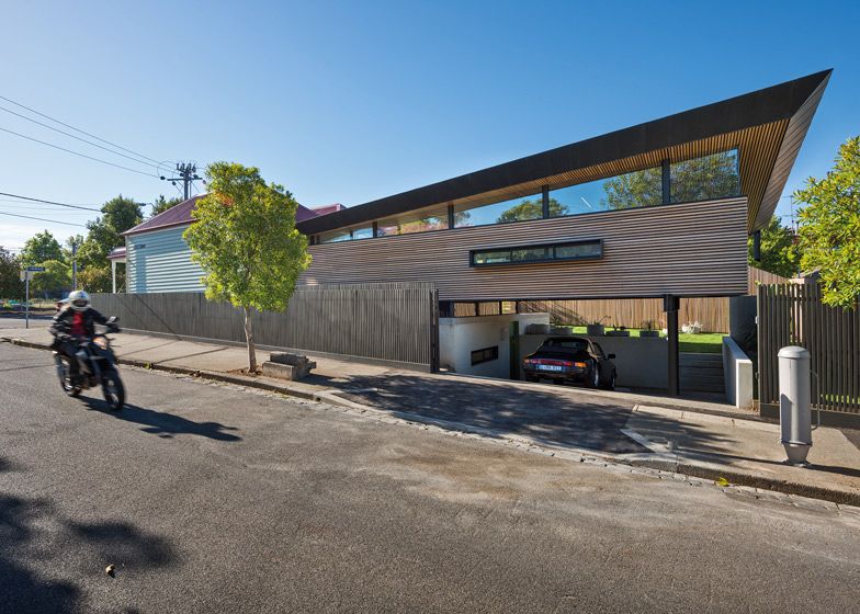
A twisted angular roof oversails this extension to a suburban house in Melbourne by Australian architects March Studio (+ slideshow).
March Studio, which is best known for designing a series of stores for Aesop, was tasked with renovating an existing bungalow in Kensington and adding an extension that doubles the size of the interior.
For the existing house, the architects retained the Edwardian facade but re-planned the interior to accommodate only bedrooms and bathrooms.
The new two-storey structure extends from the rear of the house. The architects excavated part of the ground, allowing them to create a concrete basement and parking area with a timber-clad ground-floor level above.
"The new extension is not meant to be sympathetic to an older style but rather has been shaped by the clients' brief, solar access and one of Melbourne's best views back onto the city," said the architects.
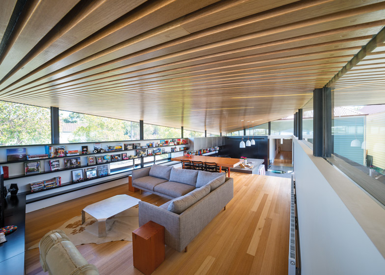
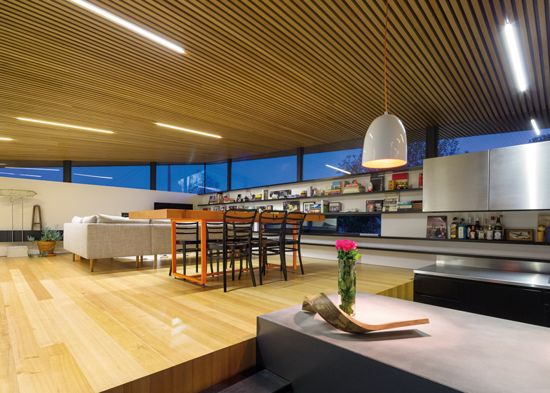
The angular black-zinc roof extends over a large living and dining room, and is angled up at two corners to allow light to filter in through clerestory windows.
"This simple twisting operation grabs light and views," said the architects. "The action and drama of the twist is expressed and amplified on the ceiling below by a series of hand-plugged timber battens."
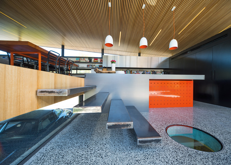
The concrete structure on the level below contains a children's playroom with circular glass skylights overhead, as well as a wine cellar, a laundry room and a bathroom.
A car can be parked beneath the projecting upper level, while a terrace and garden are positioned just beyond.
The building is named Mullet House, as a reference to the hairstyle that different at the back than at the front. According to the architects, a passerby has described the house as "formal up front with the party out the back".
Here's some text from the architects:
Mullet House
Situated in Melbourne's inner-city suburb of Kensington, 'The Mullet' performs contorted gymnastics in order to facilitate an ambitious brief on a small, yet opportunistic site.
The clients, Scott Smith and Phoebe Moore, wanted to commission not only a new and comfortable home, but also sought a challenging design. Running a family business in construction, Scott and Phoebe's own home would become an opportunity for them to showcase their own capabilities.
A Heritage overlay shaped the design for the front of the dwelling, requiring that the cottage facade and first few rooms flanking Hardiman Street be retained and renovated, (red roof and all). This is where the formality is, the face to the heritage land of Eastwood Street blends seamlessly with its cottage neighbours. Three bedrooms and two bathrooms are resolved into the pre-determined Edwardian shell, freeing up the new extension for the living areas.
The fun begins to emerge when rounding Hardiman Street. 'I don't like it' - says one of the locals half way through construction. 'It's not in keeping with the area…' The new extension is not meant to be sympathetic to an older style but rather been shaped by the clients' brief, solar access and one of Melbourne's best views back onto the city.
The balancing act that the local resident detested emerged when the brief called for off-street parking. The house would straddle the parking area, and even with the grade of Hardiman Street to advantage, excavation was unavoidable. Since a digger would be coming to site anyway, the opportunity to dig a little deeper and sink a large concrete box (along with the children in it) was far too good to refuse.
Buried within the concrete box is the rumpus room, wine cellar, laundry, and an additional bathroom. The box is capped with a concrete lid and garnished with strategically placed, trafficable glass skylights. The monolithic form anchors the new building into the side of the hill and is finished internally by the rough reality of building - and being - underground.
The concrete lid of the concrete box is not only the ceiling for below, but also the floor in both the kitchen and exterior deck. The pivot around which the other spaces are spun, the kitchen serves all parts of the house, while the dining and living areas are tucked up above the garage and closer to the night sky of Melbourne's city lights. Timber battens clad the extension, wrapping the three spaces together and providing a linear base for the last hovering piece.
Soaring above the living spaces is the black zinc roof. On the northern edge the roof is pulled up to increase natural light to the northwest corner, and pushed down to the neighbouring building on Hardiman Street on the northeast, so as not to overshadow it. On the south side, the operation is reversed, and the southwest corner is lifted to create a framed view of the city. This simple twisting operation grabs light and views from two corners and anchors the remaining two with rain heads falling to collection tanks. The action and drama of the twist is expressed and amplified on the ceiling below by a series of hand-plugged timber battens.


