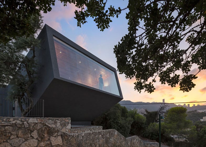
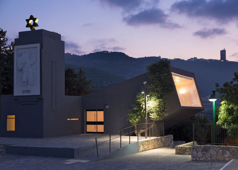
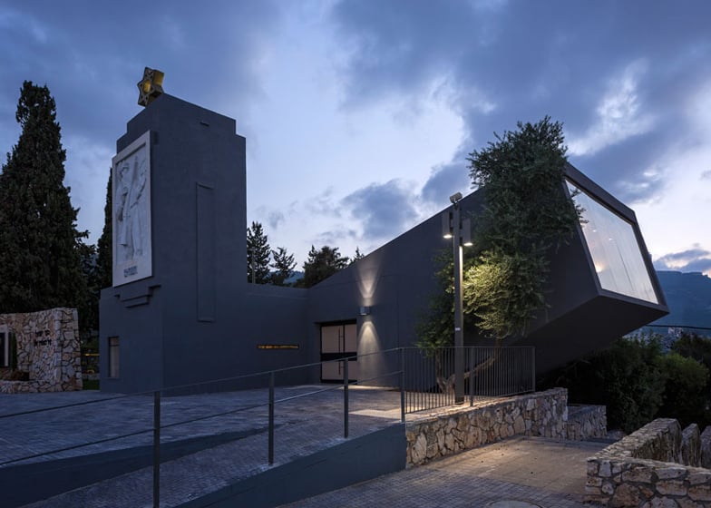
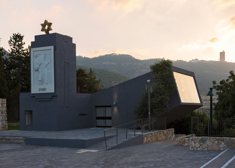
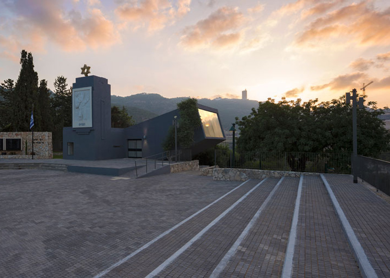
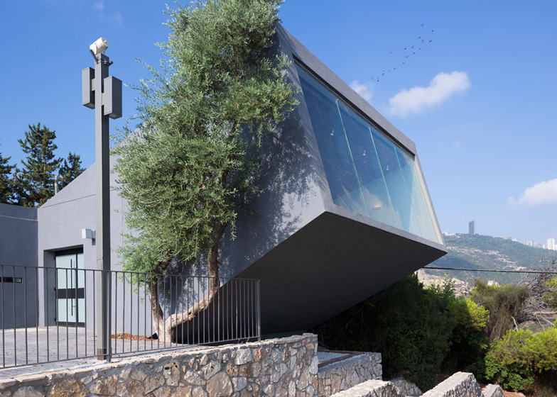
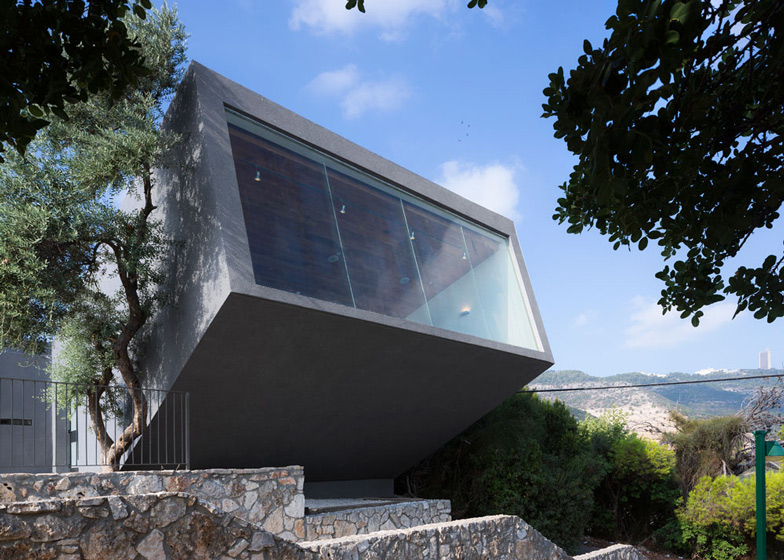
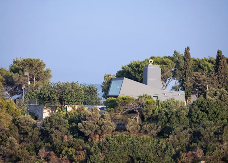
Israeli studio SO Architecture added this auditorium and gallery to a hilltop war memorial in Nesher, Israel, and tilted it upwards so that it faces towards the sky (+ slideshow).
SO Architecture designed the concrete auditorium building as an extension to the existing structure, which commemorates Israeli soldiers that died in the 1948 Arab–Israeli War but previously was only used once a year on the country's national memorial day.
The new building provides a community hall for events, film screenings and other activities, as well as an exhibition gallery charting the history of the site, which served as a guarding post during the war.
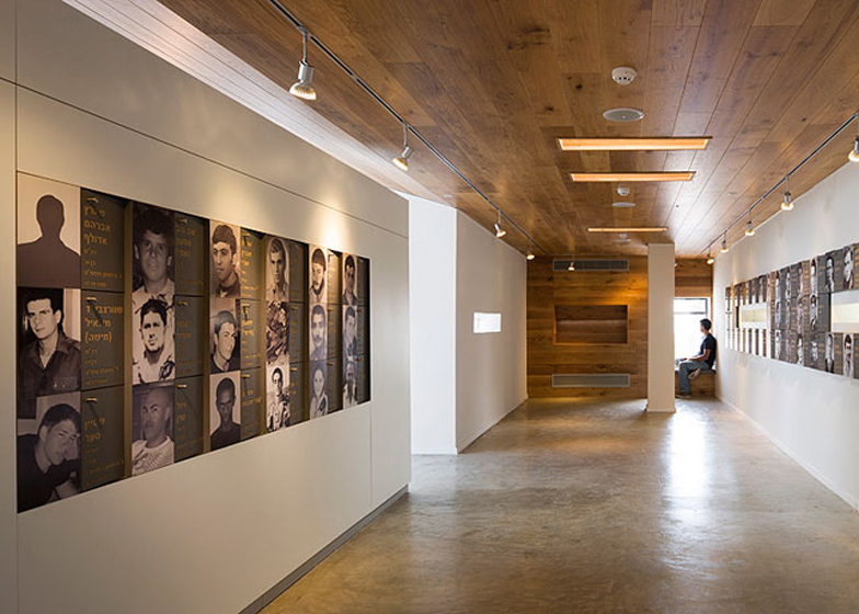
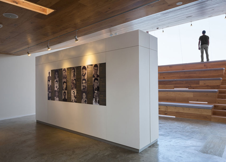
The exhibition space, called the Remembrance Gallery, is filled with photographs of fallen soldiers. These cover boxes installed along the walls, where victims' families can store items that preserve the memories of their loved ones.
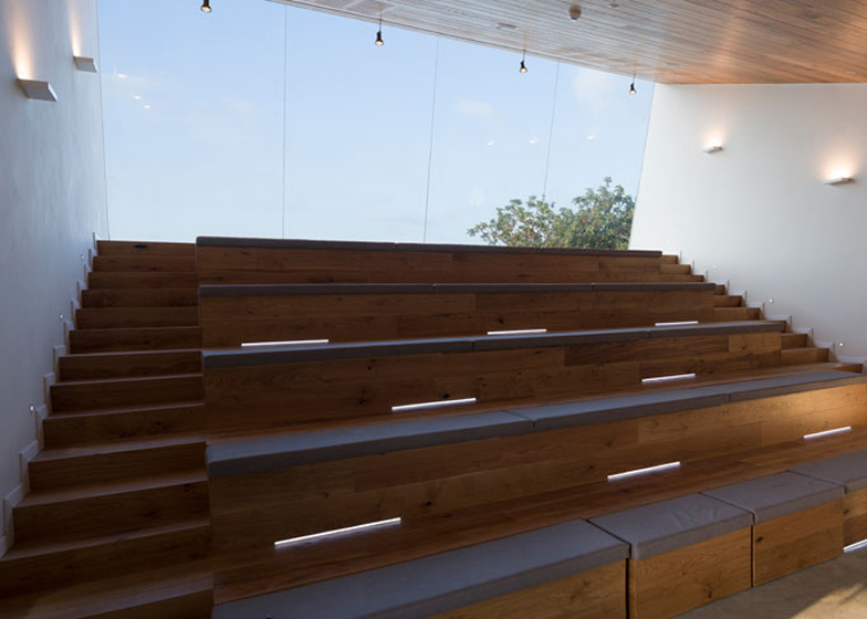
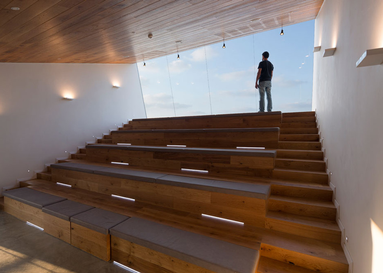
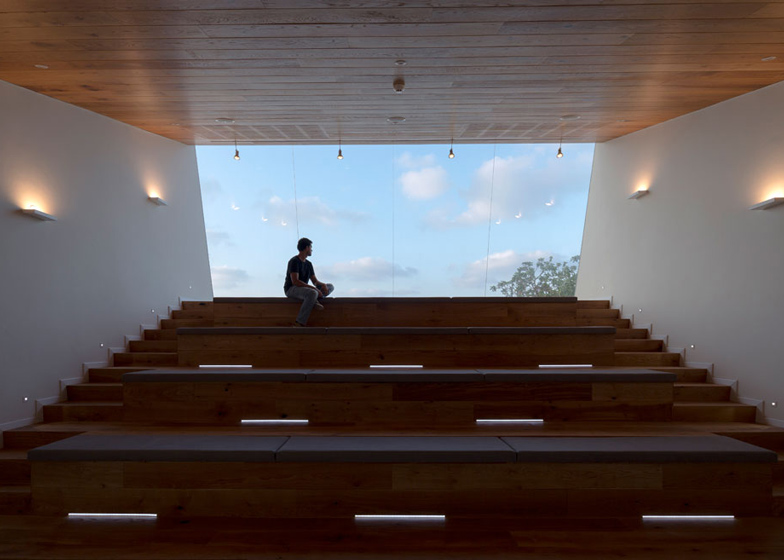
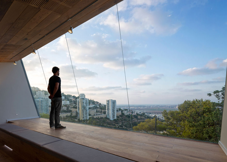
In the auditorium, rows of ascending timber bleachers provide seating, while a large window fills the space with light and offers a view out over nearby Haifa Bay.
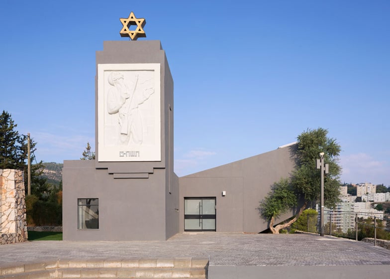
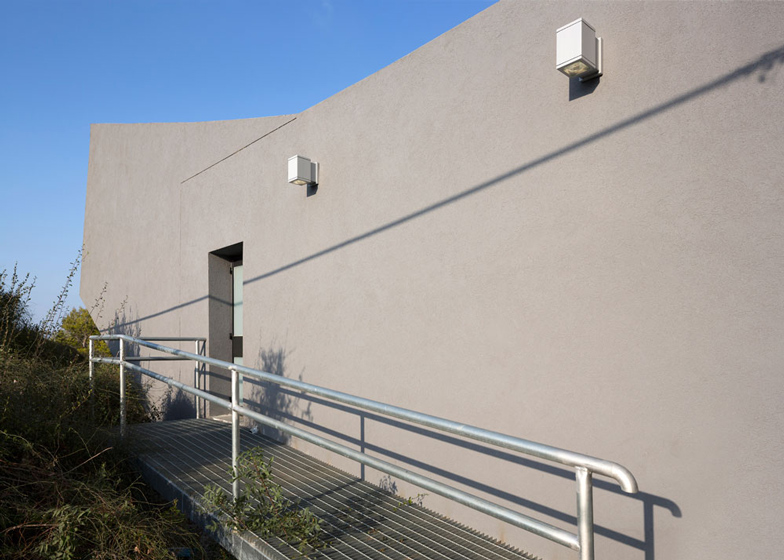
Dark grey paint covers the exterior of the extension, uniting it with the existing memorial. A concrete plaque adorns the side of the old tower, and a golden Star of David is positioned at the top.
"The concrete relief was made in the 1950s by the artist Michael Kare as part of the transformation of the building from guarding post to a memorial," added the architects.
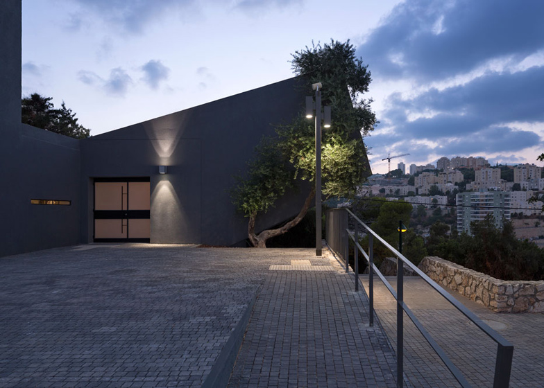
Stepped landscaping and a viewing platform have been added to the south of the site, joining an existing limestone square and a children's playground.
SO Architecture also designed the Yehiam Memorial Hall at Kibbutz Yehiam - another building that commemorates the 1948 Arab-Israeli war.
Photography is by Shai Epstein.
Here's a project description from SO Architecture:
Nesher Memorial
Nesher Memorial was built on a basis of an historic preservation building that was used in the past as a guarding position. In '48 war the position's used as protection to the residents of Giv'at Nesher. The building is located in the heart of a quiet neighbourhood, on a hilltop, surrounded by a large square and a children's playground.
Prior to the construction works, the building was neglected and was used in favour of the public only once a year – in the National Memorial Day, then it was open for a tour and impression of memorial pictures, as a part of the public ceremony for the memory of the fallen.
Nesher municipality asked SO Architecture office to expand the square surrounding the building so it will enable multiplayer events, and to redesign the building and add functions to it, so that it can serve the public throughout the year as a gathering space.
The main architectural idea was to add to the existing building an auditorium structure that could be used for different kinds of public activities such as lectures, film screenings, activities of youth groups, etc., along with preservation of the historical memory.
The auditorium
The auditorium reveals its insides geometry to the park and the city surrounding, by its inclined façade. This geometrical act has an additional meaning in creating a symbolic geometry that communicates with the memorial concept, and the function of the building as a monument.
A large window is located at the edge of the auditorium, facing north and thus brings a soft light into the auditorium and enables a breathtaking view at the landscape of Haifa bay. In a poetic allegory to reality, the window function as a bright ending to the inner space, and thus symbolises the balance between the bereavement pain and the light and hope in the living world.
The memory space
A box for each fallen, with its picture on it, is hanged on the wall of the memory area inside the building. Inside it, there is a room for storage of memorial personal belongings that the family and the municipality can put. In the space itself there is a place for seating and communion with the memory books and the memory of the fallen.
The centre of the memory space is lighted by long and narrow windows that were the shooting slits in the original guarding position, and by upper skylight windows from the original historic building. The memory space was designed in a modular manner, so that if necessary, it will be possible to add additional boxes without any difficulty.
Finishing materials
The original building contours regarding to the addition, are marked and highlighted through aluminium bars that were sediment in mortar and emphasise the contours of the old building regarding to the new addition.
The materials that we used in the building are simple.
The floor in the memory space is a concrete floor. The ceiling along the whole building is covered with oak planks, so that it creates a warm atmosphere. The auditorium area was also covered with wood, and sponge padded seats. An access to disabled was also arranged.
The square
The gatherings' square on the front of the building, was designed on the basis of the existing square. The works in it included suitability and accessibility to the disabled, creating grandstand steps in the edges to enable a more comfortable viewing, and an addition of another viewing site at the southern end of the square. The finishing material of the square is a visible concrete that delimits the steps, and grey concrete blocks.
Architects: SO Architecture www.soarch.co.il
Planning team: Shachar Lulav , Oded Rosenkier , Alejandro Feinerman , Tomer Nahshon, Samer Hakim.
Site Area: 1100 Sqm
Building Area: 118 Sqm
Year: 2013

