Roof and Mushrooms pavilion by Nendo and Ryue Nishizawa
Japanese architect Ryue Nishizawa has teamed up with design studio Nendo to create a hillside pavilion, filled with stools designed to look like troops of wild mushrooms (+ slideshow).
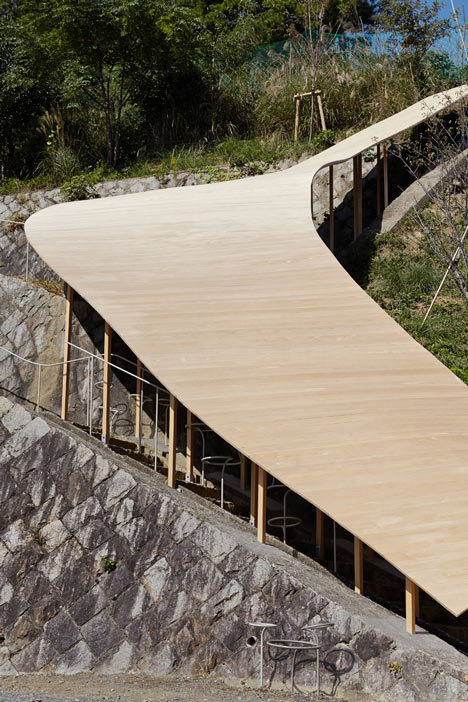
Nishizawa, who is best known as one half of architecture duo SANAA, worked with Nendo to construct the wooden pavilion on a steep hillside on the campus of Kyoto University of Art and Design.
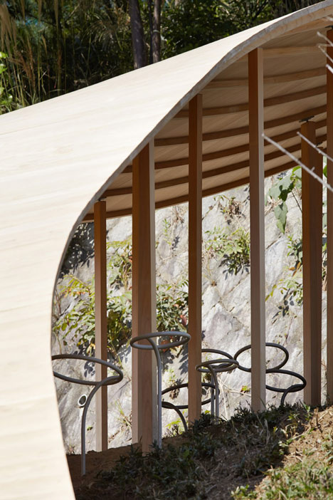
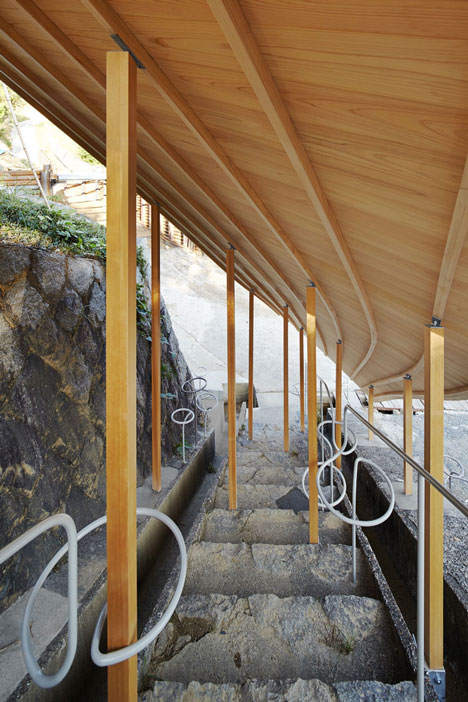
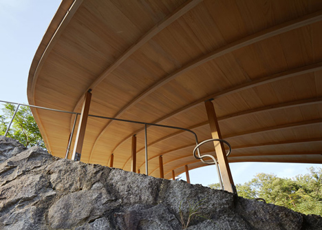
The smooth timber roof of the structure follows the incline of the hill and is supported by dozens of narrow timber columns. In some places these are anchored into the ground and in other spots they are fixed to the surface of an outdoor staircase.
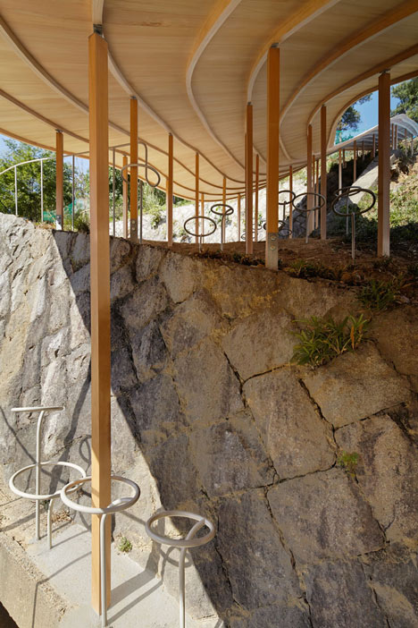
"The pavilion's spatial experience is intended to remind visitors of walking in the mountains under thick tree cover," said the designers.
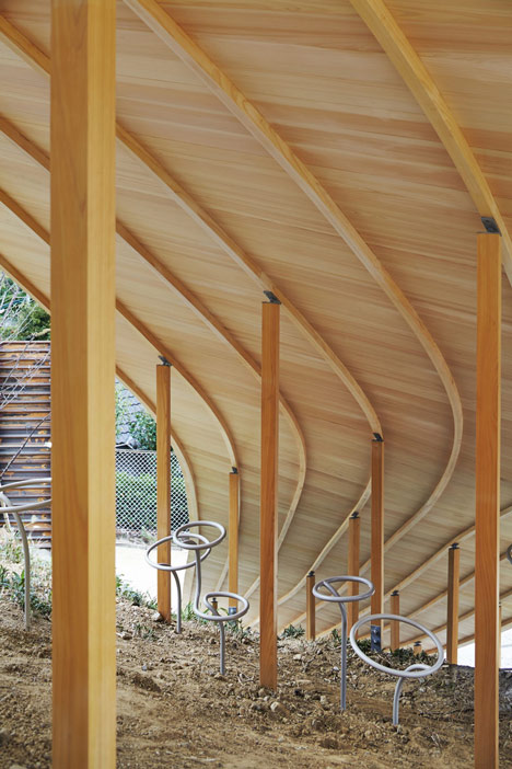
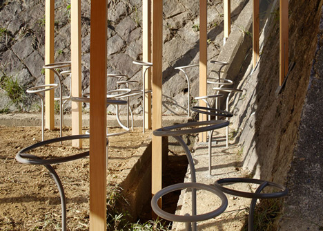
Curved steel tubes were used to make a series of stools both inside and outside of the shelter, and were designed with different shapes and sizes to mimic the way fungi grows in the wild.
"We wanted to design architectural elements that would 'grow' naturally from the space, rather than to put furniture in a room," the designers explained.
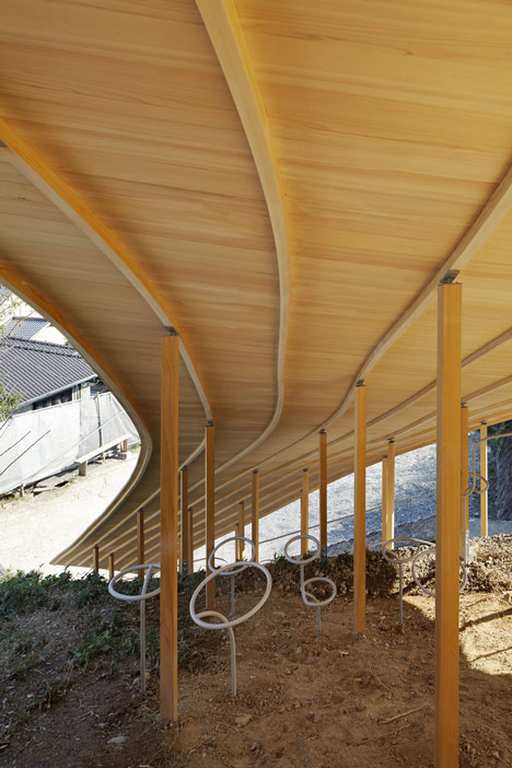
Some stools form an extension to the staircase balustrade, while others wrap around columns and some interlock with one another.
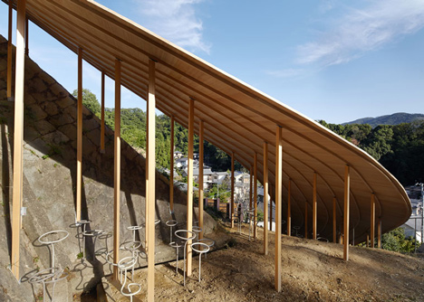
The university plans to plant a grove of Japanese plum trees on the site next to the pavilion. "Their fragrant early spring blossoms will only add to an already beautiful site," added the designers.
Here's a project description from Nendo:
A small pavilion "roof and mushrooms" in Kyoto
A small pavilion on the campus of Kyoto University of Art and Design, born from a collaboration between architect Ryue Nishizawa and design office nendo. The location: a steep hill face covered in luxurious vegetation.
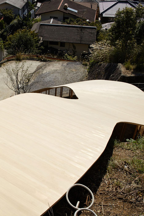
On a clear day, you can almost count the 36 crests of the hills that line Kyoto's eastern edge. The adjacent area is earmarked for a new grove of Japanese plum trees, and their fragrant early spring blossoms will only add to an already beautiful site. Nishizawa used a single roof to incorporate these elements into the pavilion's design.
The roof is subtly inclined to follow the angle of the site. Dipping under it, visitors realise that the roof, delightfully and ambiguously, is also a wall.
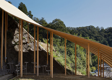
The pavilion's spatial experience is intended to remind visitors of walking in the mountains under thick tree cover.
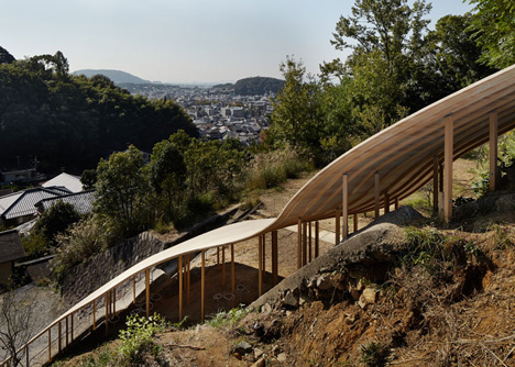
To date, many of Nishizawa's buildings have felt like bright, open and airy fields or gardens, and the furniture inside them like wildflowers that blur the boundary between interior and exterior space while adding brightness and colour.
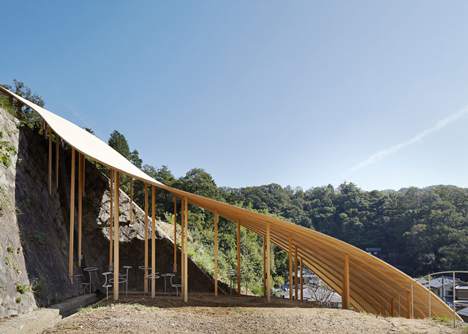
But for the shady interior of this wooden structure, clinging onto the hillside exposed to the elements, we thought that furniture like fungi would be much more appropriate.
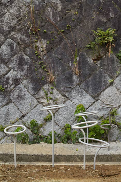
Our mushroom-like stools for the space were handmade by artisans to slightly different shapes and sizes, giving a more natural effect.
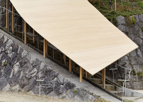
The stools' layout - clustered at the base of pillars, or in the nooks and crannies by stone walls and staircases - evokes the way that mushrooms growing the wild, and details like a handrail that transforms into a mushroom continue the metaphor.
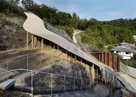
We wanted to design architectural elements that would 'grow' naturally from the space, rather than to put furniture in a room.