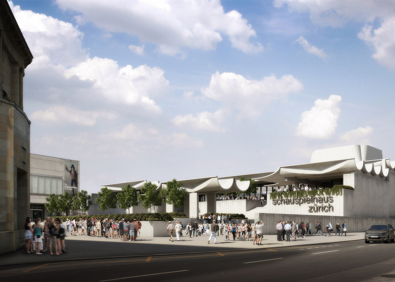
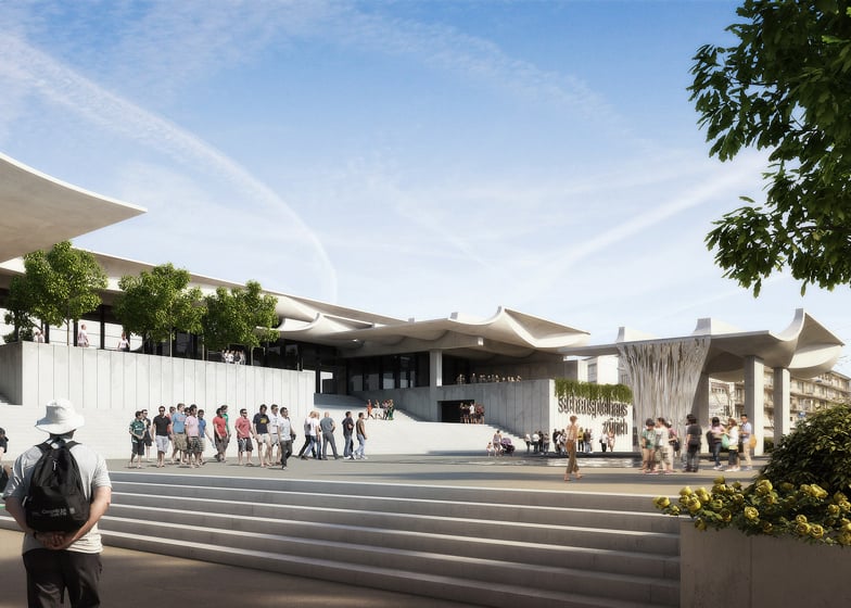
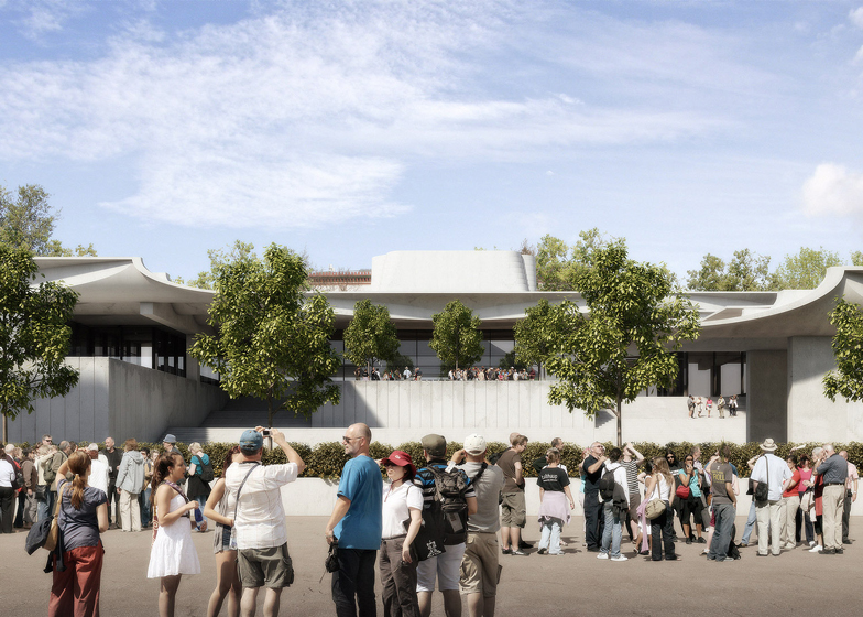
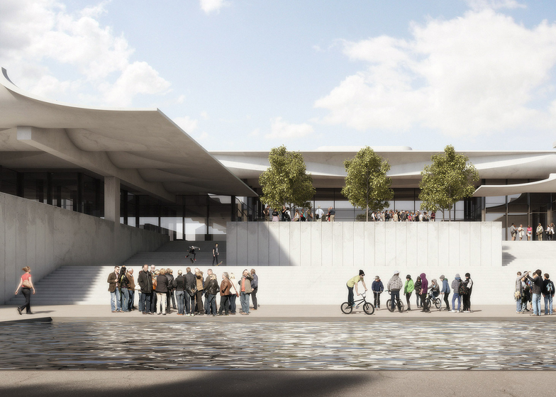
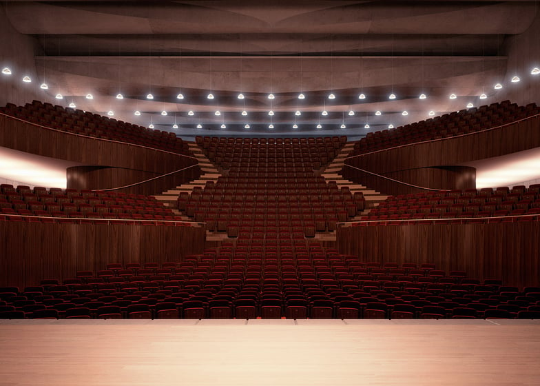
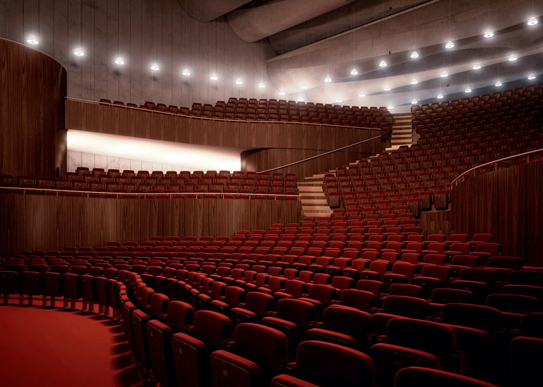
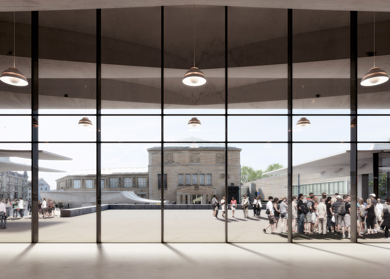
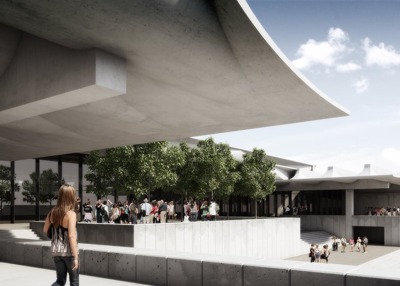
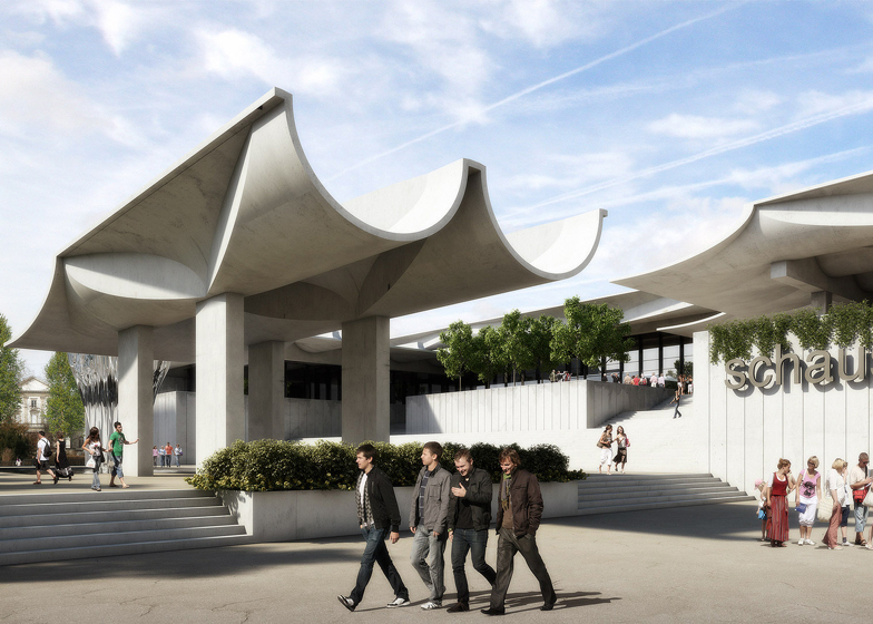
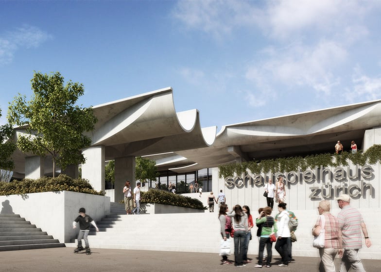
News: Swiss studio Virtual Design Unit has created a computer model of an unbuilt Zurich theatre designed by Jørn Utzon in 1964, to show that the building "could be built now" (+ slideshow + interview).
"We saw the project that Utzon did in 1964 and we were curious if this project could still be there today, or would be better than all the suggestions that have been made [for the site] in the last 20 years," said Susanne Fritz of Virtual Design Unit. "It could be built now."
Utzon, the Danish architect best known for the Sydney Opera House, won a competition 50 years ago to design the Schauspielhaus on the spot next to the Kunsthaus in Zurich, Switzerland, but after a decade of planning the project was abandoned.
Local opposition to David Chipperfield's proposed extension to the Kunsthaus on the same site prompted Virtual Design Unit, co-founded by architects Fritz and Patrick Schöll, to revisit Utzon's design in the hope of demonstrating that the building could still be an icon for the city today.
The images show the building as it would appear today, with a slightly weathered facade as though it had been build ten years ago. Fritz said the images could help show the people of Zurich how the building would fit into the cityscape - something Utzon was unable to do at the time.
"It's a theory that [Utzon's] project wasn't successful because the people of Zurich couldn't imagine what it would look like," Fritz told Dezeen. "There was a wooden model built but I think [digital] visualisations make architecture assessable for many people. The visualisation shows, in a photorealistic way, the building in context where it could be."
The project is the first known example of an unrealised architectural icon from the past being resurrected in this way. In a recent interview with Dezeen, rendering expert Peter Guthrie said 3D visualising techniques made architecture easier for the public to understand. "It makes un-built architecture more immediate and allows for greater conversation about the built environment," he says.
Virtual Design Unit's reconstruction was based on documents from the city's archives and plans belonging to Utzon's family. They knew the son of Utzon through a friend and he helped to advise them on details and put them in touch with the project manager who worked on the original design.
"We were detectives putting things together and building this thing in 3D," said Fritz, who created the 3D model in Cinema 4D and rendered in V-Ray, then the post-production work was done in Photoshop. "We had to have a lot of creativity in the interior; we still don't know how the interior would look because they didn't go too much into the detail on the plans."
The team made decisions about how Utzon may have designed the auditorium based on details of the Sydney Opera House, and chose lighting and fixtures based on knowledge of suppliers who were around at the time.
The most striking feature of Utzon's design for the Schauspielhaus is the wavy concrete roof. "He was always a fan of these concrete shells and he was always trying to get the climax of the diameter of the concrete," she said. "His shells were kind of the same concept as in the inside of the Sydney Opera House: they were very good for the acoustics."
The building was designed to step up gradually from the plaza so the entrance was on the same level as a park on the opposite side. "It's a very horizontal building but I think this platform is the main attraction of the building - that you were on another level of the city, above the ground and a bit in another world."
Virtual Design Unit is now talking to Marianne Panton about creating a "virtual refurbishment" of the famous canteen designed by her late husband Verner Panton for the Hamburg headquarters of the publishers of the Spiegel magazine in 1969. "The difference this time is that we have photo material showing what it actually was, so there's less interpretation about the furniture they used," Fritz noted. "There is a desire to revisit this building and this way you could revisit it virtually."
Here's a transcript of the interview with Susanne Fritz:
Rose Etherington: How did the project come about?
Susanne Fritz: In Zurich there is a political discussion about what is going to happen to this place - whether it's going to be an extension of the Kunsthaus museum - and then we saw the project that Utzon did in 1964 and we were curious if this project could still be there today, or would be better than all the selections that have already been made in the last 20 years.
We had been digging into the city's archives and we found all these plans for the competition but no detailed drawings. Then, knowing the son of Utzon, we called him to ask if it would be okay to give us more information and plans out of their archives. He did so and put us in contact with the project manager who worked on the competition but lives in Turkey now.
They gave us more detailed information about the building and helped us out. We were detectives putting things together and building this thing in 3D, then we showed them the images and they liked it.
Rose Etherington: How much detail was included in the archive material? Did you have to use some creativity and fill in the blanks?
Susanne Fritz: We had to have a lot of creativity in the interior. We still don't know how the interior looks because they didn't go too much into the detail of the plans. Looking at the interior of the Sydney Opera house, we came to some conclusions about how we could have done that. Then let's say for the lighting, in Scandinavia there weren't so many lamps available compared to today so it was kind of an interpretation thing but it was signed off by Jørn Utzon's son.
Rose Etherington: Do you think this building would have been a better building for the site than the one that is being proposed?
Susanne Fritz: Well it would definitely be a very interesting building but the problem is that Utzon didn't pay a lot of attention to the site and the whole restructuring of the whole area would be necessary and demolition of buildings which are under protection.
So I think the architectural project is great but you also have to pay attention to the people who are quite conservative. They don't want to demolish buildings which are of heritage or historical value and I think if you are an architect, you have to pay attention to that sensitivity in the project. From only an architectural point of view, I think it would have been a great building in the right position.
Rose Etherington: Is that why it wasn't realised at the time? Because it wasn't right for the site?
Susanne Fritz: It was because they wanted to spend 27 million on the project and then he changed the building so they had to reorganise the traffic. First they tried to put the traffic underground and then through the building, it got a totally different dimension, and suddenly it was more than twice [the budget] and it got really expensive. The demolition of these old buildings was also an issue.
There was this rumour from Sydney. What happened [with the Sydney Opera House] was that Utzon couldn't finish the project and started changing things. He wrote a letter to the minister and said that he can't work under these conditions and the minister thought that this was him resigning from the project and obviously quit with Utzon and hired another architect.
All the other architects were against this and voted for Utzon but of course there were also people who thought it was his fault, that he didn't have the capacities or the experience to do that large building, so there was some stress and some people thought that he couldn't be trusted.
I think it was a combination of a couple of things [that led to the Zurich project being abandoned] and no one knows for sure. We don't know what the City Council talked about in their session. They suddenly abandoned the project after seven years of planning.
Rose Etherington: Can we talk about Utzon's design? What his main idea for the building?
Susanne Fritz: He was always a fan of these concrete shells and in Sydney they thought that it couldn't be possible to do such a big shell. He is always trying to get the climax of the diameter of the concrete. Concrete shells were his speciality and he applied that [with the Schauspielhaus] again. His shells were kind of the same concept as in the inside of the Sydney Opera House: they were very good for the acoustics. He said that he wanted to transfer the image of the wave to this building.
Rose Etherington: Are there other features that are distinctive to his work in this building?
Susanne Fritz: The original idea that the Zurich people liked was the main hall was not a hierarchic interior, where you have different levels and then the balconies. He skipped the balconies and ended up with one big floor, and there's no social distinction between the first and second balcony.
Rose Etherington: What would it have been like for the visitors of the building?
Susanne Fritz: I think for him how you approach a building was very important, so the building kind of slowly rises and steps over the place and there's a little hill with a park on the other site. So when you go up to the entrance you would have been on the same level as the park opposite. I think it would have been very a very nice view and also you'd be above the ground and a bit in another world. And then you could wonder in this building into the different halls. It's a very horizontal building but I think this platforms is the main attraction of the building - that you were on another level of the city.
Rose Etherington: It looks like there's a waterfall coming off the edge of the roof.
Susanne Fritz: Yes that's an interpretation. We thought that could be nice, but we don't know if it was planned.
Rose Etherington: Have you always been a fan of his work or was it this particular project that got you interested?
Susanne Fritz: I really love his work and I really love concrete architecture. I mean Utzon was also a great engineer. Of course he worked with Ove Arup, but all the architects gave up because they couldn't solve this big shell problem. Because he was always studying bionics, he looked at nature and he took the static rules of nature and translated them into building. He was one of the first architects to do that and that's really admirable.
Rose Etherington: What capabilities do realist rendering techniques give us now?
Susanne Fritz: The greatest possibility is that you can make these designs accessible to everybody. It's a theory that [Utzon's] project wasn't successful because the people of Zurich couldn't imagine what it would look like. There was a wooden model built but I think [digital] visualisations make architecture assessable for many people.
Some say that these visualisations don't leave room for interpretation, which is true. With a sketch you can have much more interpretation and I'm sure if he made detailed imagery it might have had the same effect. But the visualisation shows, in a photorealistic way, the building in context where it could be.
Rose Etherington: Do you think if Utzon had access to these kind of visualisation techniques at the time that the project might have been successful?
Susanne Fritz: I think it could have been a way, because people are open to many kinds of aesthetics and architecture. I think [Switzerland] is a really progressive country in terms of architecture and there could have been more people who supported the project because the people of Zurich have a voice and they will raise it and they will raise issues if they want something or if they don't want something.
Rose Etherington: What will you do with the images now?
Susanne Fritz: We are planning an exhibition but we want to wait a bit because we have another project in the pipeline. I met Marianne Panton, the wife of Vernor Panton. The famous Spiegel Canteen [designed by Panton for the Hamburg headquarters of the publishers of the Spiegel magazine in 1969] is not there anymore and there are lots of images for it, but actually the project isn't documented very well. So we want to get out the plans again and work with Marianne Panton to get books and information. We might also rebuild this building, and the building was once there and it's not there anymore, so we're doing a virtual refurbishment. We thought we could do both things and then make an exhibition about both things.
Rose Etherington: Is there anything different about doing a virtual refurbishment rather than a virtual build?
Susanne Fritz: The difference this time is that we have photo material showing what it actually was, so there's less interpretation about the furniture they used etc. Right after we heard about it, they rebuilt the canteen in an exhibition because the canteen is so famous. That proves that there is a desire to revisit this building and this way you could revisit it virtually.
Rose Etherington: Have you ever recreated a building from the past?
Susanne Fritz: No, the Schauspielhaus by Jørn Utzon is the first. Normally we're creating architecture which we know is never going to be built, though. There are companies who want to place their product in a context of architecture, so we design the architecture for them virtually and place the product and shoot a photo which they use for marketing purposes. We act as architects, we draw plans, we built it in 3D to be built. We're working on a catalogue. We would also write the text for it. We're acting as art director and visualisation and text provider.
Rose Etherington: Did you want to try and make the Schauspielhaus appear as if it was new or as if it had been there since the 1960s?
Susanne Fritz: If you look at the images now it looks like a concrete building after a facade clean. We don't make it look old or used. The the way [the images] look now is as if it was built 10 years ago, but if it would have been built in the 1960s, it would look different.
We talked about if we wanted to make it look like in the 1960s, rendering cars and people from the 1960s, but we wanted to put the building in today's context rather than looking at the past because we think there's a discussion about what to do with this place. There's different money going into different studies and competitions, so you could pull out a super nice project and it could be built now. I mean they would have to modify it, but yes it could be built now.
Rose Etherington: Do you think renderings need to look a bit dirty to seem real?
Susanne Fritz: A lot of people do lots of renderings that look sleek and clean. They all look the same because the building standard is similar. You have parquet flooring, furniture that is minimal, Modern architecture with big windows - beautiful architecture -but I think they all look the same. The most difficult thing to do is render old bricks. It's really hard to make it look real. Or natural textures and surfaces, or even furniture. I love furniture but in all the magazines we see, vintage is mixed with modern furniture and it often makes something special, because there's some heritage in it. I think that's the most difficult thing to render.
Rose Etherington: How do you think architectural rendering should change?
Susanne Fritz: The human level in renderings - nowadays they put a ball in the image with shoes lying around, but people have decided now to create blankets. I think there will always be beautiful stills but I think it's moving more towards moving image and animation. We are close to really super nice animation where rivers flow and people walk around.
I guess that you can walk around interactively in a rendering and thats not possible now, because it has to be rendered in real time and nobody can provide that in the quality that you want. But that's something I always hear from clients. They want to walk around in the rendering. Not on a path that somebody sets for them but interactively and nobody can do it. They render for hours and hours but if you have a rendering that you can walk around in room, your eyes capture thousands of images in seconds, the designer would have to render all these thousands of images per second when you look at it and there's no computer that can do it. In ten to 20 years you can look at it in a really photorealistic quality as if you looking at your room now.

