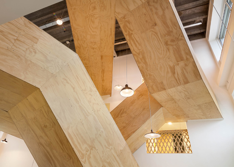
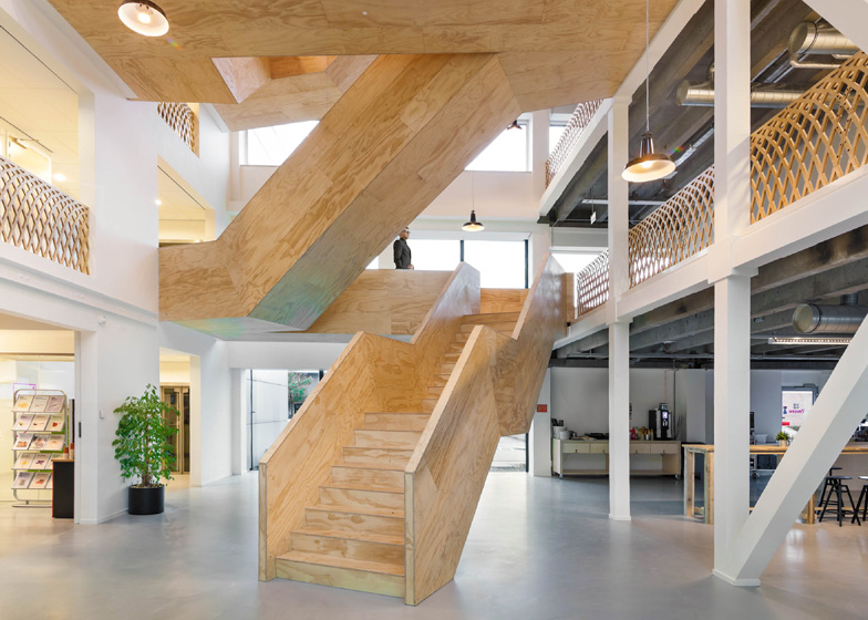
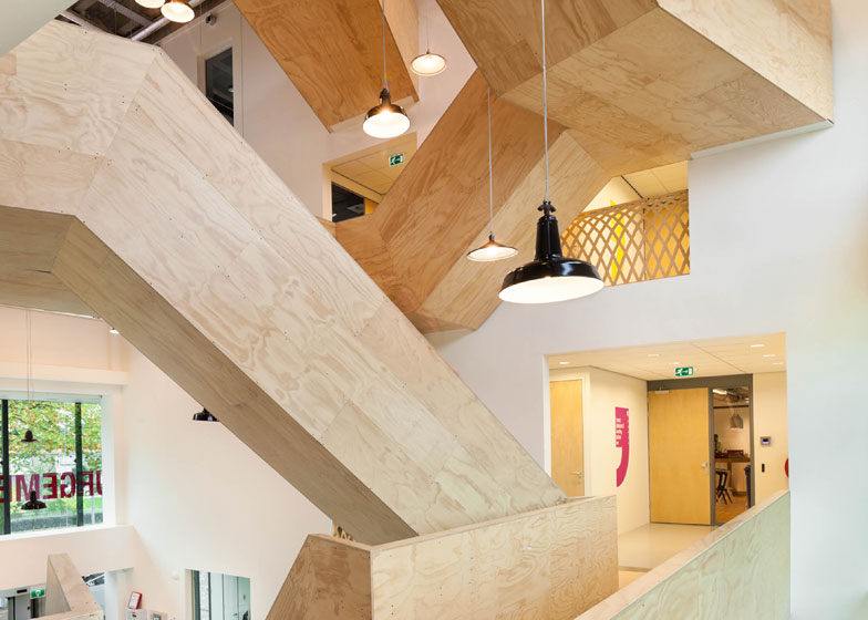
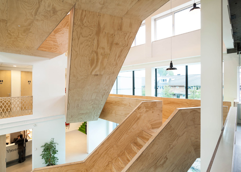
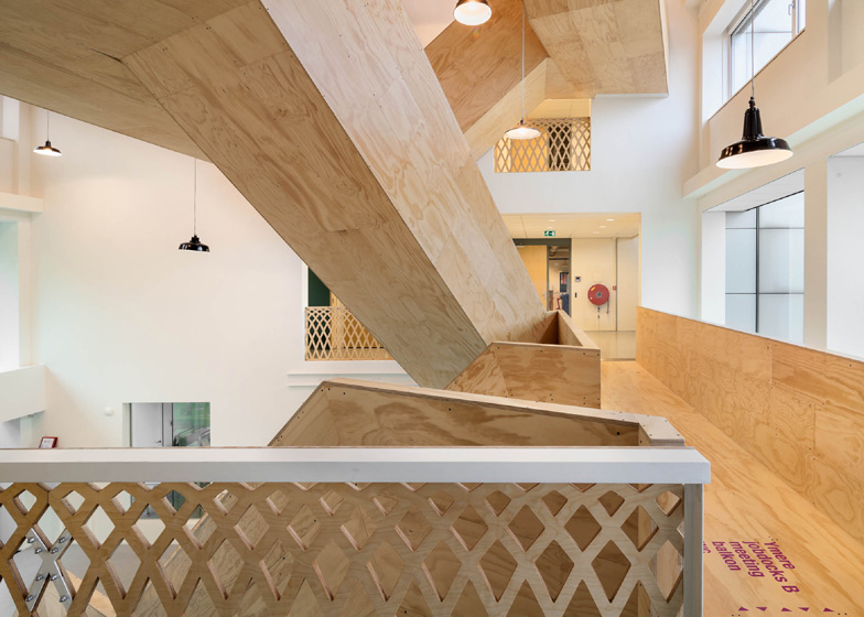
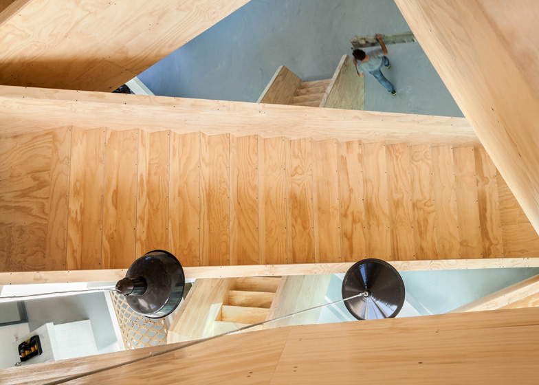
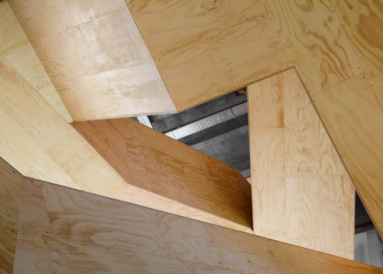
An angular wooden staircase ascends the lobby of this office renovation in the Dutch town of Hoofddorp by Amsterdam architects Studioninedots (+ slideshow).
Studioninedots was tasked with renovating an entire 1970s office building. The architects began by removing an existing staircase and enlarging the space around it to create a void that visually connects a communal area on the ground floor with the levels above.
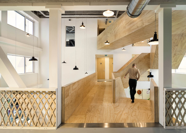
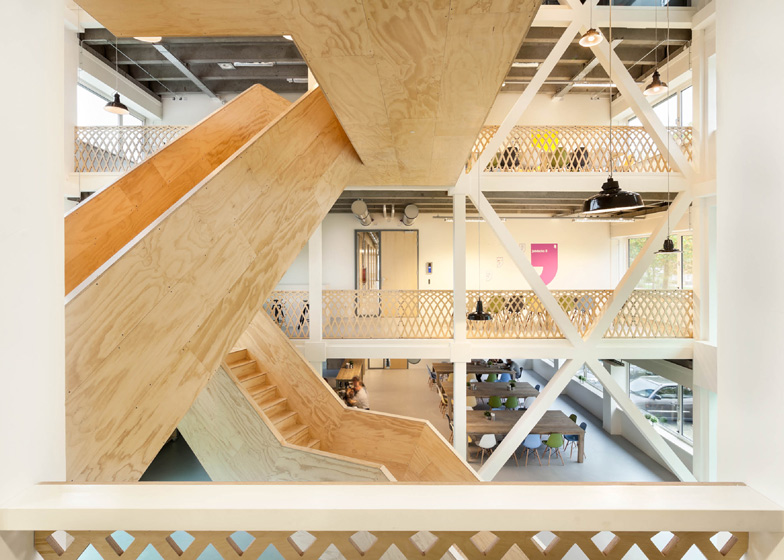
The staircase acts as the focal point of this large atrium and was made by cladding a steel structure in plywood sheets to create a series of bridges and access points to the various floors.
Broad treads encourage spontaneous interaction between employees of the different firms that occupy the shared offices.
"The staircase as a tool for communication, lends the building a collective identity," said the architects. "As a vertical lobby that offers views of all floors, it tells occupants that they are part of a larger world."
Elsewhere, the architects employed a pared-back approach so that they "could channel more resources into one spectacular, shared amenity that boosts the whole building" – the staircase.
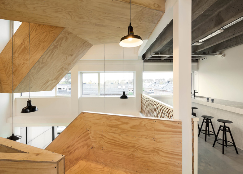
Latticed panels milled from the same plywood used for the staircase create decorative railings around the edges of the atrium.
Removing suspended ceilings revealed cast concrete beams that contrast with the warm wood of the staircase.
Large windows fill the lobby with natural light and provide views of the surrounding neighbourhood from every level.
Photography is by Peter Cuypers.
Here's some more information from the architects:
De Burgemeester renovation by Studioninedots
From an abandoned and anonymous office building to a vibrant multi-tenant complex. That’s De Burgemeester, a commercial property in Hoofddorp renovated by Studioninedots and opened on 5 November 2013. The secret of the transformation? A vertical lobby featuring an open staircase where people meet face to face, a space that brings people together both literally and figuratively.
We space. That’s our name for this communal area at the heart of the building. It’s a place that brings people together. Out of the concrete floors we carved a 14-metre-tall void that houses a giant staircase that cuts diagonal lines through the void as it makes its way upwards, linking the different floors to one another. Now people are on the move, making their way back and forth on the timber steps. Some of them linger for a chat, and there’s space on the broad treads to sit for a moment. The sound of chatter and the aroma of coffee from the café below now fill the hall. Most of the office space has already been leased, bringing the building back to life once again.
De Burgemeester was part of the ‘cloud’ of blue foam models on show in the Dutch pavilion at the 2010 Venice Architecture Biennale. In an exhibition entitled Vacant NL, the pavilion housed a vast model that depicted all the unoccupied buildings in the Netherlands. The exhibition proved confrontational for the way it captured the sheer scale of empty space and rendered it visible at a glance, and for the conclusion expressed: the era of growth is finished, and scarcely anything more needs to be built.
At the same time, that sea of blue also contained a promise. Vacant NL posed a creative challenge to architects: discover the potential of these buildings; adapt them for our era of economic stagnation and population decline; transform them, temporary or otherwise, into flexible and sustainable structures; to ensure a new appreciation of these buildings.
What’s more, the crisis offers opportunities. The pressure of cost-cutting measures creates scope for other values. More does not necessarily mean better, and that’s something increasing numbers of people are coming to realize. Born out of the idea of cutbacks and facilitated by the internet, a flourishing culture of sharing has emerged.
Thanks to Greenwheels, Peerby and Airbnb we borrow and rent cars, tools and even homes from one another. People in more and more cities are setting up resident associations to make their neighbourhoods more sustainable. And vacant sites are taken as ‘test sites’ for new spatial developments such as urban farming. The sense that ‘everybody for himself’ no longer works, and the feeling that we can really achieve something by joining forces, is gaining widespread support. And, just as important: we’ve come to realize that it’s all much more fun together.
The renovation of De Burgemeester is a response to these developments. Ymere housing association granted the building a new life as an office complex and in 2012 asked us to draw up a proposal. But the persistent crisis thwarted that ambition; it turned out to be unfeasible for a single client to occupy the entire building. That’s the reason it was decided to team up with an investor called Lingotto and turn the building into a multi-tenant complex.
Since office space with all sorts of extra amenities was no longer a realistic option with a lower budget, we completely changed our original proposal. Workspaces are fitted out without any frills so that we could channel more resources into one spectacular, shared amenity that boosts the whole building. The sculptural staircase, a social space where people can meet, a place that connects people to one another both literally and figuratively. The staircase as a tool for communication, lends the building a collective identity. As a vertical lobby that offers views of all floors, it tells occupants that they are part of a larger world. And precisely that feeling is the major quality of the renovated building.
On top of that, we maximized those qualities that De Burgemeester already possessed: views of the surrounding neighbourhood and generous amounts of daylight. The openness and transparency achieved through the addition of glass partition walls and the voluminous atrium ensures views to the outside from almost everywhere within. Suspended ceilings have been removed to reveal the authentic concrete floor with T-beams. Now this rough, column-free load-bearing structure determines the atmosphere.
The timber-clad stairs and banisters add warmth to the interior. The staircase is constructed of steel and wrapped with simple sheets of plywood with a transparent varnish finish. Custom-made railings are milled from the same sheets using an affordable industrial technique that lends the result an almost handcrafted appearance.
To complete the story, we also designed the building’s visual identity. The leitmotif for the colourful graphic design is the comma, an optimistic punctuation mark that evokes positive expectations. De Burgemeester is already well on its way to meeting those expectations.

