Aesop Marylebone shop interior by Studio KO
Skincare brand Aesop's latest shop in Marylebone, London, by architects Studio KO features shelves that reference ladders used to collect fruit.
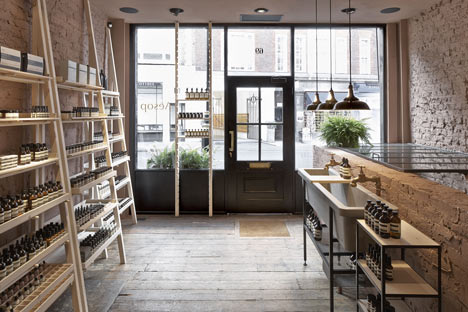
Paris and London-based architects Studio KO designed the Aesop store on Marylebone High Street, stripping back the interior of the former maternity clothing store to expose original features.
"All the existing fabric was hidden behind linings, plater boards and shop fittings," Studio KO partner Clemence Pirajean told Dezeen. "One needed much imagination to see it as rough as it is today."
Renovation work inside the building revealed hidden windows, a fireplace and coal store. These were all kept to preserve the original footprint.
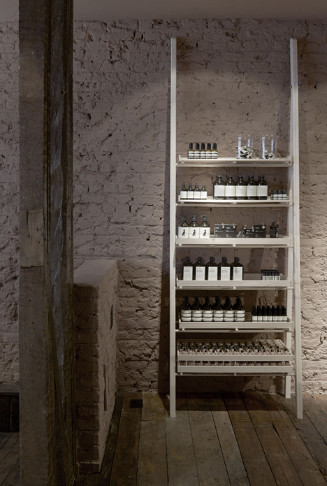
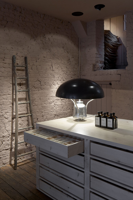
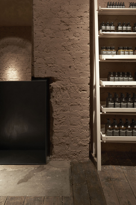
Products are presented on white-washed pear wood shelves inspired by fruit collectors' ladders, which line the exposed brick walls coloured in a musk tone.
"The existing floorboards are retained, restored and sealed," said Pirajean. "One plank is missing with a mysterious green moss growing through."
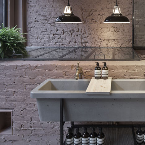
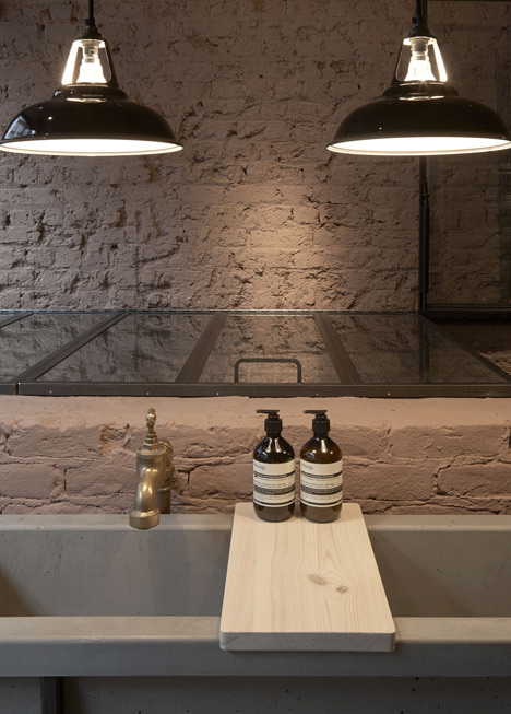
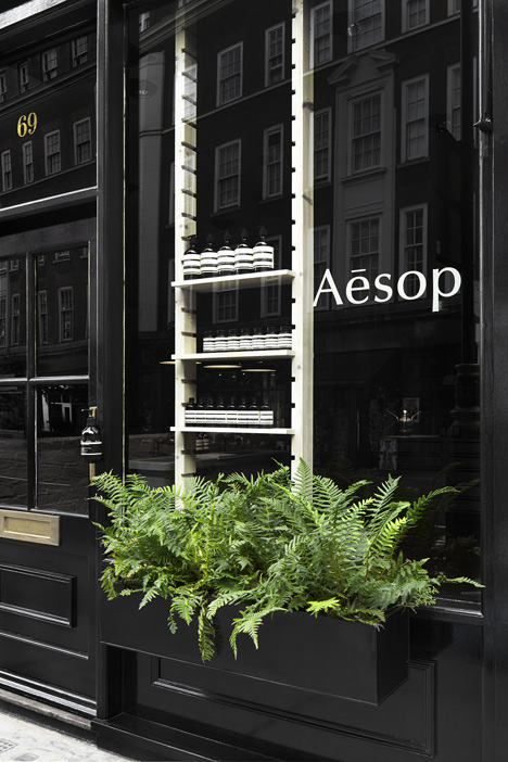
A cast concrete sink sits near the entrance beneath three black pendant lamps that match the facade.
Aesop designs each of its stores so no two are the same. When we interviewed the brand's founder Dennis Paphitis told us that he was "horrified at the thought of a soulless chain". The most recent designs we featured include the Berlin Mitte shop lined with emerald-coloured tiles and a pop-up shop in Tokyo where wooden chairs were piled on top of one another to create the shelves.
Photography is by Dan Glasser.
Here's some more information that Studio KO sent to us:
The property sits in between two very contrasting urban scenes: to the front, a beautifully animated Marylebone High Street and to the back, a quiet mews with paving stones and little brick houses.
The back 'courtyard' echoes the English countryside, which was not too far from central London a little while ago.
With a window to the back courtyard and a large vitrine to the front high street, the store acts as a link between these two scenes. The initial idea was to allow those two different worlds enter the space from both points, creating a continuity and emphasising on the transparency.
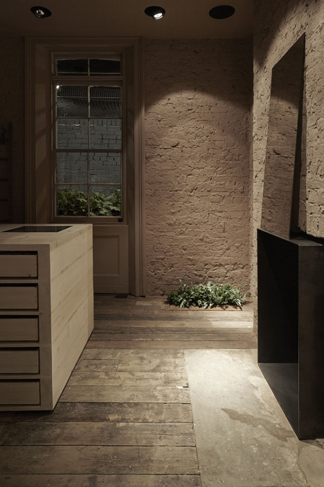
We used the vegetation as a strong conceptual element from the beginning: we liked the idea of ferns or wild vegetation growing through the cracks of old walls. In the end, the idea of robust ferns was retained, with various sizes and species.
All the architectural existing elements where brought back to life: restored and maintained forming an integral part of the design. Once the plasterwork and the dry linings are removed, traces of history appear: a former fireplace, a coal store, remains of old rooms/crevices. All elements bringing complexity to the volume.
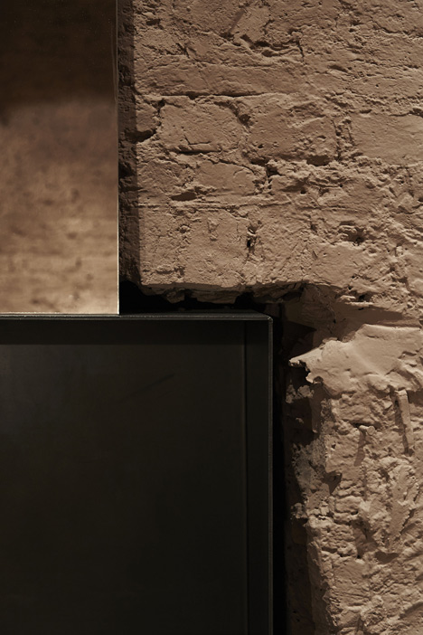
Then comes the monochrome: a super-matte colour extracted from the smoky clay colours surrounding the store. A matte powder of foggy red was sprayed onto the textured walls and ceilings, revealing bubbles and irregularities of plaster.
The existing floorboards are retained, restored and sealed. One plank is missing with a mysterious green moss growing through.
Shelving units, made from white-washed scaffold wood, were designed for displaying the Aesop products. Inspired from fruit ladders, simply leaning against the painted bricks, utilitarian looking. Looking closer, one can see the detail of a very honest fixing system, partly adjustable, with timber rods supporting the shelves, and a timber hinged front face preventing products from falling out.
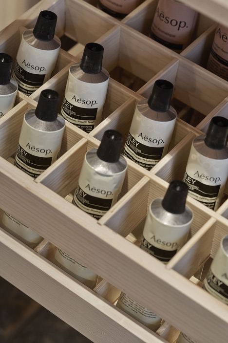
The point of sale refers to the honest construction of a palette, using planks of white wash scaffold boards, cross layered with end-grain planks. A former fireplace is retained, framed using wrought iron to emphasise its depth and shade.
The long basin in rough cast concrete, complete with oversized taps and exposed pipes resembles a water drinking trough. It sits against the staircase leading to the basement, encased between reclaimed brick walls.
The wrought iron hatches above, with their Georgian wire glass inserts, use the language of a greenhouse. The black painted façade and outdoor elements frame the interior view of the store. The abstraction and simplicity contrasts with the richness of the colour and the textures.