Nook's Barcelona apartment refurb removes walls but leaves original tiled floors intact
Spanish architects Nook have renovated a small apartment in Barcelona's gothic quarter, leaving decorative floor tiles in place to reveal the original layout of the flat (+ slideshow).
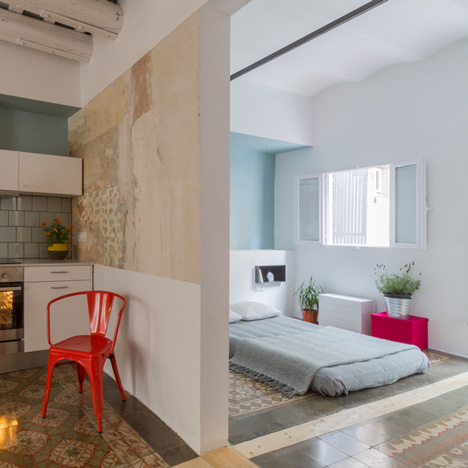
Called Roc3, the conversion is the third that Nook Architects have carried out in the same building, following Casa Roc and Twin House.
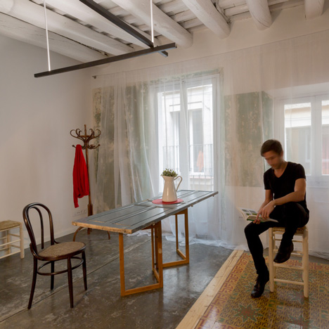
"We have followed the same conceptual thread in all three projects, highlighting the original envelope," the architects told Dezeen. "We have retained all original floors as much as possible, and they have been left exactly in the original place, so you can read the old distribution of the apartment."
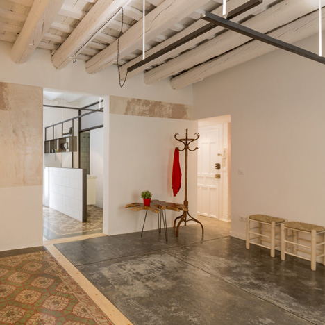
It has become fashionable to retain old tiles in Barcelona apartment conversions; see more projects that use this technique in our slideshow.
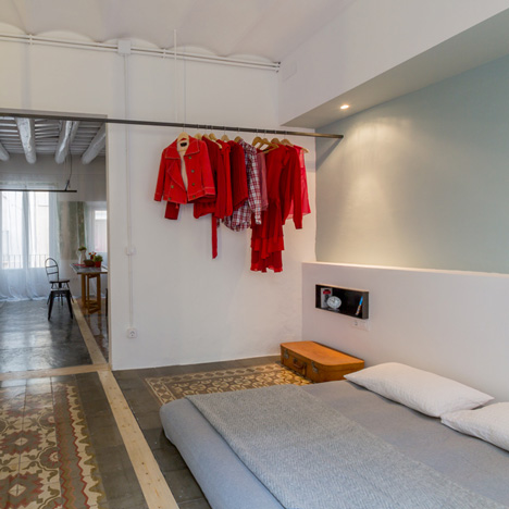
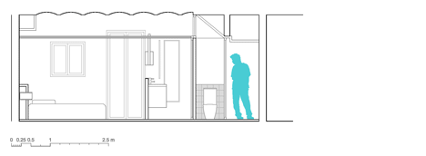
Nook removed some of the original internal partitions to optimise space, creating a combined living room and kitchen on the street side of the apartment, and a bedroom and bathroom on the courtyard side.
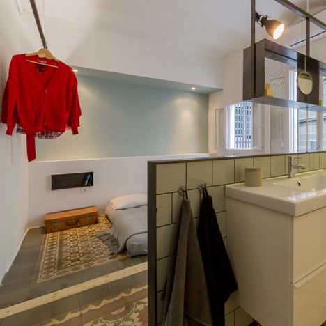
"We thought it correct to once again incorporate the washbasin in the bedroom to make a better use of natural light and to enlarge the sensation of open space," the architects said.
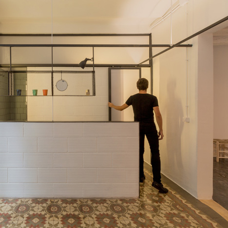
The bathroom of the one-bedroom apartment has a second door into the entrance hall, meaning that guests sleeping over in the lounge can access it without disturbing the owner.
Nook used a more industrial palette of materials than in the previous two conversions, in order to save money and create longer-lasting fixtures.
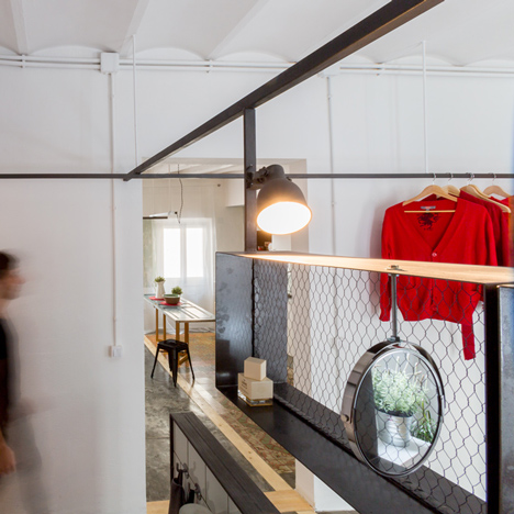
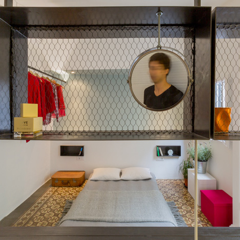
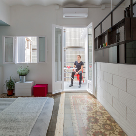
A row of suspended steel storage boxes backed with chicken wire separates the bedroom from the bathroom. The waist-high partition is made of white-painted clay bricks.
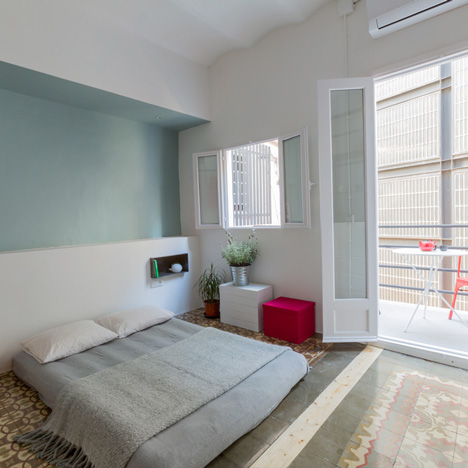
Much of the furniture was sourced from a local second-hand store while the dining table is topped with an old door. Walls are left unpainted in places, revealing layers of faded plaster and old tile adhesive.
"In all three projects, we have used modular furniture for the kitchen and the bath, concrete floors, ceramic tiles and translucent polycarbonate for interior doors," the architects said. "The other furniture, door frames and accessories have been made in steel, not like in the other two first projects which were made of wood. The idea is to use neutral materials which can last and get older in a good way."
Photography is by Nieve.
Here's some text from the architects:
ROC3 | apartment in Barcelona, third intervention | nookarchitects
With ROC3 we reached the end of a cycle, the renovation of three, very similar, but different apartments on a single building in Barcelona’s gothic quarter.
We were recently advised that in times of economic crisis, as architects, we had to look for a formula to obtain products with scalability to optimise our resources. We understood that a product with scalability was the repetition of valid solutions from one project to the other, a difficult approach within the refurbishment industry. In the midst of that search for a common denominator the opportunity to rehabilitate ROC3 arrived- another diamond in the rough on the very same building where we had done two previous interventions: CASA ROC and TWIN HOUSE.
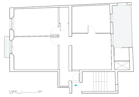
We approached the project thinking that we could apply the same parameters as in TWIN HOUSE due to the fact that it was a very similar apartment in terms of dimensions, orientation and pre-set requirements.
This meant placing the daytime space towards the Street, the bedroom towards the interior courtyard, and placing the kitchen and bathroom against the median Wall in the form of a humid strip. What seemed obvious, however, was not possible due to the fact that the sanitary drainpipe changed its position on this apartment from the one in TWIN HOUSE, so we had to look for a new solution for placing the bathroom.
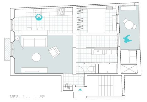
We thought it correct to once again incorporate the washbasin in the bedroom to make a better use of natural light and to enlarge the sensation of open space. This time we separated it from the rest of the room with a low Wall and suspended iron cubes that allow storage from both sides. These same cubes were also used to create night tables and extra storage space for recipe books and utensils in the kitchen.
The shower and water closet have independent entries, but can be closed using a single sliding door, a solution first use don CASA ROC. The water closet can also be accessed from the main entry through a second door, which gives the option of guests using this space without having to enter the bedroom. This way, boundaries were set between one space and the other without creating a visual barrier.

The building’s structure and closings are very irregular, so we introduced lineal elements that counterpoint these irregularities and set order within the space. Amongst these elements are a close hanger that integrates lighting (borrowed from TWIN HOUSE) and connects itself with the support of the suspended cubes and the sliding door’s guide. Wood was used to set limits on the pavement which regulates the traces of the previously existing partition walls. This was also synthetised on the living room lamp.
ROC3 was about applying new ideas to new challenges, but maintaining the spirit behind CASA ROC and TWIN HOUSE in which we searched for the original spirit of the building and subtly intervened to achieve today’s levels of comfort while harmonising with the building’s history.
Architects: Nook Architects
Location: Barcelona, España
Year: 2013
Furniture: Casa Jornet, Sillas-Muebles