Staircase with upside-down sections at an office in Mexico
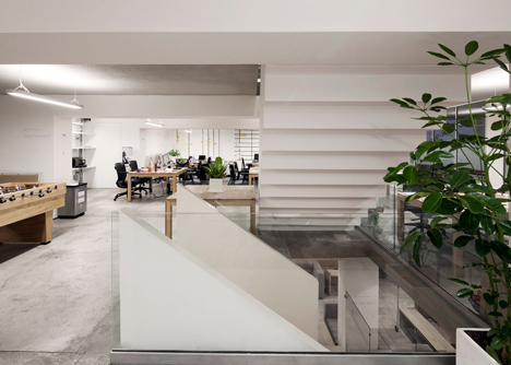
The central staircase inside this office in Mexico City by architecture studio Goko is made up of different sections, including some that look like they are upside down.

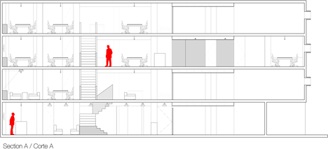
Goko cut through the floor plates of the four-storey office for marketing agency Map to create a staircase that would animate the building and encourage more interaction between staff.
Constructed from a combination of brick, concrete and timber, the staircase was designed to look different on each storey, particularly between the ground and first floors where the climb is broken up into three stages.
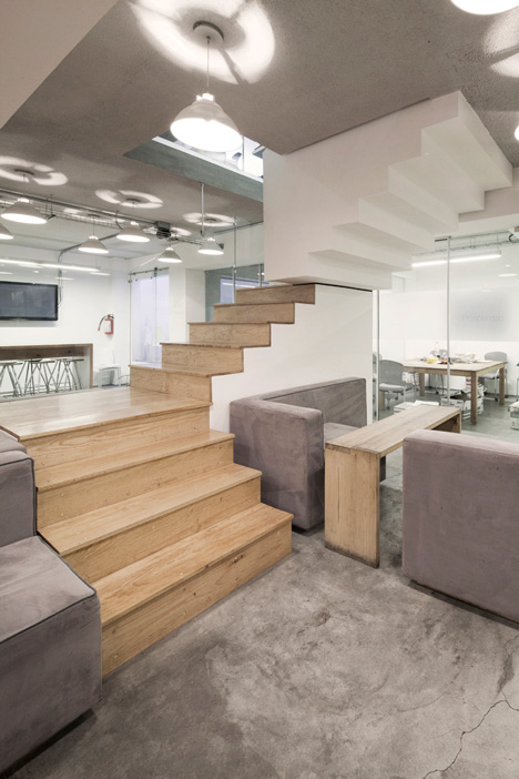
"The concept was to attach three different parts to each other as a whole, in order to have a different angle or point of view of the element on each level," architect Christopher Koehn Martinez told Dezeen.
"Although there's a main elevator in the building, the staircase was designed to be the central feature. You have to use it to connect and interact with other people, and it provides a little workout," he added.
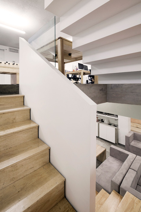
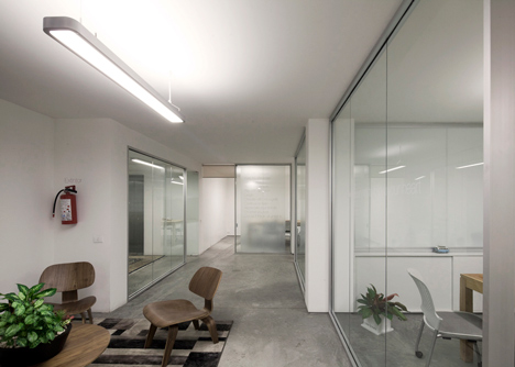
The rest of the interior was designed with an open-planlayout that features simple colours and materials, including polished concrete floors, white walls and glazed partitions.
Workspaces are arranged in clusters on every floor and each employee is responsible for looking after a plant.
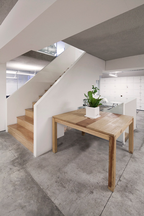
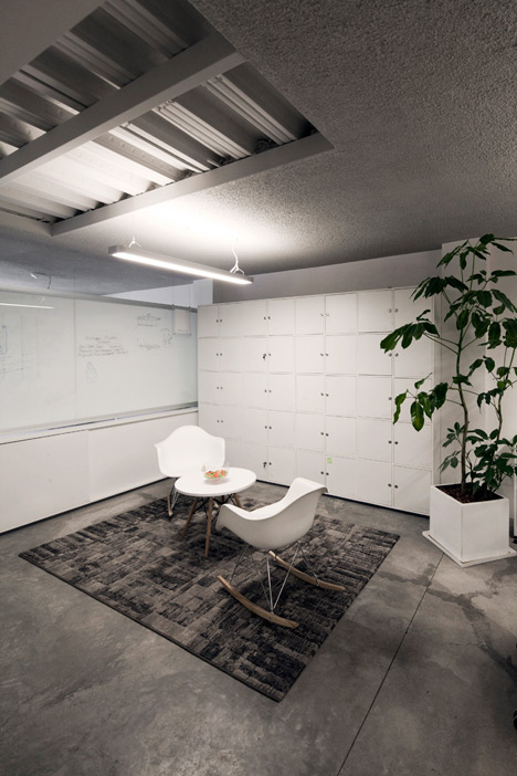
Lockers offer places for employees to store their belongings, plus cafe and bar areas are located on the ground floor.
"Our mission was to provide employees an alternate space where work and pleasure could exist," said the architect.
Here's a project description from Goko:
"Agile Working" - The luxury of freedom
Today's technology has enabled us to work anytime and anywhere. Performance is no longer determined by time spent on the office but by results. The trend is that less individual cubicles exist and more often we see companies encouraging open spaces that allow greater interaction and creativity.
Our goal: to have more efficient workers; that hours spent at work where more productive and enhance a better quality of life. Satisfied with the results of the previous project we did, our client chose to take this same experience and apply it to their new offices: a marketing firm ready to take it's workers to the next level.
Our mission was to provide employees an alternate space where work and pleasure could exist. Informal working areas on each level, a cafeteria to interact , open bars where they could work with each other or with customers. To work while doing something nice like having a coffee, a work lunch while listening to music, to play ping pong or to work on a living room alike space.
The Vertical Heart
We seized 4 floors in an office building connecting the four levels with a main internal staircase. Inside we drilled each level's slabs and created a central vertical volume as the core: a connection between all company's levels, spaces and areas.
Through this we centralised all company's access creating interaction between employees. Encouraging exercise that generates endorphins reflected in mood and user performance .
Polished concrete floors, white walls, clear glasses and the apparent slab on a light grey tone resulted in a much larger space feeling. We also used a series of pendant lights as the only element of indirect illumination creating ideal work light quality. Informal working. Fun at work.
Living Rooms, wall-talkers, personalised plants & ping pong
As a visual key to the central staircase, we created informal working areas on each level: a waiting room with lockers for each user. The idea of the living rooms was to create a flexible space to share ideas among employees, store their belongings in lockers or to receive a client with less formality .
With a special paint, we took the perimeter walls as a canvas for drawing, writing and translating ideas into them. The divisions between the few office cubicles were made with two clear crystals and a white inner film in order to draw and write on both sides. With this we helped visualise an idea and facilitate its realisation .
We consider living vegetation an indispensable element in the offices. As the only element of colour, we customised a small potted plants design, assigning each member of the company with its own plant, so that each individual is responsible for watering it and keeping it alive. This idea helped us to create an action of responsibility and consciousness.
A ping pong table lies in the middle of the creative area as an element of fun and distraction to help achieve best ideas at the right time.
The offices are no longer merely a corporate place with a cold atmosphere, which is why we injected energy to create a living office.
Project: Map Marketing Offices
Design: Goko MX (Christopher Koehn, Jose Martín González)
Colaborator: Isaac Guzmán
Date: February 2013
Location: South Mexico City
Design and construction: Goko MX