Design Miami 2013: here's a preview of the nearly completed Pérez Art Museum Miami by Swiss architects Herzog & de Meuron, which opens tomorrow to coincide with the Design Miami and Art Basel Miami Beach collectors' fairs, and which suggests a new "kind of vernacular" for the city according to Jacques Herzog (+ slideshow + photography is by Iwan Baan).
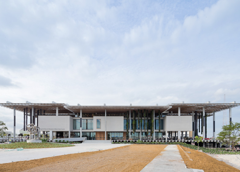
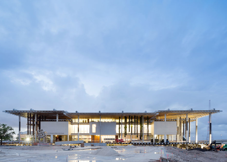
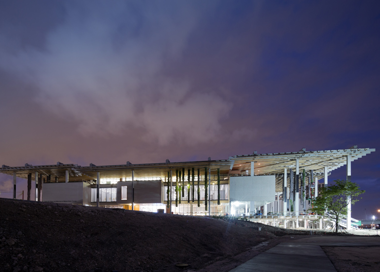
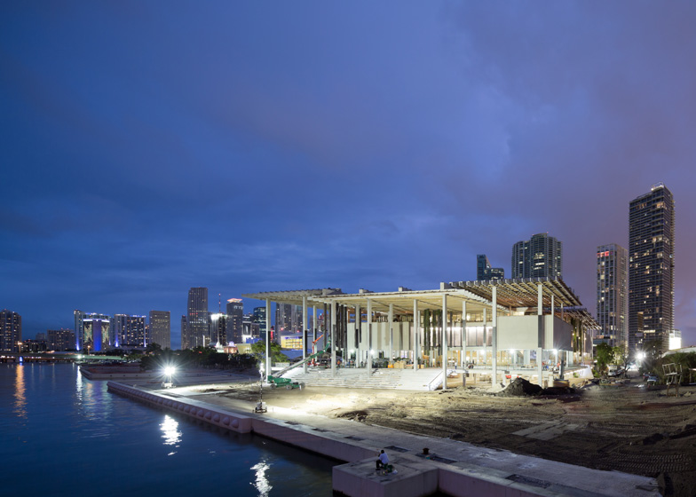
Taking over from the former Miami Art Museum, PAMM accommodates 3000 square-metres of galleries within a sprawling three-storey complex that features a huge elevated veranda, boxy concrete structures and large expanses of glazing.
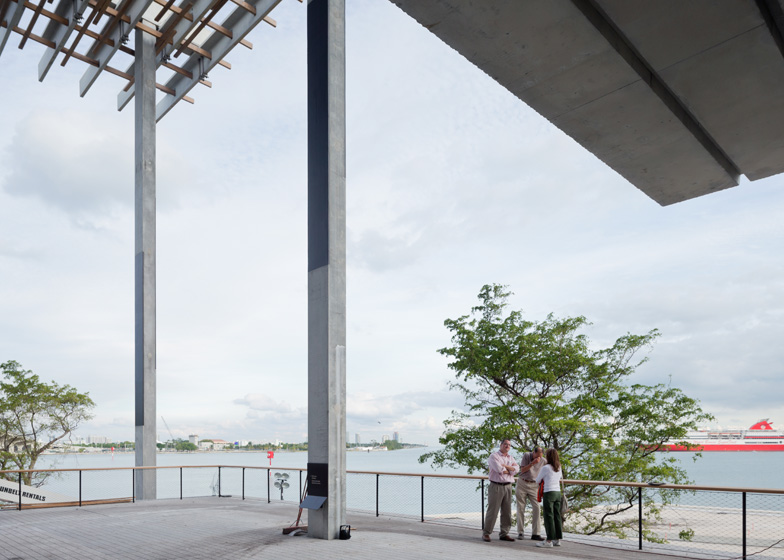
Herzog & de Meuron designed the building to suit the tropical climate of Miami. The veranda, which in time will be filled with plants, is raised up on stilts to surround the building, creating an intermediate space between the galleries and the surrounding city.
"This building is just like a shelter," said Jacques Herzog. "A roof just like the floor we stand on, under which volumes are assembled to collect, to expose and to show art."
"Miami doesn't have any local vernacular," Herzog said on a tour of the building earlier today, explaining how he wanted to avoid recreating the "decorated boxes" of Miami's iconic Art Deco District.
"It looks nice and it's associated with Miami," he said of the art deco buildings. "But in fact Miami doesn't have any local vernacular. It has something that the tourists especially like which is this art deco style. This [the Pérez Art Museum Miami] is somehow deconstructing that. It's the opposite: it's not based on the box, it's based on permeability."
Herzog compared the architectural approach to the Miami building to Herzog & de Meuron's barn-like Parrish Art Museum on Long Island, which was completed last year.
"As much as the Parrish is an answer to this more northern exposure and is a totally different typology, this is an answer for here, sitting on stilts, with the floods, with the shading, and especially the plants."
"I think something that could become a kind of vernacular is a building that is specific for this place," he continued, comparing architecture to cooking.
"The ingredients here are the climate, the vegetation, the water, the sun. The building should respond to all these things," he said. "Like cooking in winter is different to cooking in summer because you don't have the same ingredients so you shouldn't make things that make sense in summer, in winter."
Stilts support the base of the veranda, then turn into columns to support an overhanging roof that shelters both indoor and outdoor spaces. Clusters of suspended columns covered in vertical gardens by botanist Patrick Blanc hang from the roof structure.
"There's a very thin layer between the inside and the outside," added Herzog. "As soon as there are more plants, this will help to make that more accessible, and not such a shock."
The interior is complete and the exhibitions are installed; when Dezeen visited earlier today contractors were still finalising the landscaping around the building and installing the vertical gardens.
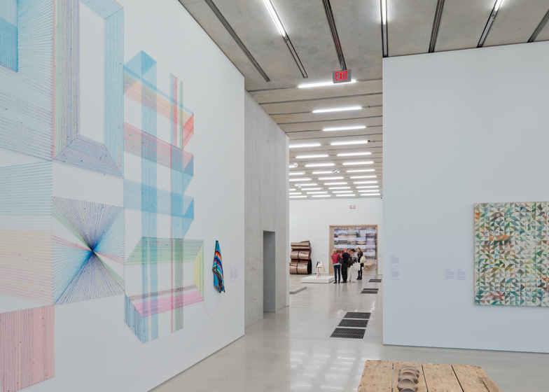
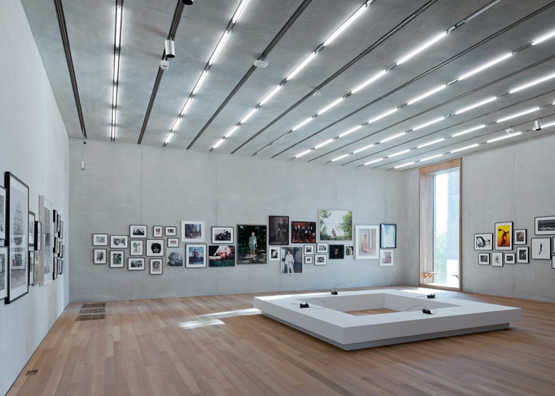
A permanent collection featuring artworks from the museum's 1800-piece collection occupy the two lower levels of the building. Special exhibitions will also be accommodated on the first floor, while the uppermost level is dedicated to education facilities.
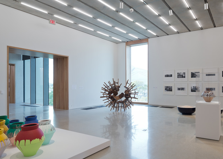
PAMM opens with the first major international exhibition of Chinese artist Ai Weiwei, alongside shows dedicated to Cuban painter Amelia Peláez and Haitian-born artist Edouard Duval-Carrié.
The building is located beside a motorway near Biscayne Bay and is the first completed museum of a waterfront complex that will also be home to the Grimshaw-designed Patricia and Phillip Frost Museum of Science when it opens in 2015.
Photography is by Iwan Baan.
Here's the transcript of Herzog talking about the building at this morning's press tour:
"Since the early 90s I have been coming [to Miami] with my wife, long before we knew we were going to be building and we were shocked about what is vernacular here: the decorated box. There's this climate and this reputation, this didn't make sense, but of course it looks nice and it's associated with Miami.
"But in fact Miami doesn't have any local vernacular. It has something that the tourists especially like which is this art deco style. This [the Pérez Art Museum Miami] is somehow deconstructing that, it's the opposite, it's not based on the box, it's based on permeability. Also this transparency with water, vegetation, garden, city and art. Art is intertwined with all these elements.
"In some ways I think this is really interesting because we are here at a crossroads between south and north: South America and North America and other parts. We, with this Eurocentric, America-centric view, didn't have any focus until not so long ago. The building should help make that possible. This building is just like a shelter, a roof just like the floor we stand on, under which volumes are assembled to collect, to expose and to show art.
"What makes it local? I think thats it's local because, if we compare it with cooking, the ingredients here are really the climate, the vegetation, the water, the sun. The building should respond to all these things. This sounds simple and it is simple but it's not easy to achieve, to not make it so boring and generic.
"It is I think something that could become a kind of vernacular, a typical building, a specific building for this place. Just like the Parrish [Art Museum] in the north, which recently opened. We've done other museums, the Tate Modern, that answer to what is already there. Like cooking in winter is different in summer, because you don't have the same ingredients so you shouldn't make things that make sense in summer, in winter. As much as the Parrish is an answer to this more northern exposure and is a totally different typology, this is an answer for here, sitting on stilts, above the floods, with the shading, and especially the plants.
"We're very happy to have a Patrick Blanc working on this. Because when we saw the old museum, and you come into the museum over this very hot plaza, and there is a black glass door and that says this is outside and that is inside, it's like boom! Such a shock, because what it gives way to is an air-conditioned, climatically-controlled box with a very thin layer between the inside and the outside.
"The plants here should be like a filter to make the transition between inside and outside. As soon as there are more plants, this will help to make that more accessible, and not such a shock."
Here's a detailed description of the design from the museum:
Pérez Art Museum Miami
Designed by Herzog & de Meuron, the new Pérez Art Museum Miami (PAMM) reflects the natural and urban landscape of Miami and responds to the city’s rapid growth as a cultural destination. The new facility borders the MacArthur Causeway with its front façade oriented toward the bay, making it a highly visible landmark amid Miami’s cityscape. PAMM includes 32,000 square feet of galleries as well as education facilities, a shop, waterfront café, and exterior plazas and gardens.
The new building supports the institution’s mission to serve local populations as a dynamic social forum, stimulating collection growth and enabling the Museum to better fulfill its role as the principal contemporary visual arts and educational resource in the region.
The Building and Landscaping
The three-story facility includes 200,000 square feet of programmable space, comprised of 120,000 square feet of interior space―a three-fold increase from the Museum’s previous facility―and 80,000 square feet on the exterior. PAMM sits upon an elevated platform and below a canopy, both of which extend far beyond the Museum’s walls creating a shaded veranda. Open to light and fresh air, surface parking will be located beneath the platform and surrounded by landscaping and terraces. Stairs as wide as the plot connect the platform to the bay and a waterfront promenade, creating a continuous, open civic space that conjoins community, nature, architecture, and contemporary art.
Designed by artist and botanist Patrick Blanc using his advanced horticultural techniques, native tropical plants hang from the canopy between the structural columns and platforms. The project team also worked closely with landscape architects Arquitectonica Geo to select a range of plant life that could withstand exposure to sun and wind as well as the city’s storm season. The platform provides a comfortable outdoor temperature by natural means. The intermediate space has the ecological benefit of minimizing the sun’s impact on the building’s envelope and reducing the cost of controlling the environment for artworks.
Curatorial Plan
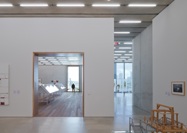
In collaboration with the Museum’s leadership, Herzog & de Meuron developed a series of gallery typologies to best display and develop PAMM’s growing collection. Different modes of display are deployed in a non-linear sequence, allowing visitors to map their own experiences of the Museum’s collection and physical space. The permanent collection galleries are located on the first and second levels. The latter of which also houses special exhibitions. Offering natural light and views of the surrounding park and bay, outward-facing exhibition spaces alternate with more enclosed galleries that focus on single subjects.
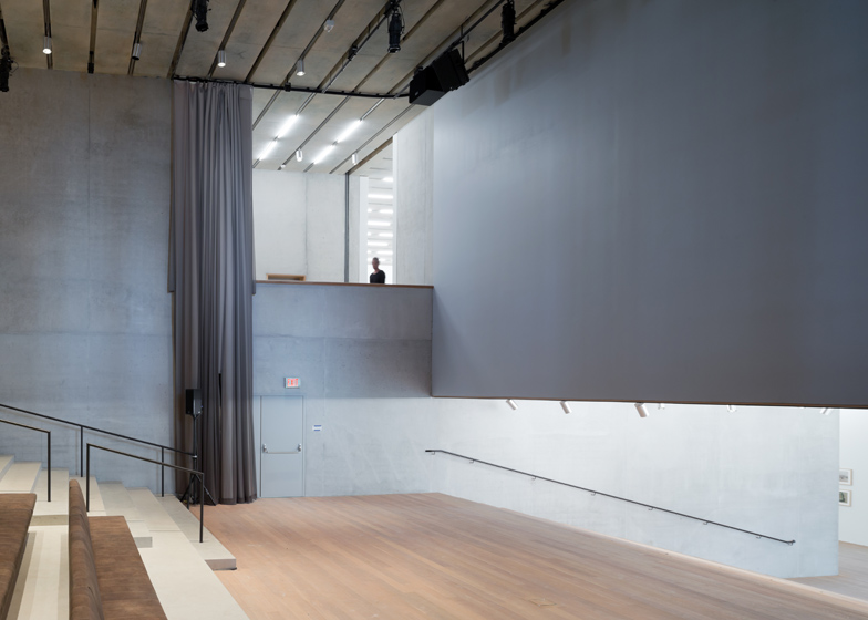
Art is displayed throughout the entire building, including the garden and the parking garage. A mostly glazed envelope on the first and third levels reveals the public and semi-public functions within: entry halls, auditorium, shop, and café on the first level, education facilities and offices on the third. By offering a specific range of differently proportioned spaces and a variation of interior finishes, as opposed to a traditional sequence of generic white cubes, PAMM proposes a new model of curating and experiencing art.

