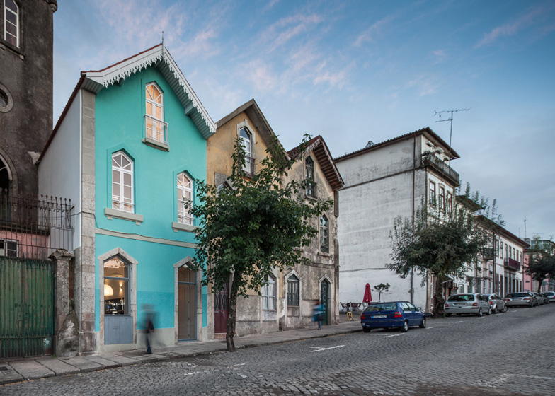
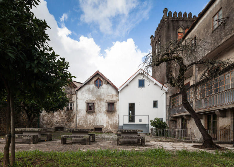
Portuguese studio Tiago do Vale Arquitectos has renovated a townhouse in Braga that was built as a servants' house in the late nineteenth century and modelled on the style of an Alpine chalet (+ slideshow).
Tiago do Vale Arquitectos overhauled all three storeys of the Three Cusps Chalet, which was originally built at a time when a number of migrants were returning to Portugal from Brazil and were commissioning grand houses influenced by trends from across Europe and South America.
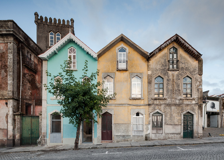
Now transformed into a light and modern home and workplace for a couple, the old house forms part of a row of three properties that were built to house the servants of a nearby palace, combining typical Portuguese materials and proportions with Alpine forms and details.
"In general everything is original, or reconstructed as the original, which required the elimination of many unqualified more recent add-ons," the architects told Dezeen.
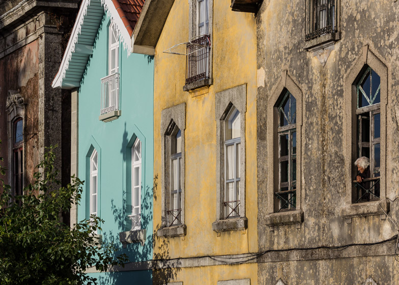
A vivid shade of turquoise differentiates the building from its neighbours, while decorative eaves and stonework have been restored around the edges of the roof and windows.
"We used a combination between the colour palette of the nineteenth century - pastels were quite popular at that time and in this region - and a sensibility to harmonise it with the street at its present state," said the architects.
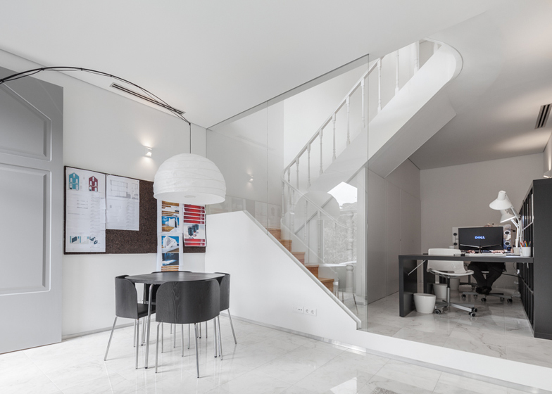
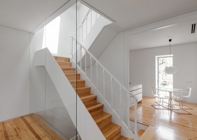
Unnecessary partitions and extensions were removed from the interior, creating open-plan spaces that are defined by the position of a central staircase that had previously been boxed in.
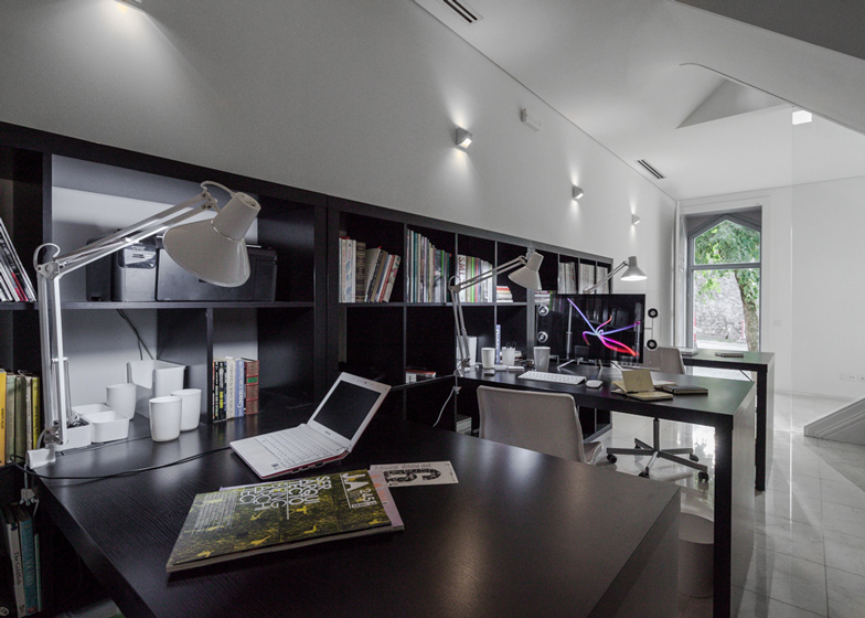
At street level, a large split-level space with a white marble floor can function as either a shop or office. A large glass partition fronts the staircase on the left-hand side of the space, revealing the route up to the domestic spaces above.
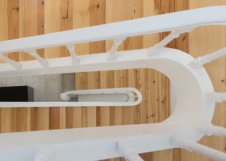
This staircase narrows with each flight of stairs, intended to emphasise how the degree of privacy increases on the upper levels.
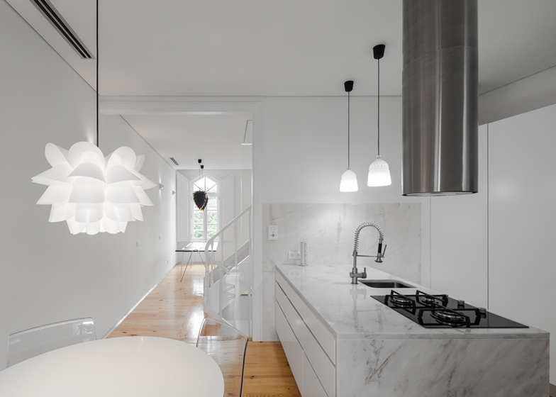
The first floor sits just above the ground level at the rear of the building, which created an opportunity for a small outdoor deck. A kitchen and dining area are just in front, while the living room is positioned opposite.
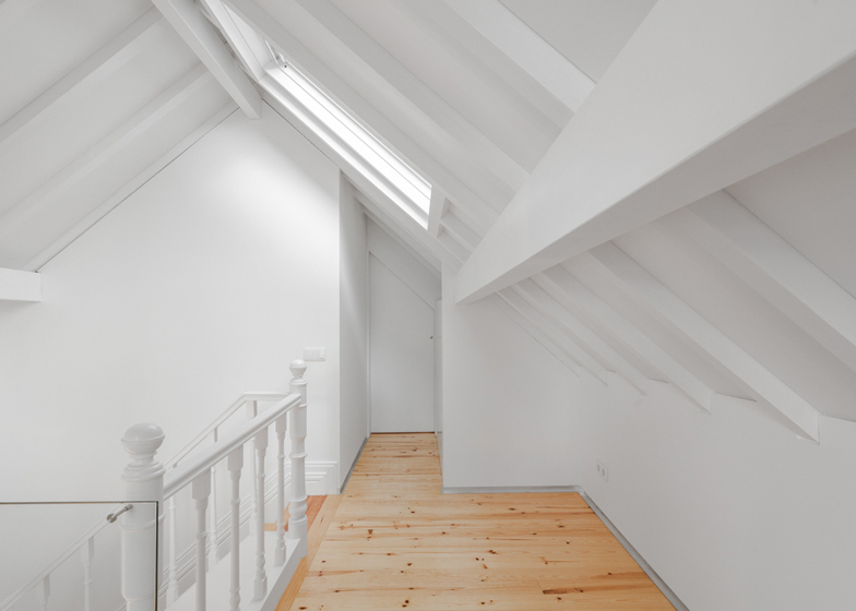
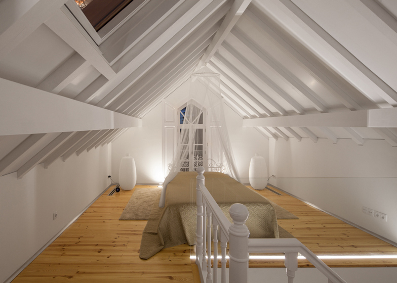
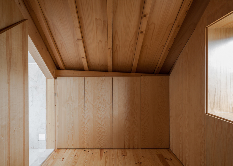
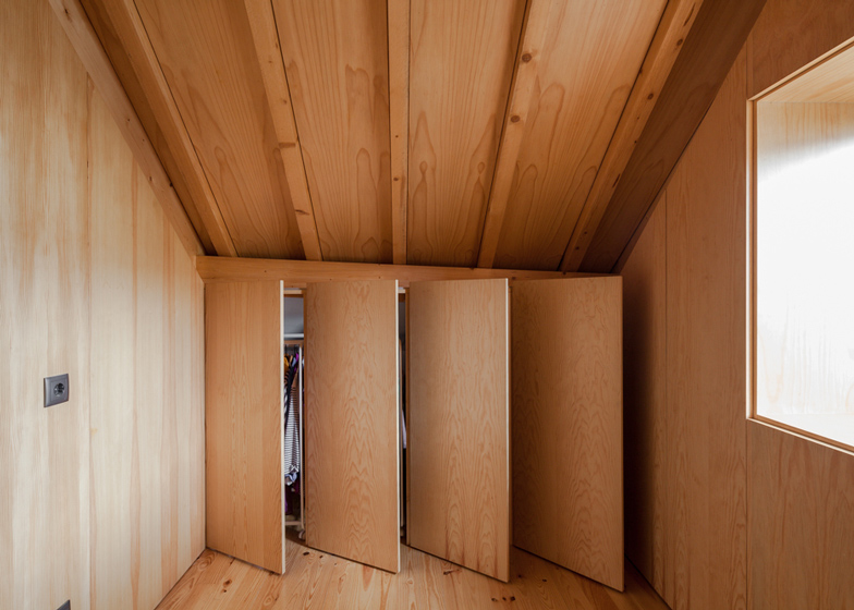
The final storey accommodates a large bedroom with simple furnishings, as well as a timber-lined dressing room that contrasts with the clean white aesthetic of the other rooms.
Photography is by João Morgado.
Here's a project description from Tiago do Vale Architects:
The Three Cusps Chalet
Historical context
In the second half of the 19th century Portugal saw the return of a large number of emigrants from Brazil. While returning to their northern roots, specially in the Douro and Minho regions, they brought with them sizeable fortunes made in trade and industry, born of the economic boom and cultural melting pot of the 19th century Brazil. With them came a culture and cosmopolitanism that was quite unheard of in the Portugal of the eighteen-hundreds.
That combination of Brazilian capital and taste sprinkled the cities of northern Portugal with examples of rich, quality architecture, that was singular in its urban context and frequently informed by the best that was being done in both Europe and Brazil.
Built context
The "Three Cusps Chalet" is a clear example of the Brazilian influence over Portuguese architecture during the 19th century, though it's also a singular case in this particular context.
Right as the Dom Frei Caetano Brandão Street was opened, a small palace was being built in the corner with the Cathedral's square and thanks to large amounts of Brazilian money. It boasted high-ceilings, rich frescos, complex stonework, stucco reliefs and exotic timber carpentry. In deference to such noble spaces, the kitchen, laundry, larders and personnel quarters, which were usually hidden away in basements and attics, were now placed within one contiguous building, of spartan, common construction.
Built according to the devised model of an alpine chalet, so popular in 19th century Brazil (with narrow proportions, tall windows, pitched roofs and decorated eaves), the "Three Cusps Chalet" was that one building.
Due to the confluence of such particular circumstances it's quite likely the only example of a common, spartan, 19th century building of Brazilian ancestry in Portugal.
Siting at the heart of both the Roman and medieval walls of Braga, a stone's throw away from Braga's Cathedral (one of the most historically significant of the Iberian Peninsula) this is a particularly sunny building with two fronts, one facing the street at west and another one, facing a delightful, qualified block interior plaza at east, enjoying natural light all day long.
At the time of our survey, its plan is organised by the staircase (brightened by a skylight), placed at the centre of the house and defining two spaces of equal size, east and west, on each of the floors.
The nature of each floor changes from public to private as we climb from the store at the street level to a living room (west) and kitchen (east) at the first floor, with the sleeping quarters on top.
Materials-wise, all of the stonework and the peripheral supportive walls are built with local yellow granite, while the floors and roof are executed with wooden beams with hardwood flooring.
Architectural project
Confronted by both its degrading state and degree of adulteration, and by the interest of its story and typology, the design team took as their mission the recovery the building's identity, which had been lost in 120 years of small unqualified interventions. The intention was to clarify the building's spaces and functions while simultaneously making it fit for today's way of living.
The program asked for the cohabitation of a work studio and a home program. Given the reduced area of the building, the original strategy of hierarchising spaces by floor was followed. The degree of privacy grows as one climbs the staircase. The stairs also get narrower with each flight of steps, informing the changing nature of the spaces it connects.
A willingness to ensure the utmost transparency throughout the building, allowing light to cross it from front to front and from top to bottom, defined all of the organisational and partitioning strategies resulting in a solution related to a vertical loft.
The design team took advantage of a 1.5 m height difference between the street and the block's interior plaza to place the working area on the ground level, turning it westward and relating it to the street. Meanwhile, the domestic program relates with the interior plaza and the morning light via a platform that solves the transition between kitchen and exterior. This allows for both spaces to immediately assert quite different personalities and light, even though they are separated by just two flights of stairs.
The staircase geometry, previously closed in 3 of its sides, efficiently filters the visual relations between both programs while still allowing for natural light to seep down from the upper levels and illuminate the working studio.
The second floor was kept for the social program of the house. Refusing the natural tendency for compartmentalising, the staircase was allowed to define the perimeters of the kitchen and living room, creating an open floor with natural light all day long. Light enters from the kitchen in the morning, from the staircase's skylight and from the living room in the afternoon.
Climbing the last and narrow flights of stairs we reach the sleeping quarters where the protagonist is the roof, whose structure was kept apparent, though painted white. On the other side of the staircase, which is the organising element on every floor, there's a clothing room, backed by a bathroom.
If the visual theme of the house is the white colour, methodically repeated on walls, ceilings, carpentry and marble, the clothing room is the surprise at the top of the path towards the private areas of the house. Both the floor and roof structure appear in their natural colours surrounded by closet doors constructed in the same material. It reads as a small wooden box, a counterpoint to the home's white box and being itself counterpointed by the marble box of the bathroom.
Materials
Fitting with the strategy of maximising light and the explicitness of the spaces, the material and finish choices used in this project were intentionally limited. White colour was used for the walls, ceilings and carpentry due to its spacial qualities and lightness. Wood in its natural colour is used for the hardwood floors and clothing room due to its warmth and comfort. Portuguese white Estremoz marble, which covers the ground floor, countertops and on the bathrooms and laundry walls and floors, was chosen for its texture, reflectivity and colour.
All of the original wood window frames of the main façade were recovered, the roof was remade with the original Marseille tiles over a pine structure and the decorated eave restored to its original glory.
The hardwood floors were remade with southern yellow pine over the original structure and all the surfaces that required waterproofing covered with Portuguese Estremoz marble.
Ground floor window frames were remade in iron, as per the original, but redesigned in order to maximise natural illumination (as on the east façade).
Architecture: Tiago do Vale Architects, Portugal
Location: Sé, Braga, Portugal
Construction: Constantino & Costa
Project year: 2012
Construction year: 2013
Site area: 60 m2
Construction area: 165 m2

