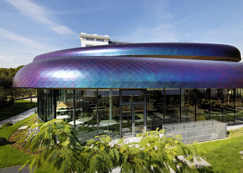
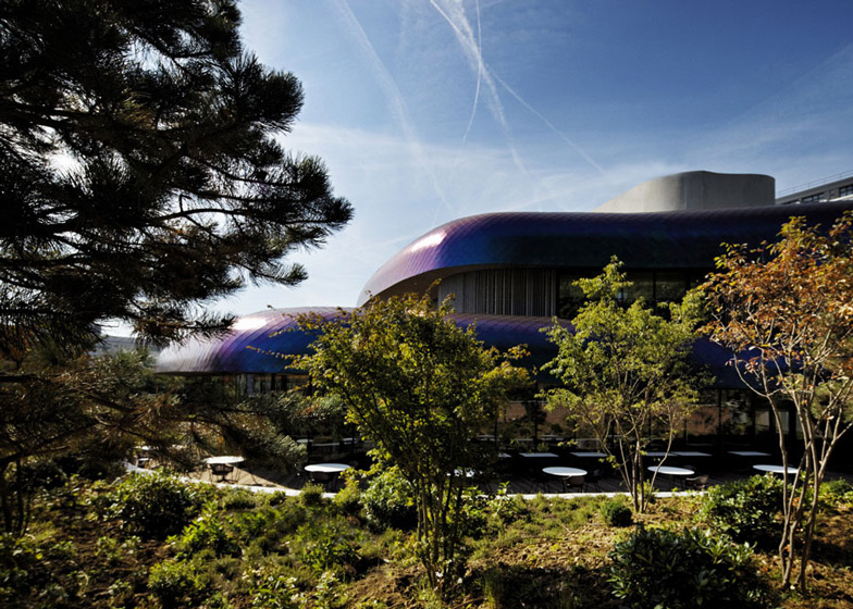
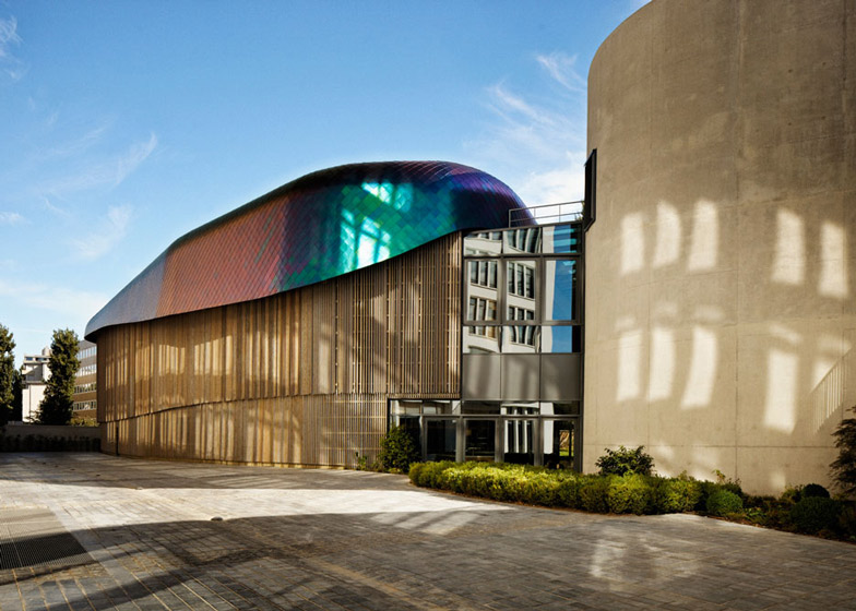
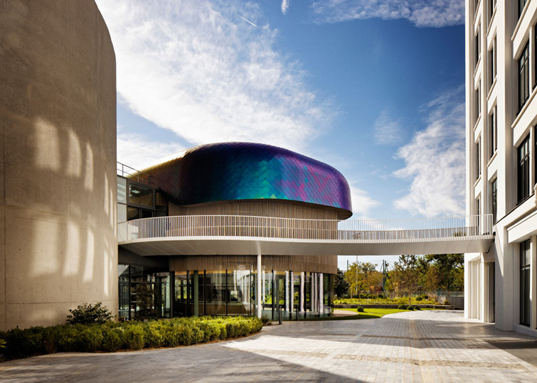
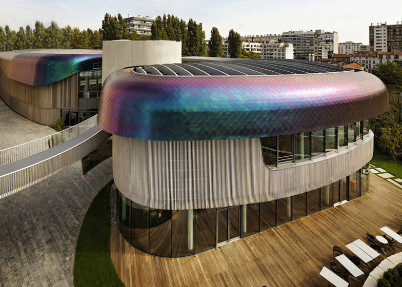
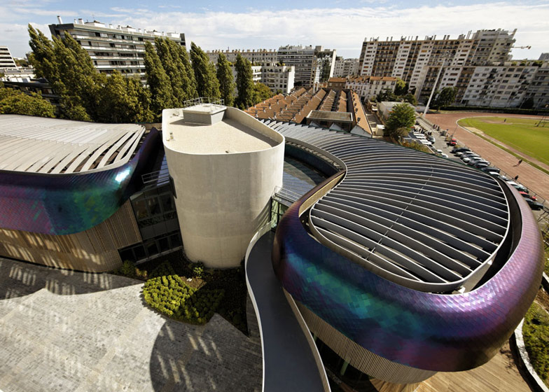
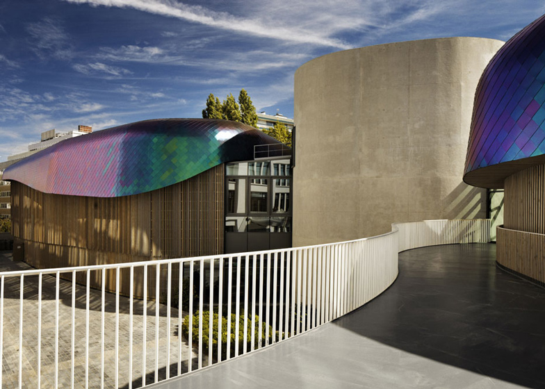
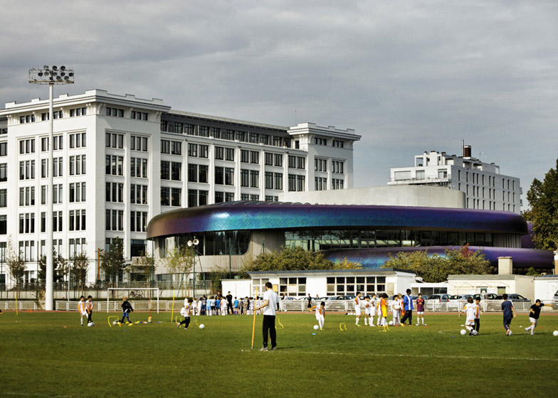
Curving iridescent structures resembling the scaled bodies of a pair of dragons slump over the top of this new wing created by French studios Agence Jouin Manku and DTACC at an office campus outside Paris (+ slideshow).
Agence Jouin Manku was asked to develop the concept for a new amenities wing for the headquarters of Société Foncière Lyonnaise, France's oldest property company, which is housed within a converted 1920s factory building on the banks of the Seine in Boulogne-Billancourt.
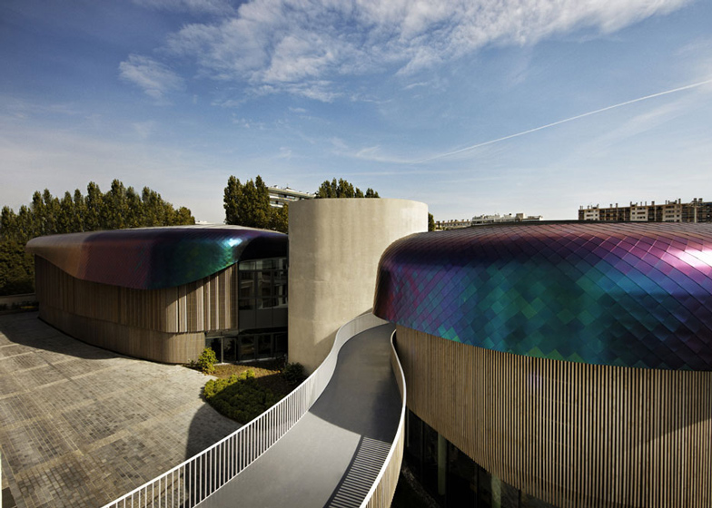
The new wing comprises a curving three-storey building that revolves around a tube-shaped concrete tower. Blocks extend out from both sides of the tower and are both topped with curving structures clad with shimmering stainless-steel shingles.
"The roof is designed like a shell made of scales," Aude Planterose of Agence Jouin Manku told Dezeen. "We can't ignore the reference to an animal; it could be a beetle or a dragon."
The iridescent tiles appear green when viewed straight on, but change colour from blue to purple when viewed at an angle.
"The building changes each time that you look at it," said Planterose. "These tiles are perfect for facade or roof, and it is actually the same technique used for the slate tiles you find on all Parisian rooftops."
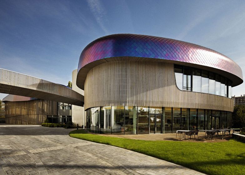
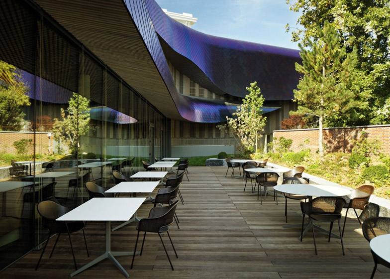
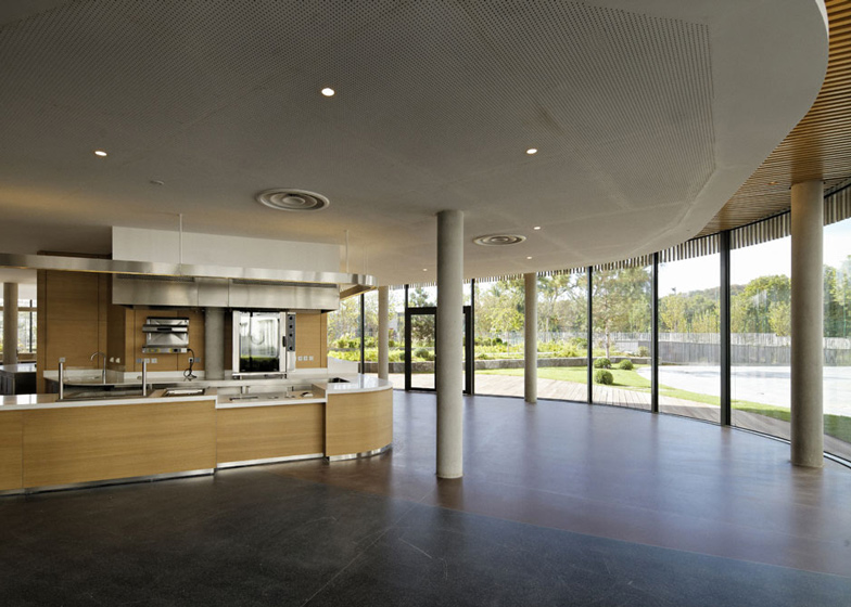
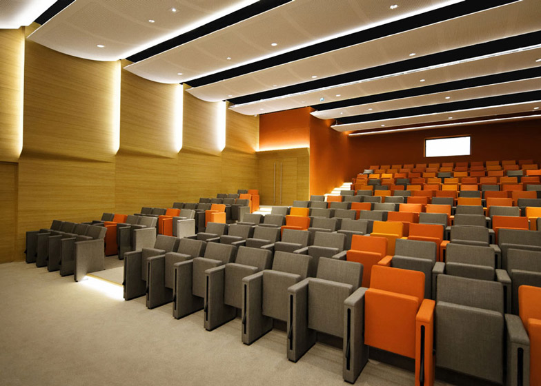
Below the tiles, the glazed exterior walls are screened with vertical timber slats that vary in density depending of the lighting requirements of the rooms behind, which include cafe and restaurant facilities for the offices, as well as new boardrooms and a 200-seat auditorium.
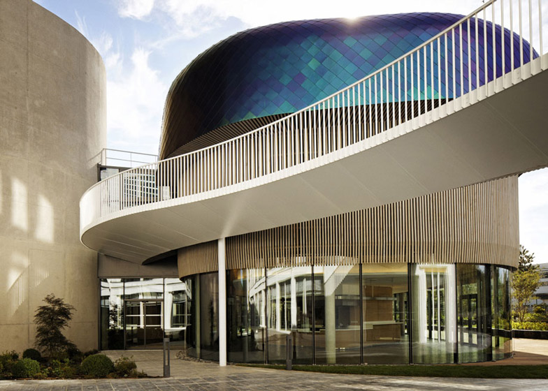
A staircase connecting the floors of both blocks is contained within the central concrete tower, while a footbridge creates a link between the new and old buildings at first-floor level.
The amenities wing was completed as part of a wider project by Paris firm DTACC to create the entire campus, which is entitled In/Out.
Photography is by Thierry Lewenberg-Sturm.
Here's a project description from Jouin Manku:
IN/OUT by DTACC and Agence Jouin Manku
An office "campus", for Société Foncière Lyonnaise, an ambitious architectural project including the transformation of the lobby with the construction of a glass microarchitecture as well as the creation of a new wing.
80 years of history
Built in 1927 by the architect Adolphe Bocage, this building, a landmark of the golden age of industry, had long been used to produce telephone control units. Located on the banks of the Seine, the site, with nearly 7 acres and a 6-storey building, used to hold the lMT society (le Matériel Téléphonique). The building soon became a symbol of industrial innovation.
The site had been designed in keeping with the great principles of the Modern Movement in architecture using simple geometrical shapes, and reinforced concrete. In 1976, Thomson-CsF took control over lMT, who, at the time, employed 10 000 people.
In 1988, seventy years after its construction, Thomson Multimedia transformed the factory into offices and set up its headquarters in the building, until 2009. SFL then decided to restructure the building, aiming for it to become a benchmark in the tertiary sector, focusing on innovation as well as on wellbeing at work. It is this ambitious decision that gave birth to the major IN/OUT project.
The site's new organisation
After our first commission to design a series of spaces for the Mandarin Oriental hotel in Paris, Société Foncière Lyonnaise (SFL), has asked us once again to embark on another adventure. This time, they have commissioned us to design a new amenities wing of their ambitious In/Out office campus, a landmark office project that is re-defining work spaces in France which houses a cafe, restaurant, board rooms, an auditorium as well as various technical spaces and the lobby, with his pavilion, of the historical building.
The IN/OUT project involves an office campus of more than 387 500 square feet. It is located on a former industrial site in Boulogne, at the West of Paris, on the right bank of the Seine River. This factory, which used to manufacture telephone tools in the 1930s, underwent a complete rehabilitation done by DTACC Architecture, such as many industrial sites in Boulogne.
This new amenities wing is nearly 40 000 sq ft.including the interiors. This building was further developed in collaboration with the engineering office TESS for the structural elements and the skin of the building and with architectural agency DTACC for the technical development and architectural execution.
The amenities wing
Agence Jouin Manku has conceived the new amenities wing (nearly 40 000 sq ft.), as well as the interior design of the wing. The building has been further developed in collaboration with the engineering office TESS and DTACC. The new wing also holds a series of services and amenities, alongside the workspaces within the 'Bocage' building (thus completing the IN/OUT campus). The wing holds: a 103 seats cafe, a 462 seats restaurant, a 200 seats auditorium, as well as corporate board rooms, lounges, 2 large terraces and a fitness centre.
A dynamic shape, symbol of an avant-garde building
How can workspaces in big companies be improved? What is missing? This interrogation has guided the design of the amenities wing. Agence Jouin Manku decided to create a very different atmosphere to complement the 'Bocage' building. This gives employees a healthy balance between formal and informal, as well as between work and play, an idea at the heart of the In/Out Campus.
The structure of the 'Bocage' building evokes nostalgia, professionalism and rigour. In contrast, the new wing has been conceived as a building of contemporary architecture, designed around the idea of movement and flow. Its shape has been made to create a series of intertwined spaces. The building is organised around the idea of passage: passing of people, light and air. It is also a place which evokes movement, production, action and dynamism.
The concrete heart: the centre of the building
The building is organised around a central tower, made of bush hammered concrete, which holds all vertical circulation. The choice to use concrete for the centre of the building was to create a coherence and dialogue with the neighbouring 'Bocage' building, which is made of the same material and clearly shows its original industrial character. Two wings revolve and wrap around the central tower, but they never meet. Their architectural lines are softer and each wing is a curved form, made of curved glass and vertical wood cladding. The spaces between the concrete centre and the wood wings are filled with glass, which allows light to penetrate almost everywhere in the building, vertically or horizontally.
On the outside, the density of the vertical wood cladding increases and decreases, depending on its position, and which indoor space it corresponds to. The pattern starts out smoothly, then its texture, created by adding chamfers, changes. These edges catch light differently and create a sense of depth on the facade. Inside, the main materials are wood, bush hammered concrete, plaster and curved glass. The curved wood that wraps a large part of the interior adds to the sense of warmth, while the simple use of glass and concrete add a crisp modernity to the project. A footbridge connects the two buildings. This bridge, made of white painted steel and wood, makes access easy between the two buildings, and acts as a symbolic link betweenthe two architectural signatures, and the birth of a common project.
An architecture inspired By nature: an inside out and outside in design
Inspired by the Saint-Cloud park, the Seine river and the lush nature just close to the site, the amenities pavilion has been designed to allow these elements to penetrate the building, as well as to create spaces that would allow one to enjoy the gardens and terraces, created as an extension of the building. The flowing shapes of the project recall the movements of nature. To underline this idea, the roof of the wing has been designed as a coloured envelope wrapping the building. The coloured stainless steel tiles were chosen for their particular iridescent character. In front view, the tiles are green, but their colour changes as the angle and light move. This gives the building a dynamic and always changing character, echoing the variations in the sky and sunlight.
The insides
The interior design and furniture have been thought out as a continuation of the outside lines of the building. While the central concrete core holds the curved staircase that links the various levels of the building, each level opens out on spaces filled with light: simple yet warm spaces, spaces that open out on terraces and gardens, as well as spaces that invite one to discover the next room. The circulation is therefore fluid, and the connection between each space is harmonious. Employees can thus enjoy each space, and will always be invited to discover the next one.
Conclusion
IN/OUT is an ambitious architectural project by DTACC architecture and agence Jouin Manku; together, they created two unique buildings for SFL. The campus offers a new approach to workspace based on the ideas of sharing, wellbeing and collective activities. The renovation and construction have greatly improved the campus' amenities, for the benefit of the future users. This project also transforms a typical scenery of the Seine river.

