Walmart office in Brazil has a crazy golf course on the roof
The Brazil headquarters for retail conglomerate Walmart's online division by Estudio Guto Requena has colour-coded levels and a terrace with a miniature golf course (+ slideshow).
Brazil firm Estudio Guto Requena aimed to create informal meeting spaces similar to those found in workplaces of technology companies on each of the floors at the Walmart.com headquarters, which occupies the sixth to tenth levels of a tower in São Paulo.
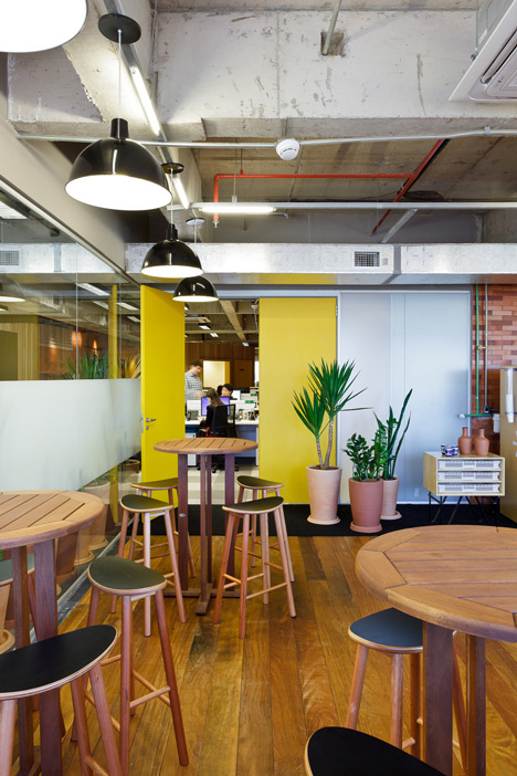
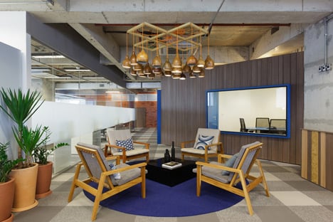
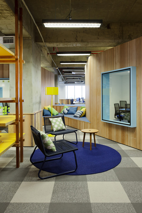
Communal areas are treated like balconies or patios, with outdoor furniture such as deck chairs, hammock-like seats and wicker swings set up for employees to socialise like neighbours.
"This is a very special project for us," studio founder Guto Requena told Dezeen. "The very first time in Walmart history that they invested so much attention in design for their space. Pushing their newest office to have a strong identity and a cosy interior... an interesting overlap between Walmart DNA and strong Brazilian culture."
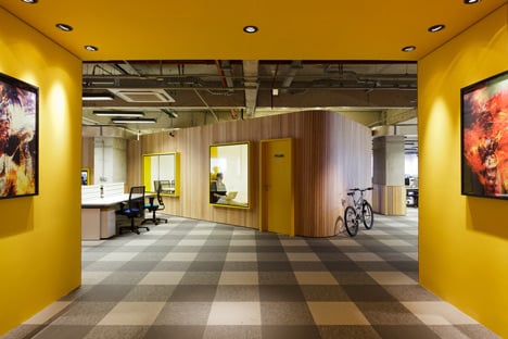
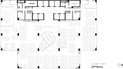
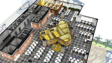
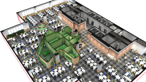
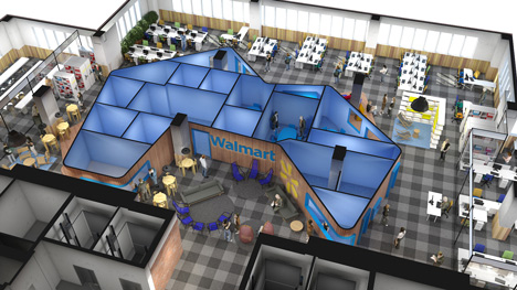
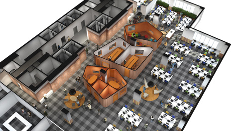
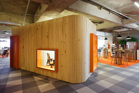
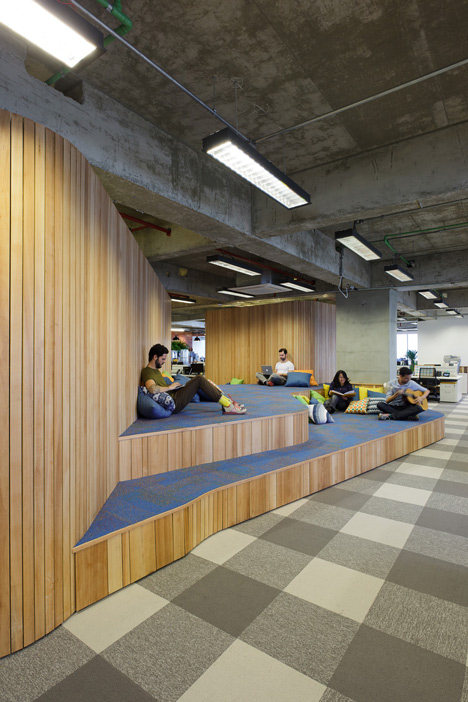
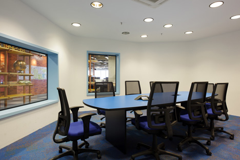
Meeting rooms are grouped into volumes at the centre of the open-plan office space on each level, surrounded by curved walls clad with timber strips on the outside.
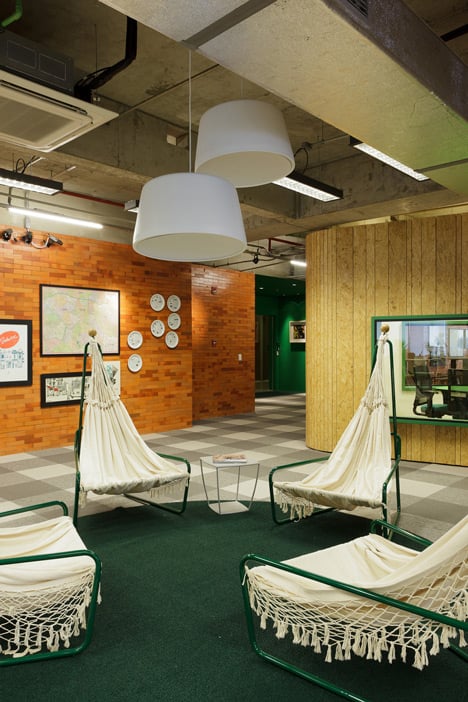
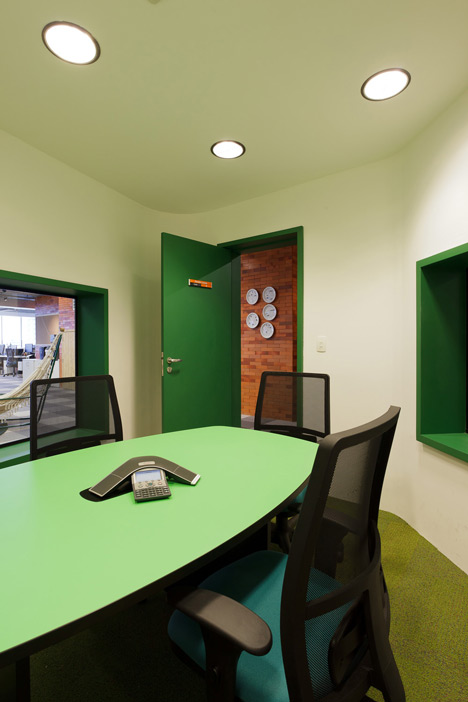
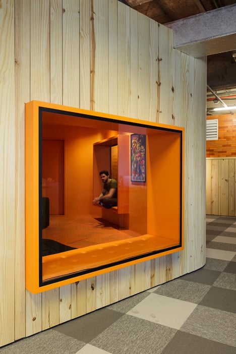
Surfaces, furniture and window frames in these spaces are treated in a different wood and a colour from Walmart's branding on each floor.
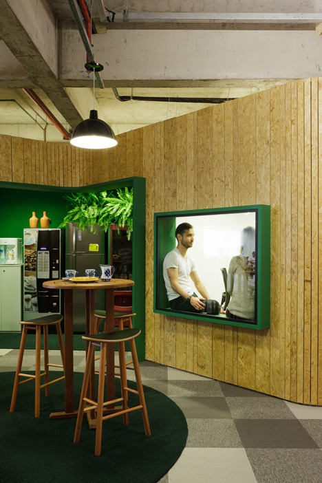
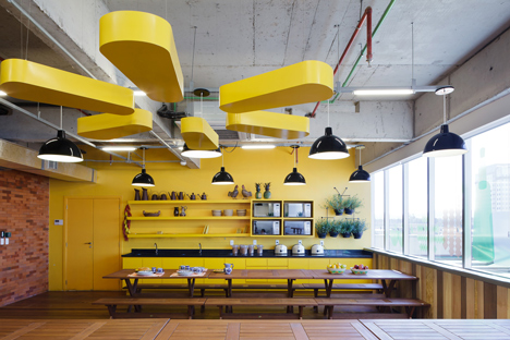
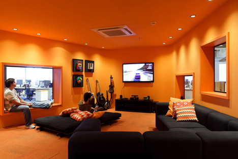
The yellow floor includes the employees' cafe, while a pool table is situated in the green zone, and a lounge with sofas and guitars is set up in one of the orange rooms.
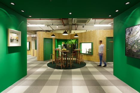
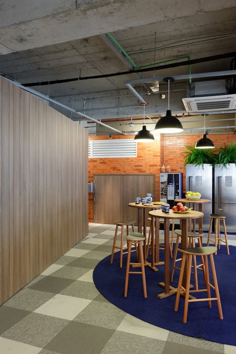
The informal meeting spaces are located in pockets formed by the odd shape of these blocks, with carpet and furniture matching those in the adjacent rooms.
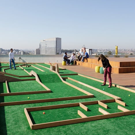
A minigolf course was designed especially for the terrace on the sixth level, where there's also a space for yoga and a seating area in front of a stage for hosting small events, concerts and film screenings.
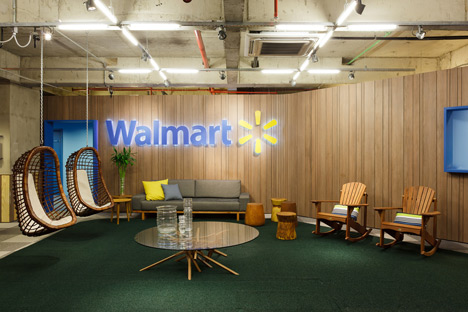
Photography is by Fran Parente.
Here's some more information from Estudio Guto Requena:
Walmart.com Office
Pre-design Research Methodology
The design for the Walmart.com Offices was derived from a research methodology developed by Estudio Guto Requena. Interviews and dynamic online exchanges with company employees were conducted to assess values, needs and expectations.
Three principal focal points emerged from this process: digital culture, the Walmart.com brand and brasilidade (Brazilian identity). This research also informed the choice of colours, materials, forms, programming and design concepts.
Conceptual Framework
We applied these three focal points and their commonalities to an exploration of the building's prominent terrace and developed from this a guiding concept for the company's headquarters: the Urban Veranda. Design choices reference the Brazilian habit of engaging outdoor areas for social interaction and relaxation.
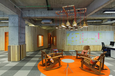
Elements include beach chairs, the many large buildings with terraced facades, picnics (visible in the carpet patterning), the patios and balconies of Brazilian homes, and the rural habit of placing a chair in the street to enjoy the evening and chat with neighbours.
Program and Identity
The headquarters occupy five floors with over a thousand square meters each. One of the challenges of this project was to bring a more human dimension to the work environment with spaces that are welcoming and comfortable, even pleasant and informal, while maintaining professionalism and practicality. Other challenges included a lean budget and a tight deadline.
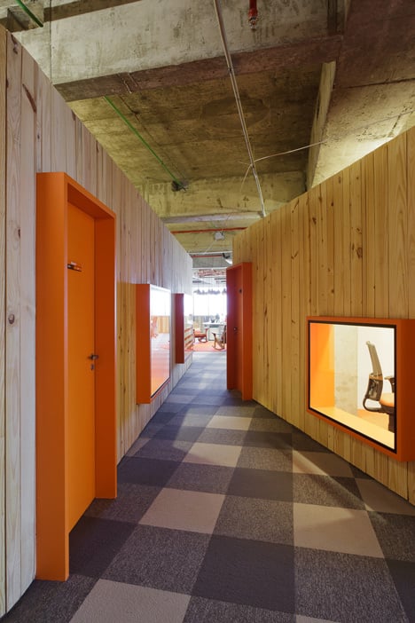
To help locate and guide visitors and employees in this large area, we created a unique visual identity for each floor through centralised cocoons that develop organically between the pillars and break the rigidity of the orthogonal space. Each floor was designed with a predominant wood type.
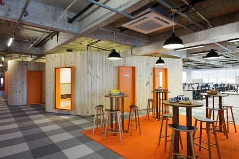
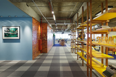
Pine, OSB, Eucalyptus and Masisa Zurich combine with a single colour in various shades, all chosen from the official Walmart colour palate of yellow, orange, blue and green. Different floors house individual departments, such as Business, Sales, Human Resources or Finance, and also contain lounges and decompression environments, including games rooms, film screening areas, video games and a library. These areas are to encourage the exchange of ideas and interaction between employees from different departments.
Lighting
Workstations are located near windows to take advantage of daylight, and the lighting design prioritises economy. In lounges and decompression areas indirect light is used in amber hues with decorative fixtures. Specifically created for this project is the hanging Gourd Lamp made from the fruit itself.
Traditionally, these have been used in Brazil as containers, and also as resonators in musical instruments such as the chocalho, the berimbau and the maracá. Dried gourds were painted gray inside and arrayed on a wooden support, with colorful wiring left exposed.
Furniture and Decoration
We prioritised the use of domestic furniture in both the offices and lounges, with signed pieces by the established Brazilians designers Maurício Arruda, Jader Almeida, Lina Bo Bardi, and Paulo Alves and Fernando Jaeger. We also included pieces that are part of the popular Brazilian imagination, such as rocking chairs, beach chairs, porch chairs and picnic tables.
For the production of objects and decorative elements we used images of contemporary Brazilian photographers, as well as maps, illustrations and Brazilian folk art. Skateboards and bikes reference the lifestyles of younger employees.
Greenery
Throughout the office we emphasised the use of plants, and created a green belt that runs through the peripheral spaces and contributes to the identity and warmth of the work environment.
Terrace
The outdoor area was designed for both work and relaxation. Wood decking orders the environment, together with porch furniture, shaded areas, a space for yoga and a grandstand facing the facade that can host small events, concerts and film screenings. A mini-golf course was also specially designed for the terrace.
