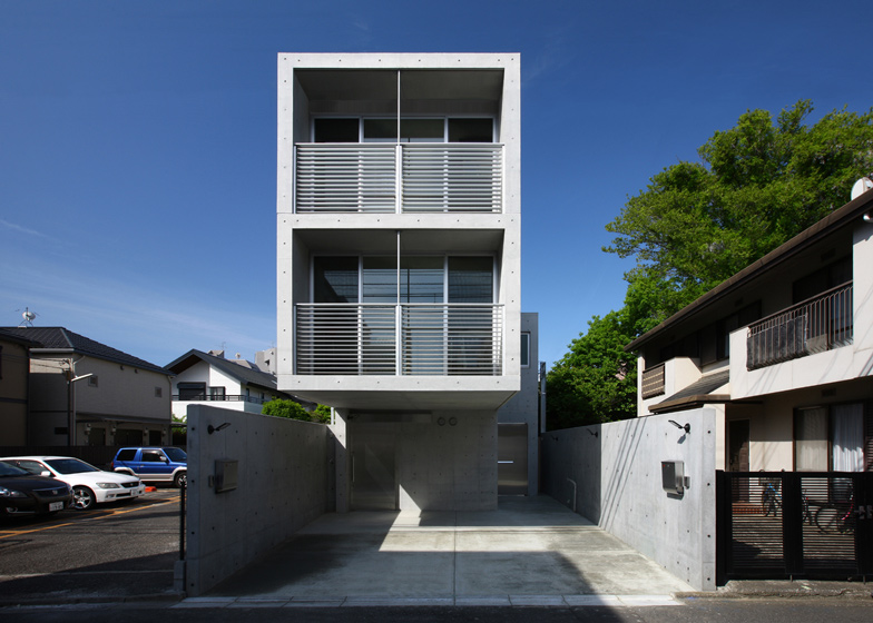
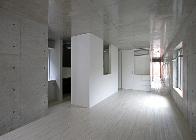
Japanese firm Atelier HAKO Architects used concrete dotted with formwork impressions for both the internal and external surfaces of these stacked residences in a suburb of Tokyo (+ slideshow).
Atelier HAKO Architects formed two houses in one building along a narrow plot in Minamikarasuyama, west of Tokyo city centre.
The circular indentations made by the panels used to form the concrete create a pattern of dots across the exterior, which continues around the walls through the rooms of the two homes.
Both houses are entered from the front drive. The door to the ground-floor home is positioned beneath a two-storey volume cantilevered above.
This apartment contains one bedroom, one bathroom and an open-plan living area, where the kitchen is concealed behind white walls.
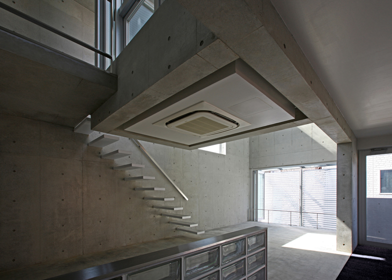
The larger dwelling above features a double-height living space at the back of the property.
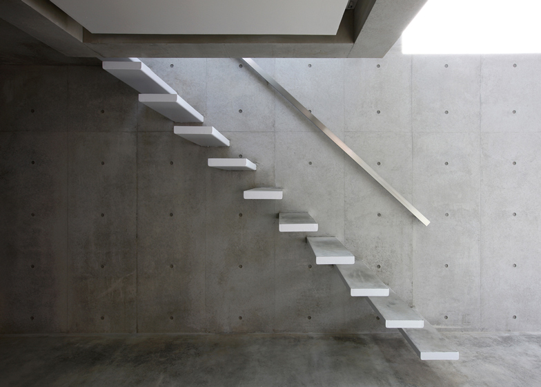
Floating treads of a minimal staircase lead up to a landing, from which a small terrace encased in glass can be accessed.
"The terrace covered with glass was suspended in a void as an element to incorporate natural light above the living area on the upper floor," said the architects.
Two bedrooms are housed within the cantilevered section of the building, one on each floor.
Another two bedrooms are also located on this floor, each with storage spaces tucked in the angled section of roof above.
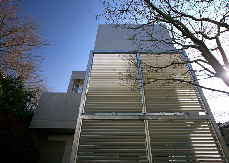
The largest windows are located at the front and back of the plot, covered with louvered screens for privacy.
Keep reading for the information from the architects:
House at Minamikarasuyama
The house sits on a narrow and long site, while facing a small vacant lot beyond the road to the front east side, and facing a pedestrian path to the back west side.
On the south long side, buildings like apartments might be built and might cause the lack of the privacy and the natural light of the house in the future, in spite of the good condition the metered parking offers now.
The dwelling units of two generations having the entrances each separate on the ground floor were stacked in the vertical, and the family living areas were placed the west side of the each house facing the tree of the pedestrian path.
One the front road side, a certain distance for a buffer to the passer and neighbours was kept by providing the open space that has full width of the site under the cantilever building.
In order to be able to live comfortably without being affected by the change of the neighbour's situation, main openings were set up in the east and west side in the direction of the long axis of the house, and the terrace covered with glass was suspended in void as an element to incorporate natural light above living area on the upper floor.
The distribution of the brightness and the silhouette of the light shine in the interior space are changing variously throughout the year and the day every moment, in response to the angle of the natural light.

