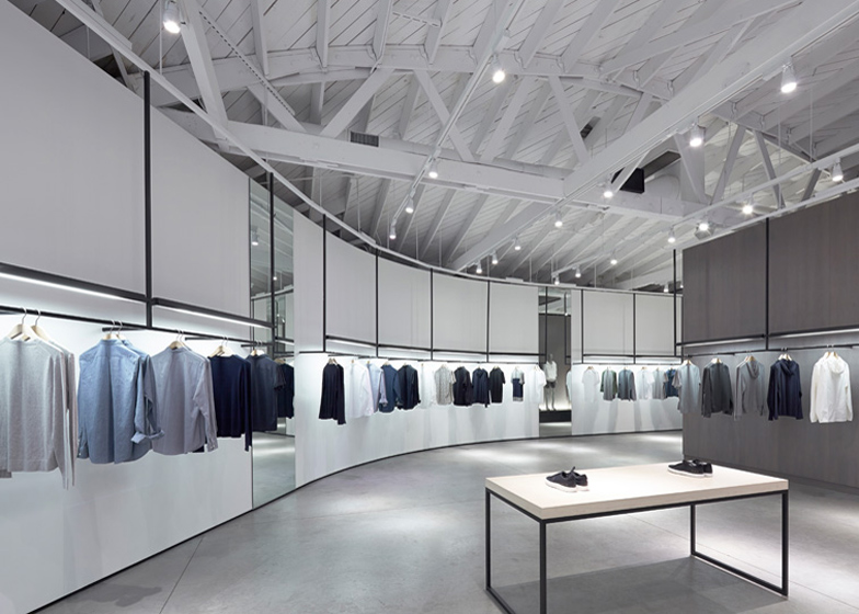
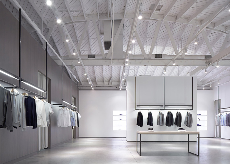
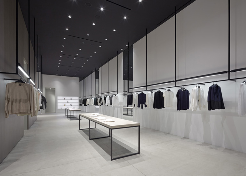
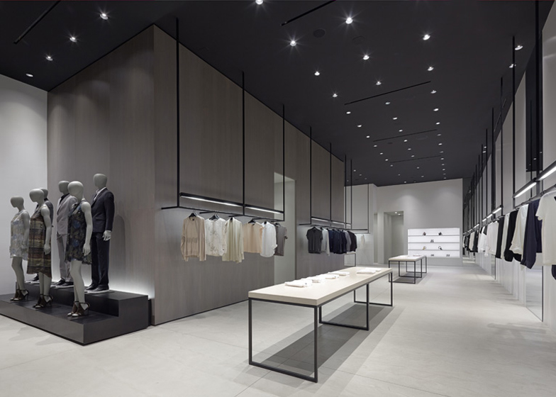
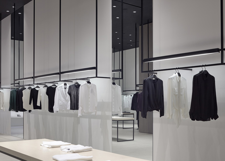
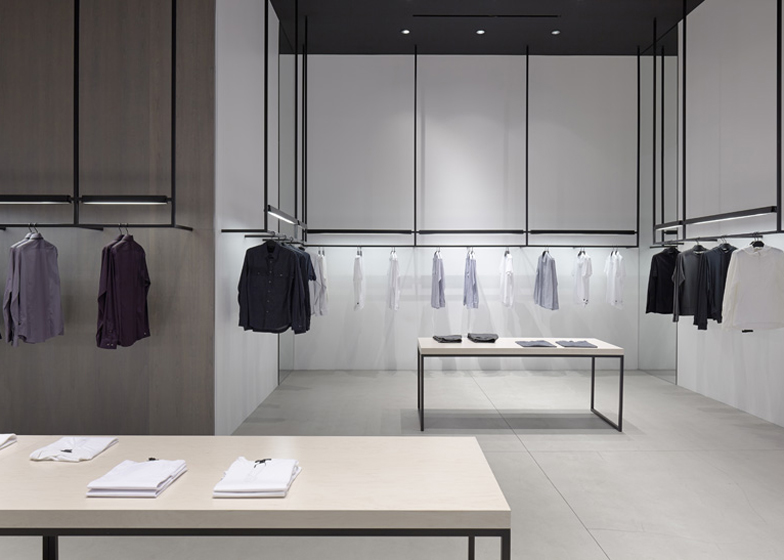
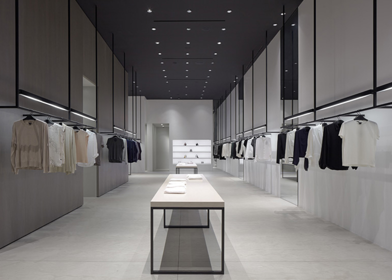
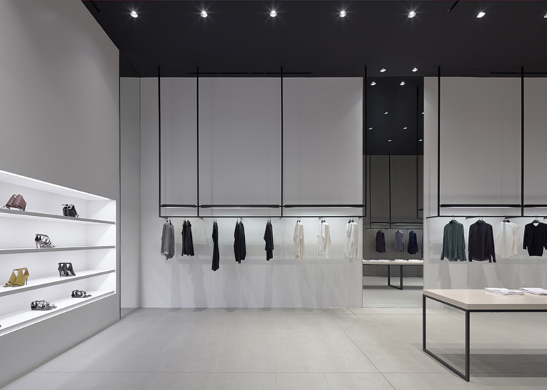
Japanese studio Nendo has created a succession of boutiques for New York fashion brand Theory where garments hang from geometric black frames and circulation routes are modelled on road layouts (+ slideshow).
Nendo has so far created a total of nine stores for Theory, including two in California, two in Paris, and others in London, Beijing, Shanghai, Tokyo and Osaka, all based on the same design concept.
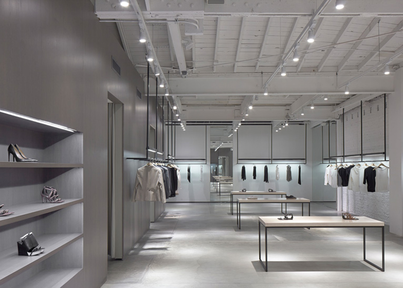
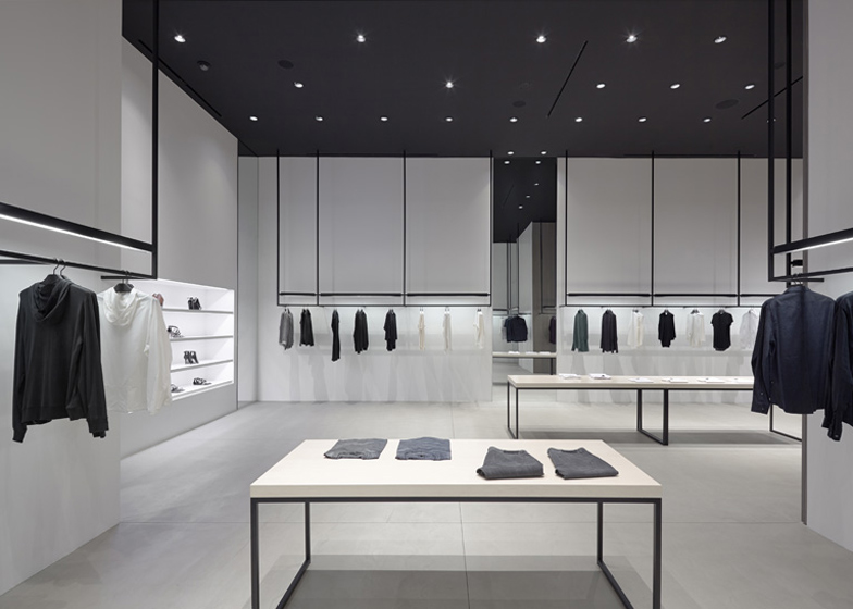
Each one has a largely monochrome interior with a layout shaped around the movement of customers through the store, which the designers compare to the flow of traffic on a road system.
"Our idea was to adhere to the brand's existing combination of simplicity and functionality with New York loft-style materials and a general sense of ease, while adding and emphasising a new concept: the flow of people," they explained.
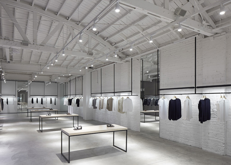
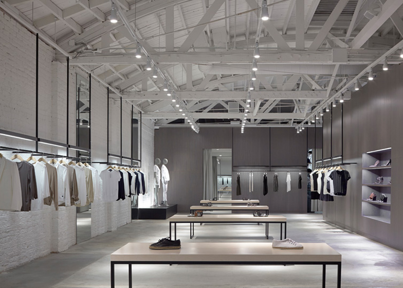
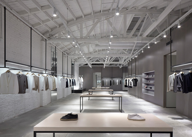
Product display tables and partitions have been arranged to clearly divide up the spaces, creating a network of junctions.
Changing rooms occupy generously sized spaces at the rear to encourage shoppers to spend more time trying on items.
"We allotted more space than usual for the dressing rooms and created a buffer zone between the dressing rooms and the shop proper, so that shoppers can take their time trying on clothes and selecting items without thinking about the main flow of people," said the designers.
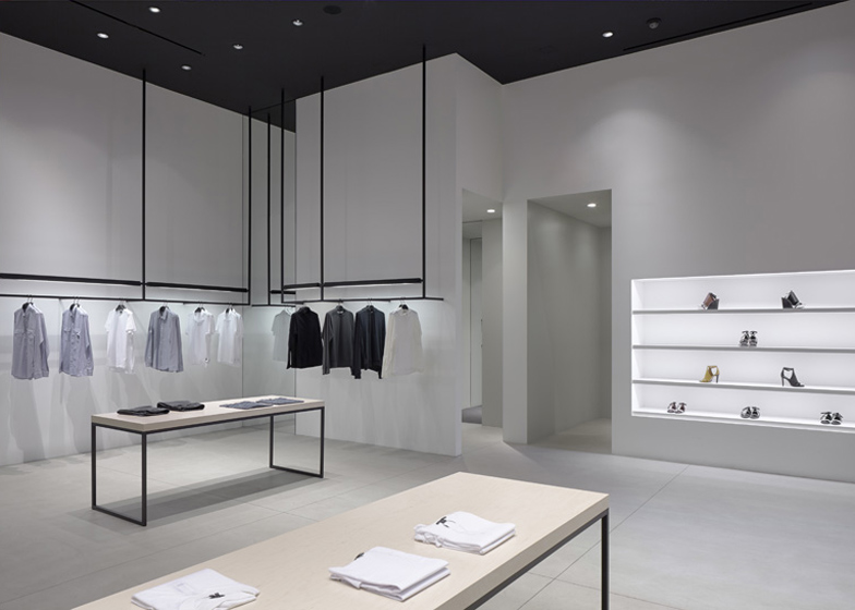
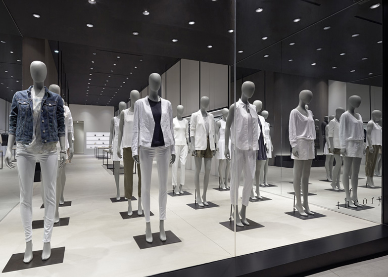
The first of the two new California stores is located in Beverly Hills and features a large shop window filled with a grid of mannequins, as well as clean white walls with recessed shelving.
A Los Angeles store occupies a converted warehouse on Melrose Avenue. Brick walls are left exposed and painted white, while steel trusses are visible overhead.
Photography is by Daici Ano.
Here's a project description from Nendo:
Theory Stores
Shop interiors for theory, the New York-based fashion brand known for basics that fuse functionality with casual trends.
We designed the interiors for two shops in Paris and Los Angeles and one shop each in London, Beijing, Shanghai, Tokyo and Osaka.
Our idea was to adhere to the brand's existing combination of simplicity and functionality with New York loft-style materials and a general sense of ease, while adding and emphasising a new concept: the flow of people. By coming up with a circulation plan as an urban planner might locate new roads within a city, we made careful provisions for people to flow into the shop naturally and move smoothly around it. For the London shop, we created a 'boulevard' that follows on directly from the crosswalk outside the shop.
The Paris shop is located on a corner, so we installed entrances on both outward-facing walls and arranged a softly curving 'short cut' between them. We then added 'plaza' and 'park'-like product display stages and lounge corners like to fit with the 'road system' in each shop and modulate each space. For the London shop, this meant installing 8.2 m long tables orientated to match the traffic flows within the shop; for the Paris shops, we added a large river delta-like stage that can display more than ten mannequins.
We allotted more space than usual for the dressing rooms and created a buffer zone between the dressing rooms and the shop proper, so that shoppers can take their time trying on clothes and selecting items without thinking about the main flow of people.
Together, these touches allowed us to respond to the different demands placed on the shop space while creating new flows of people that may, we hope, flow out into and colour the city space around the shops, too.

