American Institute of Architects names best projects of the year for AIA Institute Honor Awards
News: the American Institute of Architects (AIA) has announced 26 winners for this year's Institute Honor Awards, including a holocaust museum beneath a hill in Los Angeles, a stone mausoleum in Minneapolis, and a concrete house on a rocky outcrop in Washington (+ slideshow).
The AIA awards, which recognise excellence in the fields of architecture, interior architecture and urban design, awards projects from all around the world by architects licensed in the United States, and this year's winning firms include SOM, Olson Kundig Architects, KieranTimberlake and WXY Architecture + Urban Design.
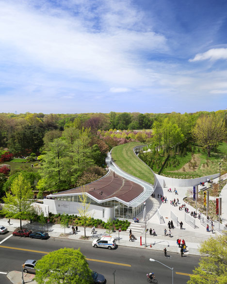
Winners in the architecture category include the renovation of a Beaux Arts library in St. Louis, an art college at a former railroad complex in Georgia and a visitor centre with a curving green roof at a botanic garden in Brooklyn.
A bar in a converted warehouse in San Francisco and an overhauled 1970s library in Seattle were among projects recognised in the interior design category, while urban design projects to pick up awards included a vision for Manhattan's East River waterfront in the wake of Hurricane Sandy and a new zoning code for public spaces in Miami.
A jury of architects and academics selected this year's winners from over 500 submissions and the awards will be presented at the AIA 2014 National Convention and Design Exposition in Chicago this June.
See the full list of winning projects below with descriptions from the AIA:
2014 Institute Honor Awards for Architecture
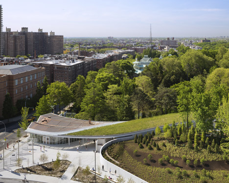
Brooklyn Botanic Garden Visitor Centre; Brooklyn, New York
WEISS/MANFREDI
The Brooklyn Botanic Garden Visitor Centre is an inhabitable topography defining a threshold between the city and the garden, culture and cultivation. Nested into an existing berm, the LEED Gold building is a seamless extension of the garden path system, framing views through the historic garden. As a chameleon-like structure, the visitor centre transitions from an architectural presence at the street into a structured landscape in the botanic garden. The building redefines the physical and philosophical relationship between visitor and garden, introducing new connections between landscape and structure, exhibition and movement.
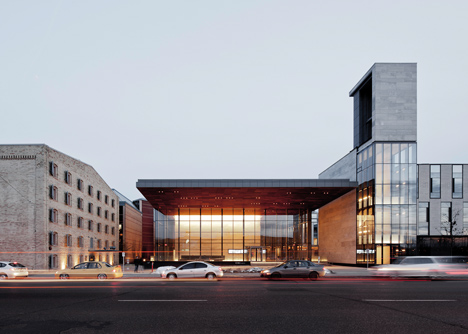
Centre for International Governance and Innovation (CIGI) Campus; Waterloo, Ontario, Canada
KPMB Architects
This project is located on a 3.9-acre site and is a reinterpretation of a traditional academic quad building based on the Oxford model. The client asked for a campus to last at least 100 years, a "vibrant sanctuary", to facilitate reflection, collaboration, and discussion. The solution consists of two three-story, interconnected buildings and an auditorium pavilion organised around a courtyard. The scale, proportions and materials of the brick elevations facing the street are a direct response to the 19th-century masonry industrial buildings in the surrounding neighbourhood. A limited palette of local limestone and brick masonry, wood and glass was used to create a serene atmosphere for study and reflection.
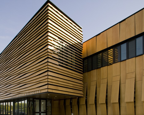
New Boathouse for Community Rowing, Inc. (CRI); Boston
Anmahian Winton Architects
This is the first permanent facility for Community Rowing, the largest public rowing organisation in the country. The project is composed of two buildings that form a courtyard that overlays two typically incompatible conditions: a public forecourt to the river and a staging terrace for the boats. The small building, a glass-shingled pavilion for single shells, displays the boats to the adjacent parkway. The large building houses longer boats, offices, and training rooms. The unique kinetic cladding system, which regulates natural ventilation and light, literally transforms the shape of the building and its relationship to the surrounding landscape.
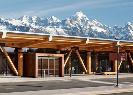
Jackson Hole Airport; Jackson, Wyoming
Gensler
With respect to Teton National Park, The Jackson Hole Airport renovation and expansion considers the building as a simple, understated foreground feature intended to merely reside within the landscape. The queen-post trusses reduced beam depths, increasing the volume, allowing for an expansive glass curtain wall that reinforces the connection between interior and exterior. This LEED Silver Certified airport distinguishes itself from the aesthetics of typical airports because of its regional design approach, materiality, and intimate scale. The airport serves as passenger's first and last impression to this truly unique region.
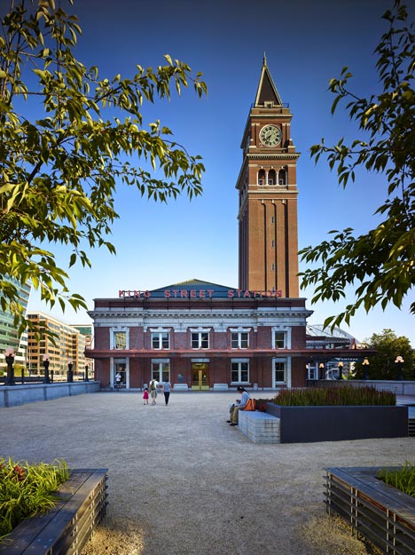
King Street Station; Seattle
ZGF Architects LLP
The rehabilitation of King Street Station restores historic 1906 architectural finishes, re-establishes the station as a modern transportation hub and capitalises on materials and energy invested a century ago by reusing materials rather than replacing them. The project enhances public spaces, improves pedestrian and multi-modal connections in and around the station, and has served as a catalyst for additional redevelopment within the neighbourhood. Securing the station for the future, the rehabilitation also included significant seismic and structural updates to improve the building's safety and durability. The project has achieved LEED Platinum certification.
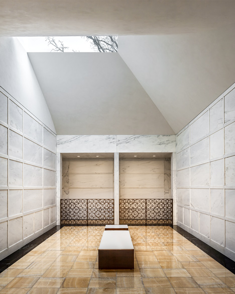
Lakewood Cemetery Garden Mausoleum; Minneapolis
HGA Architects and Engineers
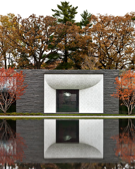
Addressing the intimacy of personal grieving and the shared rituals of commemoration, the design for the new Garden Mausoleum at Lakewood Cemetery in Minneapolis revisits an ancient building type whose setting demands contextual sensitivity and attention to materiality. The mausoleum minimises the visual impact on its historic context by nestling more than three-quarters of the building into an existing south-facing hillside. In each crypt and columbarium room, daylight strengthens the relationship between the spiritual and the earth-bound while offering a serene and healing environment. The material palette - stone, bronze, wood and glass - calls upon visual and experiential senses while recalling centuries of memorial tradition.
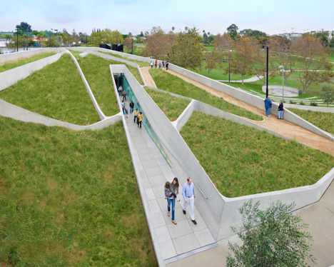
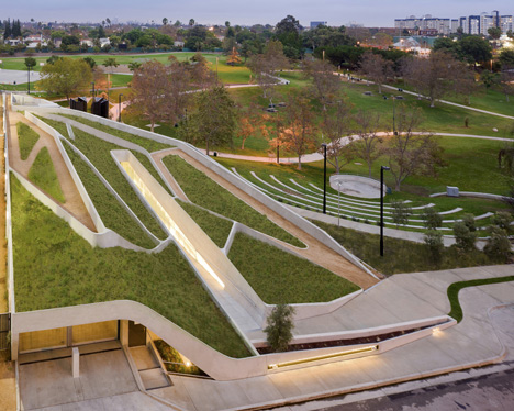
The Los Angeles Museum of the Holocaust; Los Angeles
Belzberg Architects
The Los Angeles Museum of the Holocaust is submerged into the surrounding public park space allowing the landscape to continue over the structure. Pathways are morphed onto the building and appropriated as surface patterning. The museum emerges from the landscape as a single, curving concrete wall that splits and carves into the ground to form the entry. Entry to the building entails a gradual deterioration of this visual and auditory connection to the park while descending a long ramp. Inside visitors experience a series of isolated spaces saturated with interactive archival content with diminishing natural light while descending further into the earth.
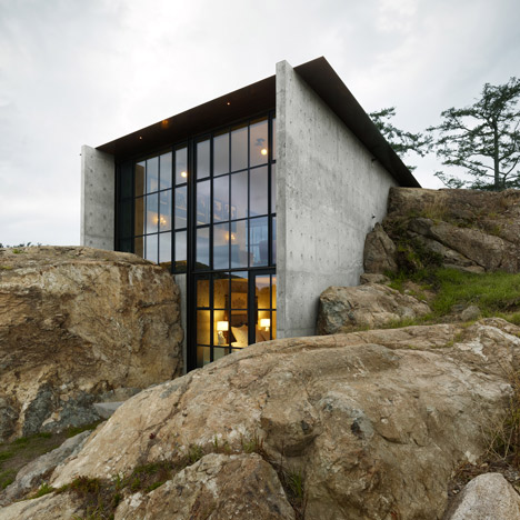
The Pierre; San Juan Island, Washington
Olson Kundig Architects
A secure and unexpected retreat nestled into a rocky outcropping, The Pierre (French for stone) celebrates the materiality of its Pacific Northwest site. The house - composed of concrete, wood, steel and glass, and topped with a green roof - visually and physically merges with nature. Inside, rugged surfaces of rock periodically emerge into the space, contrasting with the refined textures of the furnishings. While one side of the house is hunkered into the site, the other overlooks the water, balancing the dual desires of prospect and refuge.
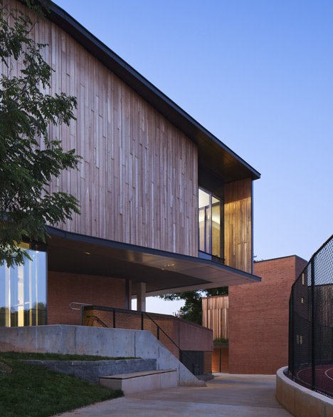
Quaker Meeting House and Arts Centre, Sidwell Friends School; Washington; D.C.
KieranTimberlake
With a minimum of means, this project transforms a non-descript 1950s gymnasium into a Quaker Meeting House and Arts Centre serving the entire middle and upper school community at Sidwell Friends School. The building program includes a worship space, visual art and music rooms, and exhibition areas. The essence of Quaker Meeting, and thus the Meeting House itself, is silence and light. Architecturally this is achieved by filtering light and sound through architecture, landscape, structure, and systems arranged in successive concentric layers around a central source of illumination, both literal and spiritual.
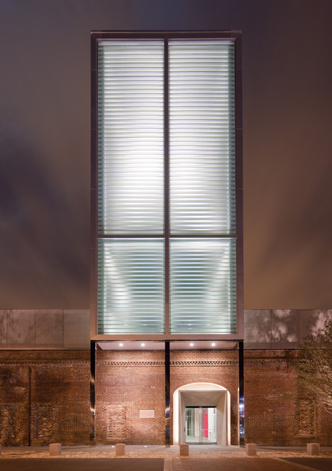
SCAD Museum of Art; Savannah, Georgia
Sottile & Sottile and Lord Aeck Sargent in association with Dawson Architects
Resurrecting the ruins of the nation's only surviving antebellum railroad complex, the Savannah College of Art and Design transformed a National Historic Landmark. The design process emphasised an artistically manual approach, honouring the humanity and integrity of the site's heritage. Ruins were integrated within a contemporary concrete structure, preserving and highlighting the historic materials as a fundamental part of the new architecture. With its galleries, art studios, classrooms, theater, public gardens, and vibrant streetscape, this new civic landmark stands as a centre of intellectual exchange, artistic discovery, and urban evolution.
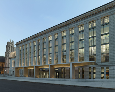
St. Louis Public Library, Central Library Transformation and Restoration; St. Louis
Cannon Design
St. Louis Public Library's Central Library, designed by Cass Gilbert, fills a city block in the centre of downtown St. Louis. The transformation of the 3-story 1912 Beaux Arts structure focused on the north wing, replacing multistorey, non-public book stacks with a new "building within the building" for public use. Now light filled and welcoming to its urban neighbours, the north wing is a new entrance surrounded by upper stories of books visible to all. The original entry and public rooms are restored and revitalised, continuing their active use as a vibrant public resource.
2014 Institute Honor Awards for Interior Architecture
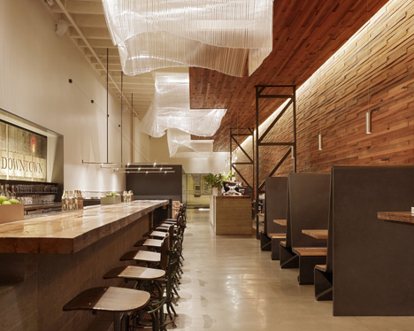
Bar Agricole; San Francisco
Aidlin Darling Design
This project is a 1,400-square-foot restaurant and bar located in San Francisco's industrial South of Market district. A wooden "hull" -constructed of reclaimed whiskey-barrel oak, milled into thin strips, and suspended from the ceiling - creates a sense of intimacy in the long, tall interior of the former warehouse building. Above the hull, three existing skylights, fitted with delicate glass sculptures formed from warped Pyrex cylinders, filter natural light throughout the space. Designed to complement the restaurant's seasonal menu, the interior palette balances warm textures with the use of durable, sustainable materials. Two bars, made of board-formed concrete and old barn beams, anchor the space. Inch-thick ribbons of ductal concrete form the high-backed banquettes.
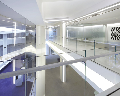
K&L Gates at One New Change; London, United Kingdom
Lehman Smith McLeish
International law firm K&L Gates' London office is seamlessly integrated into Land Securities' complex and iconic One New Change, which was designed by Jean Nouvel. Commanding views of St. Paul's Cathedral are a backdrop to technologically advanced meeting spaces and collaborative work areas that enhance the provision of integrated global services. The design responds directly to the dynamic and irregular building envelope, with enclosures, ceiling treatments, lighting, and site-specific art that define space and reflect K&L Gates' physical and strategic brand.
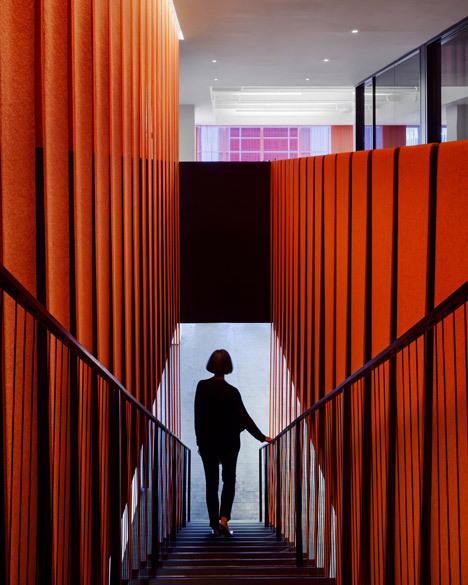
Knoll Flagship Showroom, Offices and Shop; New York City
Architecture Research Office
Architecture Research Office's design of Knoll's New York showroom, offices, and shop reflects intelligent planning, sensitivity to craft and joyful materiality. A choreographed path draws visitors from the ground floor shop through the showroom and offices. Colourful textile layers define the space, including a vibrant 55-foot wall that showcases 2,400 material samples. Two steel stairs display felt and leather and promote connectivity in the offices, where clients experience open plan, private office and activity spaces in use. This mix of spaces supports a variety of work styles - formal, informal, public and private.
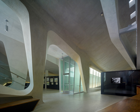
The Los Angeles Museum of the Holocaust; Los Angeles
Belzberg Architects
The interior architecture at The Los Angeles Museum of the Holocaust employs natural light and the morphing of space to open and lift or darken and compress the user's experience at key points. The lighting of the interior galleries dim as the visitor steps deeper into the earth and subsequent rooms, while limited natural light serves as a companion to each patron's unique experience. The final ascent up is filled with sights and sounds of unrestricted park land. The exhibition design incorporates educational content that is synthesised with all aspects of the design via innovative technology using integrated interactive design methods.
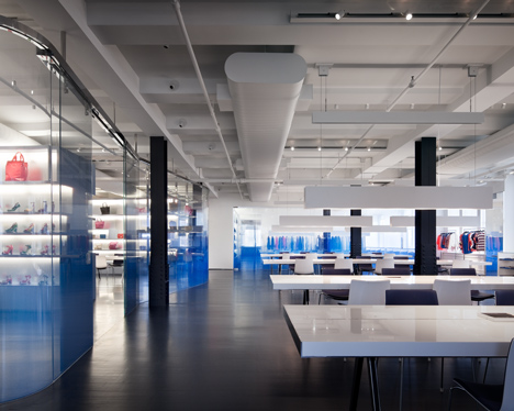
Marc by Marc Jacobs Showroom; New York City
Jaklitsch/Gardner Architects PC; HLW International
The Marc by Marc Jacobs Showroom is housed within the Manhattan headquarters of the global fashion house Marc Jacobs. The showroom is a reinvention of the client's original space and addresses the challenge to maximise the use of daylight within the building's deep floorplate, while simultaneously addressing the need for areas of relative privacy. The design solution employs a central curvilinear glass form as an organising element of the space which is used to filter natural light while creating subtle visual screening to delineate the private zones.
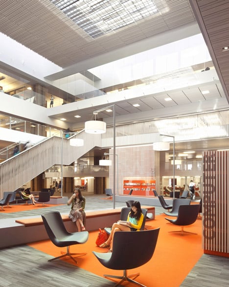
Odegaard Undergraduate Library; Seattle
The Miller Hull Partnership
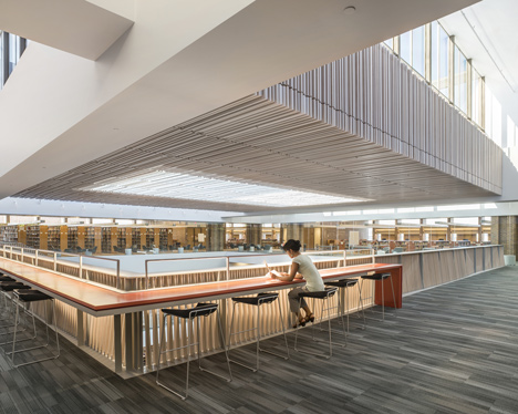
The interior renovation of the Odegaard Undergraduate Library re-imagines the learning experience for 21st century students through the astonishing transformation of space in an outmoded 1970s building; accomplished in two years by state mandate. Updates to the massive 165,000 square foot library, serving 10,000 students, 24 hours a day, include removal of an imposing atrium stair, and a 'kit of parts' approach supporting key learning behaviours in a bright, open setting. New seating, individual and group workstations, and Active Learning Classrooms further enhance the academic experience for a collaborative and tech-savvy student body.
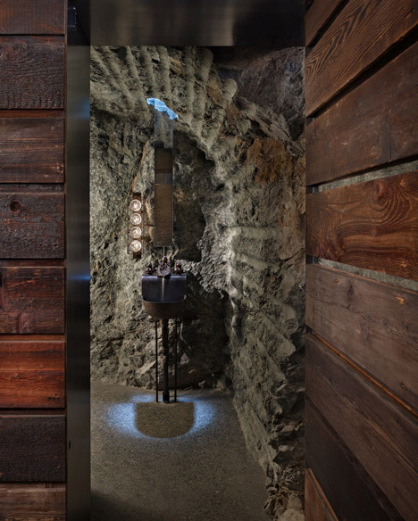
The Pierre; San Juan Island, Washington
Olson Kundig Architects
A secure and unexpected retreat nestled into a rocky outcropping, The Pierre celebrates the materiality of its Pacific Northwest site. The house - composed of concrete, wood, steel and glass, and topped with a planted roof—visually and physically merges with nature. Inside, rugged surfaces of rock periodically emerge into the space, contrasting with the refined textures of the furnishings. Antique and vintage furniture is complemented by custom-designed pieces, while contemporary works of art are displayed inside and outside the house.
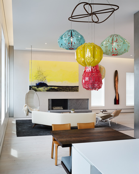
SoHo Loft; New York City
Gabellini Sheppard Associates LLP
This 8284 square foot interior renovation enhances the SoHo-Loft typology while creating multi-level garden roof terraces. The design emphasises lightness, openness, spatial fluidity and permeability. Light, considered as a tangible material, is the premise on which the program and spatial organisations are based on, with the creation of light apertures helping to organise the uninterrupted space. Influenced by the client's requests to blur the lines of separation between public and private, children and adult areas, thresholds are defined by sliding translucent doors, acting as light filters, while providing flexibility of use.
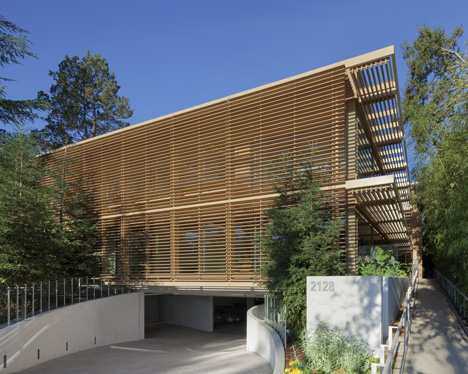
Venture Capital Office Headquarters; Menlo Park, California
Paul Murdoch Architects; Kappe Architects Planners
Gardens, transparency and wood finishes create a warm, intimate work environment for this office headquarters of a venture capital firm in Silicon Valley. To reduce on-site construction, the two-story office building is made of prefabricated steel modules set by crane on a concrete parking podium. The building interior is designed to temporarily house and incubate young companies, adapting to their changing needs. Strong, accent-coloured glass expresses the company's reputation for risk taking while fine, wire-brushed wood finishes form an elegant and understated feeling in keeping with the firm's market sophistication.
2014 Institute Honor Awards for Regional & Urban Design
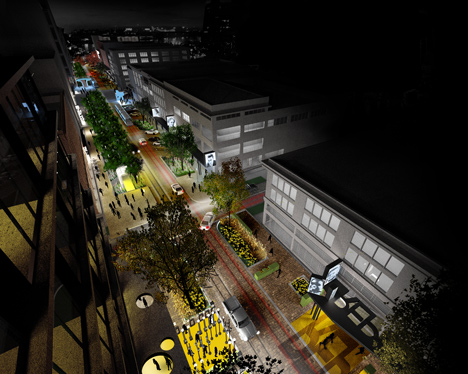
The Creative Corridor: A Main Street Revitalisation for Little Rock; Little Rock, Arkansas
University of Arkansas Community Design Centre + Marlon Blackwell Architect
The Creative Corridor retrofits a four-block segment of Little Rock's historic Main Street based on aggregation of the city's scattered cultural arts organisations. The project goal is to structure an identity for the Creative Corridor rooted in a mixed-use living environment anchored by the arts, rather than Main Street's workaday retail base. A townscaping framework reliant on the urbanism of streetscapes—landscape architecture, water management, public space configurations, frontage systems, furniture, and miscellaneous assemblages―ensures a coherent evolution of the street. The street is seen as a platform for capturing value.
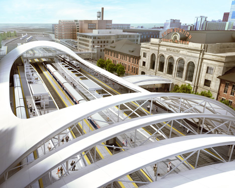
Denver Union Station Neighbourhood Transformation; Denver
Skidmore, Owings & Merrill
The redevelopment of the former rail yards at Denver Union Station is a case study of the power of transit-oriented urban design. The 42-acre master plan knits together light rail, commuter rail, and buses into a 21st-century intermodal transportation hub. Modal connectivity is facilitated by integrating land use and transportation infrastructure to support more than 4 million square feet of mixed-use urban infill. This substantial public investment has catalysed an unprecedented wave of private-sector activity, with over $1 billion in new projects shaping a transit-oriented precinct and new urban neighbourhood.
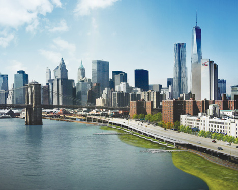
The East River Blueway Plan; New York City
WXY architecture + urban design
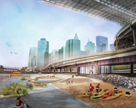
The East River Blueway Plan, led by WXY architecture + planning, provides a new vision for Manhattan's East River waterfront from the Brooklyn Bridge to 38th Street. It addresses issues that were overlooked for the last half century, including waterfront access from the land and water, environmental goals, climate change adaptation and storm resiliency for the waterfront and adjacent neighbourhoods. Completed shortly before Hurricane Sandy, the planning process offered innovations such as structures for storm water capture, saltwater marshes for wave attenuation and water quality, bridges supporting movement along the waterfront, and water recreation including boat launches, pools and fishing.
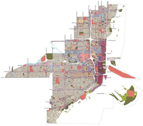
Miami 21: a New Zoning Code for the City; Miami
Duany Plater-Zyberk & Co. LLC
Miami 21 is a form-based zoning code that replaced Miami's Floor Area Ratio (FAR) and land-use based regulations. Using the Transect and the SmartCode as its basis, the new code focuses on the control of building to assure pedestrian-oriented public space, and provide physical predictability for developers and residents alike. Multiple use and density types are consolidated, and the translation from FAR to FLR (floor lot ratio that includes parking) simplifies building capacity measure and reduces parking. A public benefits program encourages the provision of affordable housing, public open space and historic preservation.
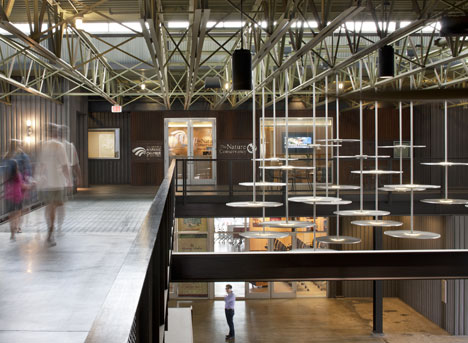
The Pearl Brewery Redevelopment Master Plan; San Antonio
Lake|Flato Architects
The Pearl Brewery Redevelopment Master Plan is serving as a transformative model and catalyst for green urban revitalisation in a long neglected portion of San Antonio's inner city. Established in 1883, the Pearl Brewing Company once had the largest brewery in Texas but eventually closed their operation in 1985. After 15 years lying derelict, the creative reuse of this 26-acre brownfield site and its abandoned structures are drawing in a rich mix of new residents, small businesses, retail, and non-profits while emphasising community, conservation, and local economic development.
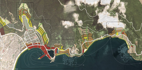
Son Tra Peninsula Strategic Vision Plan; Vietnam
Skidmore, Owings & Merrill
Son Tra is connected with Da Nang via the longest suspension cable bridge in Vietnam, the Thuan Phuoc Bridge, which was opened in 2009. This connection to the city has improved accessibility, but it has also brought development interest that threatens the environmental health of the area. The plan champions this territory as one to be enhanced, rather than exploited; it calls for the creation of a protected status for the "mountain-island", and it establishes clear "no build" zones at altitudes above 100 meters while suggesting locations where development may enhance economic opportunities without affecting the environment and natural beauty.