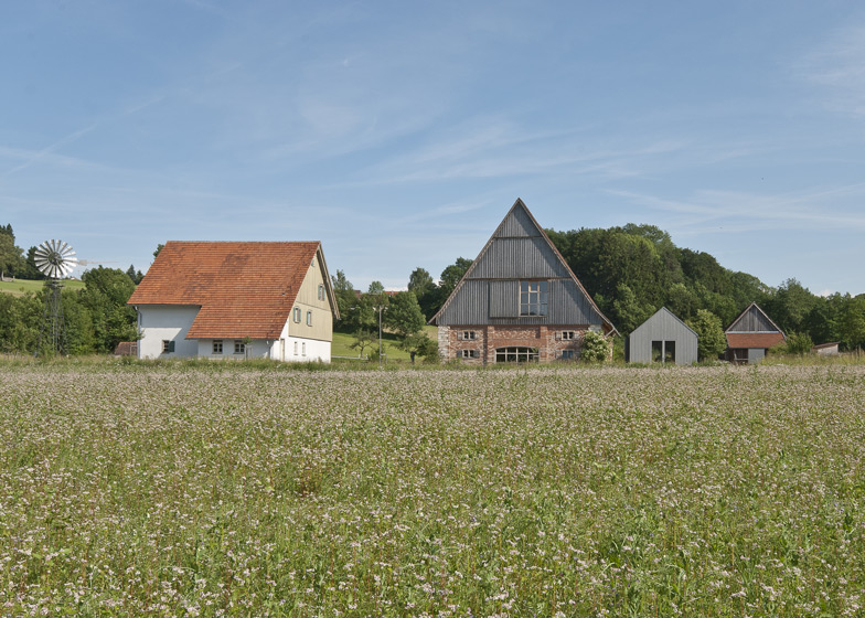
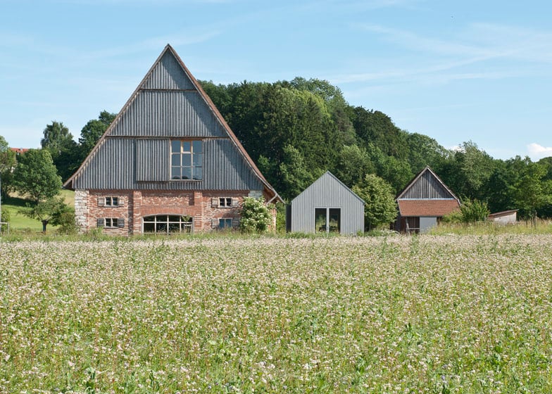
This small wooden pavilion was modelled on the design of a rural shed and added to an old museum in Germany by architects Von M (+ slideshow).
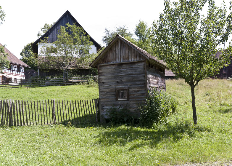
Bauernhaus Museum Wolfegg is an outdoor museum consisting of old relocated farmhouses that visitors can explore to discover the area's rural way of life from 1800 to 1900.
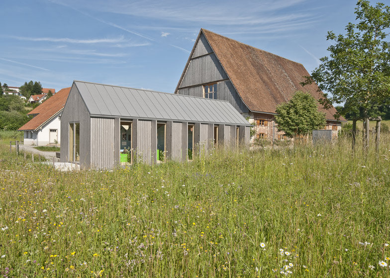
Stuttgart-based firm Von M designed the BMH pavilion as a multifunctional space for exhibitions, events and workshops. It's the only new structure on the site so needed to fit in aesthetically.
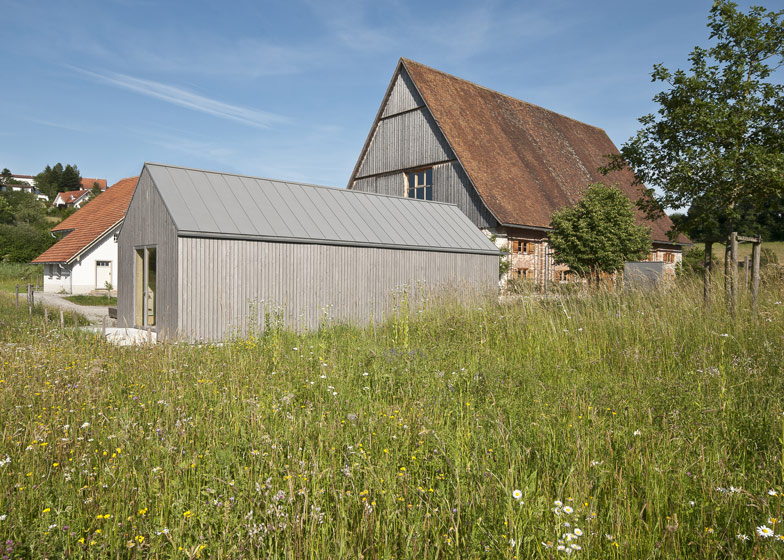
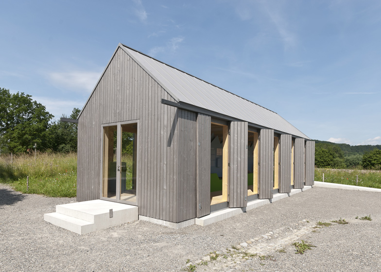
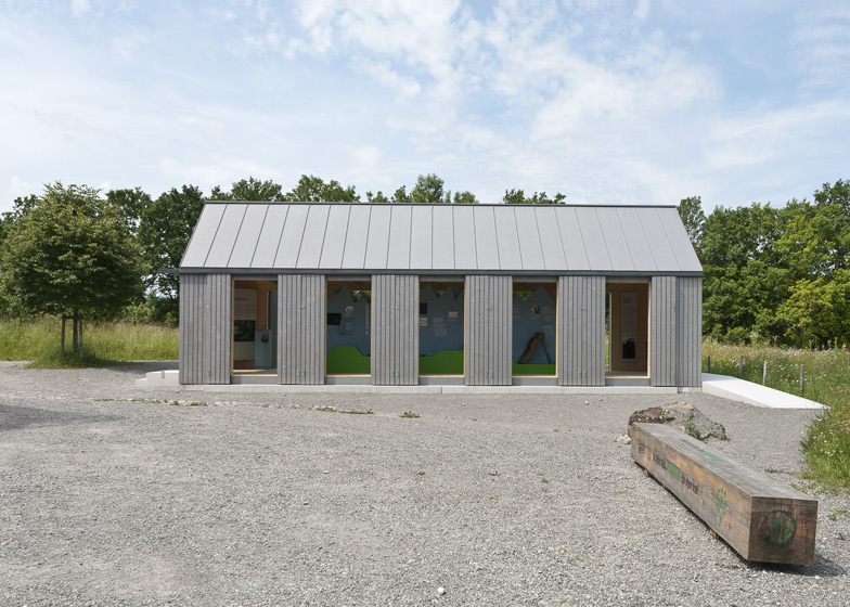
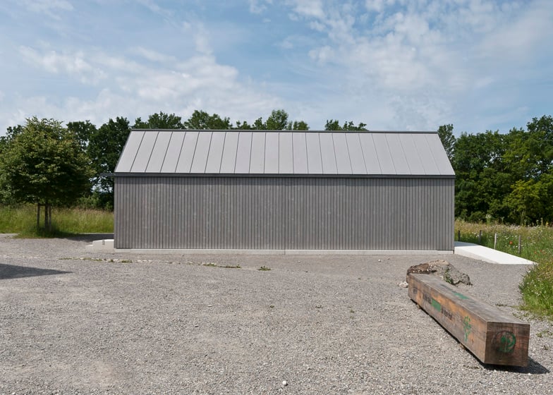
The building is clad in silver-grey spruce, while the gabled roof is covered with sheets of grey zinc.
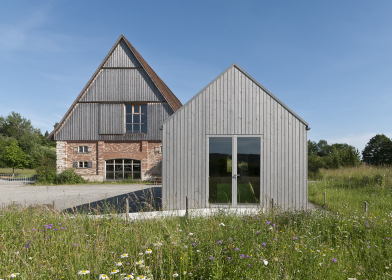
Hinged wooden shutters open at intervals along the side walls and the main entrances are via glass doors at each end.
Architect Dennis Mueller told Dezeen that the building was always intended to be a simple structure.
"The context of the pavilion is quite unique so we needed a clear idea to react to the artificial but strong and old-looking context," he said.
"The roof and the wall cladding have the same colour to achieve the monochromatic and calm appearance," he added.
Photography is by Dennis Mueller.
Here's a project description from Von M:
BHM Pavilion "Kulturschuppen"
The starting point for the design of a new building on the Wolfegg museum area was the need for a room that can be multifunctionally used. In this room special exhibitions as well as minor events and museal pedagogical workshops should take place.
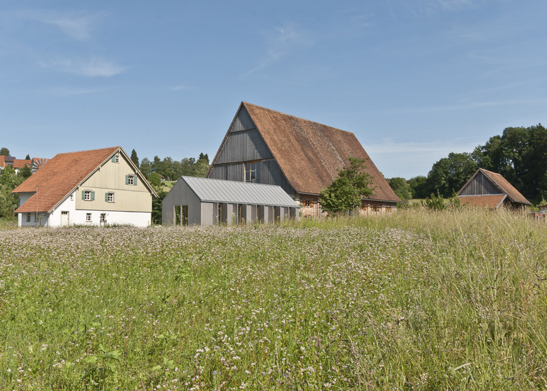
Very essential in this connection was the location of the pavilion within the museal context. The new building complements the main entrance of the open-air museum around the already existing buildings "Blaserhof" and "Zehentscheuer" that had been transferred to Wolfegg as "museum - buildings" earlier.
Because of this prominent neighbourhood that aims at attractiveness in its entity, the new building had to subordinate itself under the existing housing of the museum area. Thus the pavilion is to be understood as a fine complement of the farmhouse ensemble, not as a centre of it.
Functional agricultural buildings served as an analogy for the conceptional design. The pavilion makes use of the characteristic shape and materials of a typical shed in a rural environment thus fitting in the environment of the transferred buildings.
Still, the monochrome colour design as well as the minimalist detailing distinctly demonstrate the exceptional position of the pavilion in the midst the farmhouses of former centuries.
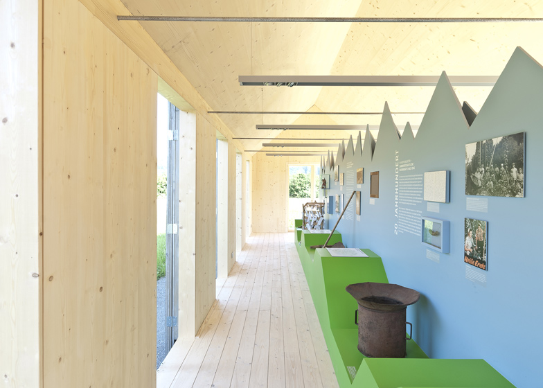
Also structurally the pavilion aims at a preferably simple and clear principle. Massive spruce plywood panels define the interior in a rhythmical interplay with the opening folding shutters.
Because of the restriction on one single material of the simple industry quality surfaces a quiet and strong atmosphere emerges in an interplay with the surfaces of the roof elements and the spruce floor, both untreated.
The bright character of the interior on the one hand, contrasts the dark-grey exterior coating of the pavilion on the other. Thus it also stresses the interplay of open and closed wall surfaces as well as the transition from inside to outside.

