Australian office Tribe Studio has hollowed out the centre of a 1920s house in Sydney to create angular ceilings and a wide entrance to the garden (+ slideshow).
Tribe Studio created House Chapple by retaining the original 1920s frontage of the old bungalow, renovating the interior and replacing a later extension at the rear.
"The challenge of this house was to achieve sun and privacy while appreciating both aspects," said the architects. "Our client wanted to retain the romantic elements of the house and its sense of humility in a suburb of flashy new builds."
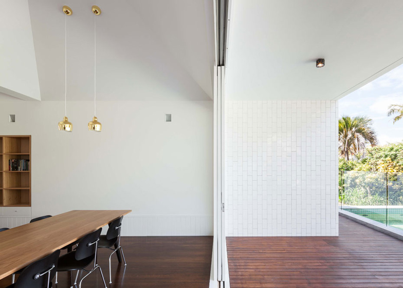
The architects removed a suspended ceiling in the centre of the house, creating a double-height living space with pyramid-shaped ceiling profiles. They also added skylights at the top and installed pendant lights with long cables.
"We allowed light into the centre of the plan, promoting stack-effect ventilation and reinforcing the unusual order of operation of the house," they added.
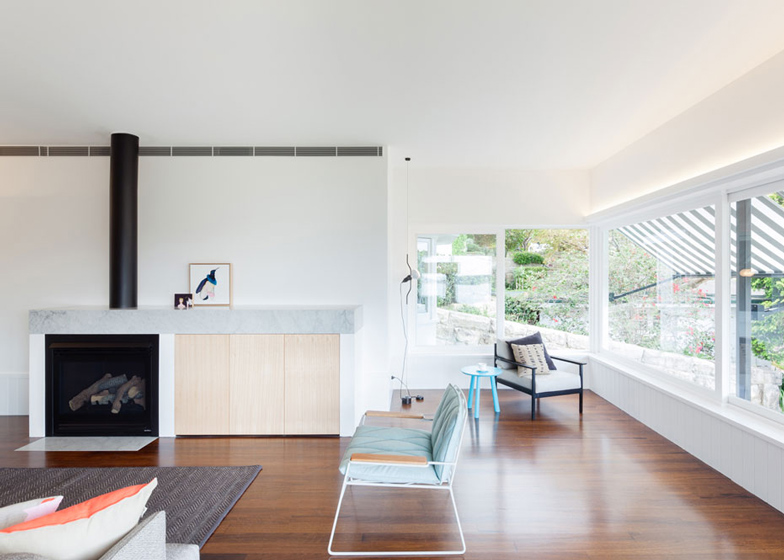
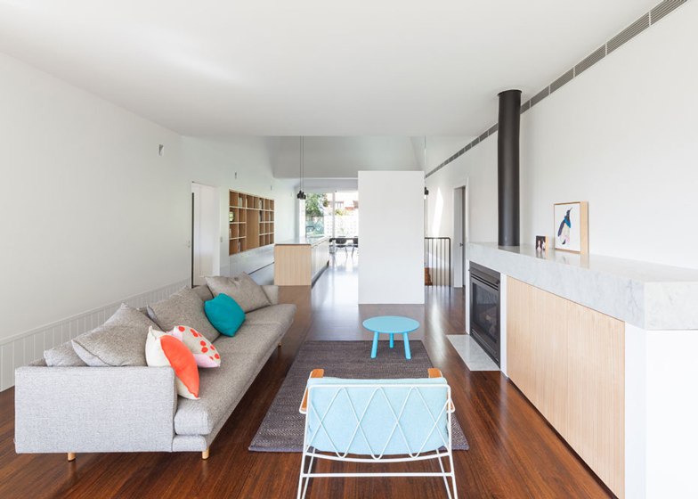
A street-facing sunroom is positioned above the garage, with views out across Sydney Harbour. The room opens out into the main living space that includes a lounge, kitchen and dining area.
Three bedrooms, a TV room and a study are positioned along the sides of the main space.
At the rear, the wide entrance opens onto a wooden deck flanking a garden with a long rectangular swimming pool.
Polished wooden floorboards and white walls feature throughout, while the brick exterior walls have been painted white.
Photography is by Katherine Lu.
Here's a project description from Tribe Studio:
House Chapple
With fantastic harbour views and a northerly orientation to the street-front and a wonderful garden and existing pool to the rear, the challenge of this house was to achieve sun and privacy while appreciating both aspects.
The house has been in our clients family since the 1960s. An important part of our brief was finding a balance between new and old architecturally and sentimentally.
Our client wanted to retain the romantic elements of the house, and its sense of humility in a suburb of flashy new builds. She was simultaneously keen to have a new start in this house and have it feel her own.
The strategy is a modest one: retain the original 1920s bungalow frontage and replace a poor 1960s addition at the rear.
The primary move is to cave out central part of the plan as living spaces with clear views to the front (harbour) and back (garden). The central band of living space is contained on either side by cellular ribbons of bedrooms and utility.
The living space occupies the area underneath the peak of the original roof. The ceiling is removed and a series of distorted pyramid ceiling voids are created within the original geometry, allowing light into the centre of the plan, promoting stack effect ventilation and reinforcing the unusual order of operation of the house.
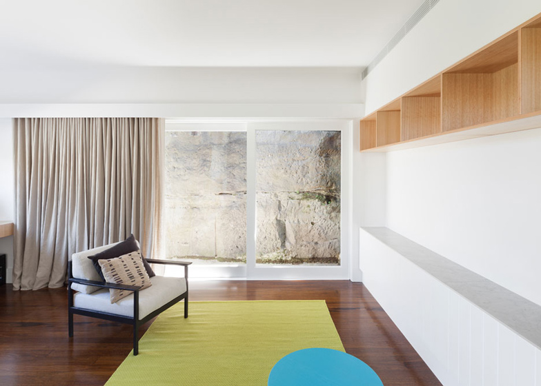
On the high side of the site, the master bedroom is nestled against an existing cliff-face, juxtaposing its harbour view and a close encounter with mossy sandstone and a cheeky orchid garden.
The intention is modest: a replacement addition that is fully concealed from the street and minimal facelift to the front.
Project Title: House Chapple
Project Design Practice: Tribe Studio
Design Team: Hannah Tribe, Miriam Green, Ricci Bloch
Project Location: Mosman, Sydney NSW
Completion Date: March 2013


