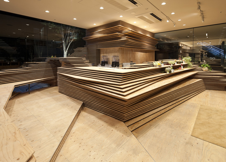
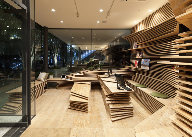
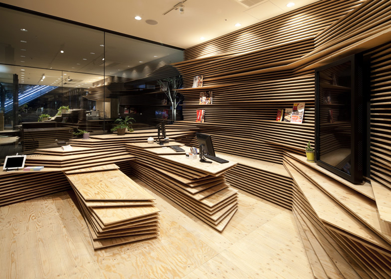
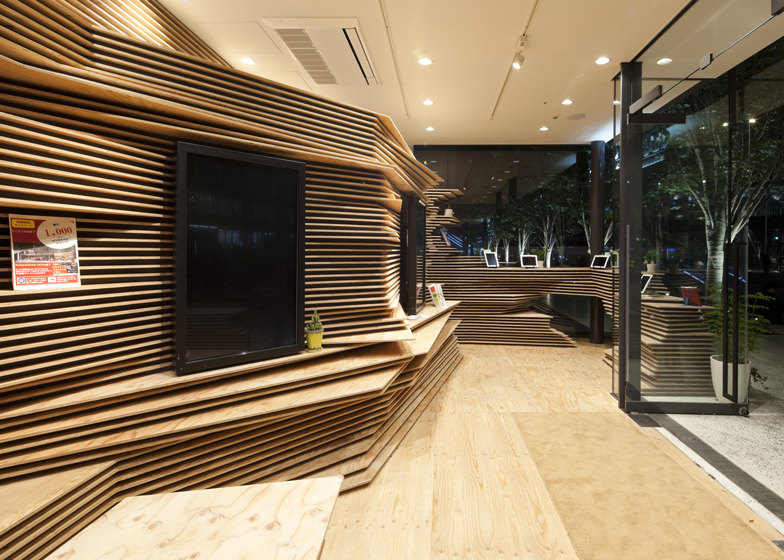
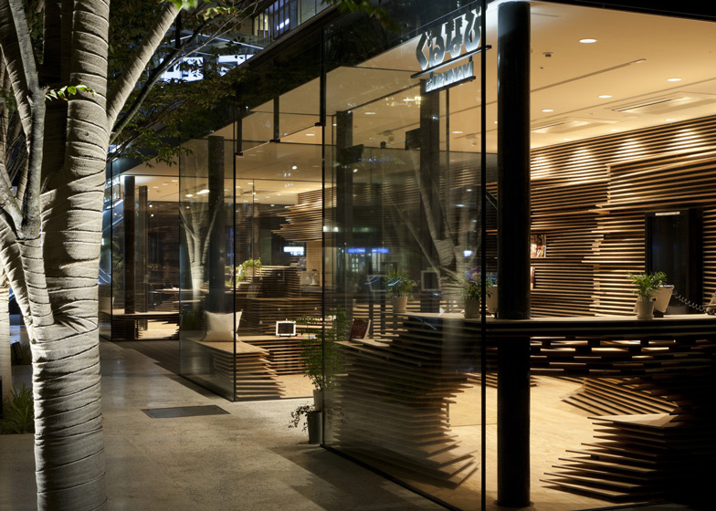
Japanese architect Kengo Kuma has layered wooden boards to create striations inside this workspace and cafe for an online restaurant guide based in Osaka (+ slideshow).
Kengo Kuma designed the interiors of two spaces for Gurunavi: one that's used as a physical base and information centre for the Japanese restaurant guide and another that serves as a cafe.
Both follow the same design language, with surfaces created using layers of plywood to create a landscape that functions as furniture.
"We piled up pieces of wooden panels to build the interior like topography," said Kuma. "Various kinds of food-related items are laid out on this wooden ground."
At the Shun*Shoku Lounge cafe, the wooden boards are stacked from floor to ceiling in one corner and create a counter in the centre plus seating around the sides.
Similarly in the workspace, the strata wrap around the edges of the room and extend out at various heights to form shelving, desks and seating.
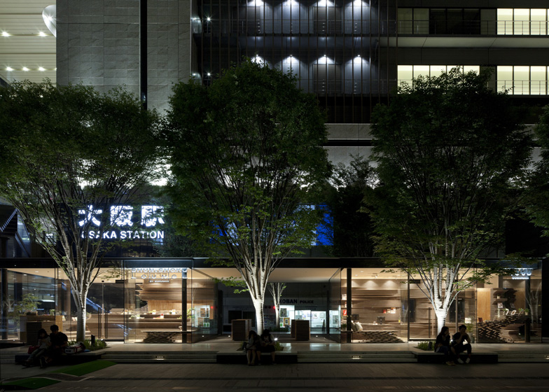
The two spaces are both enclosed by glass walls on three sides and a solid wall at the back. They are separated by a tunnel that leads to further retail units at Osaka's main railway station.
A similar layering effect also features in Kuma's design for the V&A museum in Dundee, which was granted planning permission in August last year.

