Red concrete visitor centre by Gonçalo Byrne tells the story of a Portuguese civil war battle
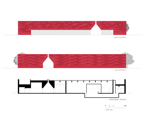
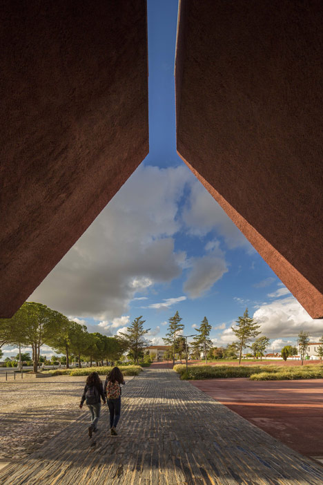
A pointed arch punctures the red concrete facade of this Portuguese visitor attraction designed by Lisbon architect Gonçalo Byrne to present the history of a fourteenth century battle between Portuguese and Castilian forces (+ slideshow).
The Centro de Interpretação da Batalha de Atoleiros was designed to host an exhibition dedicated to the story of the Battle of Atoleiros, the first clash of an eight-year period of Portuguese civil war that started when King Ferdinand I died without any male heirs.
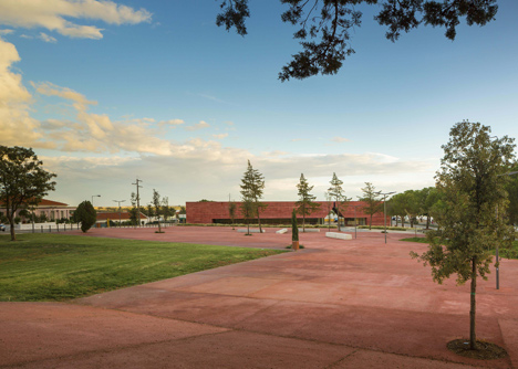
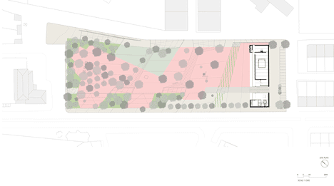
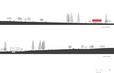
Unable to situate the building on the historic battlefield, Gonçalo Byrne Arquitectos created the centre in the nearby town of Fronteira, eastern Portugal, on a site overlooking a park.
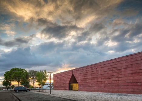
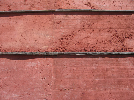
The exterior walls are made from blocks of pigmented concrete and have a coarse surface intended to be reminiscent of the uneven construction of medieval buildings.
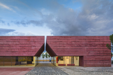
"The body of the building recalls the tactility of the traditional medieval construction, presenting rough textured surfaces very close to the primal textures achieved by human hand," said the design team.
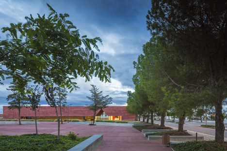
Slabs of schist, a fine-grained rock, are slotted between the layers of concrete to support the structure and give additional texture to the facade.
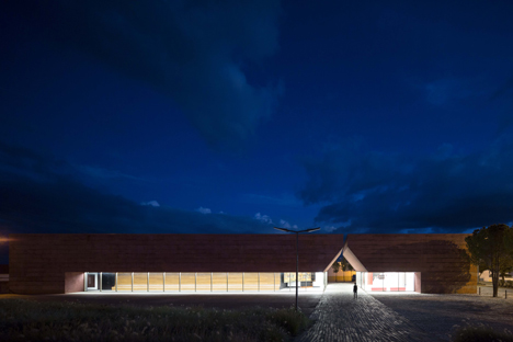
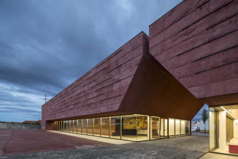
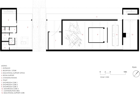
The pointed arch cuts right across the building to create a pair of glazed entrances beneath the shelter of the concrete. This glazing also wraps around the rear of the building to create a row of windows.
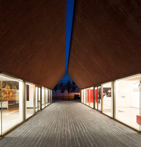
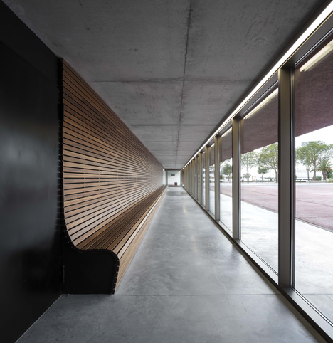
A curving wooden bench is positioned behind the windows, creating a seating area at the end of the exhibition trail where visitors are expected to look out across the park and recreate battle scenes with their imagination.
Photography is by Fernando Guerra.
Here's a project description from Gonçalo Byrne Arquitectos:
Centre for Interpretation of the Battle of Atoleiros
Object
The Centre for Interpretation of the Battle of Atoleiros, in Fronteira, is a cultural equipment intended to raise social awareness on the several perspectives over the battle occurred on April 6th 1384, and its importance in the context of the dynastic disputes between the kingdoms of Portugal and Castela, by the end of the XIVth Century.
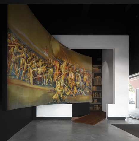
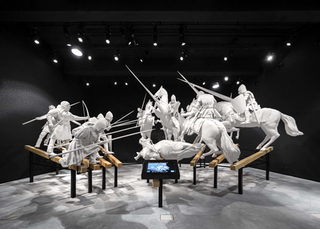
Given the impossibility on plotting the Interpretation Centre on-site, in the battlefield area, the City Council approved its plot in the town core, on a location with high visibility and inserted in an urban park system that simulates and evokes the old battlefield. During the visit to the Interpretation Centre, visitors will experience different visual perspectives of the battlefield, but also about the history, through its protagonists and authors, led by the hand of the painter Martins Barata.
A large bench, at the end of the exhibition circuit, presents urban park in all its dimensions, rehearsing another exhibition discourse, this made of vegetables and inert elements, a sculptural dimension that simulates the plains and the imagination refers to the Battle of Atoleiros.
Materials
The body of the building recalls the tactility of the traditional medieval construction, presenting rough textured surfaces, achieved by the use of pigmented concrete with raw and irregular expression, very close to the primal textures achieved by human hand. This texture is enhanced by interposing lines of schist slabs in the horizontal joints of the building.
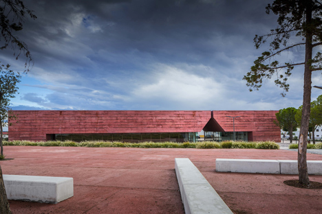
As a whole, the building generates a gravitational presence; almost an earth sculpture dyed in its own tonalities, evoking time in the spontaneous patina patterns, resembling a stained vertical battlefield, between a small and a larger body, like the two armies in conflict.
Structure
The combined use of concrete walls and a structure formed by a concrete column/beam/slab system, allowed maximal area exploitation and the display of generous exhibition areas.
Through the completion of consoles the structure had acquired more complexity, allowing lateral glazing and motivating an open relationship between inner and outside areas, between exhibition and urban park.
Environment
Portuguese southern landscape has a golden/reddish tone. The reddish wash of the building tries to emulate those colours and patterns, therefore reinforcing a sense of belonging.
Colour and textures are also enhanced by the usage of the same pitch used on the urban park paving system, serving as an essential framework for the Interpretation Centre, yet reinterpreting the battlefield original landscape.
