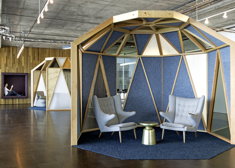
Employees meet in octagonal timber gazebos at the San Francisco headquarters of technology company Cisco by local interior designers Studio O+A (+ slideshow).
Studio O+A created the interior for Cisco's primary San Francisco workplace, after the company acquired WiFi firm Meraki in November 2012 and needed more space.
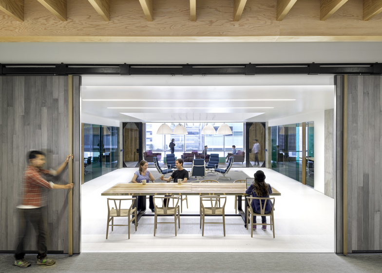
Located in the city's Mission Bay neighbourhood and overlooking the waterfront, the 110,000-square-foot office is split over two floors. It was designed to maximise daylight and provide communal areas based on feedback the designers received from staff.
"O+A surveyed Meraki's employees to find out what they liked about their old, much smaller headquarters," said the designers. "A consensus emerged for natural light, plenty of collaboration space and preservation of the company's tightly-knit culture."
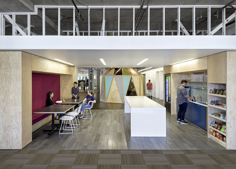
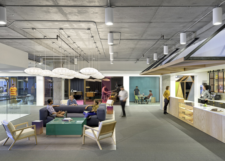
Wood-frame pavilions that are partially enclosed with triangular panels provide intimate meeting spots and break up the large floor plate.
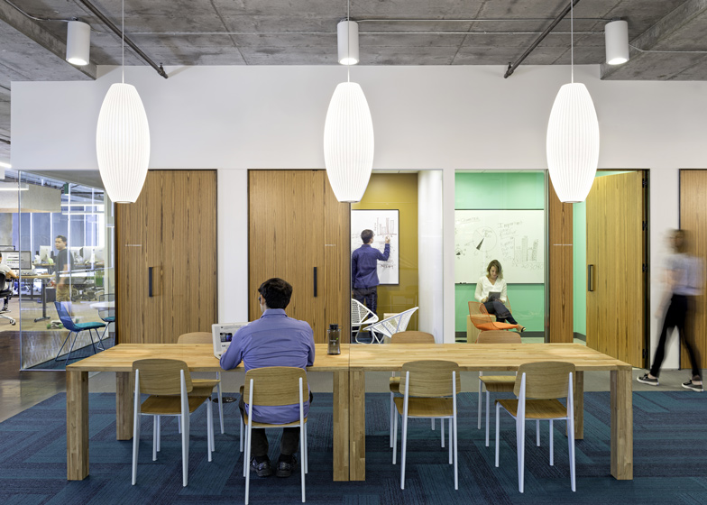
Timber-clad walls feature padded niches in which individuals can recline with their laptops.
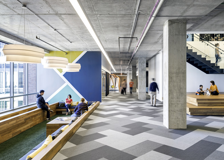
Seating areas are sunk beneath floor-to-ceiling windows to prevent them blocking the light into the deep open-plan areas.
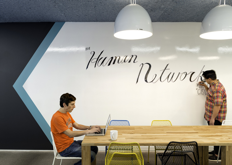
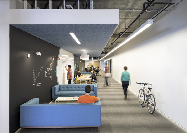
Giant whiteboards and blackboards give the employees opportunities to write and sketch ideas over the walls, while notes and memos can be pinned to cork panels.
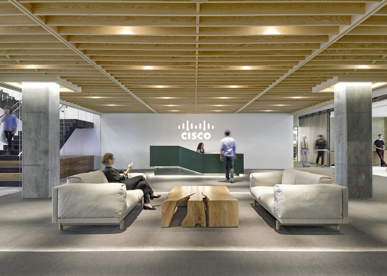
Levels are connected by a wide open staircase, which has wooden stadium seating integrated at its base.
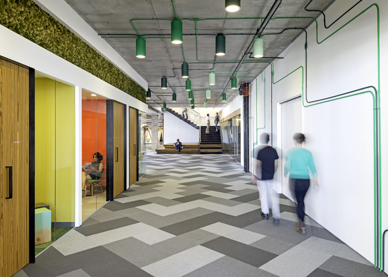
The mix of flooring types includes carpet, wood and astroturf, and a varied palette of colours is used for walls and furniture.
Green electricity cables run up the white corridor walls and across the exposed concrete ceilings to power the overhead lights.
The hallways are wide enough for workers to cycle or skateboard between zones.
A large roof terrace provides views across San Francisco bay towards the baseball stadium, the Bay Bridge and downtown.
Studio O+A has designed offices for quite a few technology companies around California. The studio completed both Facebook and AOL's headquarters in Palo Alto, as well as the Silicon Valley HQ for Evernote.
Photographes are by Jasper Sanidad.
The text sent to us by Studio O+A follows:
The panoramic view of San Francisco's waterfront visible from Cisco's new offices in some ways sets the theme for O+A's design. From almost any angle the visual impact is of light, spaciousness, bright colour, long sight lines.
Meraki, which was recently acquired by Cisco Systems, makes wireless routers—and takes pride in the elegance of their design.
O+A sought to build the space the way Meraki builds its products - with an emphasis on simplicity and seamless ease of use. But it was also mindful of the importance to the company's identity of the Cisco-Meraki merger.
Located in the rapidly changing Mission Bay neighbourhood, Cisco's 110,000-square-foot suite of offices now becomes the company's principal San Francisco location.
At the outset O+A surveyed Meraki's employees to find outwhat they liked about their old, much smaller headquarters. A consensus emerged for natural light, plenty of collaboration space and preservation of the company's tightly-knit culture.
The size of the new space and the prominence of its floor-to-ceiling windows made collaboration and natural light relatively easy bills to fill.
O+A's design offers a variety of meeting spaces formal and informal, indoor and outdoor, many of them bathed in the crystalline light of San Francisco Bay.
The scale and the light support both a rich palette of colours and design elements tailored to the broad canvas: a wide staircase with integrated stadium seating at its base, a meeting room showered from above with hanging tillandsia plants, an outdoor deck with views of the baseball park and Bay Bridge.
Maintaining Meraki's cozy ambience in the hangar-sized complex proved more challenging. O+A's solution was to create a medley of small gathering spaces within the large footprint.
Sunken seating brings intimacy to horizontal common areas while preserving broad sight lines. Yurts, cabanas and phone rooms offer varying levels of enclosure. And throughout the office informal lounge spaces allow passing colleagues to sit down and talk.
Despite the richness of the finishes and the wide array of typologies deployed, this is not a project that feels overly "designed". One of O+A's goals was to give Cisco a canvas on which to paint their own pictures.
In lieu of pervasive branding graphics, O+A provided ubiquitous chalkboards, whiteboards and corkboards so that Cisco's employees could sketch, write and pin-up graphics meaningful to them.
As might be expected of the company's strongly do-it-yourself culture, mobility and adaptability were big factors in the selection of furniture and workstations. These are people who like to move things around.

