Spanish firm Nook Architects has renovated a Barcelona apartment by adding patterned floor tiles plus a combined step and window seat leading out onto the terrace (+ slideshow).
The Casa Sal apartment in the Poble Sec district of the city is only three metres wide and 19 metres long.
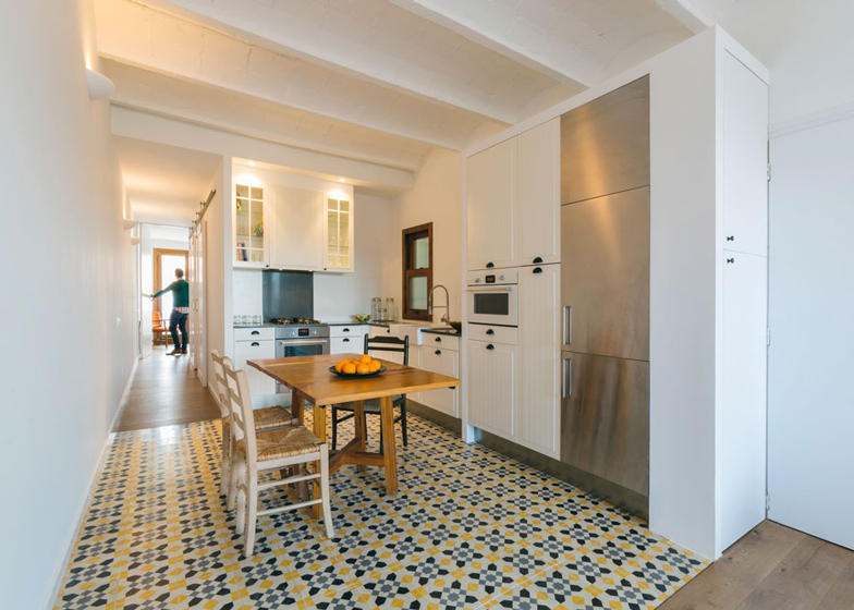
Nook Architects covered the kitchen, bathroom and study with patterned ceramics to divide up the space visually. They then used wooden flooring for a softer look and feel in the rest of the home.
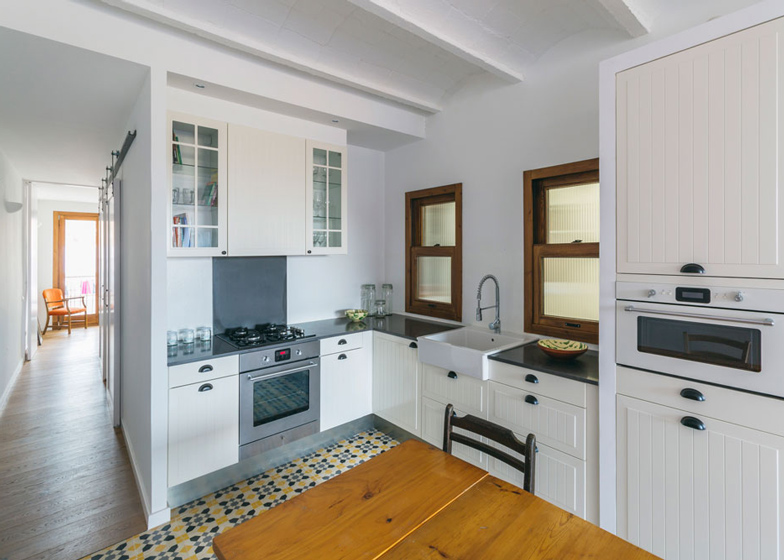
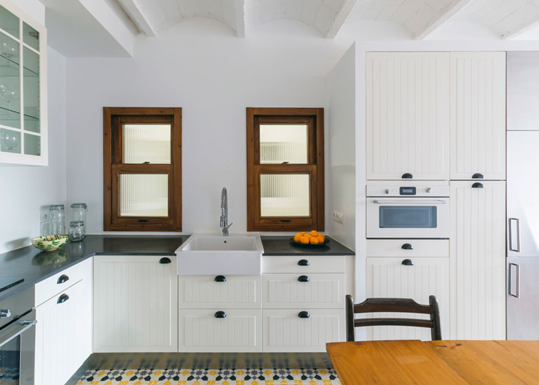
The kitchen acts as the hub of the apartment by linking the living room and the bedroom areas. Nook said they placed extra emphasis on the kitchen.
"For our client, the most important part was the kitchen which had to be the heart of the home; functional, resistant, lively, and very much on the lead in regards to the rest of the room."
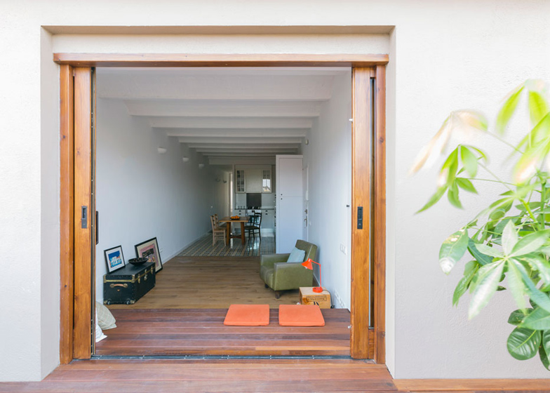
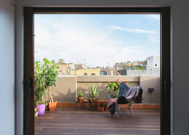
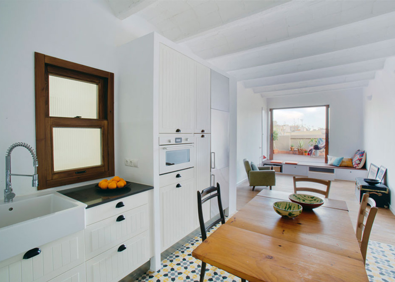
The brightly tiled kitchen leads on to the living room and a slightly raised terrace. Before work started the terrace was in poor condition and could only be accessed through a narrow, opaque door.
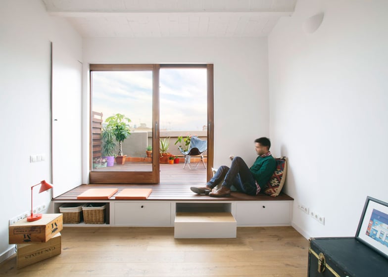
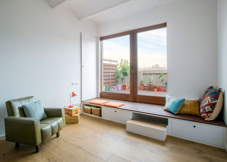
To make it feel more connected to the rest of the home, Nook fitted a window seat that doubles as a step with storage space underneath. By using the same material for the top of the bench and floor of the terrace they managed to integrate the terrace with the rest of the apartment. The sliding window doors also allow far more natural light into the room.
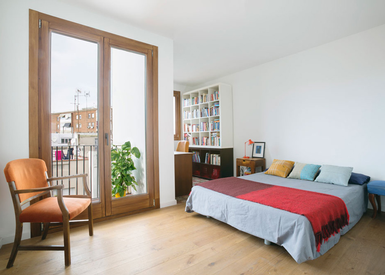
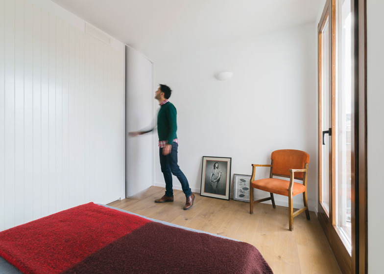
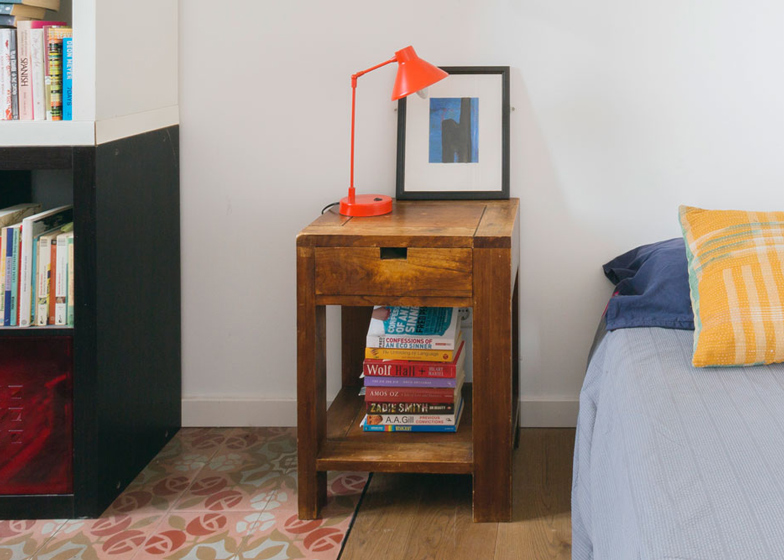
Like the kitchen and living room, the client's bedroom is separated from the study by using floor tiles. Again, Nook used the eye-catching tiles to divide up the relatively small space.
It is becoming increasingly popular to use encaustic floor tiles in Barcelona, with many architects uncovering original flooring from the 1960s. In this case, with no original tiles to unearth, Nook's client chose the tiles herself - a floral theme for the study, a checkerboard tile for the bathroom and geometrical patterns for the kitchen.
Photography is by nieve.
Here's a project description from Nook Architects:
CASA SAL, Apartment in Poble Sec, Barcelona
For nook there are two different types of projects from the client's point of view: that of an owner who will live on the dwelling, and those focused for an unknown user (for example, a rental apartment). On commissions for the first example, we try get to know the client’s day to day customs and habits as thoroughly as possible- anything that could have an effect on their way of life. This was the case of CASA SAL, where the refurbishment of a dwelling was shaped around personality of its owner.
On the other hand, we had to face de difficulties of the original geometry, a very compartmentalised rectangle, only 3 metres wide, and 19 metres long. On one of its ends lay a terrace in very poor conditions, elevated in regards to the dwellings floor level, which could only be accessed through a narrow, opaque door.
These were the premises we worked around in order to solve the architectural problems of the property and the functional requirements of our client. From the start, it involved teamwork, between the architects and the client.
For the client, the most important part was the kitchen, which had to be the heart of the home; functional, resistant, lively, and very much on the lead in regards to the rest of the room. The kitchen therefore articulates the rest of the spaces: on one side there's the living room with Access to the terrace, and on the other the most private areas, her bedroom and study, a bathroom and a guest room.
To counter the sensation of the narrow proportions of the dwelling, we treated the pavement with fringes of different types of very eye-catching finishes, placing more resistant materials in the kitchen, bathroom, and study, and combining them with Wood for a softer look and feel on the rest of the home. Our client participated by choosing the different tiles used: a hydraulic mosaic for the kitchen with geometrical shapes, a floral theme for the study, and a checker board for the bathroom.
For the terrace, we had a double objective: to solve the deficient connection between it and the living room and to transform into source of natural light, giving it a purpose all year long. This is why we decided to open a large hole on the facade and placed a seating bench that doubles as a stair and storage area with bookcases and drawers. The same pavement was used to finish the terrace on the outside, and the bench on the inside, making the terrace part of the living room itself.
We understood from the beginning that even though our intervention was over, the client’s intervention had only begun. She now has a starting point based on a very familiar architecture to her past, her tastes, and way of live, which will evolve naturally and alongside herself.
Architects: nook architects
Location: Barcelona, España
Year: 2013

