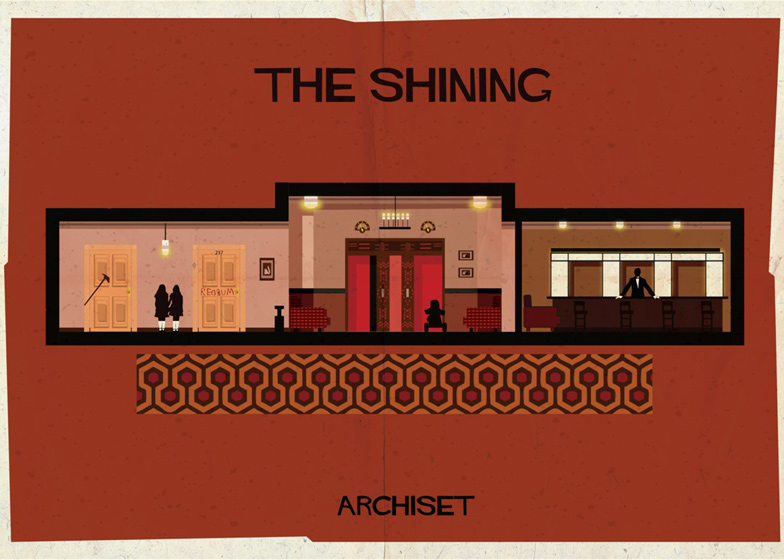
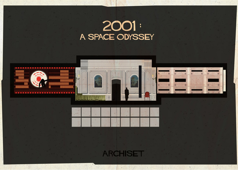
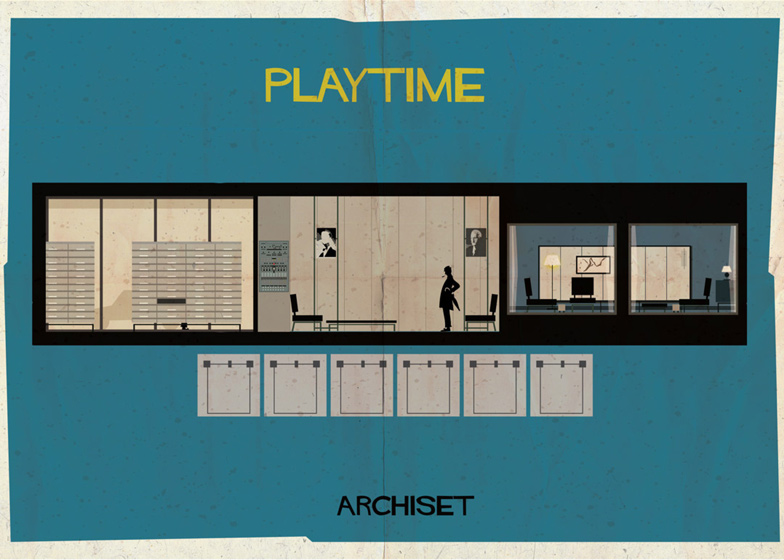
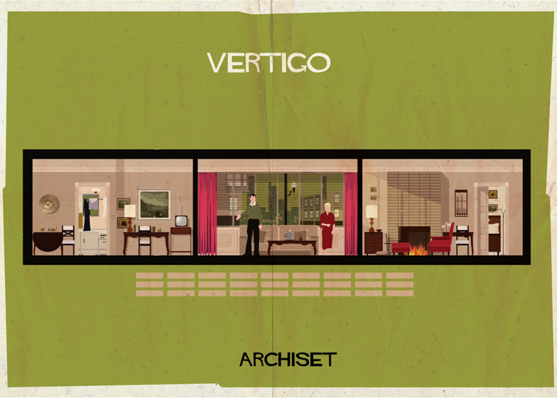
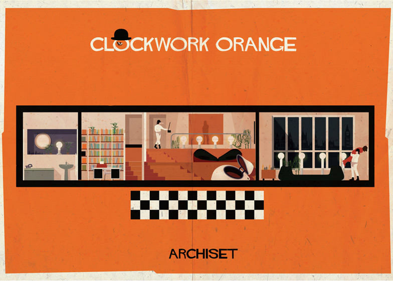
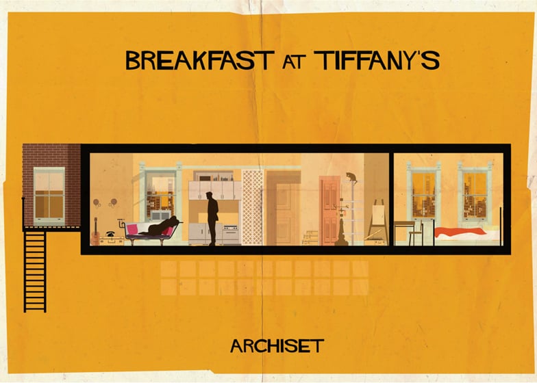
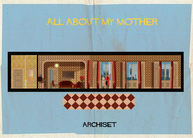
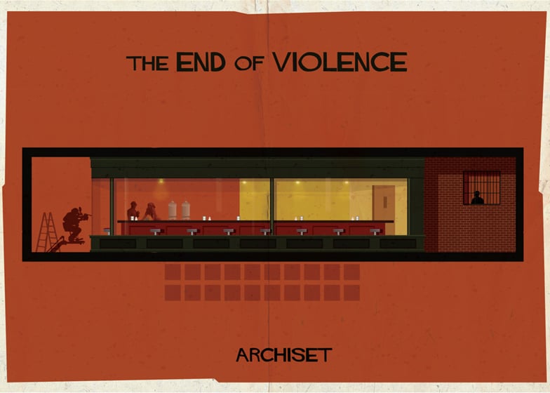
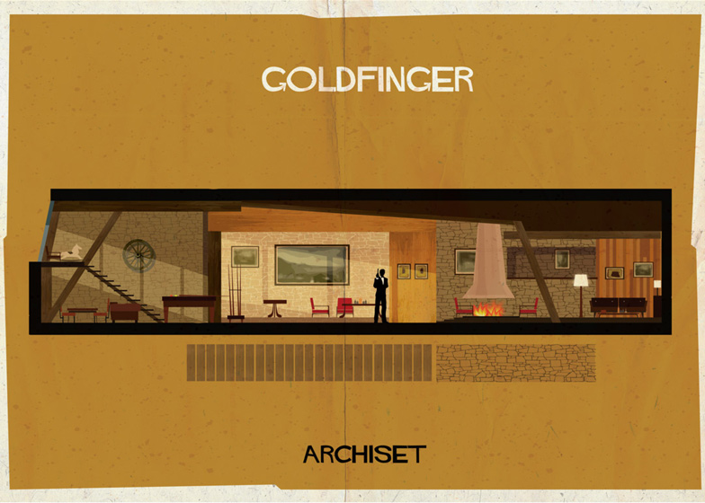
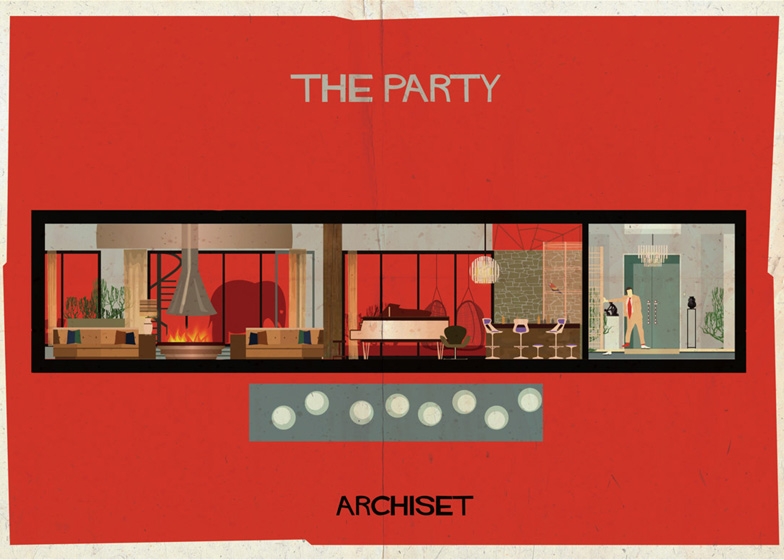
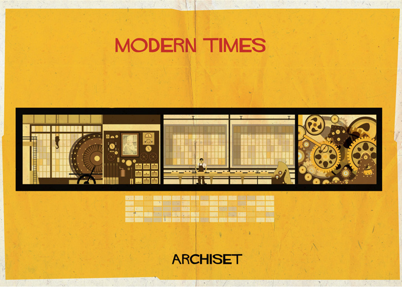
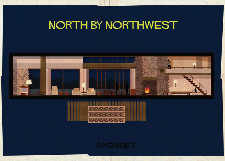
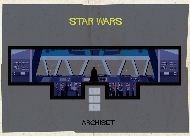
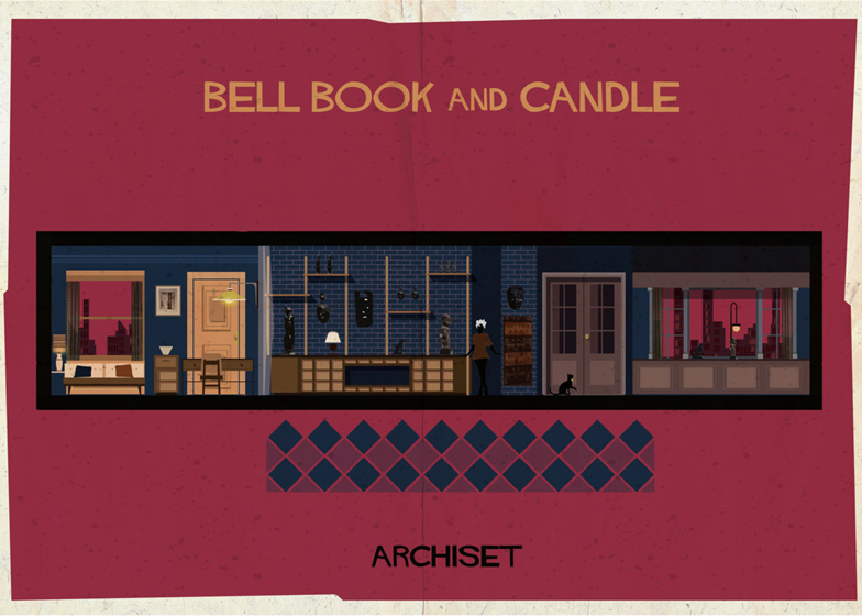
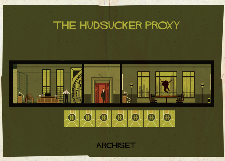
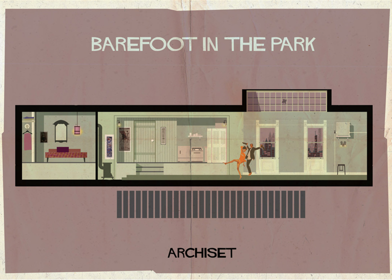
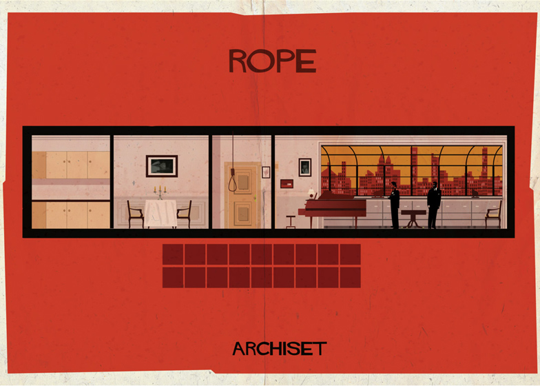
Famous film set designs are translated into detailed cross sections that resemble the insides of dolls' houses in this series of illustrations by architect and illustrator Federico Babina.
The collection of 17 posters is entitled Archiset and accurately replicates interiors from iconic films such as Alfred Hitchcock's Vertigo and The Shining by Stanley Kubrick.
Federico Babina wanted to create an architectural representation of the set designs and chose to present them as two-dimensional elevations, like a cross section of a dolls' house with characters appearing in familiar poses.
"The idea was to find a different form of expression to be able to enter and walk inside a movie," Babina told Dezeen.
The artist said the selection of movies was based on his favourite set designs: "The film, its atmosphere and script are a fundamental guide for the ideation and design of the posters."
Each of the illustrations depicts key details and props from the original sets, which were integral to the plot of the films.
Among the recognisable images is the apartment from 1961 film Breakfast at Tiffany's, where Audrey Hepburn's character lounges in a bath in her living room.
The set designed by Ken Adams for the ranch occupied by the famous villain Auric Goldfinger in the 1964 James Bond film is also featured.
The illustration of the Overlook Hotel from The Shining includes details such as an axe lodged in a door and the entrance to the haunted Room 237.
Darth Vader appears in front of the bridge on the Death Star.
Babina has previously created an alphabet of illustrated letters that depict buildings by 26 famous architects and a set of graphics representing architects in the form of vintage video game characters.
Here's a short text from the artist:
The project is called Archiset. The idea is to represent a film set as if it were a doll's house where we can start to play with the imagination together with the movie’s characters.
I am representing some of my favourite and inspiring movie set interiors. Seventeen images where cinema and architecture merge into a single frame to speak the same language.
In a movie we discover the spaces through the camera movement that reveals the spaces where the main characters live.
I enter on tiptoe through the drawing in the rooms and environments where there’s the film’s life: I touch objects, I look through the windows, I open doors.
I like to think that in a set design each object is carefully chosen. Nothing is left to chance.
Each item participates in the script and helps the development of the plot. A half-full glass on a table reveals clues and becomes part of the puzzle that makes up the story.
In these films every room has a style and a defined personality and contains surprises and unexpected details. They are like big magic boxes full of stories and characters, able to make us dream.

