Designs of the Year 2014 shortlist announced
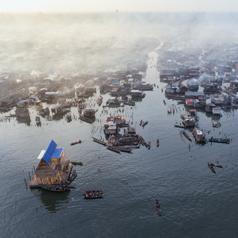
News: the Design Museum in London has announced 76 nominations for Designs of the Year 2014, including a floating school in a Nigerian lagoon (pictured), a table that weighs just nine kilograms and a mobile phone made of detachable blocks.
Architects including Zaha Hadid, David Chipperfield and John Pawson, and designers such as Tracey Neuls, BarberOsgerby and Konstantin Grcic have been named on the shortlist for 2014's best design, which encompasses the categories of architecture, product, furniture, fashion, graphic, digital and transport.
Other designs recognised include a calendar made of Lego, an arts centre at an old shipbuilding warehouse, a dome made by a robotic arm and live silkworms, and a range of tools for producing homemade cosmetics.
All 76 projects will be shown in an exhibition at the Design Museum from 26 March to 25 August, and winners from each category and one overall winner will be announced later in the year.
Dezeen are media partners for Designs of the Year. Past winners of the award include BarberOsgerby's Olympic torch and the UK government's redesigned website.
Here's the full list of nominated projects from the Design Museum:
Architecture
Child Chemo House, Osaka - designed by Tezuka Architects, Takaharu & Yui Tezuka
A place where children undergoing chemotherapy treatment can live with their families, Child Chemo House aims to facilitate an ordinary lifestyle in a beautiful, calm space.
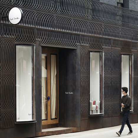
Façade for Paul Smith, London - designed by 6a Architects
The cast iron used for this facade references London street furniture and creates a sharp contrast to the neighbouring Georgian townhouses. A sinuous pattern of interlocking circles puts an abstract spin on a classic Regency shape, while curved windows nod to the glass in nearby arcades.
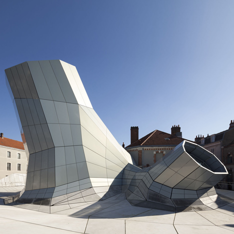
FRAC Centre, Les Turbulences, Orléans - designed by Jakob + MacFarlane
Conceived by the architects as both a landscape and a topographic surface, this faceted pavilion of concrete and aluminium conveys a perpetual flow of digital information. Volume, light and image fuse together to create a dynamic form of architecture that communicates, reveals, provokes, stimulates and informs.
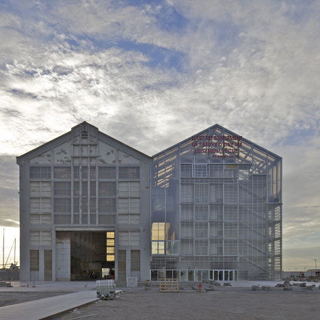
Frac Nord-Pas de Calais, Dunkerque - designed by Anne Lacaton & Jean Philippe Vassal
A contemporary art centre located in an old boat warehouse. The architects maintained the original structure and attached a double hall of the same dimensions, creating an open, industrial space.
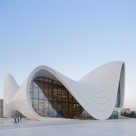
Heydar Aliyev Center, Baku, Azerbaijan - designed by Zaha Hadid and Patrik Schumacher
Elaborate undulations, bifurcations, folds and inflections modify this plaza surface into an architectural landscape that performs a multitude of functions. The building blurs the conventional distinctions between architectural object and urban landscape, building envelope and urban plaza, interior and exterior.
La Tallera Siqueiros, Cuernavaca, Morelos, Mexico - designed by Frida Escobedo
Originally conceived as a muralist workshop, the home and studio of Mexican artist David Alfaro Siqueiros is transformed into a new museum and cultural centre. Siqueiros's huge murals are repositioned to create an open courtyard, and a geometric concrete grid composed of triangles clads parts of the museum, blurring the boundaries between interior and exterior space.
Makoko Floating School, Nigeria - designed by NLÉ, Makoko Community Building Team
A prototype floating structure, built for the historic water community of Makoko, Nigeria. The school takes an innovative, cheap and sustainable approach to address the community's specific social and physical needs.
Mont de Marsan Mediatheque - designed by archi5
Standing in an austere military quadrangle drill yard, the Media Library is an uplifting cultural symbol. Designed as a covered cultural square, its transparent planes generously open to the view of the public.
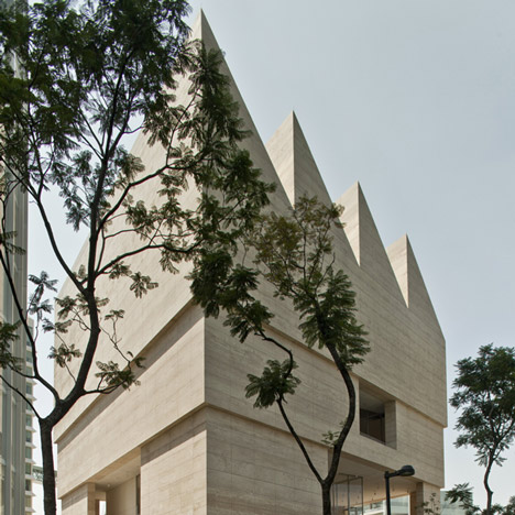
Museo Jumex, Mexico City - designed by David Chipperfield
Making full use of a difficult triangular site this elegant new museum is clad in locally-mined travertine stone, and features a distinctive saw-tooth roof which floods the top floor gallery with natural light.
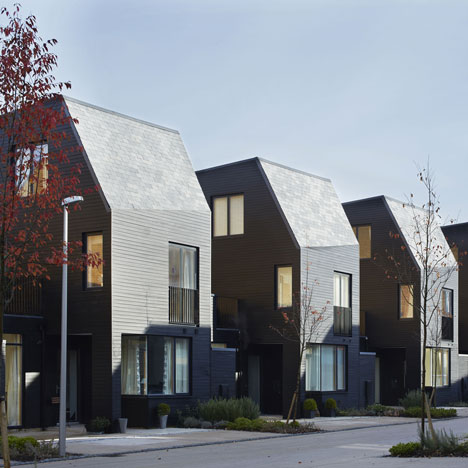
Newhall Be, Harlow, Essex - designed by Alison Brooks Architects
This 84-unit scheme in Harlow, Essex integrates a mix of new and familiar house typologies, prefabricated timber construction and a highly efficient masterplan to maximise living space and flexibility for individual homes. The scheme challenges the presupposition by housebuilders that we want very traditional looking houses.
Praça das Artes Performing Arts Centre, São Paulo - designed by Brasil Arquitetura
A new complex, in an area that has suffered from economic decline for decades, Praça das Artes incorporates historic buildings alongside new volumes built in exposed concrete and coloured with red pigments. Sheer walls guarantee flexibility of the internal spaces and unobstructed external spaces, while outside there are generous open spaces and new public passageways.
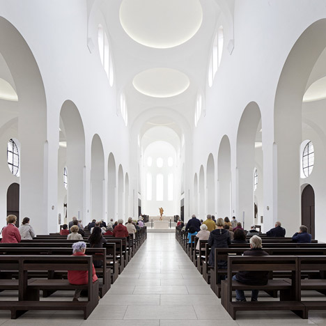
St Moritz Church, Augsburg, Germany, Interior renovation - designed by John Pawson
Taking in aesthetic, functional and liturgical perspectives, the renovation saw the painstaking paring away of selected elements to achieve a clearer visual field, drawing the eye to the apse 'the threshold to transcendence' which is designed as a room of light.
The New Crematorium at the Woodland Cemetery, Stockholm - designed by Johan Celsing
Built on an undulating terrain in a wild wood section of the Woodland Cemetery, the New Crematorium features exposed white concrete and white glazed bricks in a building which is at once robust and sensitive.
Wa Shan Guesthouse, Hangzhou, China - designed by Wang Shu
Pritzker Prize-winner Wang Shu's guesthouse and reception centre draws on the traditions of the China Academy of Art and the city of Hangzhou itself. The new building is one of 22 designed by the architect on the Academy's Xiangshan Campus.
Digital
Aerosee - designed by Paul Egglestone, Dr Darren Ansell, Dan Etherington, Patterdale Mountain Rescue
A crowd-sourced search and rescue drone designed to save lives in the Lake District mountains. AeroSee's contribution to search and rescue operations comes directly from members of the public who can become 'virtual search agents' - joining live operations from their desktop computers, tablet devices and mobiles.
Citymapper - designed by Azmat Yusuf, Gilbert Wedam, Joe Hughes, Nicholas Skehin, Emil Vaughan
Describing itself as the ultimate transport app, Citymapper aims to make the world's most complicated cities easier to use with A to B journey planning that includes everything from cost to calorie burning.
Generations - designed by One Life Remains
A mobile gaming app designed to be deployed over many centuries - unlike a conventional video game, it is impossible to finish a game of Generations in your lifetime. The player decides to whom the game will be passed on and if one day they want someone to be able to reach the top of the level. Generations questions the inevitability of death, the meaning of legacy and the nature of progress.
Hello Lamp Post - designed by Pan Studio
Hello Lamp Post is a playful SMS platform, inviting people to strike up conversations with familiar street furniture using the text message function of their mobile phones. The project launched in Bristol during the summer of 2013. Thousands of residents and visitors shared their thoughts and stories with the streetlights, parking meters, bridges and boats of the city, sending over 25,000 text messages in just eight weeks.
Lego Calendar - designed by Adrian Westaway, Clara Gaggero, Duncan Fitzsimons, Simon Emberton
The Lego calendar is a wall mounted time planner invented for a studio, with colour coded bricks representing time spent on projects. The calendar is made entirely of Lego, but when you take a photo of it with a smartphone all of the events and timings are synchronised to an online calendar.
Metro Trains - Dumb Ways to Die - designed by McCann Melbourne
A song, a book, a smartphone game, interactive outdoor posters, radio advertising and tumblr GIFs – all designed to get young people to care about safety. Dumb Ways to Die uses black humour to make the point that there are many dumb ways to die, but perhaps the dumbest is doing silly things around trains - in the process it has become an internet phenomenon and Kate Moss' favourite app.
Oculus Rift - designed by Oculus VR
The Oculus Rift is a ground-breaking virtual reality headset for immersive gaming. It is being developed by Oculus VR, who launched a highly successful Kickstarter campaign to help fund its development.
Peek (Portable Eye Examination Kit) - designed by Dr Andrew Bastawrous, Stewart Jordan, Dr Mario Giardini, Dr Iain Livingstone
A tool with the potential to revolutionise the prevention of blindness in low-income countries, Peek is a smartphone-based system for comprehensive eye examinations. It is easy to use, affordable and portable, meaning that it can bring eye care to even the remotest of settings.
Public Lab Foldable Mini-Spectrometer - designed by Public Lab contributors 2011-13
The Public Lab Foldable Mini-Spectrometer folds up in minutes to transform your smartphone into a visible and near-infrared spectrometer. Developed after the BP oil disaster in the Gulf of Mexico, it is part of an ongoing effort by the Public Lab collaborative community to make analysis of pollutants such as crude oil cheaper and more accessible.
Sidekick Creatives - Crowdfunding Great Art & Design - designed by Oscar Lhermitte, Philipp Figueroa, Yoav Reches, Arne Zacher, Molly Anderson, Tommaso Lanza
Sidekick Creatives is a collective set up to support individuals and companies to realise their crowdfunding campaigns. Sidekick Creatives collaborates with fellow designers, artists and makers by offering them the necessary tools and expertise required to successfully fund their projects. Their services range from conceptualisation to video production and campaign promotion.
Touch Board: Interactivity Everywhere - designed by Bare Conductive
The Touch Board is a way to turn almost any surface or material into an interface - light switches painted on walls, interactive books or hidden sensors that can detect a person from up to 20cm away. Connect any conductive material to one of its 12 electrodes and you can trigger a sound or other event through touch or proximity. The Touch Board is a pre-programmed, open source platform designed all levels of expertise.
Fashion
DAS Collection - designed by Reem and Hind Beljafla
A Dubai-based fashion label founded by two Emirati sisters, DAS Collection was the first abaya (a garment covering the whole body except the face, feet, and hands) brand to be stocked at Harrods. The designers set out to update the abaya, making it a fashion statement whilst always respecting its heritage and traditions.
PRADA S/S14 - designed by Miuccia Prada
Pop-art prints meet sporty details and structured shapes in this boldly coloured, powerful collection. Vogue said of the show "By next summer we'll wonder what we ever wore before."
Rick Owens S/S14 Show Presentation – designed by Rick Owens
Rick Owens presented his collection with teams of female step-dance crews, all of whom the designer discovered on YouTube. They modelled Owens's clothes in an entirely new way and their sensational performance brought a freshness and diversity to the Paris runway.
The Hinterland of Ronaldo Fraga - designed by Ronaldo Fraga
The signature of the caatinga, the natural scuffing of the cattle that the market considers a defect, becomes a sign of sophistication in this collection from the Brazilian designer.
'Totemic' Collection by Sadie Williams - designed by Sadie Williams
A collection of dresses in stiff 3D embossed textiles created by a multi-step, multi-layered process developed by the designer. Inspired by the graphic masculine print arrangement found in biker clothing, helmets and satin racing vests, the high-impact textiles are balanced with elegant A-line silhouettes.
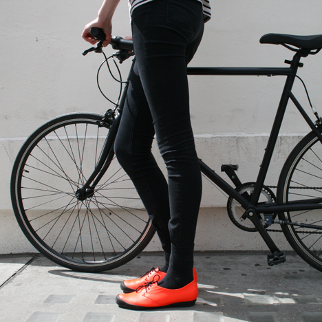
Tracey Neuls BIKE GEEK - designed by Tracey Neuls
BIKE GEEK is a hybrid of a dress shoe and a casual shoe with the performance of sportswear. It is designed to be simple, easy and suitable for all occasions. The sole is a hard wearing, one piece, rubber unit which gives shock absorption and endures many walking or biking miles, and a reflective half moon 'cat eye' tab makes the wearer safely visible at night.
Furniture
Bodleian Library Chair - designed by Barber & Osgerby
The three-legged oak chair balances a strong sense of craft heritage with sculptural form and the needs of readers. A strong vertical timber, echoing the spines of books on shelves, forms one of the three legs that attaches to the sled base. Strong but remarkably light, it is only the third new chair developed specifically for the Bodleian since 1756.
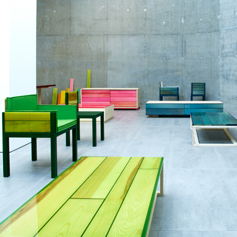
Iro - Jo Nagasaka for Established and Sons
Named after the Japanese word for colour, Iro is a family of vibrant yet elegant furniture which remains true to Nagasaka's minimalistic style, whilst making bold use of brightly coloured resin. The smooth finishing highlights the natural grain of the wood enclosed within the resin.
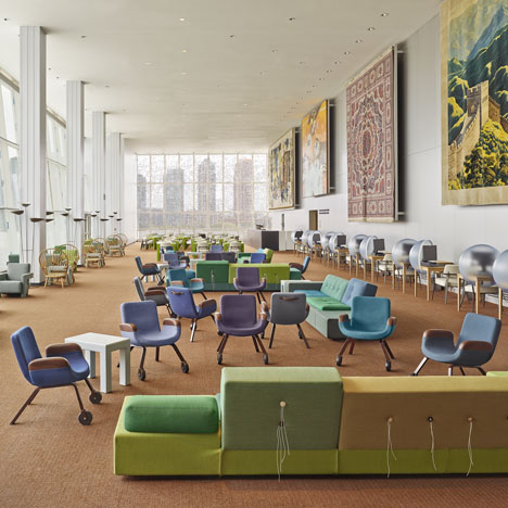
New interior for United Nations North Delgates' Lounge (New York) - designed by Hella Jongerius, together with Rem Koolhaas, Irma Boom, Gabriel Lester and Louise Schouwenberg
At the request of the Dutch Ministry of Foreign Affairs, Hella Jongerius formed a high-profile design team for this project - a gift from the Netherlands to the UN. Creating a space of both comfort and professional informality, the team carefully edited the history of the space, retaining some of the iconic Scandinavian designs and creating a new perspective on the works of art already on display.
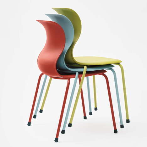
Pro Chair Family - designed by Konstantin Grcic
The Pro chair which Konstantin Grcic has developed for Flötotto features state-of-the-art ergonomics and pioneering design. The construction of the chair not only allows movement in all directions, but actively stimulates it thereby promoting healthier sitting.
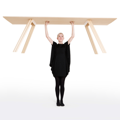
Ripple, an ultra light timber table - designed by Benjamin Hubert
Ripple is a 2.4 metre-long dining table constructed from corrugated Sitka spruce plywood. The rippled construction allows for a very high strength to weight ratio whilst still utilising a natural material. In reducing the amount of timber used the table's carbon footprint is decreased and it can be easily assembled and manoeuvred.
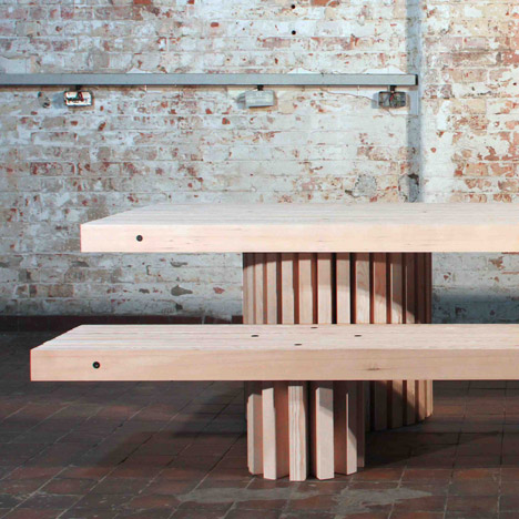
'Simple' exhibition at ProjectB Gallery, Milan - designed by Philippe Malouin
The works displayed for the 'simple' exhibition span two years of design and experimentation around the theme of simplicity. Timber slats, positioned in the right rhythm and proportions create benches, a table, a library. A Simple chair, exhibiting modest geometry and simple boxes, bookends and a lamp are composed of a readily available and humble material such as MDF.
Graphics
A Magazine curated by Stephen Jones - designed by Stephen Jones
Stephen Jones dedicated his issue of this cult fashion magazine to Anna Piaggi and the art of illustration. It featured a centrefold with Dita Von Teese by David Downton, the designs of Zaha Hadid, Raf Simons and Ron Arad, and fashion illustration from Gladys Perint Palmer, Howard Tangye, Barbara Hulanicki and Tony Viramontes.
ArtDirectorsClub: Art Directors Annual 91 - designed by Rami Niemi (Illustrator), Joao Unzer (Art Director), Juan Carlos Pagan and Brian Gartside (Graphic Designers)
Illustrations for the Art Directors Annual 91 - the best-selling international review of the year's most innovative works in visual communication.
Building Stories - designed by Chris Ware
A ground-breaking graphic novel from American comic book artist and cartoonist Chris Ware, Building Stories follows the inhabitants of a three-flat Chicago apartment house. Taking the form of a boxed set, it consists of fourteen distinct printed works—cloth-bound books, newspapers, broadsheets and flip books.
Castledown Primary School Type Family - designed by Anthony Sheret, Edd Harrington, Rupert Dunk
Originally commissioned in 2011 as a bespoke typeface for Castledown Primary School by headmaster Neil Small, the project soon evolved into collaboration with a vision to unify typography throughout UK primary schools. Creating a dyslexic friendly package that allows for use in every aspect of educational life - from letters the school would send to parents to a Cursive version that children would use to learn joined-up handwriting.
Chineasy - created by ShaoLan Hsueh with Illustrations by Noma Bar
Chineasy is an illustrated Chinese language methodology created by entrepreneur and author ShaoLan Hsueh. Chineasy's aim is to bridge the gap between the East and the West. The system is built on a building block methodology which allows students to learn a small number of commonly occurring characters, which can then be combined to create more complex compounds and couplets. These illustrated and animated characters aim to provide both a memorable interpretation of Chinese and also a glimpse into the culture behind the language.
Creation and realisation of the visual identity and the signage system of the FRAC Provence-Alpes-Côte-d'Azur - designed by Jean-Marie Courant, Marie Proyart, Olivier Vadrot
The creation of this identity and signage system is very much routed in the architecture of the building. It uses two typefaces and a white-to-grey palette with some uses of red. Different circles were designed to symbolise the different actions of the Frac.
Drone Shadows - designed by James Bridle / booktwo.org
The Drone Shadows are a series of installations consisting of a 1:1 outline of a military unmanned aerial vehicle, or Drone. They have appeared in the UK, Turkey, the USA, Brazil and elsewhere.
Escuyer Undergarment Brand Identity - designed by Modern Practice
Modern Practice created a visual solution based on the heraldic system for this men's undergarment brand. This typographic reinterpretation of heraldry is not only strongly linked to the brand's name (which derives from the old French word for 'Esquire'), it also conveys the brand's world.
Grand Central - designed by Thibault Brevet
Grand-Central is an open internet platform that lets people express themselves freely through a tangible output device. Users can submit text via their smartphones which is then 'written' in marker pen by a mechanical printer – creating a physical embodiment of a digital message.
M to M of M/M (Paris) - designed by Graphic Thought Facility
A large-format 528-page book surveying the work of French graphic design duo Michael Amzalag and Mathias Augustiniak. The alphabet, a re-occuring theme in MM's work, provided an appropriate way to organise the projects and interviews. Like the cutting and re-stacking of a pack of cards, the pages are re-arranged so that the letter M opens and closes the book.
Serpentine Galleries identity - created by Marina Willer in collaboration with Brian Boylan
Willer's team created a new identity for the Serpentine Galleries to express a spirit of openness. The logo acts as an aperture, opening for different content and different ideas in an ever-changing way, and also as a bridge - echoing the actual bridge over the Serpentine that links the two Galleries in Hyde Park. The team created the graphic language, imagery, colour palette and all other brand elements. Pentagram's Daniel Weil worked with Willer to create the signage system for the Galleries both externally and internally.
The Gourmand - a food and cultural journal - created by David Lane (Creative Director), Marina Tweed & David Lane (Founders/Editors-in-chief)
The Gourmand is a food, arts and culture journal, printed bi-annually. It prides itself on high production values – combining exquisite printing with a variety of materials, more akin to book publishing than traditional magazines. All of the content is specially commissioned with submissions from well respected writers, photographers and illustrators as well as up and coming talent.
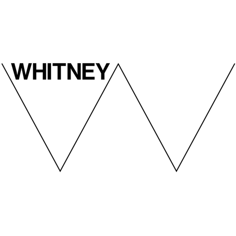
Whitney Museum Identity - designed by Experimental Jetset and the Whitney Museum
Called the 'Responsive W' by its designers this graphic identity specifically references the museum's name, while also communicating openness and representing a non-linear approach to art. The apparently simple 'W' has a huge number of variations and potential applications.
Works That Work, a magazine of unexpected creativity - designed by Atelier Carvalho Bernau
Works That Work is an international magazine, covering a mix of diverse subjects connected by the theme of unexpected creativity that improves our lives. It features original, in-depth essays and stories on subjects connected with design, presenting projects that challenge and change the way the reader perceives them.
Product
75 Watt - created by Revital Cohen and Tuur Van Balen (Artists), Alexander Whitley (Choreography) and Siya Chen (Film production)
In 75 Watt, a product is designed especially to be made in China. The object's only function is to choreograph a dance performed by the labourers manufacturing it. The project seeks to explore the nature of mass- manufacturing products on various scales; from the geo-political context of hyper-fragmented labour to the bio-political condition of the human body on the assembly line.
ABC Syringe: A behaviour changing syringe - designed by Dr David Swann
The ABC Syringe is a frugal innovation to combat the prolific use of non-sterile syringes. The syringe remains colourless when stored inside a sterile pack. However exposure to air triggers a controlled colour change that transforms the syringe barrel from colourless to red within a few minutes. This visual transformation alerts and empowers both literate and illiterate patients to make better risk decisions, and provokes doctors into clinical compliance.
Alba Collection of Vases - designed by Massimiliano Adami
A collection of vases in archetypal forms enriched with a soft colour change, giving the object an unusual lightness. The effect drives rotational moulding technology to reach a new aesthetic potential.
Bloom Helmet - designed by Tokyo Safety
Strong enough to protect against falling debris the Bloom helmet can also be folded down, making it easily transportable. When in its closed position a cord attached to the back of the protective gear can be pulled-outward, expanding the adaptable panels into a concave form.
Chair 4 Life - designed by Bruce Renfrew, James Williamson, Shaun Phillips, David Fawkes, Ken Poberezny, Minghao Zhou, Michael Phillips
'See the Child, Not the chair' was the motivation behind this modular wheelchair system which grows with the child and allows later modifications through a standard catalogue of attachments and bespoke components. It centres on a standard chassis which is retained throughout a child’s journey, greatly reducing disruption to their lives caused by lengthy waiting times for new chair systems.
Clever Caps - designed by Claudio Patrick Vollers (Co-inventor & Designer) and Henry Suzuki (Co-inventor)
Clever Caps are bottle caps which also work as building blocks. They can be collected and used on their own, but are also compatible with the world's most popular building blocks. In this first commercial version, they were designed to fit PCO 1881 standard bottle necks, and include a tamper evident safety seal.
Fairphone - designed by Bas van Abel
Fairphone is a social enterprise that uncovers complex systems with the aim of changing how things are made. The Fairphone is made as fairly as possible. Its transparent supply chain looks at every mineral, component, person and process to reveal the real impact of electronics production.
Formlabs Form 1 High-Resolution Desktop 3D Printer - designed by Formlabs Inc.
The Form 1 is a high-resolution desktop 3D printer. It uses reversed stereolithography technology to create highly-detailed models, using a light-sensitive liquid resin and a focused laser beam. The Form 1 combines simple, intuitive design with ground-breaking technology, in a union that is at once striking and accessible.
GoPro Hero 3 Black - designed by GoPro
The GoPro Hero 3 Black makes producing professional quality video easy and affordable, allowing amateur film makers to achieve unprecedented results.
Luffa Lab - designed by Mauricio Affonso
Luffa Lab explores the inherent qualities of Luffa fibres as an alternative to synthetic materials for a wide range of applications and durable consumer products. 'Luffa cylindrica' is antimicrobial, biodegradable, lightweight and highly absorbent – features that make it a viable material for applications such as low cost splints or as acoustic insulator, it can also be used as absorber of toxic dye waste from denim processes.
Lunaire - designed by Ferréol Babin
Lunaire is a wall lamp with a surprising light effect, reminiscent of the phenomenon produced by eclipses. A smaller front disc containing the light source is set inside a large concave aluminum diffuser. Two different effects are possible depending on how the small disc is positioned with respect to the diffuser: back lighting when the front disc is closed, or from inside the diffuser when the disc is pulled forward.
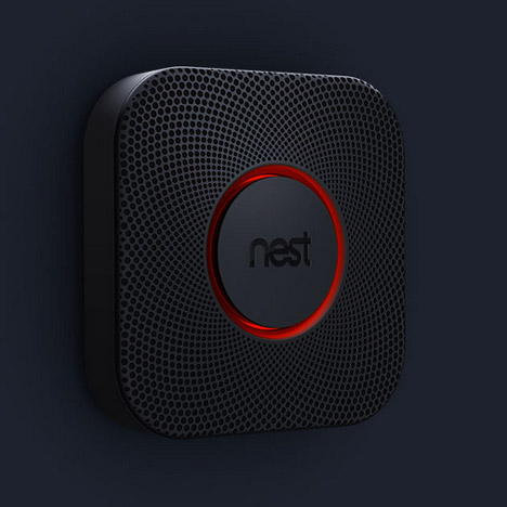
Nest Protect: Smoke + carbon monoxide alarm - designed by Nest
Nest set out to transform people's feelings about their smoke alarms from one of dislike to trust and even enjoyment. This alarm has several features: it integrates with mobile devices and sends a message if the batteries run low; it shows you its sensors and batteries are working with a green glow; its LED lights act as a night light; and false alarms can be stopped with a wave of the hand.
Pet Lamp - designed by Alvaro Catalan De Ocon
Hand woven from strips of discarded plastic bottles, each lamp is a durable object which combines one of the planet's most industrial products with one of the most down to earth artisanal techniques found in every culture.
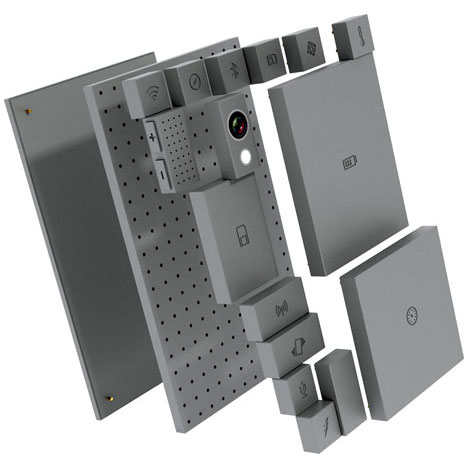
Phonebloks - designed by Dave Hakkens
Every year millions of mobile phones are thrown away because just one part is broken. This mobile phone consists of separate components that can be 'clicked' together. Every component has its own function - WiFi, battery, display – and when an upgrade or repair is needed only that part is affected. The phone can also be customised for specific functions.
Plume Mudguard - designed by Patrick Laing & Dan McMahon
Plume is a recoiling bicycle mudguard which maintains a thin, sleek profile when protecting the rider's back; when not needed it recoils into a tight circle under the saddle. Plume can be pulled out and recoiled while riding and is constructed from resilient materials.
Risk Centre - designed by Onkar Kular & Inigo Minns
Over the course of three months, the Risk Centre transformed the Arkitekturmuseet, Stockholm into a risk assessment facility and educational performance space. Part film set, part educational facility and part theme park, the centre recreated familiar scenes and places from the suburbs and the inner city that were then used to host a civic programme for local school groups and the general public.
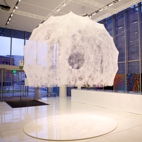
Silk Pavilion - designed by Mediated Matter Group at the MIT Media Lab
The Silk Pavilion explores the relationship between digital and biological fabrication on both product and architectural scales. The primary structure was created of 26 polygonal panels made of silk threads laid down by a CNC machine. 6,500 silkworms were then released on to the structure where they worked as biological 'printers' spinning as they moved across the panels.
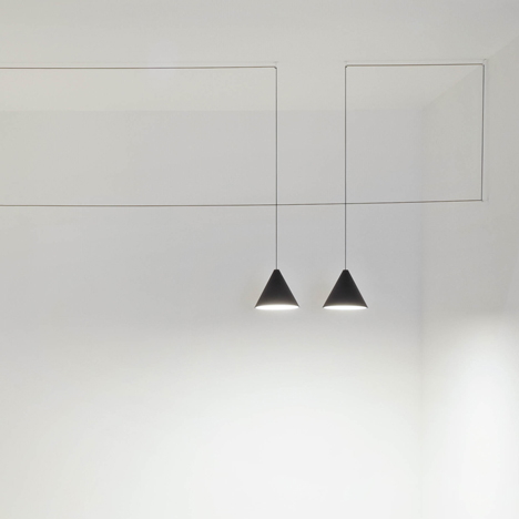
String Lights - designed by Michael Anastassiades
Inspired by perfectly parallel strings connecting pylons and the strings of lights used to mark outdoor spaces, these simple lights can be suspended in multiple configurations to create striking shapes.
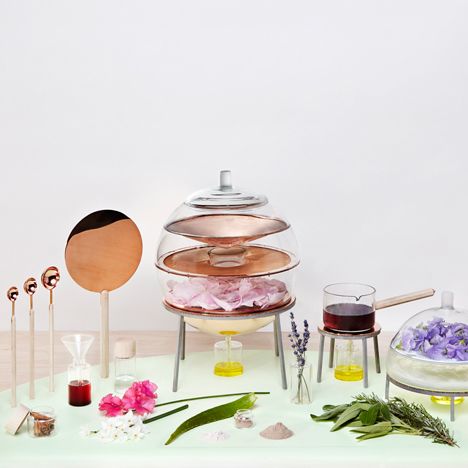
The Alchemist's Dressing Table - designed by Lauren Davies
A collection of analog tools for the production of natural cosmetics at home, inspired by ancient rituals and the transformative powers of alchemy. The palette of copper and maple wood are chosen for their traditional and folkloric symbolism respectively. Cork is used for its insulating properties, borosilicate glass for its heat resistance and stainless steel for strength. All components are fabricated in collaboration with London-based craftsmen.
The Bradley Timepiece - designed by Hyungsoo Kim, Nick Gu, David Zacher, Amanda Sim, Maeve Jopson, Cynthia Poon
The Bradley is a tactile timepiece that allows users to not only see what time it is, but to feel what time it is. Created in collaboration with product designers, engineers, and people with vision loss, The Bradley changes the way users interact with their timepieces. It is named after Bradley Snyder who lost his vision completely in Afghanistan in 2011 serving as a bomb defuser and went on to win two gold medals and one silver in Paralympics in London in 2012.
The Seaboard Grand - designed by Roland Lamb and Hong-Yeul Eom
The Seaboard is a reinvention of the piano keyboard, re-imagining the keys as soft waves that enable continuous and discrete real-time, tactile control of sound through three-dimensional hand gestures. The design combines contemporary minimalism and traditional handcrafted quality.
Transport
A Journey Redefined - designed by A2B
The A2B hybrid electric bike range is the result of the engineering innovation and loving attention to detail.
IFmove Bicycle - designed by Section Zero
Pacific Inc's 9-speed, 11.5kg IFmove unfolds in seconds and combines striking looks with rigid aluminium construction. It can also be rolled along on its 20” light weight wheels whilst folded.
ME.WE: Forward-Thinking Car - designed by Massaud & Toyota ED2
ME.WE's philosophy combines flexible geometry, a customisable look and environmental responsibility. It features an aluminium tubular structure, expanded polypropylene panels, electric power wheels, and a bamboo interior.
Single Seat Alright - designed by e-Go
e-Go aeroplanes has created this striking new single seat aircraft, which costs dramatically less to fly than traditional aircraft. It uses novel technologies to boost performance, and achieves a low cost of development and operation by exploiting the newly deregulated environment in the UK. Very lightweight but strong construction is achieved using ultra-thin carbon fibre and foam – the empty aircraft weights just 115kg.