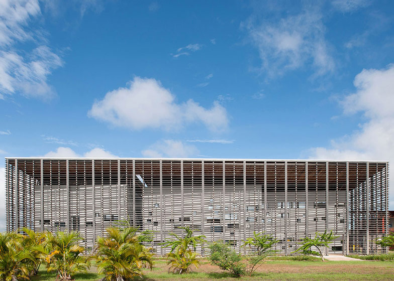
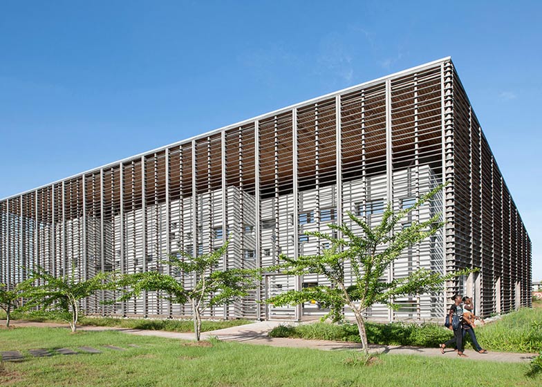
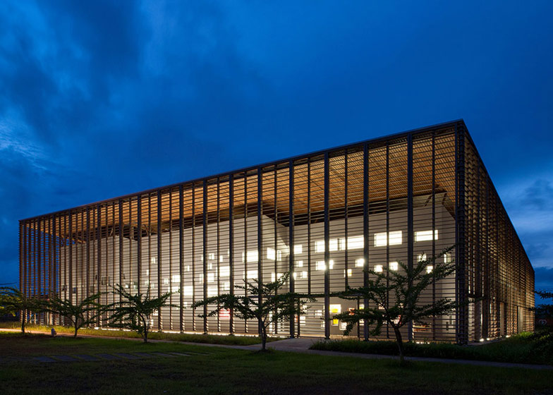
An all-encompassing timber lattice creates a sheltered gallery around the perimeter of this university library in the South American country of French Guiana by Paris studio RH+ Architecture (+ slideshow).
Located at the heart of the newly constructed Rectorat de Guyane campus in capital city Cayenne, the library was designed by RH+ Architecture as the building that brings together students from all the surrounding teaching departments.
"Our aim is to give to this unique building a proper architecture, identifiable by its volume and its uses," said the architects.
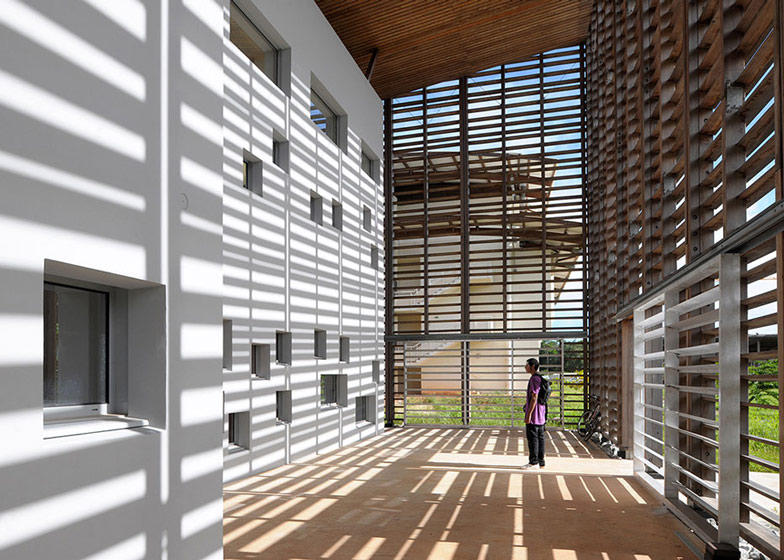
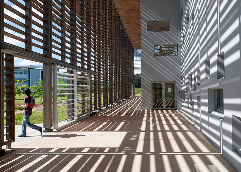
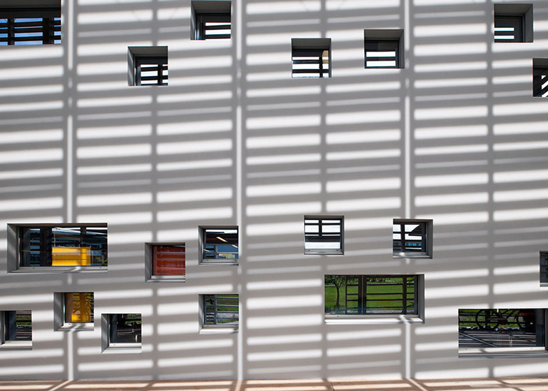
Constructed from narrow timber slats, the screening outer wall functions as a brise soleil that diffuses light onto the second facade - a concrete wall punctured by dozens of rectangular and square windows.
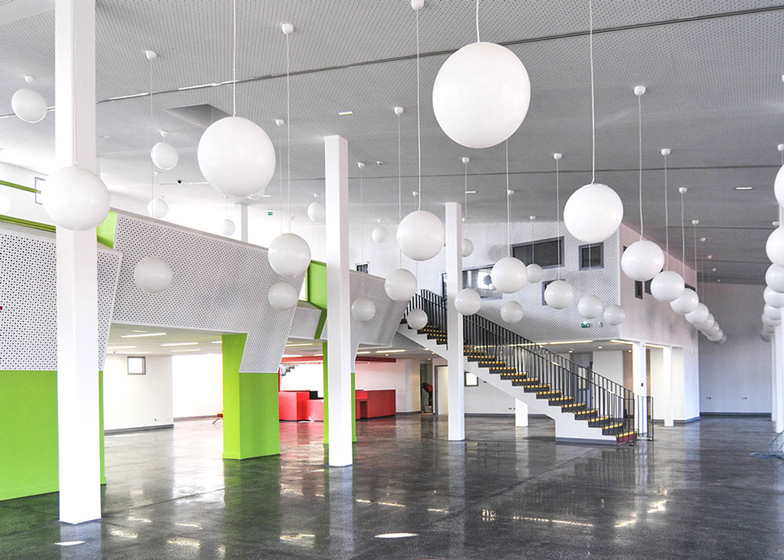
The open-air gallery is sandwiched between the two facades on all four sides of the building, but widens on the eastern elevation to create a generous entrance lobby that blocks out direct sunlight but allows a breeze to flow through.
"This gallery is an open space, a place where the students meet and pass through, an extra room between inside and outside, sheltered from sun and rain," said the architects.
Indoor patios divide the interior of the library into two sections, separating public reading rooms and workspaces from staff offices and storage areas.
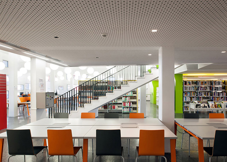
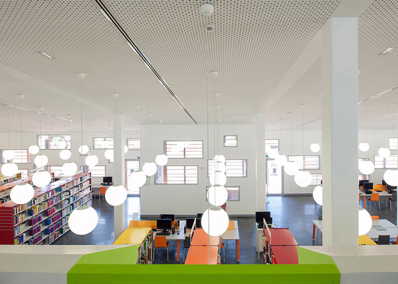
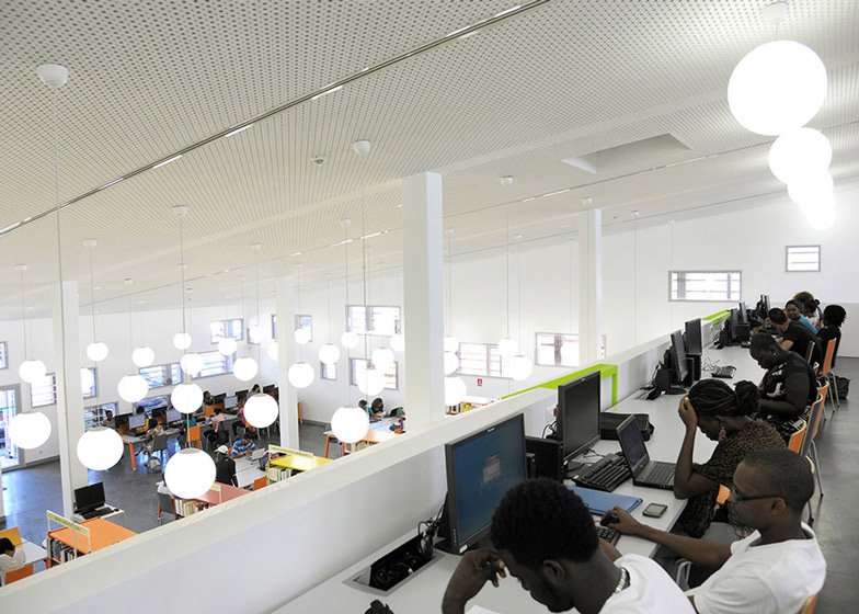
The main reading room is a large open space beyond the entrance. It includes a dedicated section for periodicals and a temporary exhibition area, plus stairs lead up to study spaces on a mezzanine floor above.
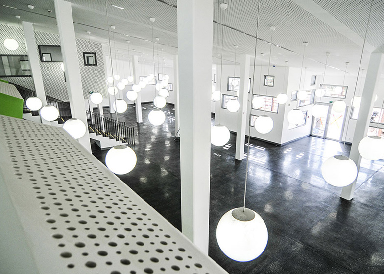
Diffused daylight filters in through the surrounding windows and is complemented by low-hanging lighting pendants suspended from the ceiling.
"The library is a place for studying that is not cut off from the rest of the world; all it takes to see the life of the university campus is to look up when sitting at a reading table and have a look at the traffic and motions in the gallery," added the architects.
The two-storey administrative section runs along the southern side of the building and has its own separate entrance.
Photography is by Jean-Michel André, apart from where otherwise indicated.
Here's a more detailed description from RH+ Architecture:
Construction of the New University Library in Cayenne, French Guiana
A coordinating facility, open to the University
The building of the University Library, located at the heart of the Guyanese University Campus has to be a driving force within the University and contribute to its regional radiance. It is a structuring facility for all the buildings that constitute the Guyanese University Campus: its vocation is to gather books and readers in a unique place dedicated to knowledge, an open and generous place within the University. It is about providing a cultural and documentary service of quality and also materialise the image of the regional community, therefore one of the main issues is to give to the building of the University Library a physical, social and symbolic identity that will impact the one of the neighbourhood and of the city.
Our aim is to give to this unique building for its program and its central position, a proper architecture - identifiable by its volume and its uses - combined to an opening upon the whole University.
A gallery around the building and at the heart of the University
The main architectural choice is the creation of an open peripheral space: unlike a construction cast in one piece with no dialogue with the surrounding, the building is wrapped up with a peripheral space of variable dimensions called "gallery" or peristyle. This gallery is an open space, a place where the students meet and pass through, an extra room between inside and outside, sheltered from sun and rain.
Additional wealth, the peristyle forms a place to exchange, a public space taken over - and even "the space for the public" - which connects the library to the rest of the University: the library is a place for studying that is not cut off from the rest of the world, all it takes to see the life of the University Campus is to look up when sitting at a reading table and have a look at the traffic and motions in the gallery. This one is made of a filter: a slope of wooden lace carefully placed around a concrete core.
The wooden filter allows:
» to open the building upon the whole University,
» to provide an extra collective space, a transitional space for stimulating sociability,
» to bring dim light inside the building,
» to offer a building of great unity and create a landmark on the University Campus.
Amazonian environmental quality
The construction industry in general, is a field highly consumer for the primary resources (water, energy, raw material) and great waste producer. Our thought has naturally been brought towards an Amazonian Environmental Quality process, version of the High Environmental Quality certification in tropical and subtropical countries.
The aim is to minimise, during its whole lifespan, how much the building will impact its external environment and the users who will live there during several generations.
The main goal for a library is to be able to read comfortably and, beyond the comfort given by the furniture planning, the essential following criteria have to be taken into account:
» The thermal comfort - the sun protection of the building rests on the principle of the double-skin facade. All the facades and particularly the W/E facades are protected by this wooden filter that forms a very effective brise soleil, a second roof protects the programmatic heart from the solar radius very intense in Guyana (proximity of the Equator).
» The visual comfort - it is a decisive condition: it consists in providing a diffuse light into the room so that any angle with which one takes a book, there are no embarrassing reflections. The project offers a gentle and enveloping light, as a result of the many openings spread over the facade: the generous light first filters by the wooden skin is then released in a homogeneous manner inside the building. With the same logic, the artificial light is regularly distributed in order to avoid any brutal dazzling light or source of reflections and backlighting.
» The acoustic comfort - by implementation of absorbing materials: soundproof ceiling, plaster wall lining for sound insulation of the Mezzanine and the training / exhibition rooms, etc, offer inside calm inviting concentration.
Functional organisation
The library is considered as an open space, with wide reception spaces, diverse reading and research spaces and the possibility of lending books. It is also a facility that combines traditional documentation and modern technologies.
The building is composed of 2 parts: one that receives the public and one reserved for administration and its technical rooms. The spaces dedicated to the public are located on the ground floor and on the mezzanine; the ones for the administration on the ground floor and the upper level. Patios and rifts mark this dissociation and improve the lighting at the centre of the building.
On the ground floor: once coming through the gallery - true threshold - the library is reached through a double door entrance space open on a wide entrance hall. Into the hall there are: a waiting area, a reception desk, and in the back the sanitaries (the central position of this desk allows to control at a distance away from the reading room). After going through the access control, the visitor directly reaches the lending desk, the press room, or the temporary exhibition space. The documentary room largely extends in the whole space located behind the reception desk and the temporary exhibition space.
Two patios have been set up in order to bring natural light at the core of the building between the public part and the administrative part, and also in anticipation of an extension requested in the program. The central patio therefore becomes the heart of the connection element organised in a thematic garden.
On the upper floor: for the public part on the mezzanine there are:
» in the documentary room, spaces dedicated to individual consultation: individual work cubicles and research networks; reachable directly from the large central staircase or from a smaller staircase on the side. This configuration offers privileged workplaces that have a clear view over the large room located below.
» a "box" or an autonomous volume that contains the multimedia training room on one side and the exhibition room on the other. The latter is also reachable from a staircase that gives onto the entrance hall.
The entrance to the administrative part is direct from the ground floor, taking the elevator or stairs located on the side of the patio. The offices and the common premises are divided on both sides of the staircase ; they all benefit from natural lighting and views outside and to the patio.
Programme: construction of a new university library
Project owner: Rectorat de Guyane
Location: Cayenne, Guyane (973)
Cost: 5,3 M € HT
Net surface: 2 143 m²
Delivery: December 2013
Architect: rh+ architecture
Architect partner: ARA - Jocelin Ho-Tin-Noé
In charge of the construction: Anaïs Durand
Eng. Structure: Technopôle Martinique / SODETEC
Eng. Fluid: Louis Choulet
Eng. HQE: Solener
Eng. Acoustic: Rémi Raskin
Eng. Wood: Sylva Conseil

