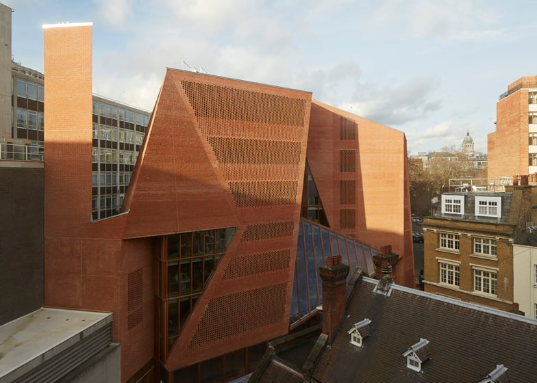
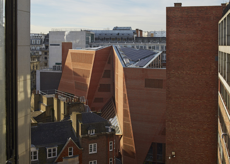
Irish architects O'Donnell + Tuomey mapped sight lines along the narrow streets of the London School of Economics campus to generate the faceted red brick structure of the university's new student centre (+ slideshow).
The Saw Swee Hock Student Centre consolidates all of the university's student facilities under one roof at the LSE's historic Aldwych campus. Designed by architects Sheila O'Donnell and John Tuomey, the seven-storey-high building has an irregular faceted shape informed by the angular geometries of its site and surroundings.
Walls angle inwards along the eastern facade to give the centre a recessed public entrance that lines up with approaching streets to the north, south and east.
"The public space at the threshold of the student union, on axis with St Clement's Lane, creates a place of exchange; a spatial bowtie that intertwines circulation routes, splices visual connections between internal and external movement, and pulls pedestrian street life into and up the building," said the architects.
"Like a Japanese puzzle, our design is carefully assembled to make one coherent volume from a complex set of interdependent component parts," they added.
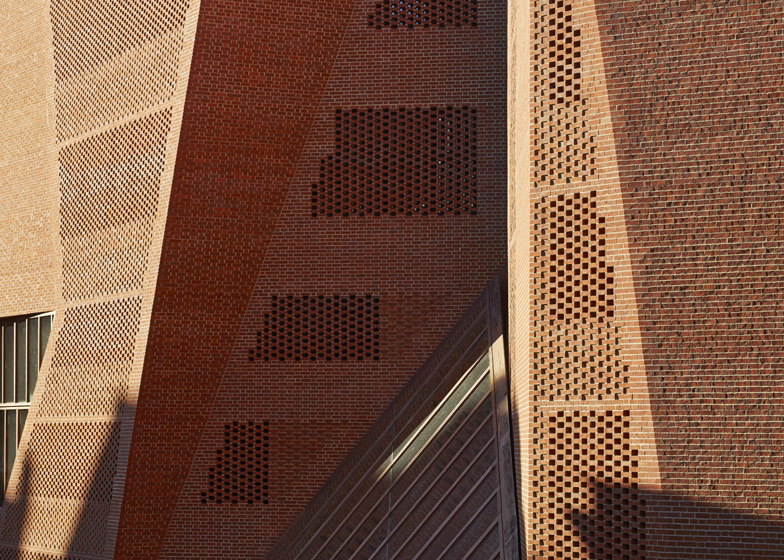
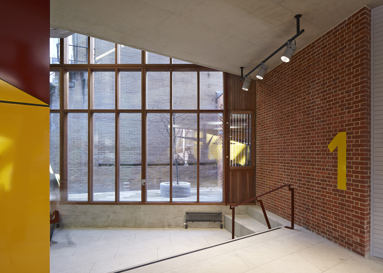
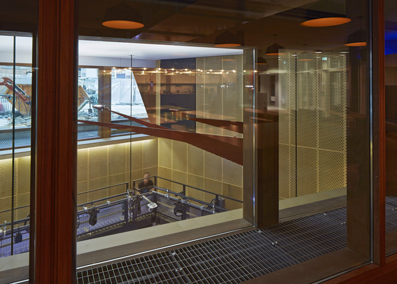
Red brick was used to construct the walls of the building using a typical flemish bond. In some places the material forms solid walls, while in others it creates perforated screens across windows.
"The perforated planes are constructed from a single leaf of brickwork with spaces in the flemish bond pattern to allow light to both infiltrate the interior spaces and filtrate out at night to create a pattern effect," said the architects.
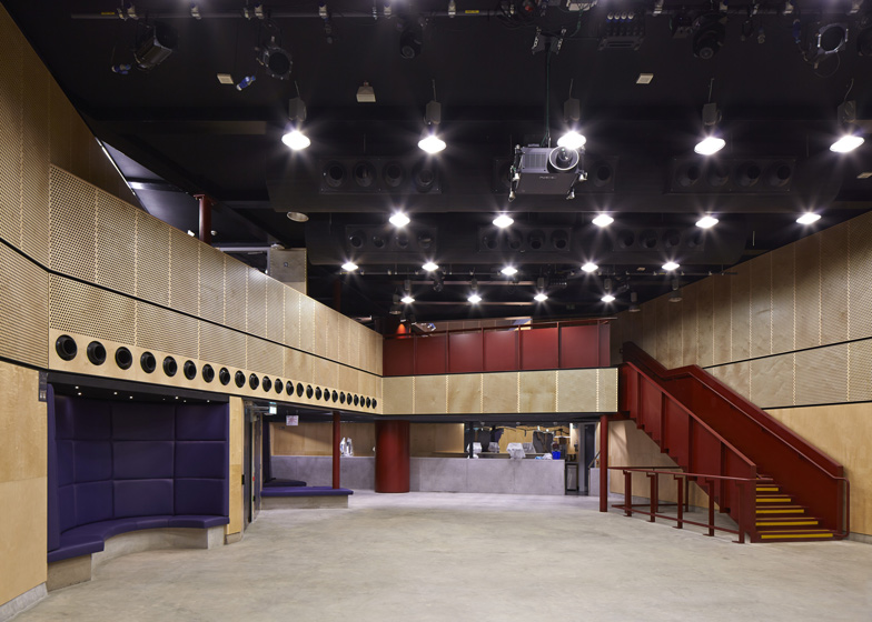
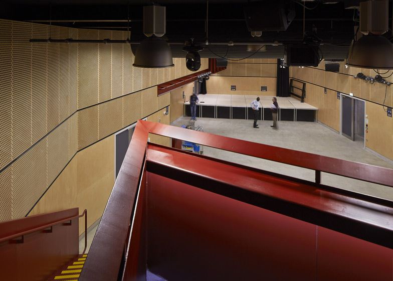
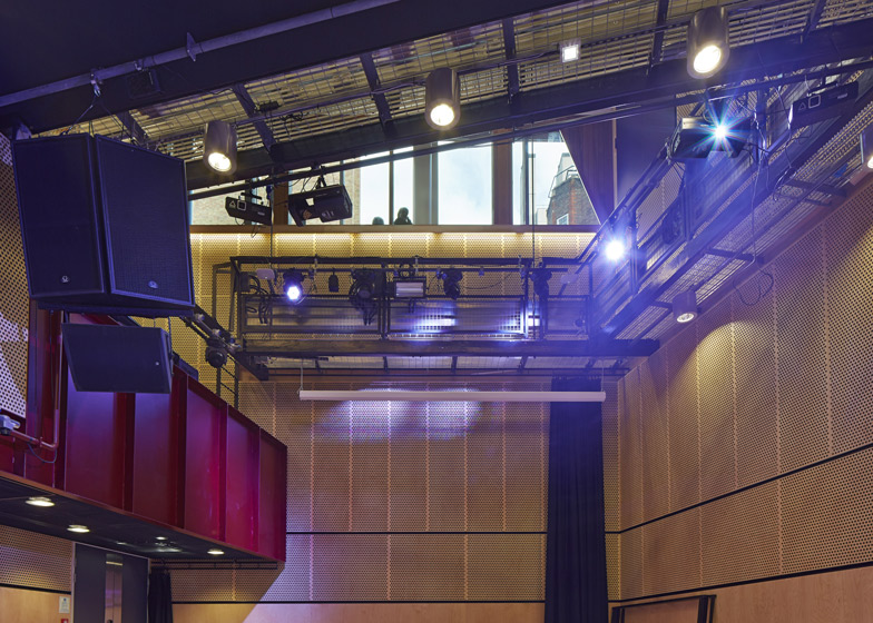
Spaces within the building accommodate a variety of functions, including an events venue, a bar, a cafe, a gym and dance studios. There are also prayer rooms, offices and multimedia facilities.
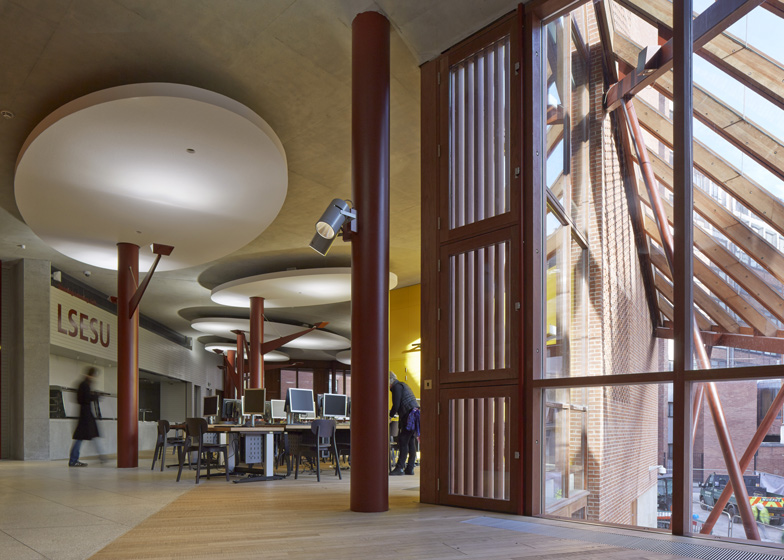
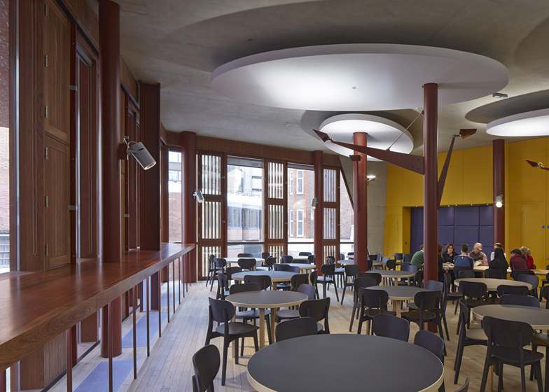
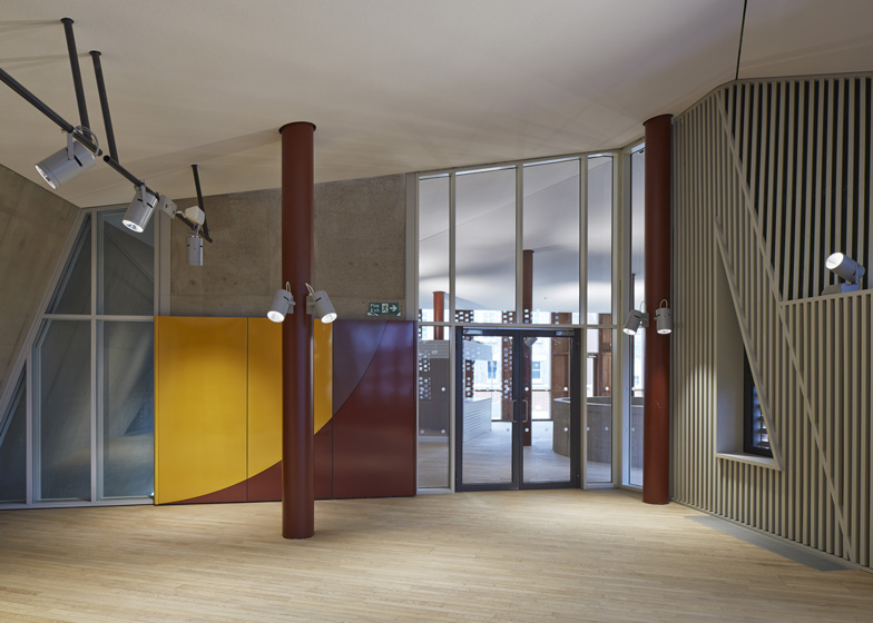
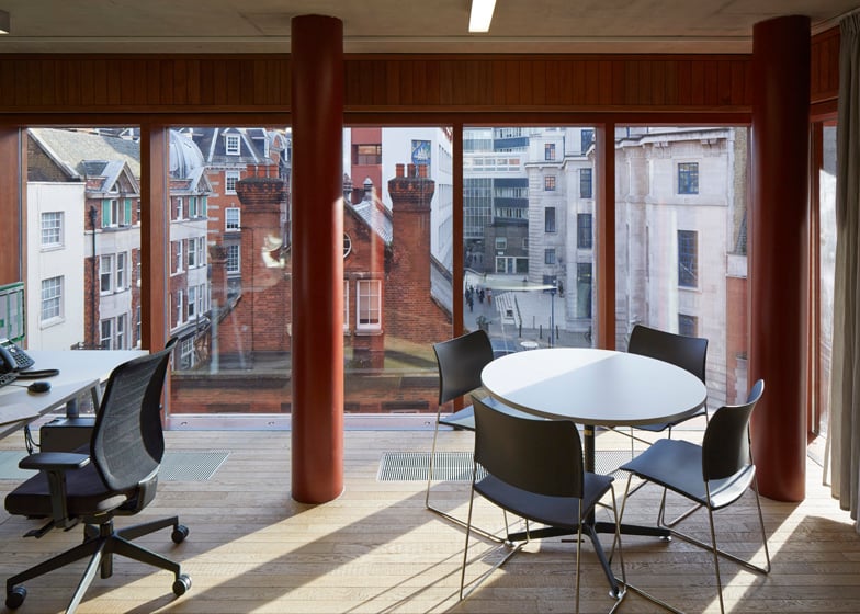
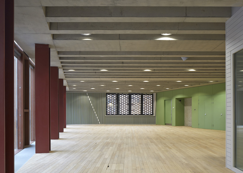
Designed to resemble a "lived-in warehouse", the building has an exposed structure that combines steel columns and trusses with concrete floor slabs.
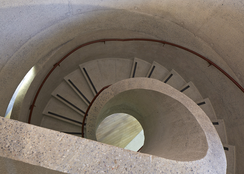
Floor plates differ in shape and size on different floors. Angular stairwells are positioned at three corners of the building, while a spiral staircase is positioned near the entrance.
"Space flows freely in horizontal plan and vertical section, with stairs gently twisting and slowly turning to create a variety of diagonal break-out spaces at landings and crossings throughout the building," said the architects.
An assortment of windows and skylights ensure that each corridor receives daylight, and an events hall in the basement can be naturally lit though a row of clerestory windows.
The building will open next month, but its surrounding landscaping is not set to be finished until the summer.
Photography is by Dennis Gilbert/VIEW.
Here's a project description from O’Donnell+Tuomey Architects:
Saw Swee Hock Student Centre, London School of Economics
Client Brief
The brief was to bring student facilities together under one roof. The multi-functional building includes a venue, pub, learning café, media, prayer, offices, gym, careers, dance studio and social spaces. The brief asked for the "best student building in the UK" and had the aspiration for BREEAM Excellent rating. The design achieved BREEAM Outstanding.
Planning Constraints
The site lies within the Strand Conservation Area. The context was complex and the site was restricted by surrounding building lines. Specifications were closely monitored by Westminster planners, who supported the ambition for a contemporary design integrated with its setting. Throughout the building process, the planners maintained a commitment to the enduring quality of carefully crafted construction.
Street Life
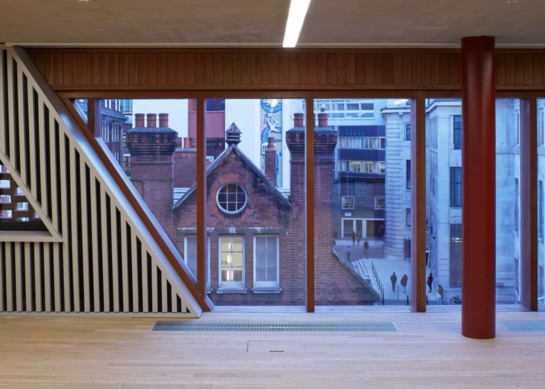
The site is located at the knuckle-point convergence of narrow streets that characterise the LSE city centre campus. The faceted facade operates with respect to the Rights of Light Envelope and is tailored to lines of sight, to be viewed from street corner perspectives and to make visual connections between internal and external circulation. The brick skin is cut along fold lines to form large areas of glazing, framing views. Analysis of the context has influenced the first principles of a site specific architectural design.
Embodiment
The building is designed to embody the dynamic character of a contemporary Student Centre. The complex geometries of the site provided a starting point for a lively arrangement of irregular floor plates, each particular to its function. Space flows freely in plan and section, with stairs turning to create meeting places at every level.
Construction, Colour and Atmosphere
London is a city of bricks. The building is clad with bricks, with each brick offset from the next in an open work pattern, creating dappled daylight inside and glowing like a lattice lantern at night.
The building has the robust adaptability of a lived-in warehouse, with solid wooden floors underfoot. The structure is a combination of reinforced concrete and steelwork. Steel trusses or ribbed concrete slabs span the big spaces. Circular steel columns prop office floors between the large span volumes and punctuate the open floor plan of the café. Concrete ceilings contribute thermal mass with acoustic clouds suspended to soften the sound.
There are no closed-in corridors. Every hallway has daylight and views in at least one direction. Every office workspace has views to the outside world. The basement venue is daylit from clerestory windows.
Inclusive Design
The building is designed with accessibility and inclusive design as key considerations. Approaches are step free. Floor plates are flat without steps. Circulation routes are open and legible with clearly identifiable way-finding. Services are located at consistent locations. The central wide stair was carefully designed to comply with standards and details agreed with the approved inspector.
Architect: O'Donnell+Tuomey Architects
Executive Architect: O'Donnell+Tuomey Architects
Structural Engineer: Dewhurst Macfarlane and Partners/Horganlynch Consulting Engineers
Services + Environmental Engineer: BDSP
Security / Fire / Acoustics / Transport & Logistics / Venue: Arup
Catering: Tricon Foodservice Consultants
Access:David Bonnett Associates
Archaeology: Gifford
Project Manager: Turner & Townsend
Quantity Surveyor: Northcroft
Planning Consultant: Turley Associates
Party Wall Consultant: Anstey Horne
Building Control Consultant: Carillion
CDM Coordinator: Gardiner & Theobald
Main Contractor (D&B): Geoffrey Osborne Limited

