Large glowing letters spell out the Portuguese Spanish word for tea at the front of this tea house in Brazil by architects Estudio 30 51, the third cafe we've featured in the last seven days (+ slideshow).
Gustavo Sbardelotto of Estudio 30 51 teamed up with architect Mariana Bogarin to design El Té for the ground floor of a shopping centre in Porto Alegre, and installed the two huge wooden letters across the shopfront so that they frame the cafe's entrance and serving counter.
"The fronts of the letters are backlit so at night time they work like urban lanterns illuminating the front of the store," Sbardelotto told Dezeen.
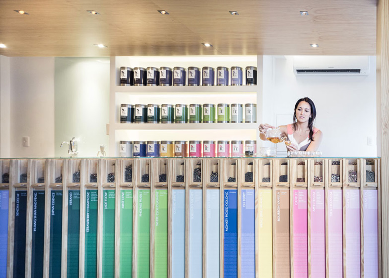
The colourful packaging of the teas provided the starting point for the shop's interior design and create a rainbow effect along the edge of the glass-topped serving counter.
A range of 30 different teas are displayed across the sections and customers are invited to to sample and smell different types.
The rest of the space is lined with wooden panels to allow these colours to stand out. This includes the base of the counter, walls, doors and shelving.
White tables and simple wooden chairs fill the space, sitting over a floor of square paving stones. Customers can also choose to sit on outdoor furniture in front of the entrance.
A stockroom and office for staff is located upstairs.
Photography is by Marcelo Donadussi.
Here's a project description from Estudio 30 51:
Tea house
Located in one of the most important commercial galleries in the city of Porto Alegre, El té – Casa de chás (tea house) focuses on the sale of teas and everything that involves the product.
The project concept was born from the immersion in the world of teas. All its colours, textures and aromas were the starting point for creating this environment. Wood was elected as the primary materiality of the project , acting as a neutral base where the colourful herbs are the highlight.
Due to the shop window be visually obstructed by the wall of the shop next door and be quite far from the sidewalk, the store needed a visual attraction that arouse the interest of those who passed through there. For that reason it was sought a synergy between the element of visual communication and architecture.
From the graphical representation of the words "El TE" chosen as store name, and that literally means "The Tea", it was developed a pictogram identification of the tea house that is both visual communication and the main piece of furniture - this goes beyond the scale of a usual sign composing the facade and interior design of the shop.
On the face of "TÉ", facing the street it was implemented a backlight that functions as an urban lantern, an exciting surprise to those who pass by the store by night. The depth of the letter "E" on the facade extends beyond the outer limit, penetrating inside the store and acts as the main design element. This element home the showcase of teas, infusions preparation desk and cashier.
The samples of 30 variations of teas are arranged in small drawers so that clients can smell the product before they decide which one they want to buy. The 30 variations of the infusions are indicated by different colours beneath each small drawer, which facilitates the identification of each tea by customers and creates a colourful scheme.
Architects: Gustavo Sbardelotto (estudio 30 51) e Mariana Bogarin
Location: Porto Alegre – Rio Grande do Sul - Brazil
Project Year: 2012
Area: 63,00 sqm


