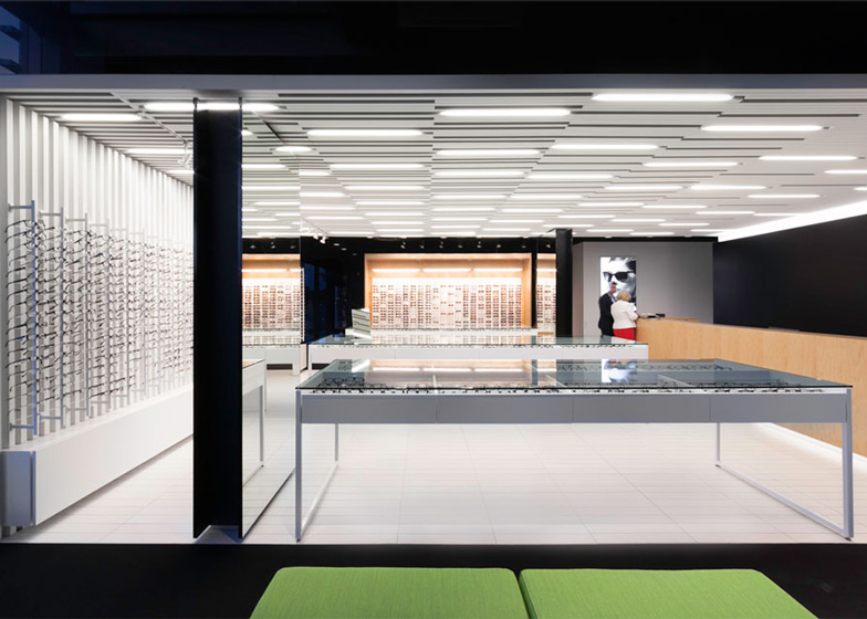
A white spectacles showroom contrasts with black examination areas at this opticians near Montreal by Canadian studio La Shed Architecture (+ slideshow).
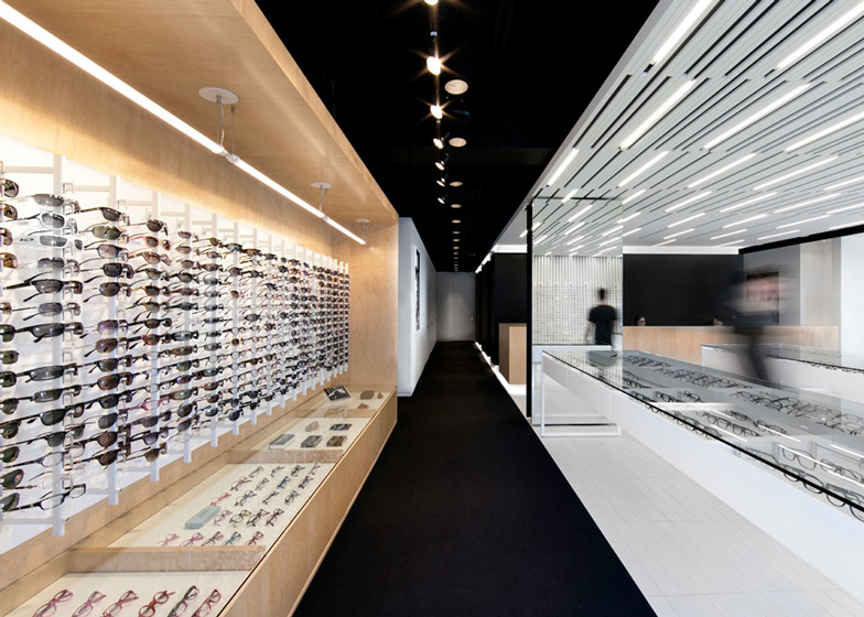
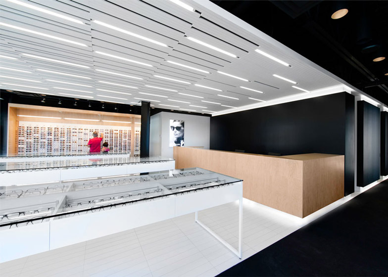
To create a distinction between the commercial and medical areas of L'Aire Visuelle eye clinic, La Shed Architecture installed a white element that runs through the 284-square-metre space in Laval, northwest of Montreal.
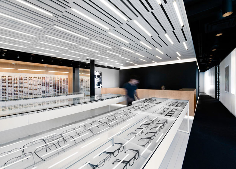
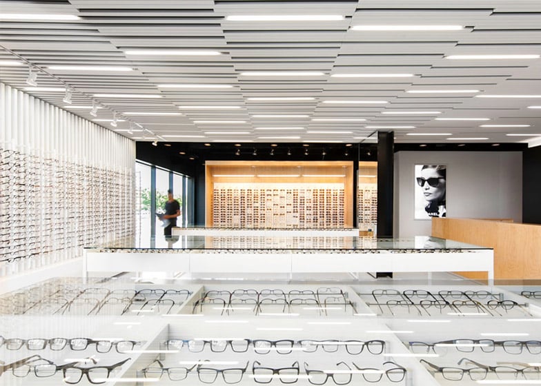
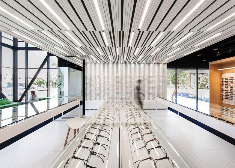
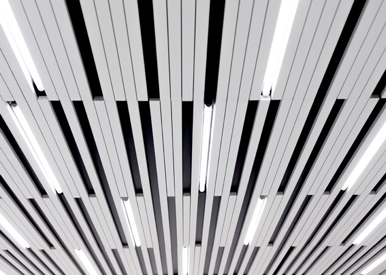
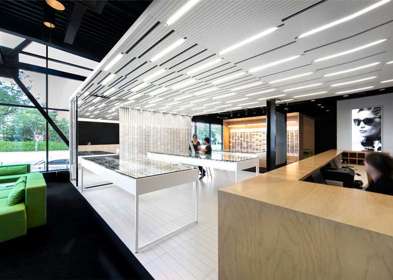
In the shop, wooden slats are randomly interspersed with strip lighting above glass display counters and linear tiles are laid in the same direction on the ground.
"The commercial space was designed as an atelier-boutique, characterised by low display tables in the open area, avoiding any visual obstruction," said the architects.
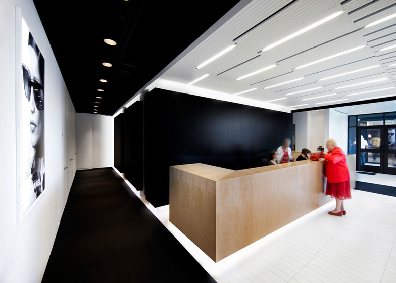
These ceiling and floor materials continue beyond a wooden reception desk into the treatment and storage spaces behind.
In contrast, circulation spaces situated either side of the feature element have black carpets and surfaces.
These lead to dark examination rooms on one side and the staff room on the other. The waiting area is also situated on the black carpet, next to the entrance and beside the display units.
Retail consultation spaces sit inside a wooden cube, which also displays frames in the side facing the store.
Here's some more information from the architects:
L'Aire Visuelle
Working from high contrast and simple natural materials, the firm la SHED architecture have designed a unique optometrist and optician clinic redefining the customer's experience. The commercial space was designed as an atelier-boutique, characterised by low display tables in the open area, avoiding any visual obstruction. Looking for frames becomes the opportunity of a friendly exchange, underneath the bright ceiling, composed of wooden slats installed randomly.
With the goal of giving their enterprise a breath of fresh air, the associates of L'Aire Visuelle sought to create a new corporate image based on the state-of-the-art products and techniques that they offer, as well as the quality and expertise of the services they provide. The first objective was to redefine customer experience in the clinic. Their previous office became too narrow over time as a result of company expansion; the client therefore required an organized, spacious and open space where emphasis was placed on the sales area and their selection of eyeglass frames.
Creating a hierarchy of movements between patients and employees was an essential part of optimising displacements and creating a functional environment. The project mandate consisted of planning and developing an optometry clinic and its eyeglass store at the ground level of an existing two floor commercial building. With windows on three facades, the 3060-square-foot office accessible from a common hall had an irregular shape – a portion of which had a misaligned angle in relation to the main structural frame.
A space with double the height opening onto the second floor dental clinic offered an abundant amount of natural light. The client’s budget was limited to a maximum of $450,000 for the entirety of project work involved including mechanical work, furniture and professional fees.
The space was designed in such a way to position the sales area at the front of the building, in the section that contained the most windows and was closest to the entrance. People walking into the clinic could therefore instantly see all available products. Visible from the reception, the waiting area was placed beneath the office's area of double height and is apart from the consultation rooms while being open to the sales area.
The two main axis of circulation are on either side of the reception area – one being meant for clients heading for consultation and examination rooms, and the other for clinic personnel heading to the employee common room, apart from the client zone. The design hierarchy was therefore established, with busier areas at the front near the entrance, and areas requiring quiet and privacy located at the rear of the office.
The concept, geared towards the creation of a workshop-boutique, opted for presentation tables in order to keep the display area clear of all obstacles limiting vision or obstructing lighting. As a result, the eyeglass frame shopping area turns into a far more friendly area, where artificial light is articulated within a randomly organised ceiling of lath wood. The ceiling, by its dynamic and rhythmic design, creates an illusion of movement within the adjacent space.
In the spirit of architectural continuity, a wall of vertical lattice creates a space for attaching eyeglass frame presentation modules while enveloping the sales area. The long and narrow ceramic tile flooring is a harmonious continuation of the lath wood ceiling, therefore completing the envelopment of the sales area.
The immaculate white band that is the showroom is a start contrast to the wooden monolithic cube immediately adjacent to it, covering the private consultation areas. Behind the sales floor, a black satin volume containing the exam rooms seems to have slipped under the ceiling lath, creating an attractive backdrop to the reception area. Detached from adjacent surfaces by recessed lighting, this volume, fragmented by full height openings, seems to float gingerly between the floor and ceiling.
The highly contrasted colours provide the area with a theatrical character featuring the eyeglass showroom with its bright white presentation modules, whereas the mechanical and unaesthetic elements of the open ceiling disappear in black. A sober, neutral and classical colour palette ensures a total coherence between different elements of the clinic.
A black carpet covers the floor in circulation and consultation areas, absorbing sound and light emitted by the sales area. Fluorescent tubes randomly built into the lattice ceiling frame animate the sales area by producing bright and stimulating lighting in stark contrast to the other more private spaces. Black cylindrical tubes hidden throughout the mechanics and structure provide rich and soft lighting in the circulation, waiting and consultation areas as opposed to the abundant lighting of the showroom.
The contrast of porosity, colours and textures within the project elegantly reflect the different character of each space, and contribute to a simple and clear understanding of the planning of the office. Refined finishing details such as doors with hidden frames, and recessed plinths contribute to the clean appearance of the various spaces, underscoring the strong architectural ideas implemented to make L'Aire Visuelle a contemporary and elegant optometry clinic.

