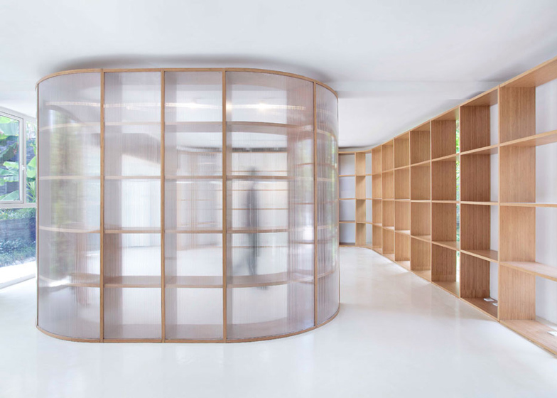
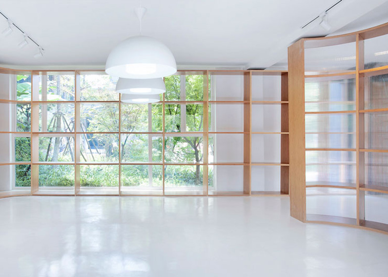
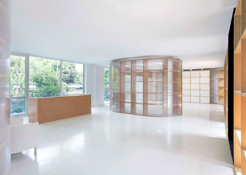
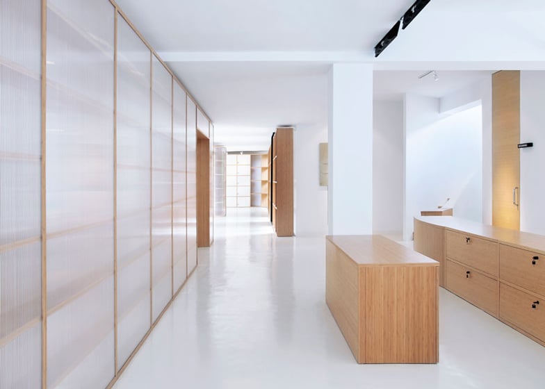
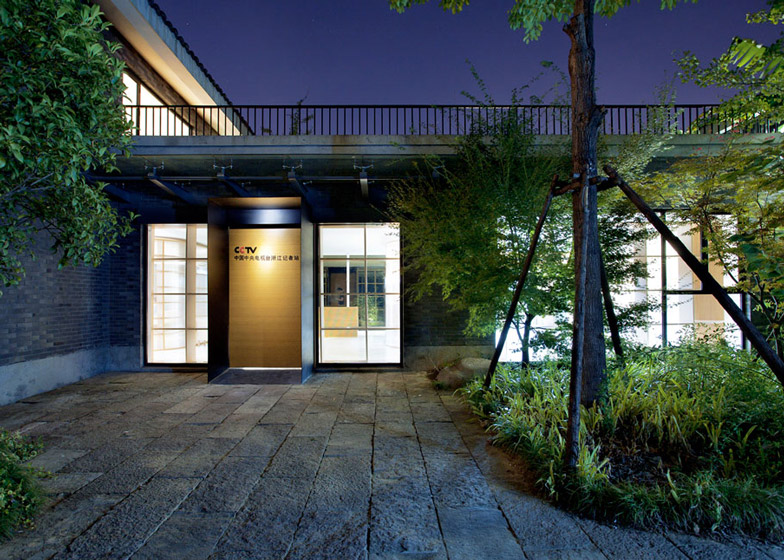
Semi-translucent polycarbonate panels and wooden shelving systems create partitions in this office renovation for a television station in Hangzhou, China, by Daipu Architects (+ slideshow).
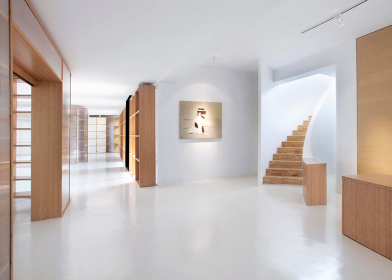
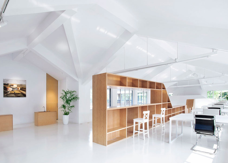
Chinese studio Daipu Architects renovated the two-storey open-plan office to bring more light to the interior and inserted a system of shelving, cabinets and partitions to break up the different spaces.
Architect Dai Pu said he designed the interior layout to be similar to that of the Mies van der Rohe Pavilion in Barcelona, also using influence from the three-dimensional works of Italian artist Giorgio Morandi.
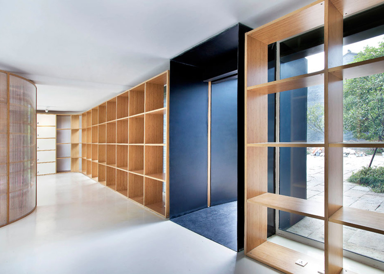
"No regular partition walls (plaster wall or brick wall) have been built," Pu said. "The new partition is composed of very light cabinet and one centimetre semi-transparent polycarbonate panel, while the furniture, stairs, handrails and bar counter all come up to constitute the partition system."
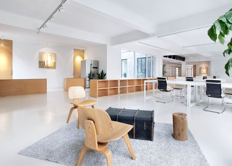
The simple interior features polished white floors with wooden desks, chairs and shelving.
A cafe, kitchen and a mixture of office spaces and meeting rooms make up the lower floor, with extra space for leisure activities including a ping pong and a football table.
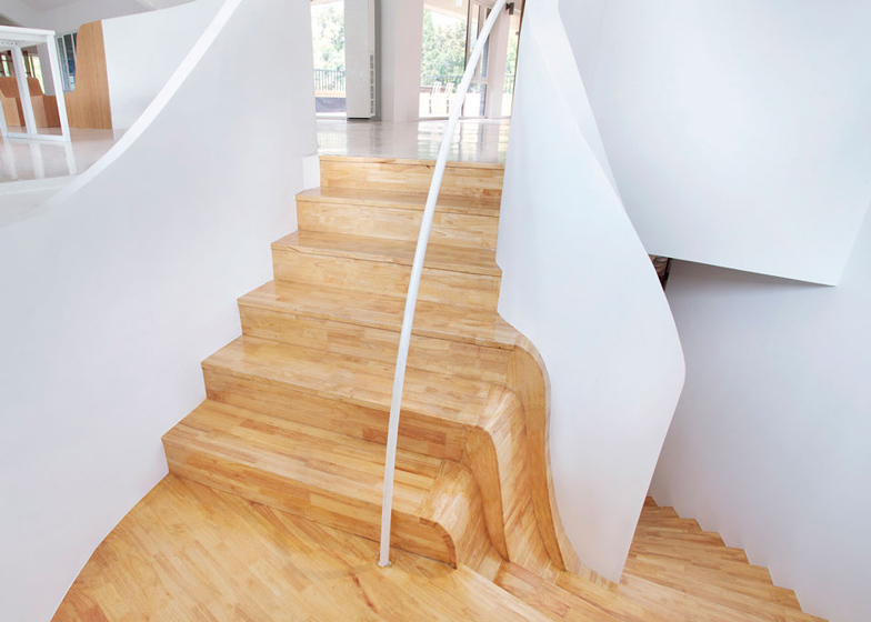
In the lobby, a curved plaster-clad staircase with wooden treads leads up to the first floor.
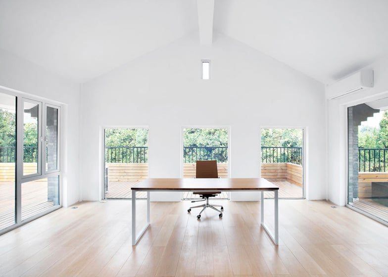
Two rooftop terraces used as interview spaces sit on either side of a large meeting room. The rest of the first floor is occupied with more desks, a corner reading room and another small room with beds for staff members to rest.
Photography is by Xia zhi.
Here's a project description from Daipu Architects:
Office Renovation of CCTV Zhejiang Reporter Station
This office renovation is located in west of Ba Gua field, Hangzhou, China. The site possesses excellent landscape; however, it was dark and gloomy in the old building. The existing structure had a floor-height of 3.3 m for the ground floor, and the clear height below the beam is only 2.6m, which is comparatively depressing for open office. The height of the second floor was ok, however it did not have enough connection with the ground floor. The old structure layout could hardly exhibit advantage of a double-deck.
So the first consideration was to build up a connection between 2 floors, the connection not only on physical space aspect, but also on psychological perception of people who will work here. People who will be working downstairs or upstairs could feel the existence of the other part of colleagues, thus to create an ambient of teamwork.
A lot of attempts have been made. Finally the Barcelona Pavilion of Mies and the painting works of Morandi give a breakthrough. The work of Mies only offered the idea for the 2-dimensional design, whilst the approaches of Morandi were good examples for seeking the 3-dimensional solutions. In Morandi's late works, the relations between the main object and the background and their colour relations were becoming assimilated and simplified; it can see that the boundaries of many objects merged into the background in many of his works.
The approach is, if we take the furniture as the object, while taking the structural components like the walls and stairs as the canvas, then to make the object (furniture) merged into the canvas (structure), it can easily pass the perception of flowing to the people as the furniture is the very thing which most connected to the people. The space upstairs now is connected to the space downstairs due to this assimilated effect happened between the building structure and the furniture. In order to imply the space concept and work with the atmosphere, a few works of the Morandi’s paintings have been redrawn and placed in some particular corners.
There is not any regular partition wall (plaster wall or brick wall) has been built. The new partition is composed of very light cabinet and 1cm semi-transparent polycarbonate panel. The furniture, stairs, handrails and bar counter all comes up to constitute the partition system.
The prefabricated partition system saved the cost of on-site work, and it also avoided wet operation meanwhile it saved the time. The partition system, as the most important part of the construction had been put into furniture factory which has advanced equipments; this is also a solution to improve the perfection of construction here.
Location: Hangzhou, Zhejiang, China
Design Architect: Daipu Architects
Design Director: Dai Pu
Design Team: Dai pu, Luo yaqin, Wang tiantian
No. of floors: 2
Area: 640 sqm indoor, 147 sqm outdoor
Program: office, dubbing, duty, outdoor interview, leisure, storage
Client: China Central Television
Furniture manufacture: Hangzhou Runzhu Science & Technology Co. Ltd
Contractor: Zhejiang Sunshine Decoration Engineering Co. Ltd
Design: 2012.06 - 2012.09
Construction: 2012.09 - 2013.09

