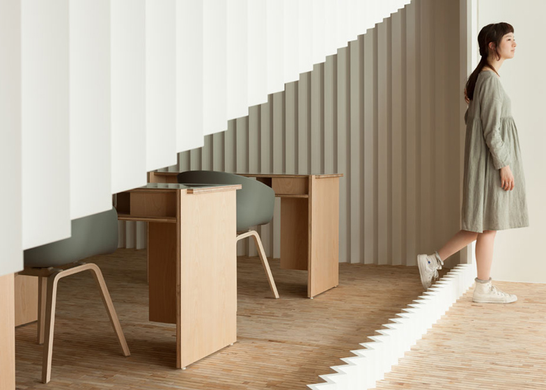
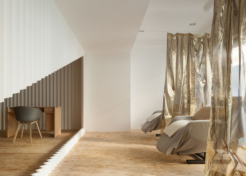
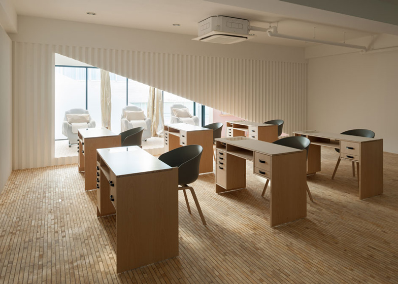
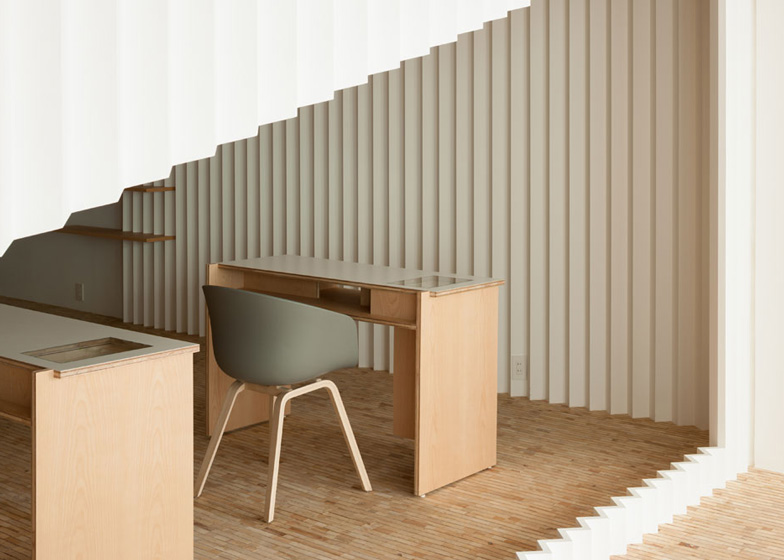
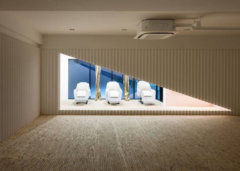
A crimped wooden screen with a triangular hole through its centre divides the spaces of this beauty salon in Osaka by Japanese designer Yusuke Seki (+ slideshow).
Yusuke Seki used a simple palette of wood and white paint to make the interior of the Kolmio+LIM salon reflect colours of natural skin tones, then added a selection of pastel colours reminiscent of nail polish.
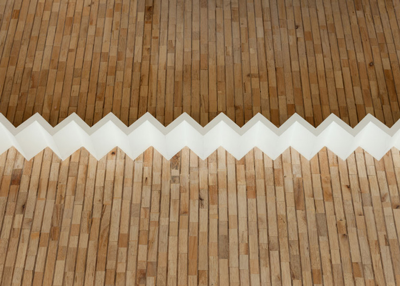
"We designed the zigzag wall in white to represent the basic skin tone," Seki told Dezeen. "Through shadow and light it creates more definition."
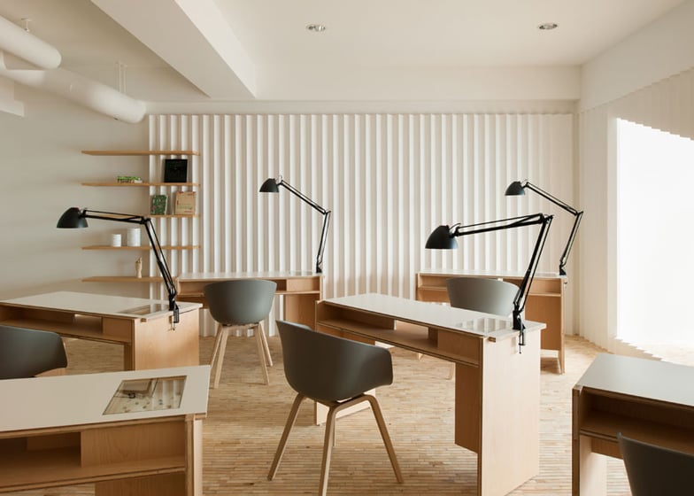
The crimped wooden screen cuts the space into two sections, but also folds around a corner to line the edge of a sidewall. "The zigzag wall catches the natural light and evokes differences, like the skin and nail tone does," added Seki.
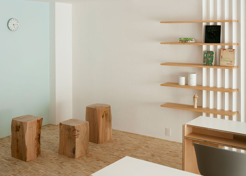
A blue-painted feature wall provides a backdrop for the reception area, which features small wooden seats made from tree trunks and a wooden bookshelf.
This space opens into a main room with six wooden tables for nail treatments and two reclining chairs positioned off to the side for pedicure treatments.
Customers have to step through the triangular hole of the crimped wooden screen to access the beauty treatment area at the rear of salon.
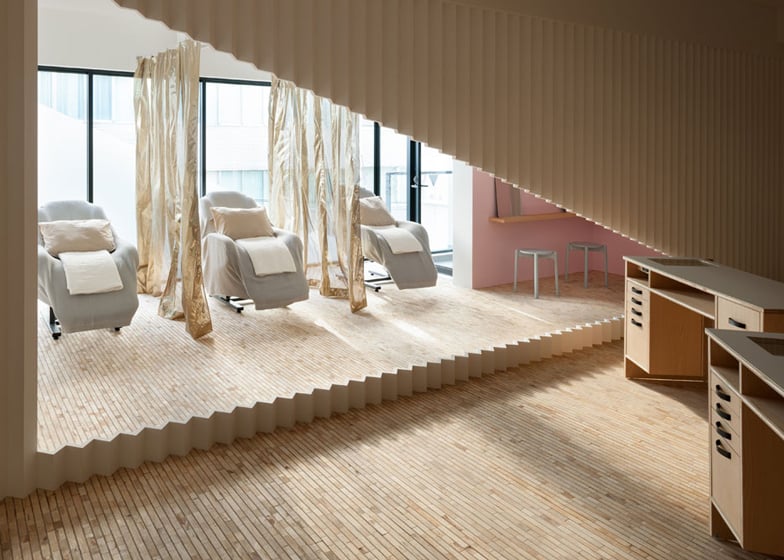
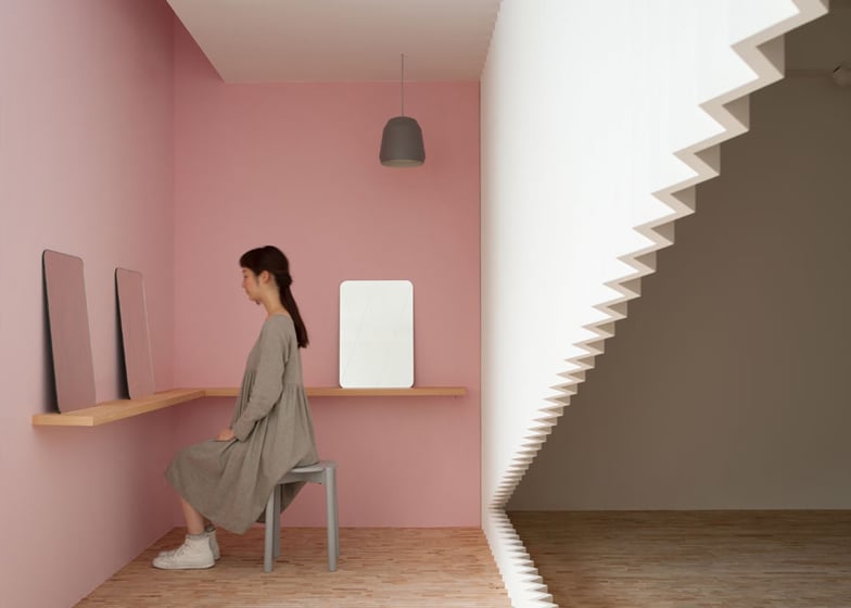
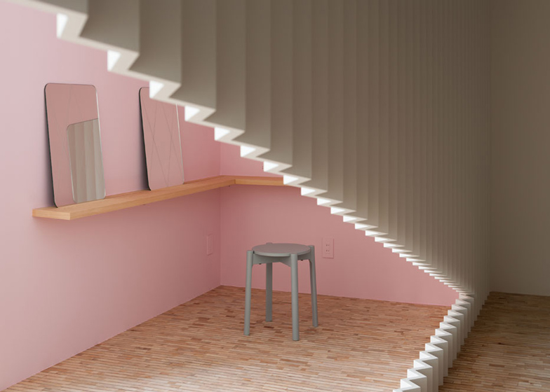
Eyelash treatment chairs are separated by shimmering gold curtains that are partially transparent, while a pale pink feature wall with additional mirrors creates an extra seating area.
The pastel colours chosen for the walls reference coloured buildings in the surrounding neighbourhood, while a linear grid of wooden blocks creates a parquet floor.
Photography is by Takumi Ota.
Here's a project description from Yusuke Seki:
The Nail Salon Kolmio+LIM
The Nail Salon is designed with iconic triangle division as it reflected the meaning of "Kolmio".
"Kolmio+LIM" is a nail salon located in Osaka, the western capital of Japan, which is where our client LIM started her first hair salon. They have since expanded their beauty business. "Kolmio" is taken from the name (kolmio+LIM) the Nail Salon means triangle in Finish.
The store layout of basic wood and white has been designed to reflect the essential colour of natural skin tones, and the space itself is intended to symbolise the process of nail colouring. The zigzag wall and natural lighting refraction make references to the twinkle glitter reflection of nail polish, and the colour themes of the design represent the various layers of nail polish applied one after another.
Yusuke based the design, of various tones of white, upon basic natural human nail colours. He tried to express the Japanese proverb "Diverse men, diverse minds", which directly translates as 'ten people have ten different colour'; as every person has their own skin colour as a base for colouring, to bring a new personality by adding layer upon layer of beauty work requires precision by the nailist.
The coloured walls take their inspiration from the neighbourhood buildings just outside the window, as a way of incorporating the surrounding aesthetics, as part of an overall interior design theme. "Kolmio" is originally an intricate triangle decoration. This stores' dynamic shapes are inspired by kolnio and possess an iconic value, as well as providing a functional division through the centre of the space. All of the design methods are inspired by there environment, and the actions all happened surroundings.

