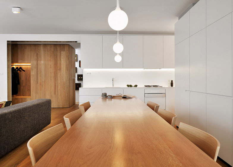
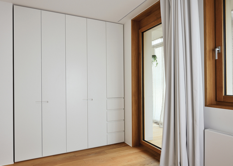
Slovenian firm Studio 360 built walls of modular white shelving inside every room of this L-shaped apartment in Ljubljana to maximise space whilst removing clutter (+ slideshow).
Studio 360 renovated a 100-square-metre apartment in the heart of the Slovenian capital to create the modern home, which contains a large living and dining room, two bedrooms, two bathrooms and a study.
The designers didn't make any changes to the layout of the apartment, but gave each room a different arrangement of shelving based on simple geometric shapes. This inspired the project's name, Geometric Residence.
The studio also made small structural adjustments by changing windows and doors, replacing the flooring and rewiring the electrics.
"When the client approached us, this apartment was vacant and ruined," explained studio director Lidija Dragisic. "In order to bring it back to life, the renovation was absolutely necessary."
The interior combines basic materials and natural colours, with white walls, oak furniture and detail accents in black. "This approach allowed the residents the freedom of doing any additional decorations without disrupting the overall design statement," said Dragisic.
Entering the space, the apartment opens onto the open-plan living room, accessed by walking under a strip of mirrored glass.
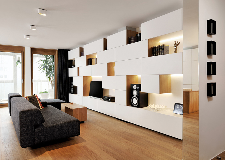
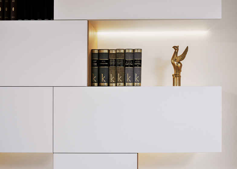
The lounge area is dominated by block white shelving, with gaps made of oak deliberately inserted to allow the addition of books, a TV and speakers.
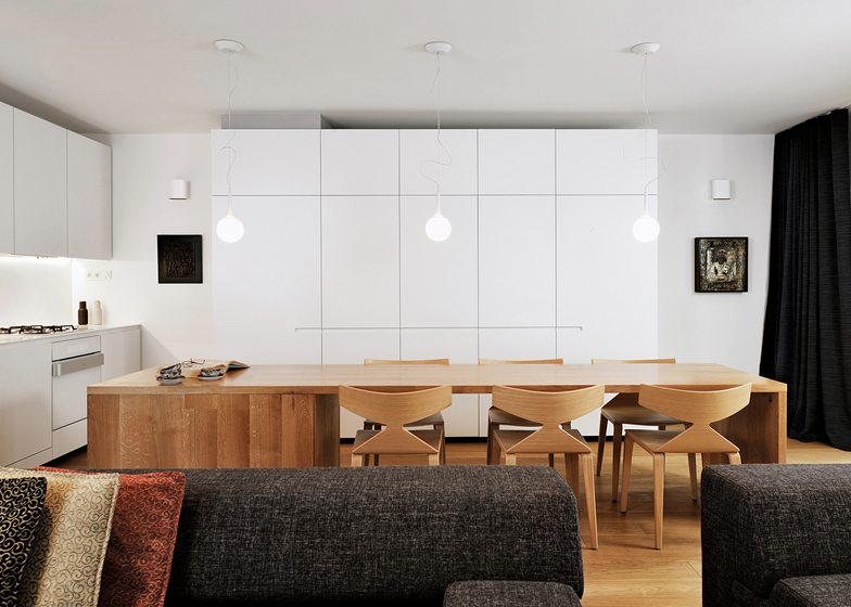
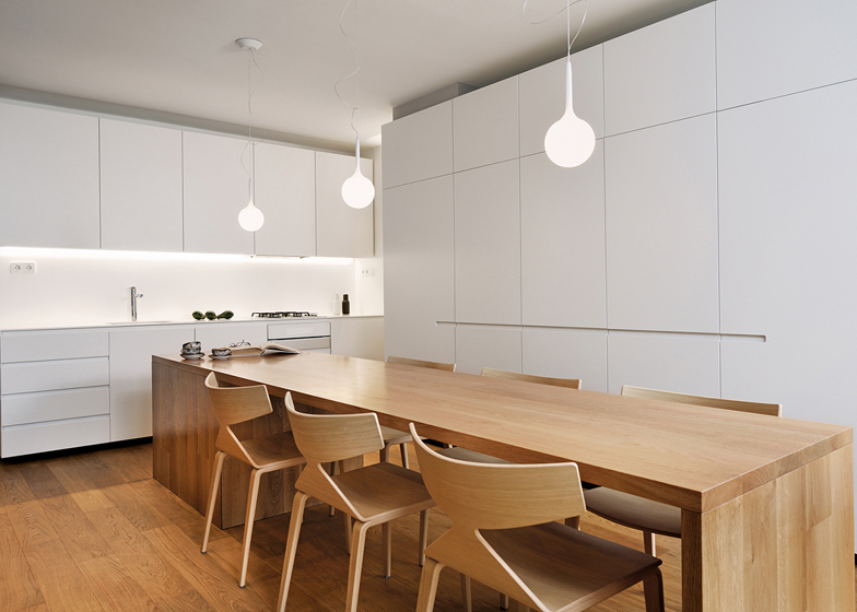
In contrast, the adjacent kitchen features uniform white units, which surround a custom-made 3.5-metre wooden table with a parquet finish.
In the master bedroom, oak storage units are suspended from the wall above a bed made from the same wood. Both this room and the second bedroom feature full-height white wardrobes.
Sandwiched between the two bedrooms is a small study with shelving divided into squares and rectangles.
The two main bathrooms are finished in slate grey tiling and feature mirror-lined walls and white inlet shelving.
Photogaphy is by Miran Kambic.
Here's a project description from the designers:
Geometric Residence, Ljubljana, Slovenia
The apartment is located in the heart of Ljubljana, the capital of Slovenia. It is divided into living area (consisting of a large living room with kitchen and dining room) and more intimate / sleeping area (two sleeping rooms and a study room). In between these two spaces there is a service part offering two contemporary bathrooms and one utility.
When the client approached us, this apartment was vacant and ruined. In order to bring it back to life, the renovation was absolutely necessary. The adaptation didn’t make any significant changes to the floor plan, besides some bathroom enhancements, windows & door replacements, new flooring and electrical installations.The interior furnishing design is simple, with design-scheme combining basic materials and natural colours: oak, white furniture and some detail accents in black. This approach allowed the residents the freedom of doing any additional decorations (art, coloured cushions, carpets, accessories etc.) without disrupting the overall design-statement.
The furniture along the walls is in a neutral white and designed in a geometrical pattern, which magnifies the flat’s ambience. Several carefully selected accents are wood, which create a pleasant and cozy atmosphere. The furniture is custom and unique - for example, a big 3.5 m long wooden table in the middle of the dining area or a huge pantry with parquet-finish, which brings the living and private spaces together. The marriage of white and oak is implemented in the master bedroom as well (master-bed and a geometrically-shaped wall closet above). The massive curtains throughout the apartment achieve additional intimacy, softness and consistency (they are also in a neutral black & white combination). The bathrooms are simple and without any unnecessary decorations, which allows the beautiful concrete-like tiles to stand out. These spaces are visually enhanced with the clever use of built-in mirrored walls.
Our aim was to adapt this interior to the versatile, ever changing needs of the modern customer. Besides the functionality, we wanted to create many different lighting scenarios and environments. This is achieved by combining basic lighting with the indirect led lighting, which are hidden in the furniture elements. The ceiling in the bedroom adorned with a crystal chandelier, which (along with the other vintage accessories) gives this residence a unique soul.


