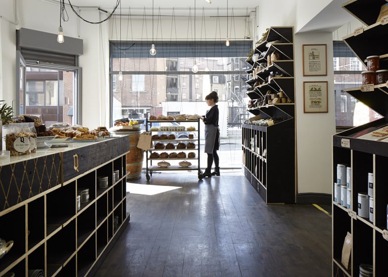
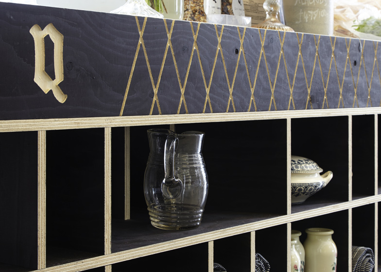
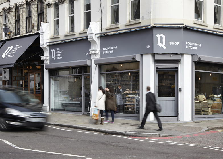
Jagged shelving units and scored surfaces were designed to evoke the look of food crates and packaging at this London butcher and delicatessen by local office Fraher Architects (+ slideshow).
The client asked Fraher Architects to design an interior for The Quality Chop Shop in London's Farringdon that promotes the quality ingredients used in its neighbouring restaurant.
The architects chose utilitarian materials and raw finishes to reference the packing materials used to transport food to the shops and eateries that surround London's historic Smithfields and Exmouth markets.
"The most unusual aspect of the response to the brief was to focus on the packaging aspect of produce used within the restaurant and the cooking profession as a whole," architect Lizzie Webster told Dezeen.
"To continue this wrapped packaging theme through the layout of the display shelves, the joinery and lighting itself was a challenge," she added.
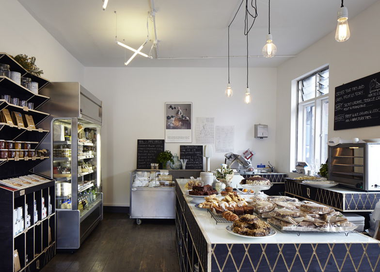
Food is displayed on shelves and counters made from plywood, which were stained black in reference to the charred or sprayed labels commonly found on wooden packing crates.
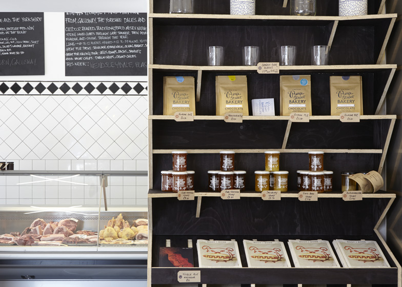
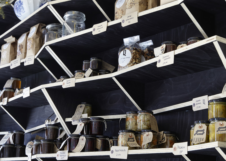
The edges of the shelves expose the raw plywood to create a contrast with the blackened surfaces and give the impression of packaging that has been sliced open.
Each of the wall-mounted shelves has a jagged profile, creating an effect that appears to thrust the product forward, and items are framed against a dark background by the edges of the shelves.
Exposed light bulbs suspended from simple black cords were chosen to reinforce the rough-and-ready aesthetic.
Black cord also creates a criss-crossing pattern in front of the windows that recurs in an inverted form around the edge of the central display and sales point.
Original black and white tiles behind the butcher's counter were retained and continue the basic palette used throughout the space.
Photography is by Jack Hobhouse.
Here's a project description from Fraher Architects:
Quality Chop Shop, Farringdon
We have just finished working on the design and fabrication for the Quality Chop Shop in Farringdon, London. The shop sits next door to the Quality Chop House which has a reputation for excellent cooking and good quality ingredients. The Client approached us to consider design proposals for the refurbishment of the adjacent shop unit that had recently become available.
The food had to be displayed in a clear and simple manner, but pay reference to the utilitarian aesthetic of the food units surrounding Smithfields meat market and Exmouth Market.
The fit out elements such as the counter, produce display and lighting deserved to portray a textured and slightly rough finish, hence the display of end grain to all the plywood joinery.
The deep black stain contrasts sharply with the timber core of the units, reflecting the blackened character of timber food crates. The blackened stain plywood is reinforced by the use of cable lighting that represents the packaging and the wrapping of the food produced. The use of exposed bulbs reflects the raw nature of the food preparation that relies on exceptional raw ingredients.
Access to the working kitchen of the Quality Chop House restaurant was important to ensure that the fresh food and cake trays are constantly re-stocked with baked good throughout the day.
The project was delivered to a tight deadline, with Fraher and Co fabricating and installing the joinery within five days on site.

