Branch Studio Architects adds timber-clad extension to Australian school library
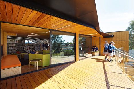
This wooden extension to a school library near Melbourne, by local firm Branch Studio Architects, creates a reading lounge and balcony nestled among the branches of surrounding trees (+ slideshow).
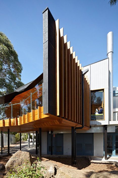
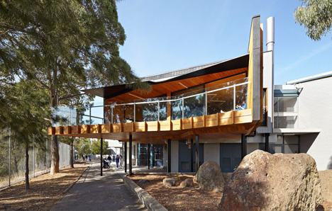
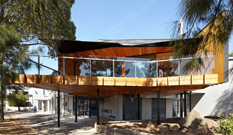
Branch Studio Architects renovated the existing library at St Monica's College and added a new reading room and decked terrace, which extends over a previously unused courtyard.
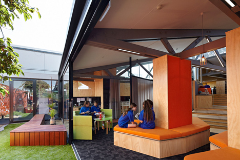
Pupils enter the library through a doorway clad in dark wood, which opens into an existing corridor and leads to a lounge area featuring angular sofas and benches that wrap around supporting columns.
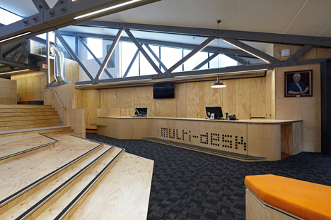
Beside the entrance, a multi-purpose reception desk also incorporates borrowing facilities, an audiovisual hot desk and digital access to the library catalogue.
Sliding doors can be pulled back to open this space to an outdoor courtyard featuring planted beds and a tree surrounded by wooden structures that create seating areas.
On the back wall of the courtyard is a mural painted by architect Brad Wray that references the colours and shapes found in the landscape of a nearby national park.
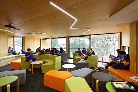
The natural orange tones of the mural and the contrasting green grass in the courtyard informed the colours used to upholster some of the plywood furnishings.
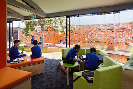
"A carefully chosen colour and material palette was selected to reflect and complement the courtyard artwork, engaging with the Australian outback, an important icon of the St Monica's College philosophy," explained Wray.
Pupils can ascend from the lounge to the library's main reference area using a wide set of stairs designed to evoke the monumental Spanish Steps in Rome.
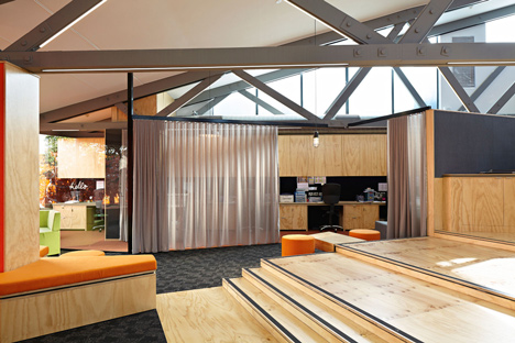
"The book stacks are placed on the upper level of the library in reference to the books being the Trinita dei Monti Church at the top of the Spanish steps and the external courtyard as the Piazza di Spagna at the bottom of the steps," said Wray.
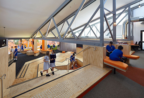
This staircase incorporates spaces for pupils to sit and read, conduct meetings or use the built-in photocopying facilities.
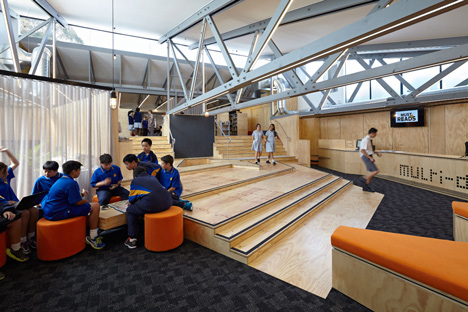
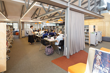
It leads to an area containing the bookshelves and a series of work spaces that can be divided by drawing translucent curtains around them.
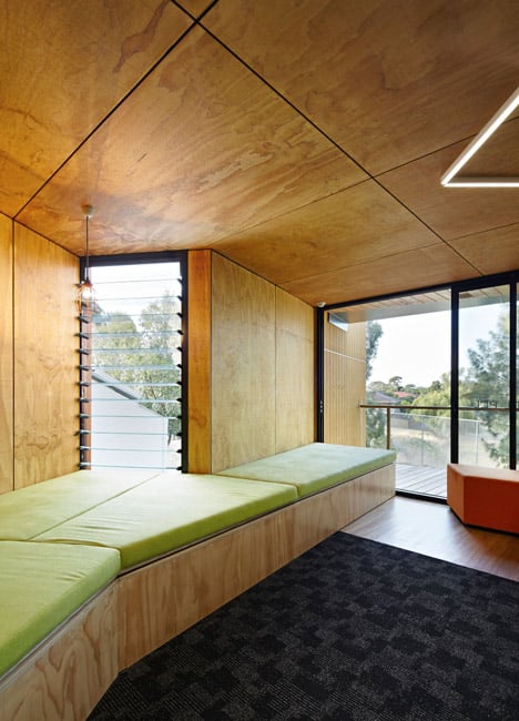
An existing wall was removed to create the entrance to the treetop reading lounge, which culminates in a balcony providing views towards the nearby countryside.
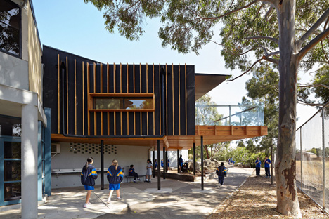
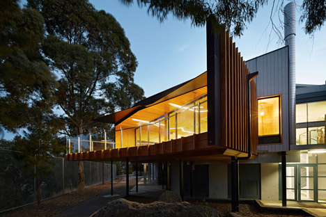
The exterior of the new addition is clad in black-stained plywood with natural timber battens creating a vertical contrast that references the nearby gum trees.
Plywood used throughout the interior provides continuity with the library's facade and creates robust, hard-wearing surfaces that will be able to resist the scuffs and marks of daily life in a school.
Zig-zagging LED strip lights in the extension echo the shape of the bookshelves and the lights are also applied to highlight existing trusses in the main downstairs reading area.
Photography is by Nils Koenning.
Here's some more information from the architects:
St Monica's College Library, Epping, Australia
The traditional school library is becoming more digitalised and the all mighty physical book becoming more and more scarce. The St Monica's College Library fit-out new extension consists of two parts: a renovation to the existing school library and a new reading lounge & deck extension. The project celebrates and elaborates on the traditions of the school & civic library through a series of key ideas, or 'chapters', that were translated into architectural interventions. These architectural interventions were collectively composed and narrated as a single 'story'.
1. Entry Threshold - Inspired by the entry to the 'Secret Garden', the Entry Threshold is conceived as a singular volume and is the main entry to the library. The threshold protrudes slightly into the existing school corridor like a portal into another world.
2. Garden Foyer - Two large glass sliding doors open up the library to the courtyard where an existing internal corridor is used to segregate the courtyard from the library completely. The internal library spaces are now engaged with the external courtyard, creating an indoor/outdoor reading area.
3. The 'Multi-desk' - A singular multi-purpose, multi-use, "Swiss army" reception desk, catering for borrowing, audio-visual hot-desk, library catalogue and a seat.
4. The Spanish Steps - An existing 1400mm change in levels between the lower & upper floors of the library was previously connected by two awkward, narrow stairs. This has been redefined as a series of platforms that promote impromptu spaces for discussion, meeting, photocopying, reading, viewing and traversing between the two levels of the library.
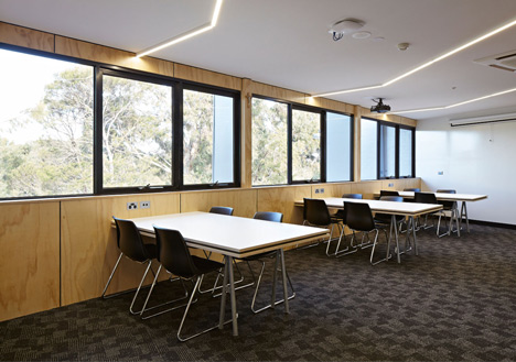
5. Tree-top reading lounge - A new reading lounge punches through an existing brick wall on level one and extends out over a previously unused courtyard. The reading lounge is specifically orientated & configured to offer views towards the nearby Darebin creek green belt and wetlands. Flexible & translucent staff areas encourage teacher and student engagement. Through the use of a curtain divider, a more transparent & sometimes blurred visual & spatial barrier is created. Similarly, curtains are used as informal screening devises to create flexible teaching & study areas. When a private class is required curtains may be pulled shut. At other times the curtains can be pulled open for the area to be used as a large open study area during lunchtime and after school.
A 'grand' reading-room area for larger class and study groups, sits in contrast with a series of 'nook’ areas where students can hide-away, immerse themselves in the library and read alone. The library contains a series of Forum spaces for smaller, more intimate student reading, study groups and area for one-on-one teaching. The library supports both traditional reading and digitalised plug-in learning.
Painted dark grey and lined with strip LED lights, a series of existing zig-zag trusses are celebrated, creating a improved sense of space which previously was cluttered & segregated from the upper level of the library.
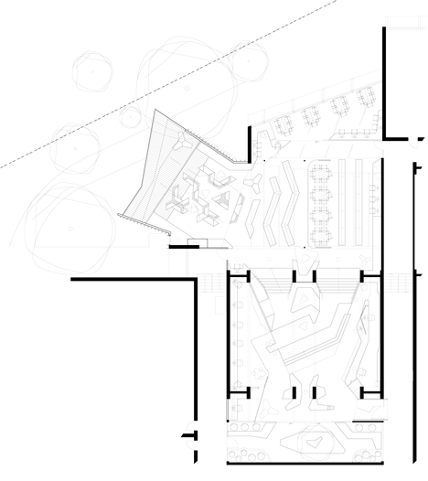
The book stacks are placed on the upper level of the library in reference to the books being the 'Trinita dei Monti Church' at the top of the Spanish steps and the external courtyard as the 'Piazza di Spagna' at the bottom of the steps.
A carefully chosen colour and material palette was selected to reflect and complement the courtyard artwork, engaging with the Australian outback, an important icon of the St Monica's college philosophy.
Moments of the colour orange are used throughout in fabrics, paint finishes and bench tops to link back to the external courtyard artwork. The courtyard artwork or mural was designed and painted by myself [Brad Wray] with the help of my wife - Ellie Farrell. It is an abstraction of the Bungle Bungle national park viewed from an aerial perspective. It is the second time now I have been fortunate enough to simultaneously take on the roles of both architect and artist on a project. The painting was completed out-of-hours, after work and on weekends over a 3-month period.
Plywood was used generously throughout for its durability and practicality. The schoolyard is a place where wear and tear is common and plywood is a material whereby scratches and scuffs could add to the patina of the material. Often the embedded grain within the plywood ceiling, wall and joinery panels bare reflection with some of the forms and textures outside on the nearby grey gums. Vertical natural timber battens, in collaboration with black stained plywood cladding, promote a visual connection with internal and external spaces. The shadow-clad external plywood cladding references the black and grey tones of the nearby grey-gums. Vertical, Victorian ash timber battens reference the vertical nature of the tall grey gums nearby.

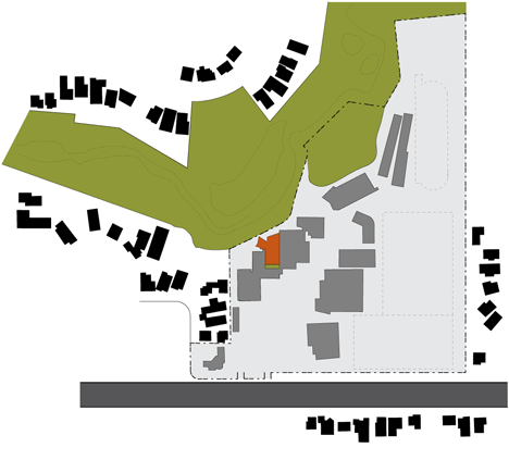
The extension is almost completely hidden from outside of school grounds. Situated amongst the tree canopies with only a small glimpse to be seen from a nearby walking track, the new building fabric merges with its surroundings. Internal loose furniture was custom designed for the project and made by a local furniture maker. A series of pendant lights highlight and promote both specific and non-specific areas of engagement within the library.
The project was constructed in two parts. One used a traditional means of contract with a building contractor undertaking the extension part of the works. Whilst the internal works or fit-out, which includes everything from all joinery to the Spanish steps were impressively undertaken by St Monica's College's own internal 'maintenance' team. It has been rewarding to learn from library staff, the amount of borrowing has significantly increased due the opening of the new library.