"The star of Milan this year was Instagram"
Opinion: the photo-sharing site set the agenda at this year's Milan design week and hints at how technology will transform the way we experience the world, says Marcus Fairs, who also shares a selection of his own Instagram images from the week (+ slideshow).
I was attending a talk in Milan the other day and I noticed that one of the panelists was far more interested in his iPhone than the discussion. The girl sitting next to me in the audience was similarly preoccupied. Then I realised what was going on: the guy was Instagramming a picture of the girl, who had just Instagrammed one of him.
For me, the star of Milan this year was Instagram. It was the lens through which I experienced the week: it was a kind of parallel digital version of my real-world experience.
Instagram is how I kept up with what friends were doing in Milan, and was a key source of research for what I should see. It's how I found out about the things I'd missed. I know plenty of other people who said the same.
It was my preferred method of documenting my own experiences at the fair this year. And when a journalist from La Repubblica called to interview me about my Salone highlights, her first question was "What was your favourite Instagram moment?"
Instagram is how I found out that Massimo Morozzi had died. A few years ago news like that would have spread on Twitter, but this year the design cognoscenti have switched to the photo-sharing service.
An Instagrammed Milan is very different from a tweeted Milan. Twitter helps news and gossip to spread like wildfire; it's a verbal medium that encourages debate. During the Salone del Mobile in 2011, journalists converged on Twitter to share information and opinions on the dark side of the industry, creating the biggest talking point of the week that year.
But Instagram is a purely visual medium that does not criticise but instead, through its filtered trickery, burnishes. It's not a surprise that designers, who collectively aspire to create a more beautiful world (and were largely silent during the 2011 twitterstorm), have embraced it too.

This wasn't a vintage Salone in terms of talking points and there appeared to be little consensus among Intagrammers as to the outstanding shows. Rather the city itself - and particularly its more photogenic venues - became the stars. The breezily atmospheric Palazzo Clerici in Brera; the eccentric Spazio Rosanna Orlandi; the breathtaking Villa Necchi Campiglio; the charming pop-up street cafes and garden bars in Ventura Lambrate; the surreal Fornasetti house. Under a benevolent sun, it felt more like a sprawling lifestyle festival than a design fair.
Instagram feeds are highly personal, highly curated visual diaries of an individual's aesthetic interaction with a place. The filters and cropping tools allow you to achieve visual perfection within a little square frame, creating an idealised world free of the clutter and noise of the real world.
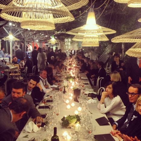
My own Milan Instagram diary is low on design but high on portraits of people I've met, dinners I've attended and incidental tableaux from my meanderings around the city. Trawling through my feed will no doubt strongly influence my memories of the week. It's an airbrushed digital travelogue that paints both the city and my interaction with it in a flattering light.
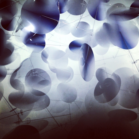
Instagram is a powerful arbiter of taste because it favours certain aesthetic experiences over others. It likes a strong, colourful form against a plain background; it loves translucency and diffraction; it adores sunsets. I wouldn't be surprised if brands soon start to rethink their presentation strategies to enhance the Instagrammability of their stands.

Instagram also favours eclecticism: a typical fairgoer's feed will feature a product followed by a selfie followed by a street scene followed by their lunch. Design has existed in a bubble of its own for decades: to walk round a design fair or flick through a design magazine is to see an aesthetic monoculture. But Instagram reveals how the design world intersects with other realities, and shows them to be just as beautiful.
Instagram is just a foretaste of the way we will use digital technology to experience events like the Salone del Mobile in future. Capturing technologies like 360-degree video - which records everything in all directions - allows the creation of convincing digital replicas of physical spaces.
And display technologies like Google Glass, augmented reality and virtual reality mean that we will be able to access additional layers of information as we move around an event, or even experience it without being there. One day the Salone del Mobile could be hosted in a huge server farm, accessible only through a virtual reality headset.
These technologies also allow users to inhabit enhanced, personalised worlds - or entirely artificial worlds - that can be designed around their preferences, edited on the move, Instagram-style, and filed for future enjoyment. Bored by the colour of your kitchen? Use a real-time filter to change it. Walk to work too drab? Brighten it up, adjust the contrast, cut and paste some sights from your last holiday.
To an extent we already inhabit a parallel space: time spent on Instagram, Twitter or other social media is time spent in a virtual community rather than the real world. The cliche of the person so entranced by their iPhone that they notice nothing of their physical surroundings is just the beginning of the migration towards parallel digital worlds that are as convincing as the real one.
Somebody will have to design these worlds but it is astonishing how little attention designers and the design industry is paying to this potential. In Milan this year only Moooi dared dip their toes into the water, presenting an online 360-degree digital walkthrough that allowed people who were not in the city to experience their show.
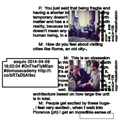
Elsewhere, Joseph Grima's FOMO (Fear of Missing Out) project harvested images from Instagram, reactions from Twitter and combined them with robot-generated transcripts of discussions. It treated the fair as a giant data-generating event and used algorithms instead of journalists to decide what to publish.

Apart from those two examples, and a smattering of other projects, this year's fair was largely a tech-free zone. The lack of innovative uses of technology at the fair was the elephant in the room. This is an extraordinary missed opportunity for an industry that needs to embrace technology if it is to have a future.