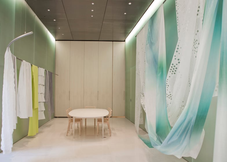
Milan 2014: Japanese architect Toyo Ito spoke to Dezeen about his design for textile brand Kinnasand's first Milan showroom and his "site specific" architecture (+ interview + slideshow).
Kinnasand, a company founded in Sweden over 200 years ago and now owned by Danish textile brand Kvadrat, asked the 2013 Pritzker Prize-winner Toyo Ito to develop its showroom interior for Milan design week.
Ito rarely designs interior projects, but in an exclusive interview with Dezeen the architect said that he agreed to collaborate with Kinnasand as he felt that several of its fabrics were reminiscent of the transparency and natural influences inherent in some of his architectural projects.
"What I have felt from the start is that it would be important to create an architecture that is more site specific, that is going to take into account what surrounds the human begins," said Ito, who discussed the underlying ethos that connects the wide variety of styles and forms he has experimented with.
"When I think about a new piece of architecture, I think about making it as if it was a piece of clothing that must be wrapped around a human being," he said.
Ito's career has spanned more than four decades. Predominantly based in Japan, his best known projects include the Mikimoto Building, created for a jewellery company in the Ginza district of Tokyo – which features a series of irregular glazed openings all over its facade – and the Tod's building in Tokyo with criss-crossed concrete bracing that echoes the silhouettes of the trees on the street it faces on to.
His more recent projects include the Sendai Mediatheque – a transparent glass cube that aimed to remove some of the architectural barriers around how space should be used. In 2011 he completed work on the Toyo Ito School of Architecture in Ehime, completed in 2011.
At the last Venice Architecture Biennale in 2012, he curated Japan's award-winning pavilion presenting alternative housing solutions for the aftermath of the country's 2011 earthquake and tsunami.
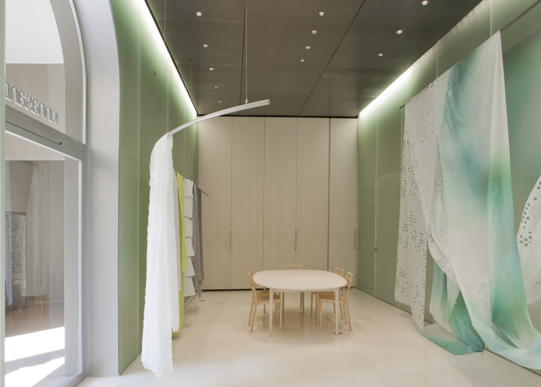
For Kinnasand's showroom, he chose to translate the properties of the company's textiles into the materials used for the showroom's walls, floors and ceiling.
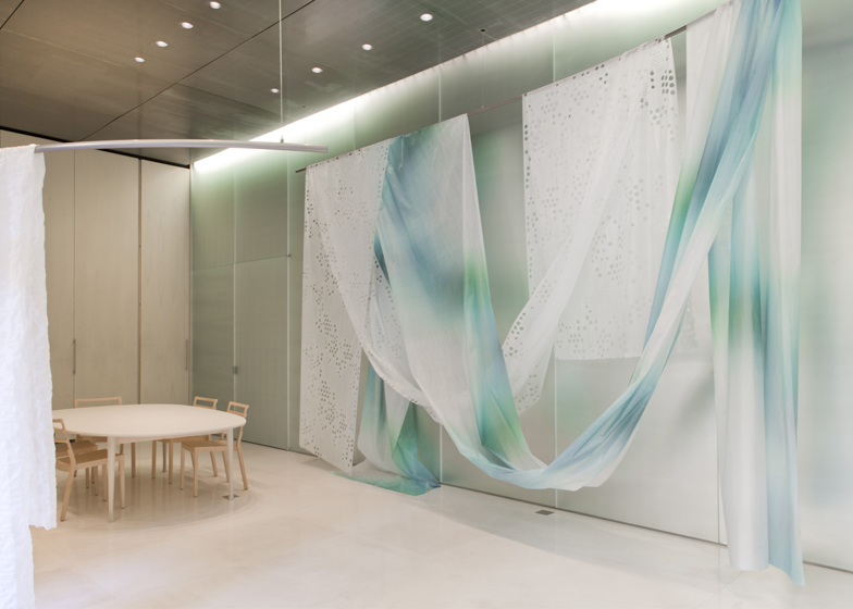
"Some of them were transparent, others were semi-transparent, all of them were very light and it really felt like they could float over the whole space of the showroom," said Ito, describing the fabrics.
"I decided that the architecture for this space needed to be something that would not overwhelm the essence of these fabrics. It needed to be something that could leave the textiles the possibility to float around the space," he added.
"This is the image that I had in my mind and this is also why I decided to use the reflective glass, but at the same time I decided it needed to be something with a not too strong reflection. I wanted to create a soft but deep environment for the showroom."
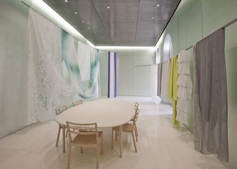
The glass walls have a frosted finish that reduces their reflectivity and are complemented by the dull shine of the electropolished steel panels on the ceiling and the polished white limestone floor tiles.
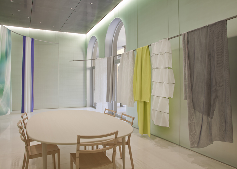
Two curving metal poles suspended from the ceiling provide rails over which the fabrics can be draped to enclose the central area of the showroom and form its only product displays.
A storage area for further fabric samples is concealed behind floor-to-ceiling wooden doors featuring minimal metal handles at one end of the space.
The clean and bright aesthetic is enhanced by basic furnishings including a rounded meeting table and chairs made from pale wood, which reference the brand's Scandinavian heritage.
Lighting is provided by spotlights and strips of LEDs hidden behind the edges of the ceiling that wash the walls in light that can be adjusted between different colours to alter the mood of the space.
Read the edited transcript from our interview with Toyo Ito:
Marcus Fairs: How did you get to come into contact with the brand and how did you apply your architectural ideas to an interior?
Toyo Ito: About one and a half years ago, I had a visit from a Kinnasand person that arrived in Tokyo with a suitcase full of textiles and I was asked if I would be interested in doing the interior design for the showroom. And I have to say that usually I don't do just interior design, I do architecture. But in this case, the textiles that I had the chance to see were so beautiful, so brilliant, that I really wanted to do just the interior design for the space.
Marcus Fairs: Tell us about the way you've used the space here.
Toyo Ito: I had the chance to take first a look at all the textiles of Kinnasand and I realised that is was very sensitive fabric. Some of them were transparent, others are semi transparent, all of them were very light and it really felt like they could float over the whole space of the showroom. They could actually envelop, they could wrap the whole environment.
So I decided that the architecture for this space needed to be something that would not overwhelm the essence of these fabrics. It needed to be something that could leave to these the textiles the possibility to float around the space. This is the image that I had in my mind and this is also why I decided to use this reflective glass that you can see here but at the same time, I decided it needed to be something with a not too strong reflection. I wanted to create a soft but deep environment for this showroom.
In order to have the materials of this architecture not take all the attention in this space, I give a lot of attention to small details and this is why I decided to choose simple materials. As you can see for those doors, you have a surface that is very plain and flat but at the same time is very simple and linear. So you do not have a frame where the doors are actually hidden, you have some doors that become the surface itself of a very linear construction, so that it could envelop this whole environment. This is something that I really wanted to give great attention to in the details.
Marcus Fairs: The white fabric with the pattern of circular dots on it reminds me of the facade of the Mikimoto building in Ginza, Tokyo, which has a similar pattern of circular windows. Did you spot that similarity?
Toyo Ito: Absolutely, I think that the fabric right behind me is perfect for my architecture. In relation to the building of Mikimoto in Ginza, it has got a very simple surface with several sized holes in it. Also, just by having a look at the fabric behind me, I think I would really like to use Kinnasand's fabrics and textiles in my own architecture.
Marcus Fairs: Throughout your career, there's a lot of different forms you use and different structural solutions. How would you describe your approach to architecture?
Toyo Ito: As you said, my style, the materials I've been using, has changed throughout several eras. Also the shape and the form of my architecture. But there is one thing that is consistent, which is that my own architecture is something made for human beings. You have other architects that think if human beings are not a part of the particular architecture, that architecture will look even more beautiful. I do not think so. I think that architecture is something that must be made for human begins. That human beings must be partners with the architecture itself. So when I think about a new piece of architecture, I think about making it as if it was a piece of clothing that must be wrapped around a human being. This is my image of architecture.
Marcus Fairs: Sendai Mediatheque was a hugely revolutionary building because of the structure and the way it used data, and the Mikimoto building is fun and it has a pattern on it. So what is the link between those two different architectures?
Toyo Ito: Both the Sendai Mediatheque and the Mikimoto building have got a very important point which is the structure. Of course what I wanted to create was a kind of structure that had not yet been seen until that very moment. But what I wanted to focus my attention on is that when you decide to use a new kind of structure, you have to think of how you can make it as human as possible. To turn it into a human space as much as possible.
For the Sendai Mediatheque, I decided to use pieces of wood like tubes that would give the human being inside the space the idea of being surround by a forest – so you have a human being that can enjoy a video or just some time inside the forest. And for the Mikimoto building, of course that was also commercial architecture, so we didn't have the chance of making the interior design. As for the main architecture, I decided that it was also interesting in that case to have the light entering the building as if it were through the leaves of a forest and so in both cases, you have a very natural element that is strongly felt by the human being inside the environment and that's the common point in my architecture.
Marcus Fairs: And the Tod's building in Omatesando in Tokyo has a glass facade with large tree shapes set in it.
Toyo Ito: Of course Tod's even more than the Mikimoto building, you would have the possibility to see a very strong and direct wooden silhouette, wooden structure. In that case, we didn't have that much of a volume we could use and also the facade was L-shaped. In that case we decided to have a wooden structure and having it completely surrounded by wood you would feel like you were really surrounded and wrapped by nature and this is the image that I had when I created the design.
What I have felt from the start is that it would be important to create an architecture that is more site specific, that is going to take into account what surrounds the human begins. So it would be important to create an architecture that destroys that distance between human begins and nature. Up to now, human beings have lived in environments that are very far from nature and actually I would like the chance for human beings to live inside nature and to be surrounded by nature.
Of course you have to take one step at a time, and I think that if we do take one step at a time in that direction we can achieve some kind of evolution. And I can also tell you that to a certain extent, we are already going towards that direction, and if we continue completely towards the direction and arrive at the goal we will be able to enjoy a much more lively life. We will get back to a more primitive instinct that will give us the possibility to be more natural in our everyday life. Like animals to a certain point, having the possibility to completely enjoy the surroundings and that is the kind of architecture that I think we should all aim for.
Marcus Fairs: And when you say "we", do you mean "we" as an architectural office, or "we" as a society?
Toyo Ito: Of course I mean my personal office but not only just that. I would like to think I am extending the meaning of what I just said to all people who are currently making architecture.

