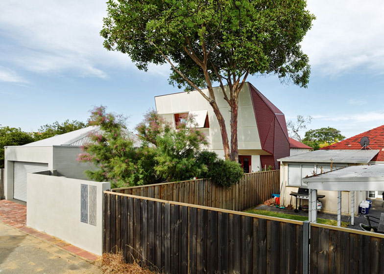
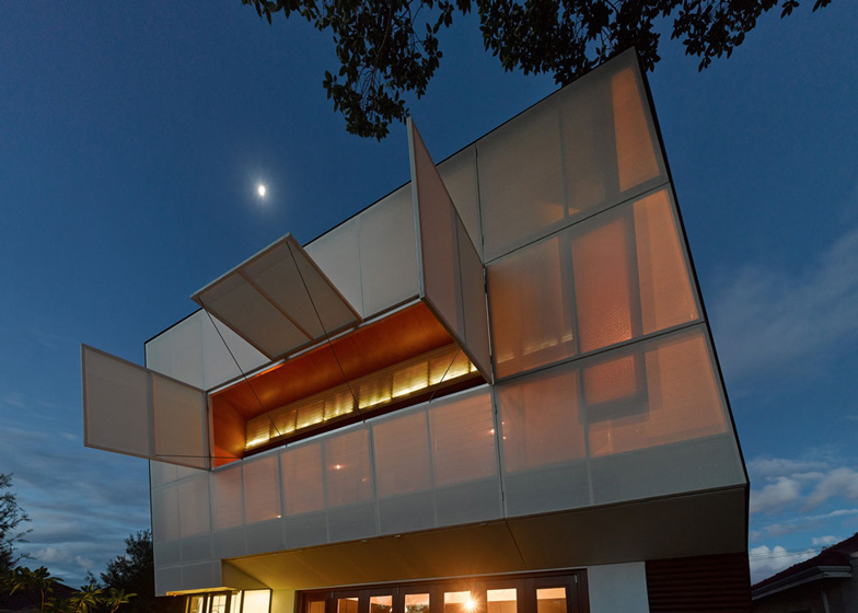
Australian architecture office Iredale Pedersen Hook has renovated a 1930s property in Perth and added an angular rear extension that contrasts with the traditional street-facing facade (+ slideshow).
Architects Adrian Iredale and Caroline Di Costa of Iredale Pedersen Hook own the house and have been gradually conducting renovations over the past four years to adapt it to the changing needs of their young family.
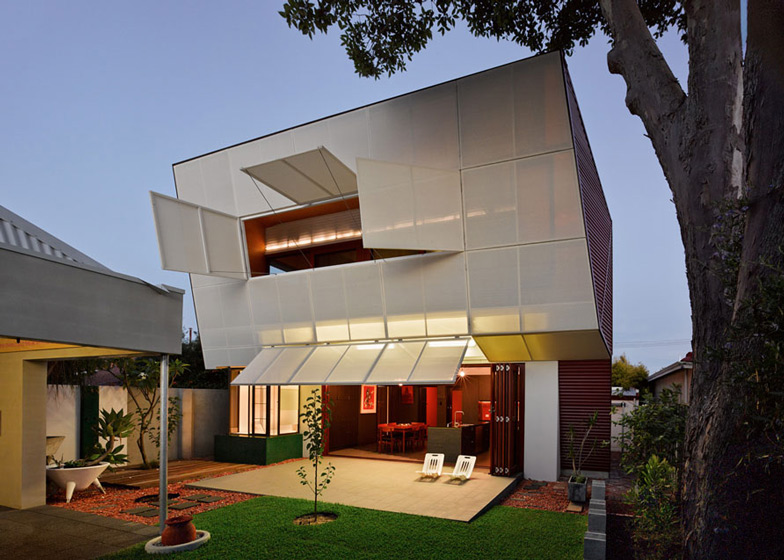
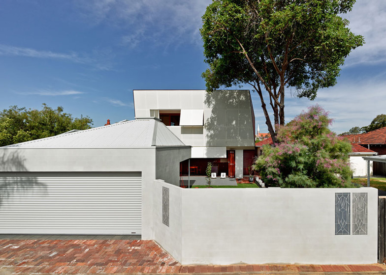
Mindful of preserving the property's historic aesthetic while updating its functionality, the architects retained the front facade and based the faceted shape of the extension on the multiple sloping surfaces of the original roof.
"Folding forms developed from the existing roof achieve a reinterpretation of the surrounding streetscape and roofscape, binding old and new [as well as] historic and contemporary," said the architects. "A Jekyll and Hyde quality, the street appearance remains almost untouched; a silent figure, a backdrop, the rear is the extrovert, complex and challenging."
When viewed from the adjacent street, the house appears to retain the appearance of the Queen Anne Federation-style properties typical in the city's Vincent district, which feature details reminiscent of the Baroque style of architecture that gained popularity in England during the early eighteenth century.
A key feature of this style is a sheltered verandah next to the entrance, which was popular with the Italian and Greek immigrants who moved to the neighbourhood following the First World War. The architects reintroduced this element to the building to enhance the connection between the house, the garden and the street.
The faceted extension extends upwards and outwards from the existing sloping roof at the rear of the property, which prevents it from being seen from the street.
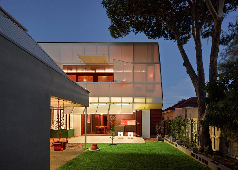
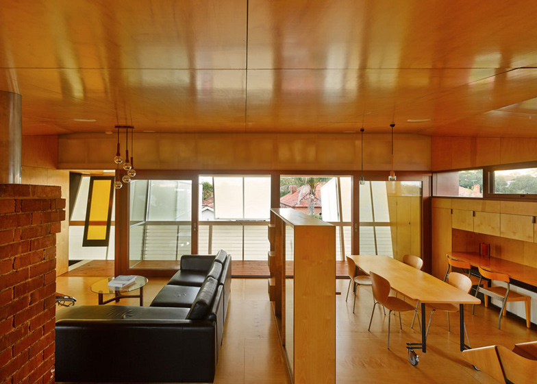
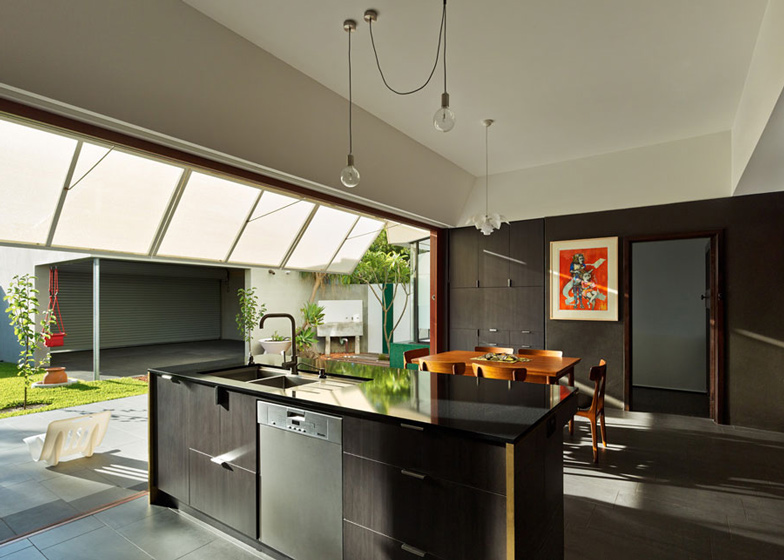
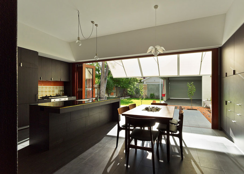
Folding doors on the ground floor can be pulled back to connect the dining room and kitchen with a terrace that projects into the garden.
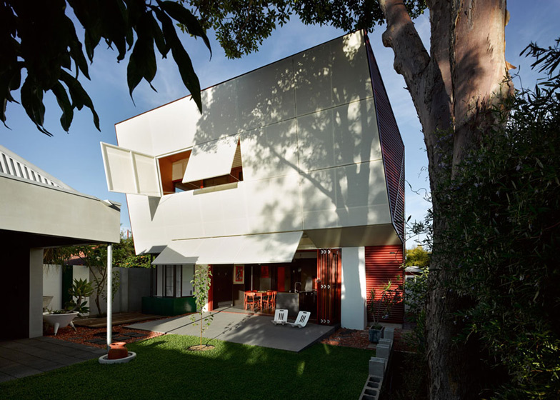
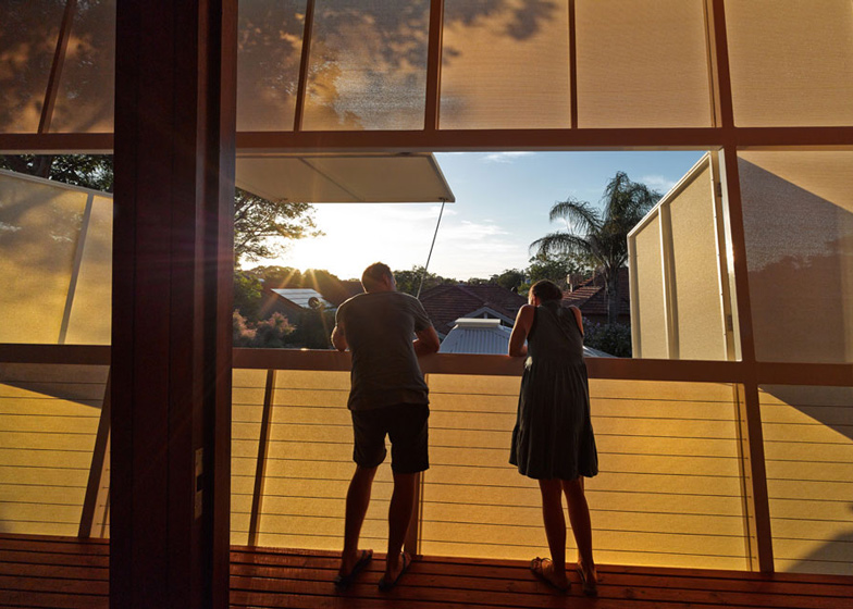
Above the terrace, the upper storey leans forward to shield the interior from the low summer sun and to make the most of views across the surrounding rooftops.
The facade of the extension is covered with fabric panels, which allow light to permeate and display shadows from the branches of nearby trees. Some of the panels at eye level can be opened to provide views of the horizon.
A cooling system that drips water down the fabric panels to chill hot air before it reaches the interior was based on the principle of the Coolgardie Safe - a traditional refrigeration technique employed by Western Australian miners to cool food.
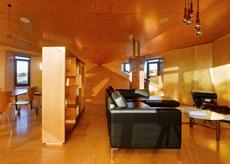
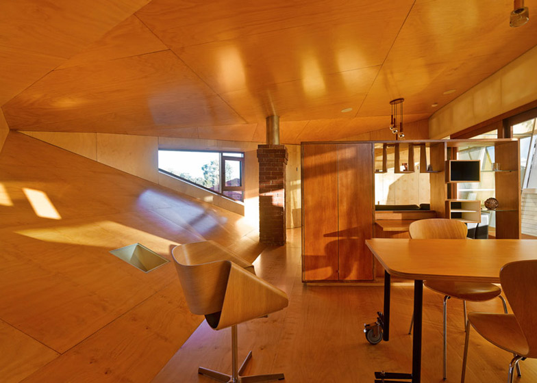
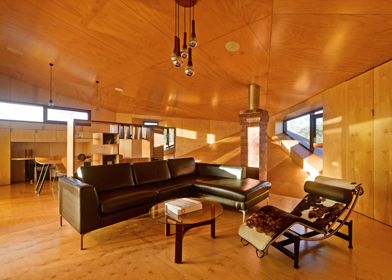
The angular interior of the study and living room on the upper floor is entirely clad in plywood panels. The sloping back wall replaces the tiles of the original roof and provides a surface that Iredale and Di Costa's two-year-old daughter uses as a slide.
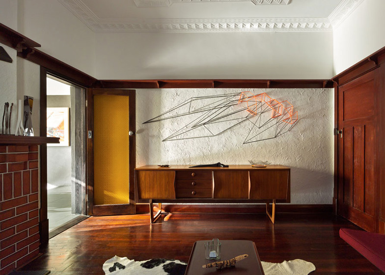
As well as the roofline, the architects retained features including the chimney, which has been converted into a water collector, and a 1950s sliding door with an amber glass panel at the top of the stairs.
A multipurpose pavilion constructed in the garden features a pyramidal polycarbonate roof, culminating in a transparent panel that allows daylight to reach the interior and provides views of the sky.
Photography is by Peter Bennetts.
Here's a project description from Iredale Pedersen Hook:
CASA31_4 Room House
Conceptual Framework
CASA31_4 Room House re-interprets the role of memory, tradition and social and cultural value in a rich spatial experience that is simultaneous familiar yet unfamiliar. Our architecture preserves and reinterprets the past. History is layered but never erased. Fragments of the past continually remind us that we are only another layer in the rich and unfolding history of this place.
All spaces contain elements of the past, often manifest as objects of intrigue, the sloping floor (the former roof), the barge scrolls on the front fence, the roof tiles creating a musical score along the boundary, the chimney as water collector and the up-cycling of former building elements as decks, gates, architraves and furniture.
A front deck engages with the street, re-introducing the role and value of the front garden as social setting and meeting place, a past tradition by the immigrant Italians and Greeks that has almost disappeared in societies obsession with privacy and security.
Over the last 3 years we have explored our 1936 Queen Anne Mount Hawthorn Federation house scraping, layering, and peeling with 4 primary spatial ideas; the room to the interior, the room to the garden, the room to the horizon, the room to the sky.
The room to the interior explores what existed, years of layering, the art of construction, knowing what to keep, what to reveal and what to remove, knowledge gained from 13 years indulging in the past. Rooms become the embodiment of a city, a microcosm of the qualities that make a great city. The room to the garden focuses attention to the exterior at ground level, it is purposely heavy and grounded engaging with the earth, the section expands to the exterior, a series of folding screens layer the engagement.
A space of deep sensory delight, an architectural palette cleanser, transitions the ground and upper level, the eyes and nose are overpowered by the burnt and waxed plywood walls and the amber light cast by Nan's 1950's sliding door.
The room to the horizon filters the suburban roof tops, the screen abstracts the exterior world, the interior is one folded space formed through a play on the one point perspective that intensifies the horizon. Openable screens create a direct view framing the horizon, releasing the interior volume. The space is cooled with an interpretation of the old Coolgardie safe, water is dripped down the fabric cooling the outside air. The newly restored, 1956 Iwan Iwanoff Guthrie residence cabinet finds a new home after 15 years of storage in numerous architect's garages. The roughly painted 'I love Linda' remains on the chimney, a rear window frames the distant Saint Mary's Church.
The room to the sky creates a vertical spatial experience, a halo of love poems embraces us (former wedding installation) and at night a cross of light abstracted by polycarbonate awakens but unlike St Mary's Church our little spire opens up to the heavens.
Contribution to lives of inhabitants
After 4 years of renovating it is now time to enjoy the richness and intensity of experience that this renovation has created. Every day is a different experience, one that is tender, unexpected, personal and embedded with history. The design enables our children and us to grow and evolve in a sequence of spaces that encourage engagement with each other and the dwelling and offers new ways of understanding and exploring family relationships and an understanding of space. Our house is simultaneous a memorial, playground, place of celebration, stage set, place of community interaction and most importantly 'home'.
Program Resolution
The design exploits all areas of the site with an inherent flexibility for not only day to day use but the long term capacity to adapt to evolving and changing requirements as the family grows and ages.
It re-engages with the street and community allowing our children to play in safe environment connected to the street and house. Spaces are specific and flexible, while offering sufficient capacity for personal interpretation and use.
Sustainable Architecture Category
This project includes both a macro and micro approach to sustainability. It also extends the meaning of sustainability beyond environmental to include contextual, social, cultural and economic concerns.
This house will be a case example for the City of Vincent demonstrating the importance of preserving the 1935 Queen Anne Federation home with the capacity to embrace contemporary expectations of living, without comprising the street context or privacy of adjoining properties. The neighbouring house completes the street sequence of ‘twins’ and twins should never be separated.
The removal of material from site is minimised, an attitude of 'upgrading' ensures that materials once concealed for structural purposes are now used for furniture, decks, doorframes and architraves.
The upper and lower level spaces are protected from the low, intense summer sun with timber framed fixed and operable screens, the upper level is cooled with a manually operated reticulation system that drip feeds water on to the fabric, hot moving air is rapidly chilled, this is Perth's largest 'Coolgardie Safe', a 19th century low-tech refrigeration system used by the Coolgardie WA gold miners to cool edible goods. Windows are strategically located to maximise cross ventilation or for winter heat gain (north facing highlight window with a deep reveal for shading).
All interior spaces preserve elements of the past, history is layered but never erased. Low energy light fittings, recycled light fittings, low water use and storage, pv cells and solar hot water systems all form part of the sustainable equation but is the focus.
Economy is achieved through re-cycling, restoring, re-interpreting building materials and historic traditions and minimising waste. This project represents a holistic approach to design and dwelling, where memories are preserved, carbon footprint minimised and the concerns of the broader community celebrated.
Context
Folding forms developed from the existing roof achieve a re-interpretation of the surrounding streetscape and roof-scape, binding old and new/ historic and contemporary. A Jekyll and Hyde quality, the street appearance remains almost untouched, a silent figure, a backdrop, the rear is the extrovert, complex and challenging.
A front deck engages with the street, re-introducing the value of the front garden as social setting, a past tradition by the immigrant Italians and Greeks. A mosaic tiled seat offers a place to rest for neighbours. All exterior spaces contain elements of the past, often manifest as objects of intrigue.
Integration of Allied Disciplines
As architect owners we were keen to maintain an open line of discussion that enabled details to be developed and refined as the project evolved. This often involved the capacity to re-use building waste. Our structural engineer and builder eagerly entered in to this arrangement in particular the role of the builder extended beyond the traditional role.
Architects: Caroline Di Costa Architect and iredale pedersen hook architects
Architectural Project Team: Caroline Di Costa, Adrian Iredale, Finn Pedersen, Martyn Hook, Brett Mitchell, Sinan Pirie, Matthew Fletcher.
Structural Engineer: Terpkos Engineering
Builder: Hugo Homes
Completion: December 2013

