Milan 2014: Dezeen's Dan Howarth braved the mad dash of Milan design week for the first time this year. He picks his top five projects (+ slideshow).
From the perspective of a first-time visitor, Milan's design week seems vast. As well as the official Salone del Mobile, there are multiple design districts that spring up in different areas of the city. In the past these satellite showcases have provided some of the real highlights of the four-day dash that Milan often becomes.
Running, and sometimes sprinting, between locations in order to see as many exhibitions and installations as possible in four days, it quickly became clear that this year the best projects were scattered across different districts rather than concentrated in one place.
Although there was no one product that appeared to capture the collective imagination of the Milan crowds, the Salone offered plenty of new and innovative designs as well.
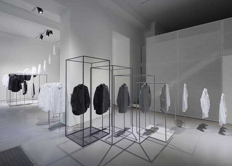
Starting with a highlight from the Brera Design District, north of the centre of Milan, the Nendo and COS collaborative installation was a Minimalist match made in heaven. The trail of painted COS shirts that meandered through Nendo's series of metal frames was simple and ethereal. In the contrasting all-black basement below, an exhibition of Nendo's design projects was also beautifully curated.
It highlighted the studio's minimal designs, shown alongside Oki Sato's line sketches depicting how shapes and actions formed the basis for products.
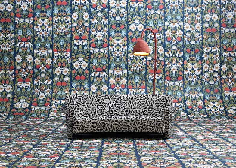
In the Tortona district – an old industrial area in the south of the city where exhibitions are usually held in former warehouses – Studio Job debuted a wallpaper collection created using patterns from the designers' back catalogue. Motifs were taken out of projects ranging from catwalk designs for Viktor & Rolf to cabinets for Moooi; an original way to collate and reinterpret a varied retrospective of work.
The designs were rolled out side by side, down one wall and across the floor for the installation, creating a visually striking display that drew in both design aficionados and passers-by from the street.
Nika Zupanc's delicate collection for Sé was a highlight from the show at Spazio Rossana Orlandi, another satellite space curated by gallerist Orlandi in a series of buildings surrounding a courtyard. Zupanc's work stood out not only for the sparing use of marble and delicate metal details – the furniture and lighting looked beautiful and cohesive presented together.
The refined shapes and smooth surfaces were a refreshing contrast to the craft aesthetic seen in many of the other projects displayed in the gallery and it's courtyard garden.
One of the favourites on show at the focal Salone Internazionale del Mobile furniture fair was Hella Jongerius' East River Chair, launched by Swiss brand Vitra. The colourful seat with optional front wheels was first designed for North Delegates' Lounge at the United Nations buildings in New York, which Jongerius renovated with Rem Koolhaas.
This reminded me of Danish Modernist architect Arne Jacobsen's designs for the SAS hotel in Copenhagen, which became hugely popular once they were put into mass production. We'll have to wait and see if Jongerius' design will achieve the same level of success, beyond their apparent popularity in Milan.
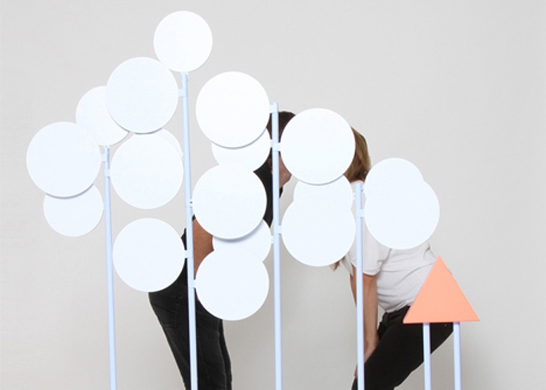
Over at Ventura Lambrate in the east of the city, a photo booth triggered by physical contact proved to be the most entertaining installation of the week. The Thermobooth 2.0 by taliaYstudio takes a snap when users kiss, hug or high five. TaliaYstudio was also showing a collection of holdables at the Confessions of Design exhibition at the Rotonda della Besana in the east of Milan that offered a satirical take on the biggest tech-trend of 2014.
The Thermobooth created some awkward moments for visitors testing it out and members of the Dezeen team (not pictured above) shared a lot of love while having a go.


