Designer Reiichi Ikeda inserted boxy partitions that follow the pattern of existing ceiling trusses into this clothing boutique in Osaka, Japan (+ slideshow).
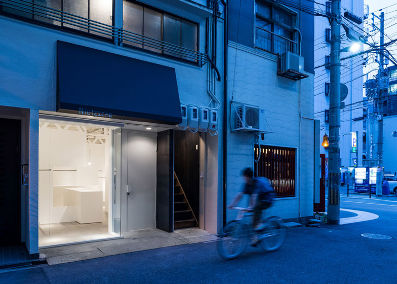
Reiichi Ikeda designed the narrow interior of retail store Nietzsche to display a collection of clothing brands.
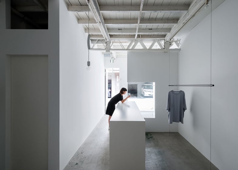
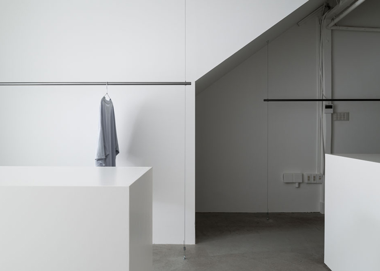
The sparsely furnished all-white space has been filled with of an arrangement of counters and free-standing painted wooden partitions.
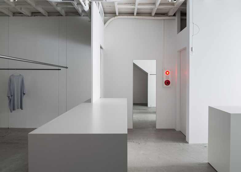
The partitions and benches are all different heights, creating a maze-like pathway through the store.
Ikeda told Dezeen the client didn't have a strict brief, but simply requested an interior that made the clothing on display "look attractive".
"I felt that it was important to remove the colours for displaying these clothes, so I used white in the interior rather than black," Ikeda explained.
"There are random partitions in the long and narrow space to adjust the view, which you can find a bit too wide without these," he added.
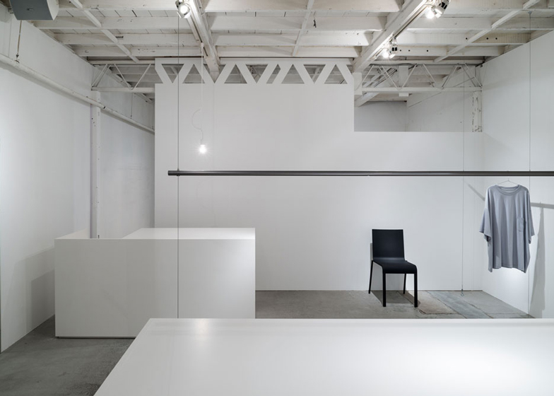
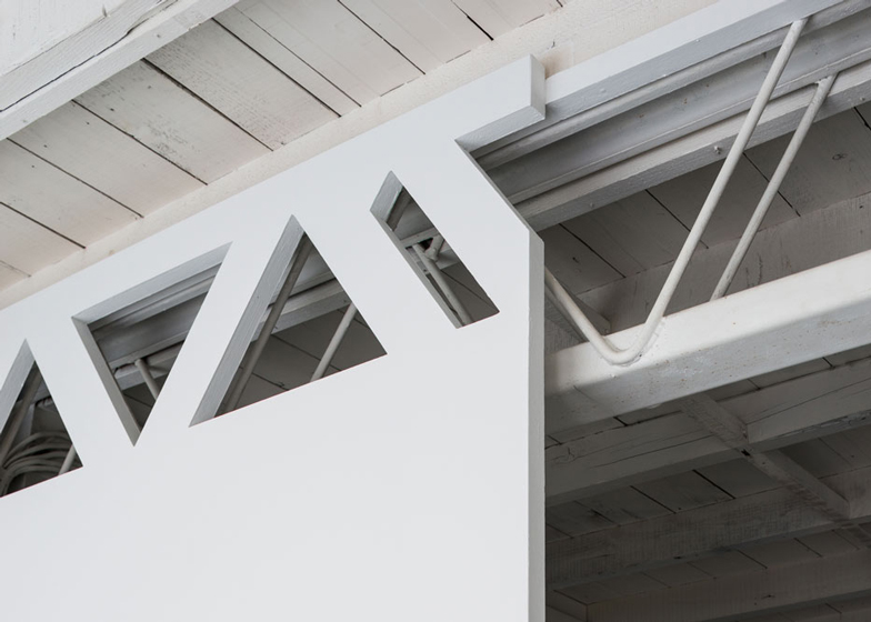
At the top of the new partitions, Ikeda has created a series of openings that mirror the the forms of the existing ceiling trusses in the space.
Customers can manoeuvre their way through the store around the benches and partitions to access clothing hanging on metal rails. These are attached to both the ceiling and concrete floor by long, thin metal wires.
Original wooden boards lining the ceiling and metal trusses have also been painted white.
Rectangular mirrors are attached to various sections of the walls, while bare light bulbs hang at low points throughout the store.
Photography is by Yoshiro Masuda.
Here's a project description from Reiichi Ikeda Design:
Nietzsche
This boutique carries various unique brands in Horie, Osaka.
At the first visit to this long narrow site, the trussed ceiling structures caught my eyes in the space which had only white painted walls. The trussed structures showed a presence in the blank environment, and I felt the sigh dotted with them was already made up as a good design.
I planned my design should be an extension of this existing sigh, and worked on it based on the concept of "structures + structures". I partitioned the boutique with trussed design panels at the same places as where the trussed ceiling structures are on just to link to them.
After I made interior constructions linked to the building ones, just the shape of the structures became to handle the general public flow line. I tried transforming the functional part of the building constructions to the design element, and gave dynamic image to the boutique.
Project Name: Nietzsche
Use: clothing store
Location: 1-9-12-1F, Minami-Horie, Nishi-ku, Osaka-city, Osaka, Japan 550-0015
Area: 64.41 square meters
Date: Aug. 17, 2013
Client: Kenji Nakai
Constructor: Takakura Construction Inc.
Lighting: Ushio Spax Inc.

