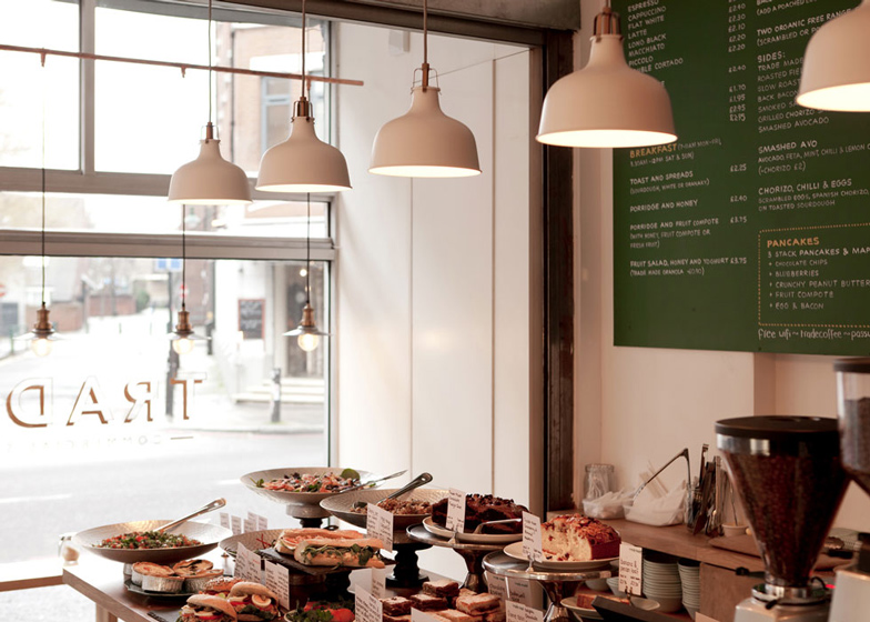
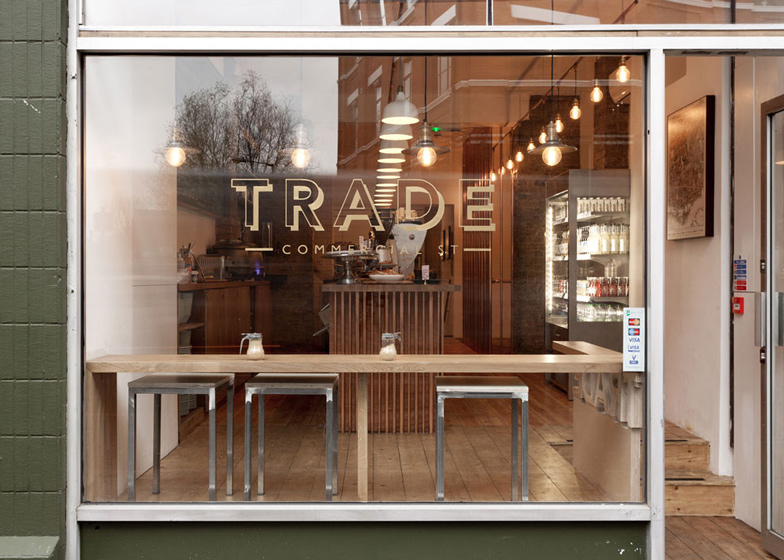
The interior of this east London cafe by local firm TwistInArchitecture features copper tubes, timber boards and metal light fittings, designed to reference the area's trade history (+ slideshow).
TwistInArchitecture converted a run-down space on Commercial Street in east London for a cafe called Trade, retaining three separate zones from the original layout to use for display, coffee and food preparation and customer seating.
The firm's designer and co-founder Andreja Beric said the philosophy for the build was to create a "contextually responsive environment" by re-using materials that were once traded by builder's merchants along the street.
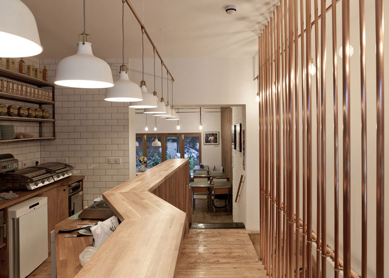
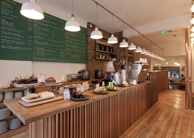
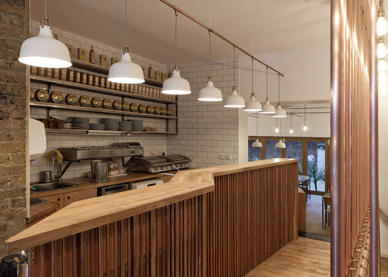
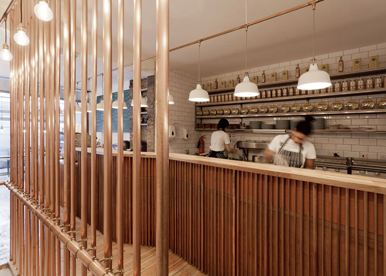
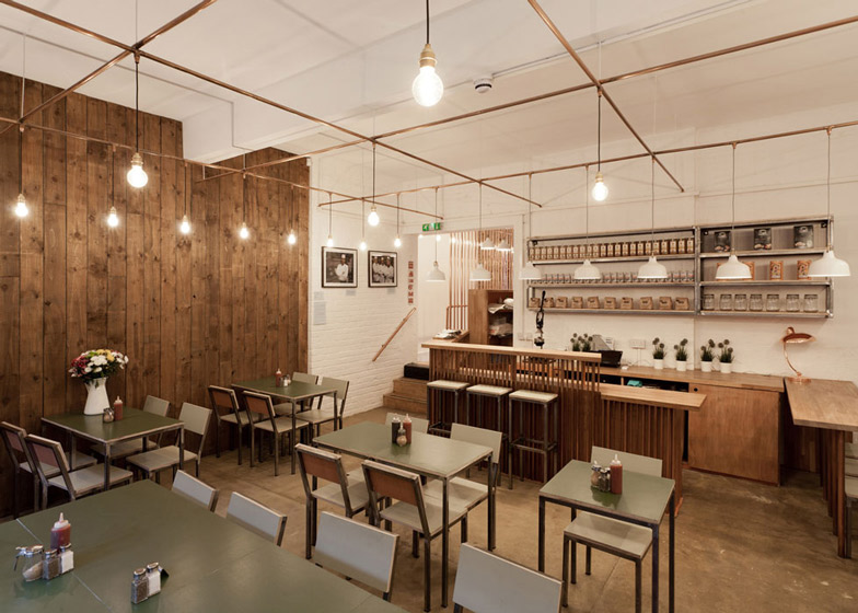
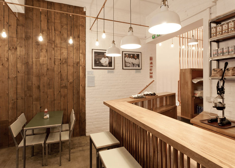
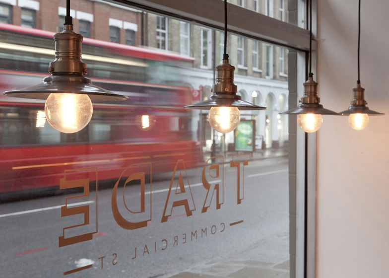
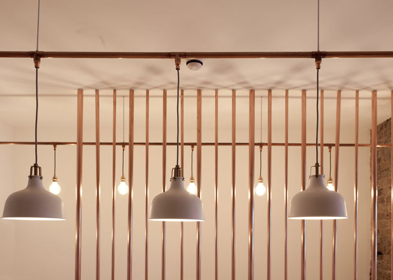
Copper tubes are used in different arrangements to create a screen in the centre of the cafe and clad the base of the plywood counter. They are also implemented as a staircase balustrade and to construct a grid that hangs from the ceiling, used to suspend low-hanging lamps.
"The space is kind of strange, it had three different areas that were quite different in feel so we wanted to have a common thread that combined it all," Beric told Dezeen, referring to the lighting grid.
"Lighting was something that was quite important for the shop and we wanted to achieve rhythm with this, it made sense and visually it was quite good to repeat the element at a high point," Beric explained.
"Copper and wood work well together, both are warm materials and contrast with the matte and shiny surfaces," he added.
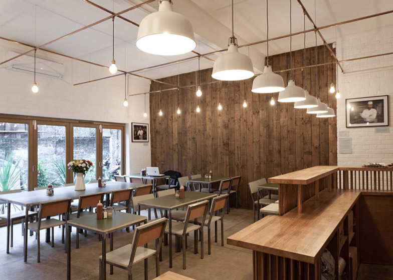
Pieces of laminated oak wood zig-zag across the counter top in the food preparation area and continue to where customer seating is located at the rear.
Recycled boards salvaged from a timber yard form a floor-to-ceiling feature wall.
The designers also demolished the back wall and inserted bi-fold doors to open onto a wooden deck, creating more room and allowing extra light into the space.
Existing wooden floorboards throughout the cafe were stripped of their painted surface and varnished.
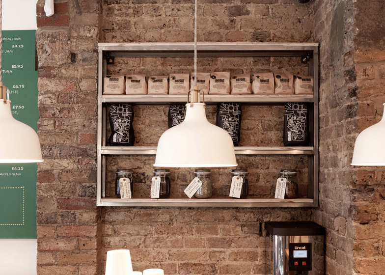
Sections of exposed brick wall form a backdrop to the coffee machine, while the remainder of the interior is lined with white tiles.
Here's a project description from TwistInArchitecture:
Trade
London-based architectural practice TwistInArchitecture – founded on the principle of creating buildings with an unusual twist – today announces the opening of a unique new coffee shop in London's East End, on Commercial Street. As well as recusing a run-down space, the philosophy for the build was to re-use a number of materials which were once traded along Commercial Street by builders' merchants and in the material yards, to create a contextually responsive environment.
For this reason, the interior is dominated by copper tubes – which are normally hidden away within wall cavities – serving both an aesthetic and design role, but also a functional one. Indeed, hundreds of yards of copper tubing has been used to create both the internal screens of the main bar fascia, as well as being suspended from the ceiling to carry electricity to the lighting fixtures (see Figs. 1 and 2). The signature use of copper has also been applied to the staircase balustrade and handrails, creating atmosphere through muted reflections and intricate shadows.
The new venue – appropriately called 'Trade' – also benefits from a number of modelling changes. It has a new staircase location, new large opening to the back wall to allow natural light to enter, and a complete re-work of the basement. The unusual geometrical twists of the copper are warmed by the use existing brickwork and timber floors, while the true heroes of the shop – it's coffee and home-made signature food are given the most prominent position.
Trade is located two minutes away from trendy Spitalfields Market, and can accommodate 60 people, spread throughout its three zones: the display section at the front, the preparation area in the middle, and the seating section at the rear. The shop front itself is open and inviting.
Andreja Beric, co-Founder of TwistInArchitecture, said: "We're very pleased to have completed this quirky project, which brings something new and interesting to Commercial Street, while also breaking away from the ‘shabby chic norm’ of so many other sites. The three internal spaces would typically have three different interior concepts, so we decided to allow these spaces to have their individuality but be tied together by the use of copper – at a low height through the counter, and at a high level through the lighting conduit. These threads work to complete the interior with one idea. It also helps that trade looks seriously cool, has awesome food and coffee, and is in tune with its surroundings and historical significance."

