Monochrome apartment by Maciej Kurkowski and Maciej Sutuła features conference spaces
A geometric arrangement of CNC-cut plywood panels defines a lounge space in one corner of this live/work apartment in Warsaw by Polish designers Maciej Kurkowski and Maciej Sutuła (+ slideshow).
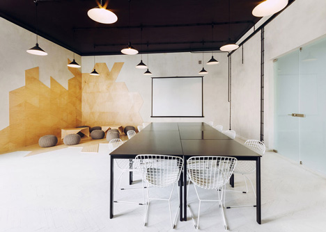
Kurkowski and Sutuła restored the upper floor of an early twentieth-century building, creating a combined home and workspace for a company manager. As well as typical domestic spaces, the apartment features a multi-purpose area for meetings, exhibitions and other events.
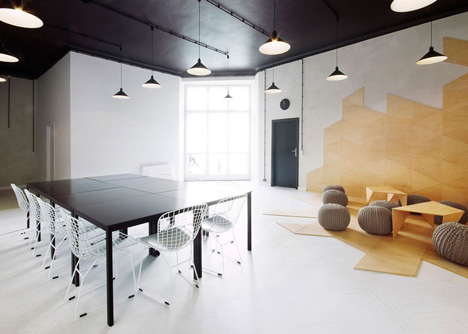
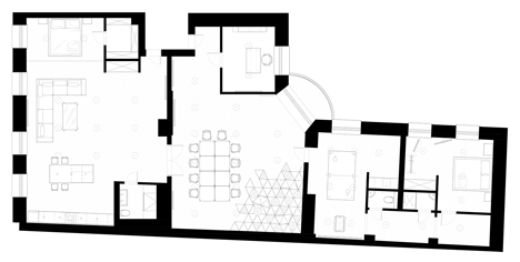
The designers removed the originals partitions and reorganised the space, creating the open-plan apartment at one end, the meeting room and lounge space in the middle, and two smaller spaces that accommodate a games room and a guest bedroom.
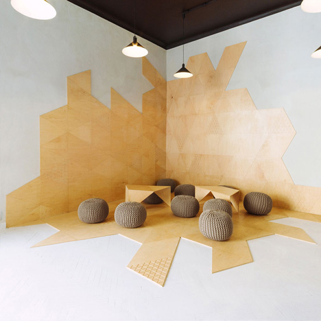
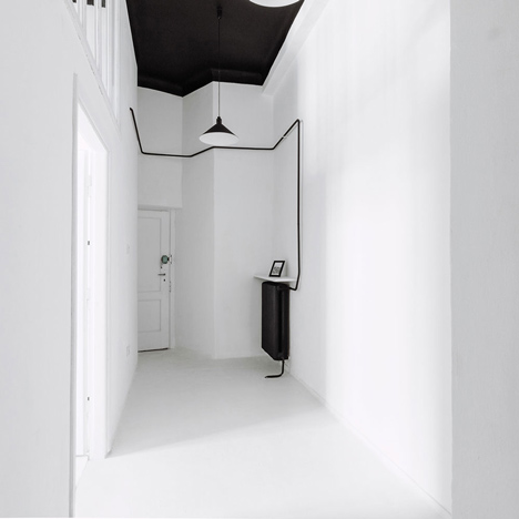
A monochrome colour palette was applied throughout the interior. Walls and flooring were painted white, while the ceilings were given a coat of black.

"The colours of the interiors have been chosen taking into consideration large, abstract and colourful paintings that were supposed to be introduced in the rooms," said the designers.

"The space here is defined by a pre-existing parquet that was painted white, a black ceiling and walls in the shade of light grey with expressive texture of coarse-grained plaster," they added.
The black and white shades of the meeting room are interrupted by the yellow tones of the plywood-panelled corner, where a collection of round, knitted stools and low wooden coffee tables create an informal seating area.
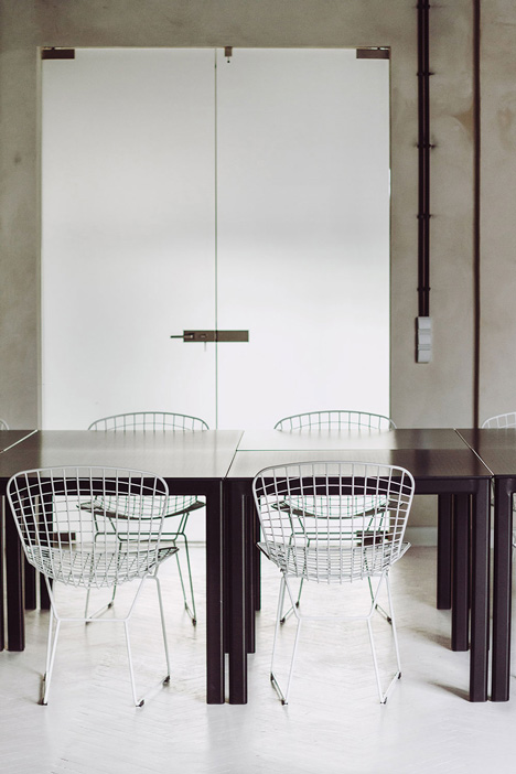
On the other side of the space, an arrangement of modular tables form one large conference table, but can also be separated to provide individual desks.
"Considering the extreme flexibility expected from the office part, its space was designed to be as manageable as possible," said Kurkowski and Sutuła.

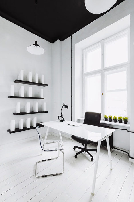
A small office is located at one end of the meeting room. The monochrome space has a black-painted ceiling, white walls and white-painted floorboards, with a single desk and chair.
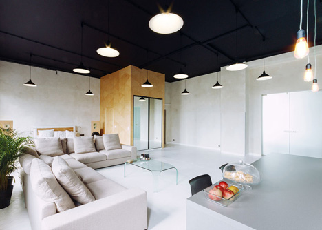
A pair of glass doors lead through from the meeting room into the private spaces of the apartment, which comprises an industrial-style room featuring a large sofa and several plants. A kitchen unit is installed at one end, while a second guest bedroom is positioned at the other.
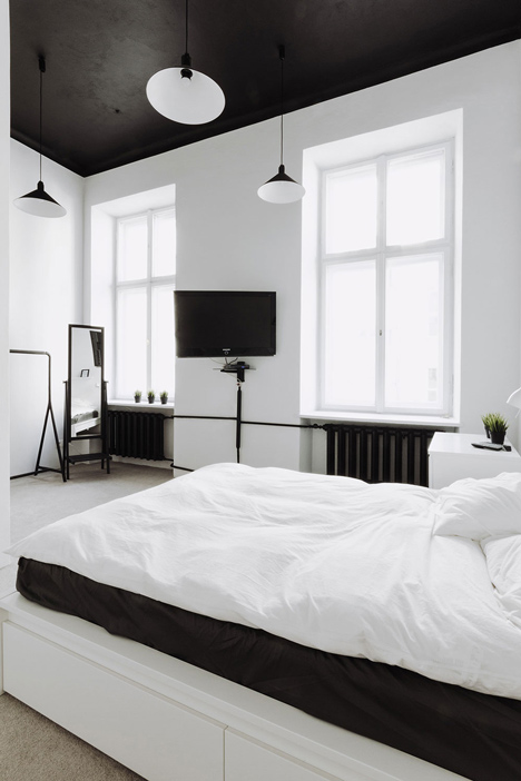
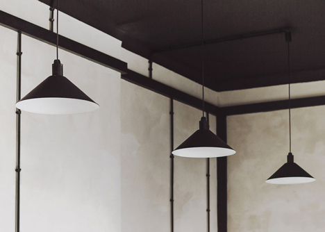
Low-hanging black lamps were installed throughout the space, which the designers recycled from other parts of the abandoned tenement building.
Photography is by Paulina Sasinowska, Maciej Kurkowski, Maciej Sutuła.
Here's a project description from Maciej Kurkowski:
Apartment/Conference Kredytowa, Warsaw, Poland
The object of design is a property in the centre of Warsaw, located on the Kredytowa street. This tenement house, funded by Mr. Goldstand in 1912-1916, was realised according to the project by Józef Napoleon Czerwiński and Wacław Heppen as a strongly decorated, seven-storey building. It survived the WWII in relatively good condition, but during a modernisation in the 50s its appearance was changed drastically, according to pseudo-modernistic fashion: the structure was reduced to four storeys by liquidation of its beautiful crowning, also the characteristic decoration of the facade was destroyed. For many years there had been service shops on the ground floor of the house. Lately, a big effort has been put into restoring those functions.
Rooms on the upper floor of the tenement house, despite a limited budget, were to be adopted for a representative space dedicated for two functions: an apartment and a conference room with a supporting social room. The investors strongly insisted on preserving the raw atmosphere of the interiors of this old tenant house. The renovation was conducted to achieve the style which in reference to revitalised factory buildings is called industrial, although in this case it is reinterpreted in a much warmer and cosier variation, so to reflect that the interior always served as a house, not a plant. The aspiration of the investors was not only to create a place for living and organising meetings, but one that could also house happenings, exhibitions and other artistic events.
The colours of the interiors have been chosen taking into consideration large, abstract and colourful paintings that were supposed to be introduced in the rooms. Therefore a monochromatic tonality of warm greys was chosen, creating a neutral background for the pictures.

After removing all the unnecessary partition walls, the two interiors could be composed. The space here is defined by a pre-existing parquet that was painted white, a black ceiling and walls in the shade of light grey with expressive texture of coarse-grained plaster. In the opposite corners two pairs of cubical elements were added: one pair covered with birch plywood panels specially designed and produced using digital fabrication methods, and another pair with perfectly smooth plaster finish. Those interventions didn't aim to mask the differences between the two interiors, but rather to obtain a harmony and equilibrium of the whole. It makes us feel, that when we cross the huge double door we pass through a magic mirror, recognising a reflection of the shapes seen before, despite the fact that they are projected in a non-literal manner, where every element is being reinterpreted.
Considering the extreme flexibility expected from the office part, its space was designed to be as manageable as possible. Traditional solid conference table has been substituted with modular system of smaller tables that can be easily adjusted to different needs, including individual workplaces.

Following the principle of equilibrating the two interiors, when in one corner a separate office was created, in the other the motive was reinterpreted in creation of an open zone for relax and more informal meetings, and distinguished from the rest of the space by triangular composition of CNC cut plywood panels, dedicated coffee tables and wool puffs.
This leisure zone is correlated with social zone housing a kitchen and gaming equipment that allow for active recreation after hours, like table tennis, foosball and darts. This part contains also a number of guest rooms (with shared bathrooms) designed in a monochromatic tonality.
Industrial atmosphere of the interior is emphasised by numerous details: electrical ducts in black integuments left visible, heating installations painted black or lamps picked from the abandoned part of the building and restored as the main artificial lighting source, as well as carbon bulbs.
Location: Warsaw, Poland
Total Area: 216 m2
Volume: 842 m3